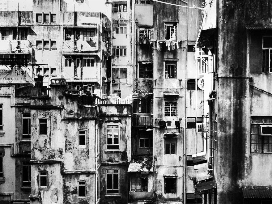
“To me, photography is an art of observation. It’s about finding something interesting in an ordinary place… I’ve found it has little to do with the things you see and everything to do with the way you see them.”
— Elliott Erwitt

“To me, photography is an art of observation. It’s about finding something interesting in an ordinary place… I’ve found it has little to do with the things you see and everything to do with the way you see them.”
— Elliott Erwitt
Olympus is no more, but before OM System started warming up yesterday’s ramen in the form of rebadged products from a more successful era, Olympus was a major innovator in camera technology. The IS-2000 isn’t one of those cameras that gets whispered about in hushed tones alongside legends like the original OM-1 or the Mju series of point-and-shoots, but I think it deserves a little more attention.
The only thing it really has in common with the Olympus Mju is the cheap plastic housing. While those cameras were celebrated for putting sharp optics into compact bodies, the only thing small about the IS-2000 is the price tag. I picked mine up for the princely sum of 18 Australian dollars, or closer to $30 once postage was included. As princely prices go, we’re talking bargain-basement Prince Andrew, with all the associated heft, although at least this camera actually works.
The Mju may have legendary status, but the hundreds of dollars being asked for a second-hand Mju II puts it firmly into the Emperor Has No Clothes category. My own copy no longer works and I’m not prepared to replace it at those prices, so perhaps this Olympus can fill the gap. The only problem is finding the gap, because this thing is big. It lumbered onto the scene in 1991 and, in today’s world of sleek electronics, it’s probably best described as husky.
That size was actually part of the appeal when it was new. Olympus marketed the IS-2000, also known as the IS-2 or L-2 depending on where you were, as a ZLR — a Zoom Lens Reflex camera — offering the advantages of an SLR without the weight and inconvenience of carrying interchangeable lenses on holiday. These days we’d call it a bridge camera, but at the time it represented a new class of camera, and this was the second model in Olympus’s flagship range. It certainly wasn’t cheap either, with the retail price approaching US$1,000.
So the question I wanted to answer was simple: adjusted for inflation, is this thing really worth close to two thousand Australian dollars, or have I overpaid at a hundred times less?
To find out, I took this heritage camera to a heritage town, Guildford in Perth’s Swan Valley. Founded in 1829, it’s one of Western Australia’s earliest settlements, and the pioneers apparently arrived, discovered that you could grow grapes here, and decided never to leave. It takes a while to go from vine to wine, though, and I was only there for a short walk.
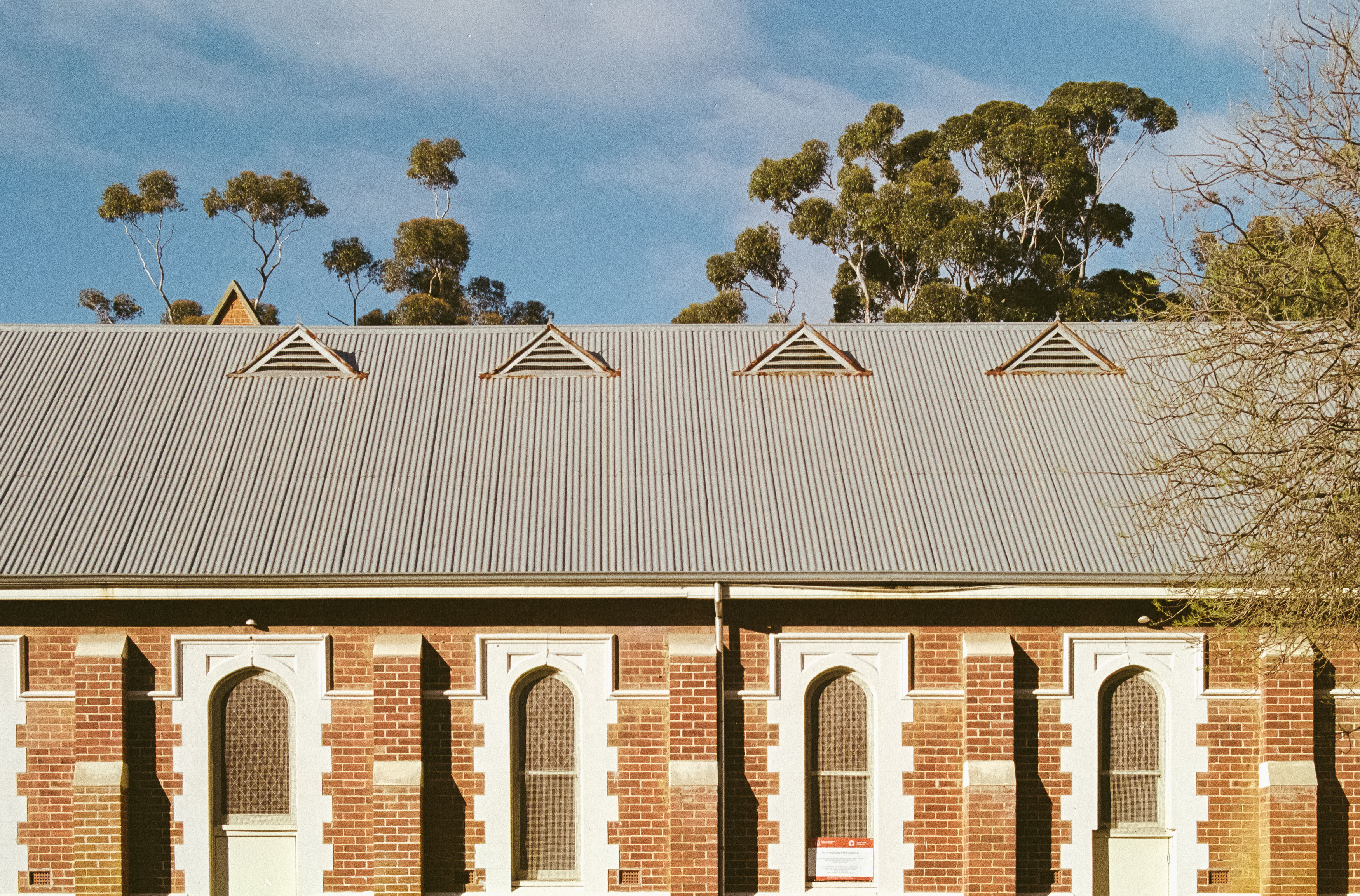

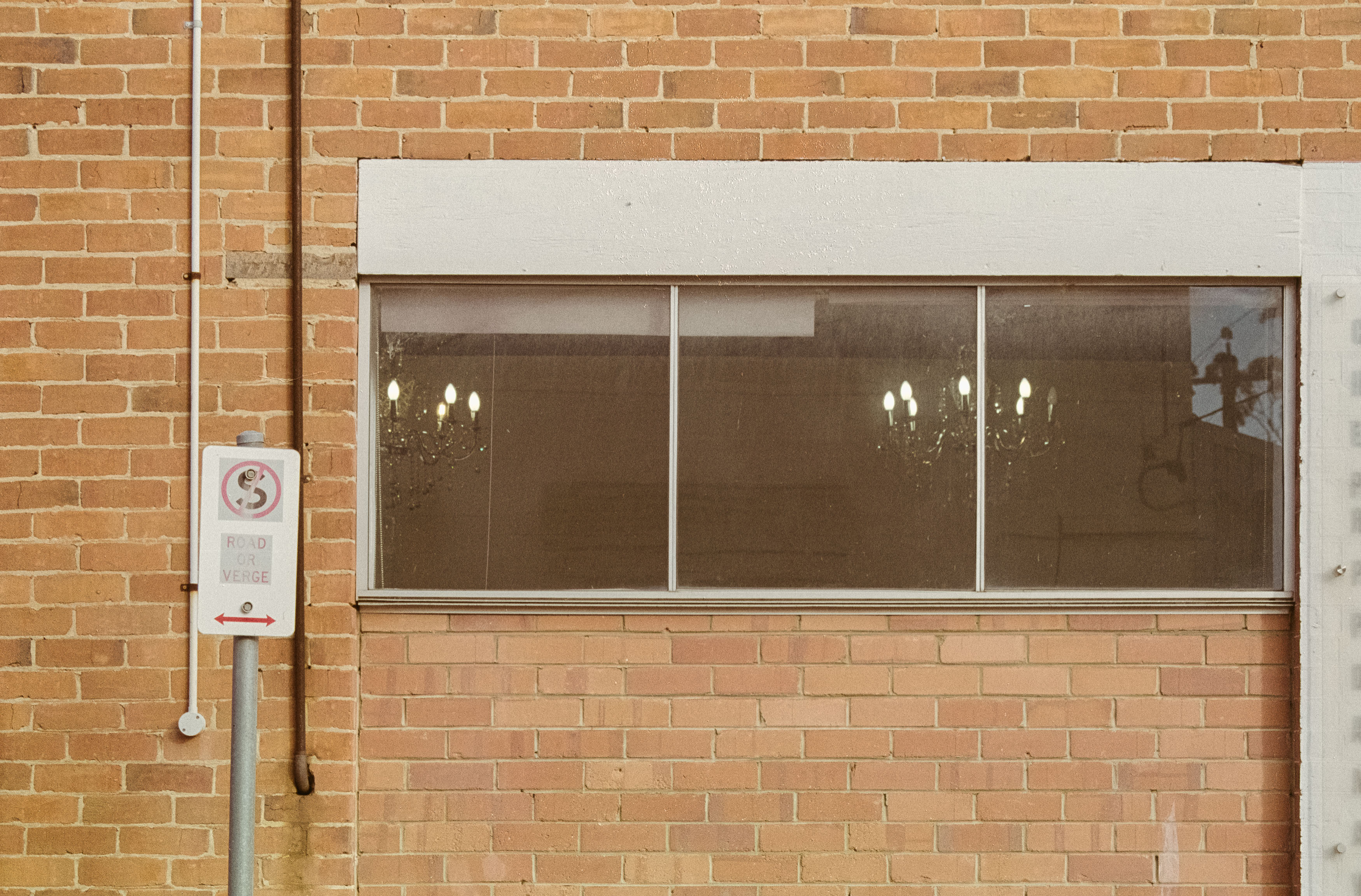
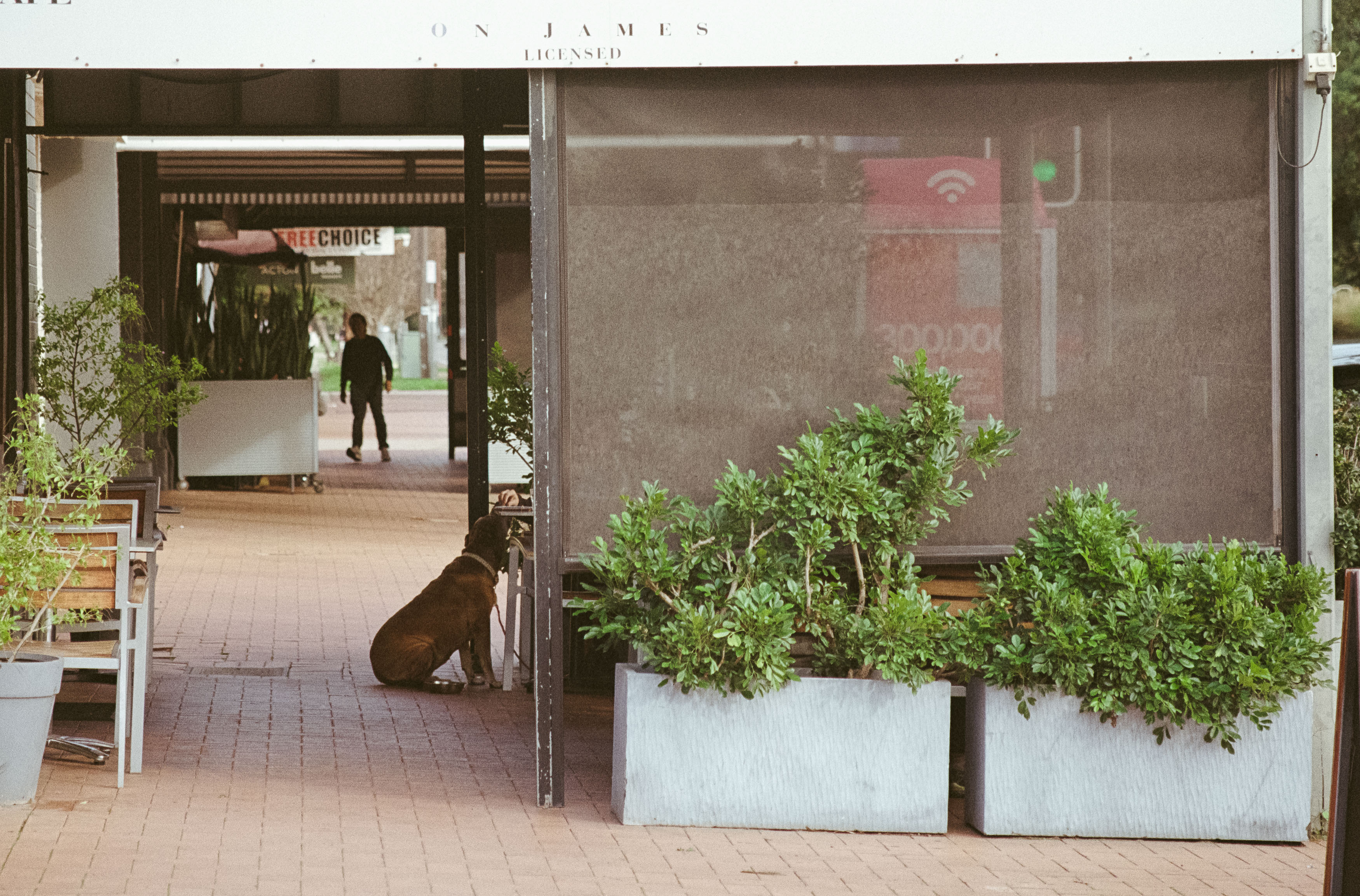
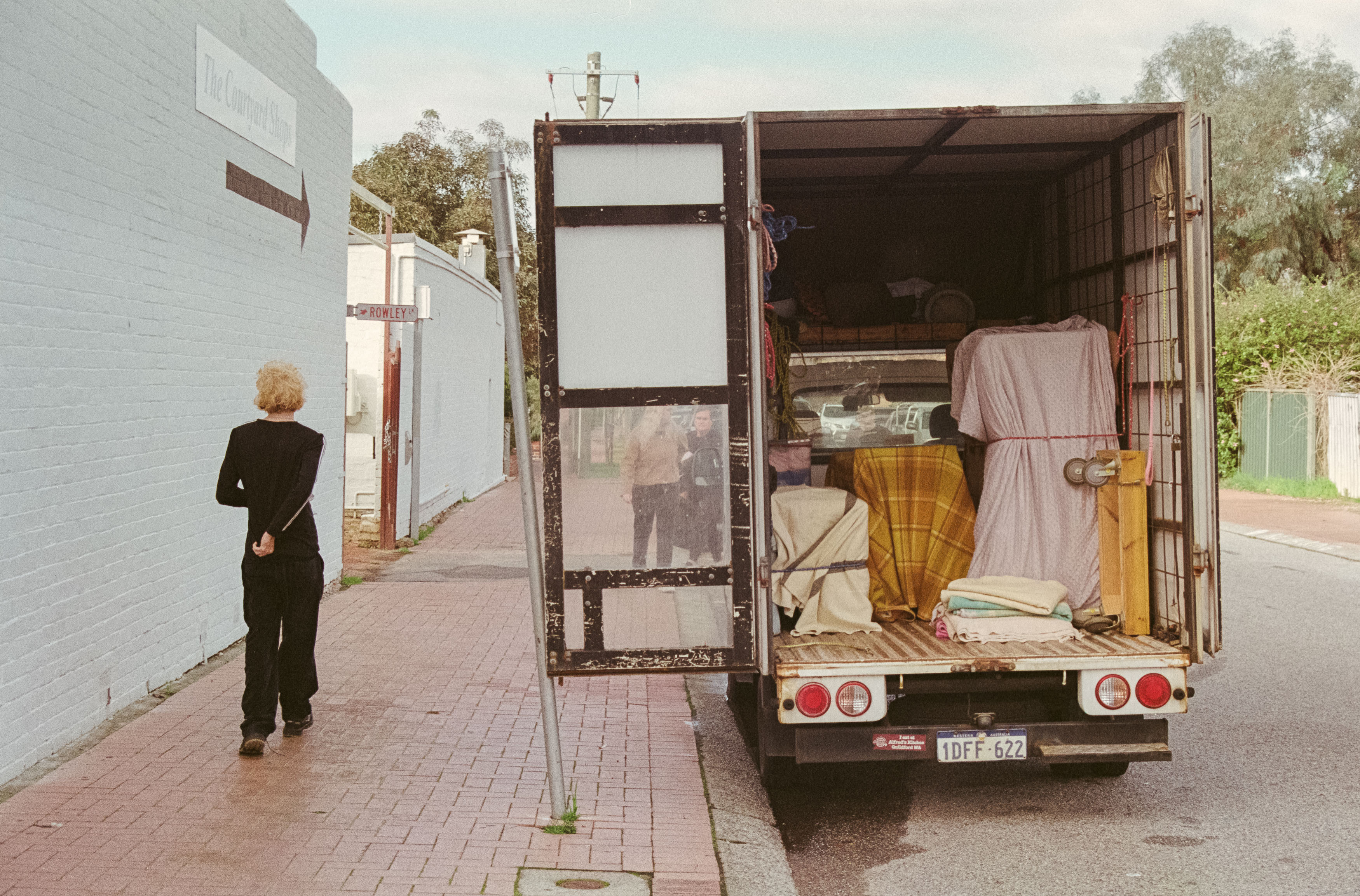
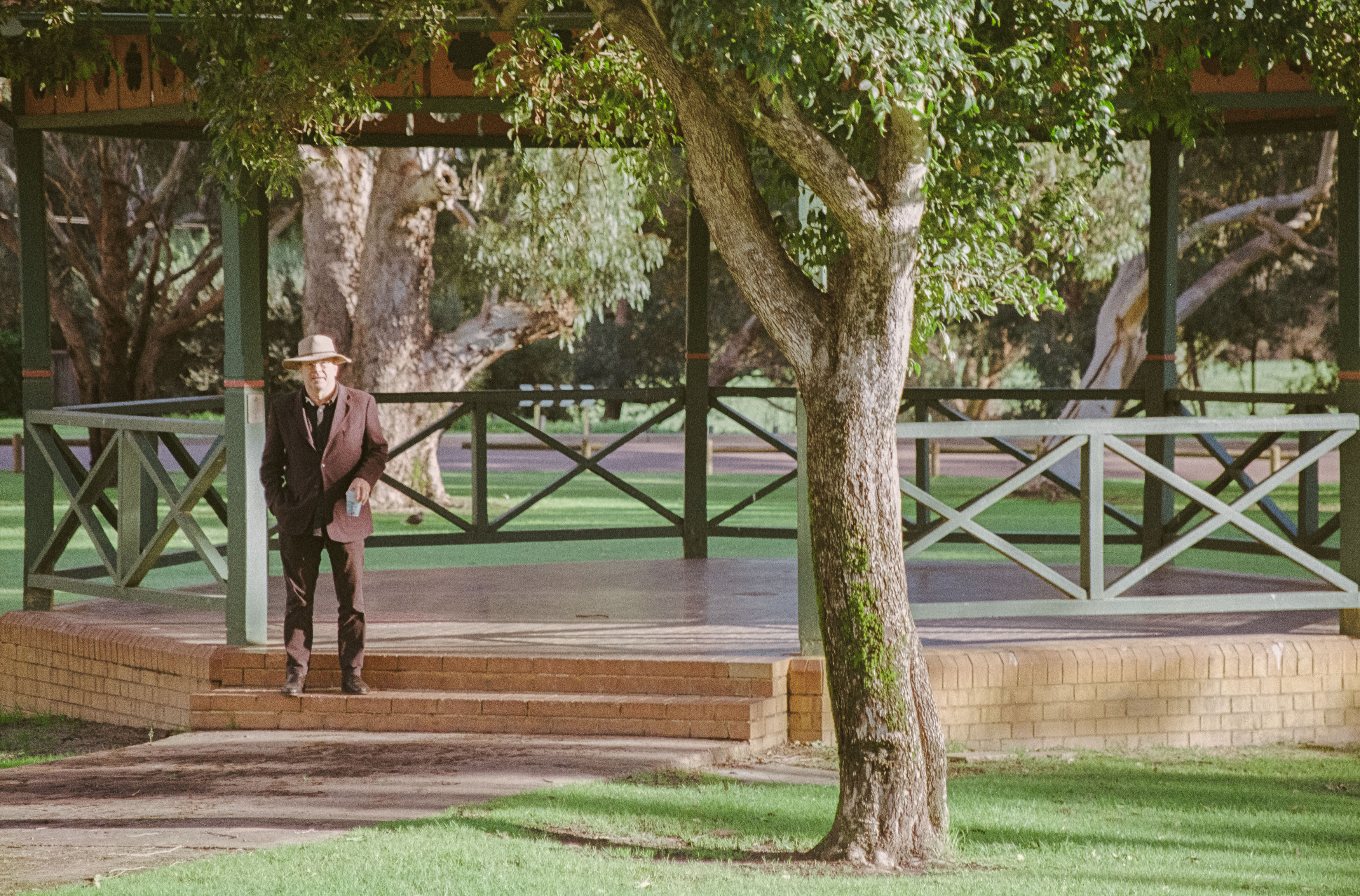
Despite the size, the Olympus is genuinely quite a pleasure to use. For all intents and purposes, you’re using a single-lens reflex camera, just one with a fixed zoom lens and somewhat dubious build quality. You get shutter speeds all the way to 1/2000th, shooting at up to two and a half frames per second, although I’m not sure anyone had the money or interest in blasting through a roll of film in fifteen seconds.
The maximum aperture is a slightly disappointing f/4.5 at the wide end and f/5.6 at telephoto, and there doesn’t appear to be any image stabilisation. The 35-135mm zoom range is practical for a point-and-shoot, although 35mm isn’t going to let you fit the whole ceiling of the Sistine Chapel into the frame. You also get an ISO range from 25 to 3200, provided your film is DX encoded or you’re prepared to hack the cassette if you want to push or pull it.
It does, however, have considerably more going on than a conventional point-and-shoot. There are three macro modes, including a zoom macro that lets you focus as close as 0.6m and a supermacro mode that gets you down to 39cm with the zoom locked at 70mm. There’s even an accessory capable of producing a 1:1 reproduction ratio, although naturally I don’t have that, nor do I have the panorama accessory.
The flash system is more interesting than it initially looks. It uses Olympus’s Intelligent Variable-Power flash system, and there are actually two flashes built into the camera. The system can put enough light into a scene without simply blowing out the highlights in close-up subjects.
Most of the cleverness is hidden from the user, but the function button gives you access to considerably more control than you’d expect. There are program, aperture-priority and manual exposure modes, along with options to prioritise fast shutter speeds for sport, wide apertures for portraits or slower shutter speeds for night photography. There’s single or continuous autofocus, double exposure, exposure lock and multiple flash modes including fill-in.
Ergonomically, it feels surprisingly good in the hand, even though it’s big and heavy. The buttons are a little spongy but well placed, and the zoom rocker sits naturally on the top left of the lens barrel. It feels good to shoot with, even if aesthetically it takes its cues from a 1940s gas mask.
The camera isn’t perfect. One of the first problems I encountered was loading film, because the film door only opens 90 degrees, partly because of the technology stuffed into the databack. You have to get the film underneath a red tab and push it deep into the corner so the teeth can grab the film leader. I managed it in one go previously, but doing it one-handed in the field while holding a GoPro proved considerably more difficult.
Once I got going, I used the flash to see what the camera could do. In automatic mode, it apparently decided the scene didn’t need any assistance, while the fill-in flash did a much better job of forcing some light into the shadows. A backlit portrait of my daughter showed the same thing: despite the flare and lack of contrast, the fill-in flash added some useful punch to an otherwise flat scene.
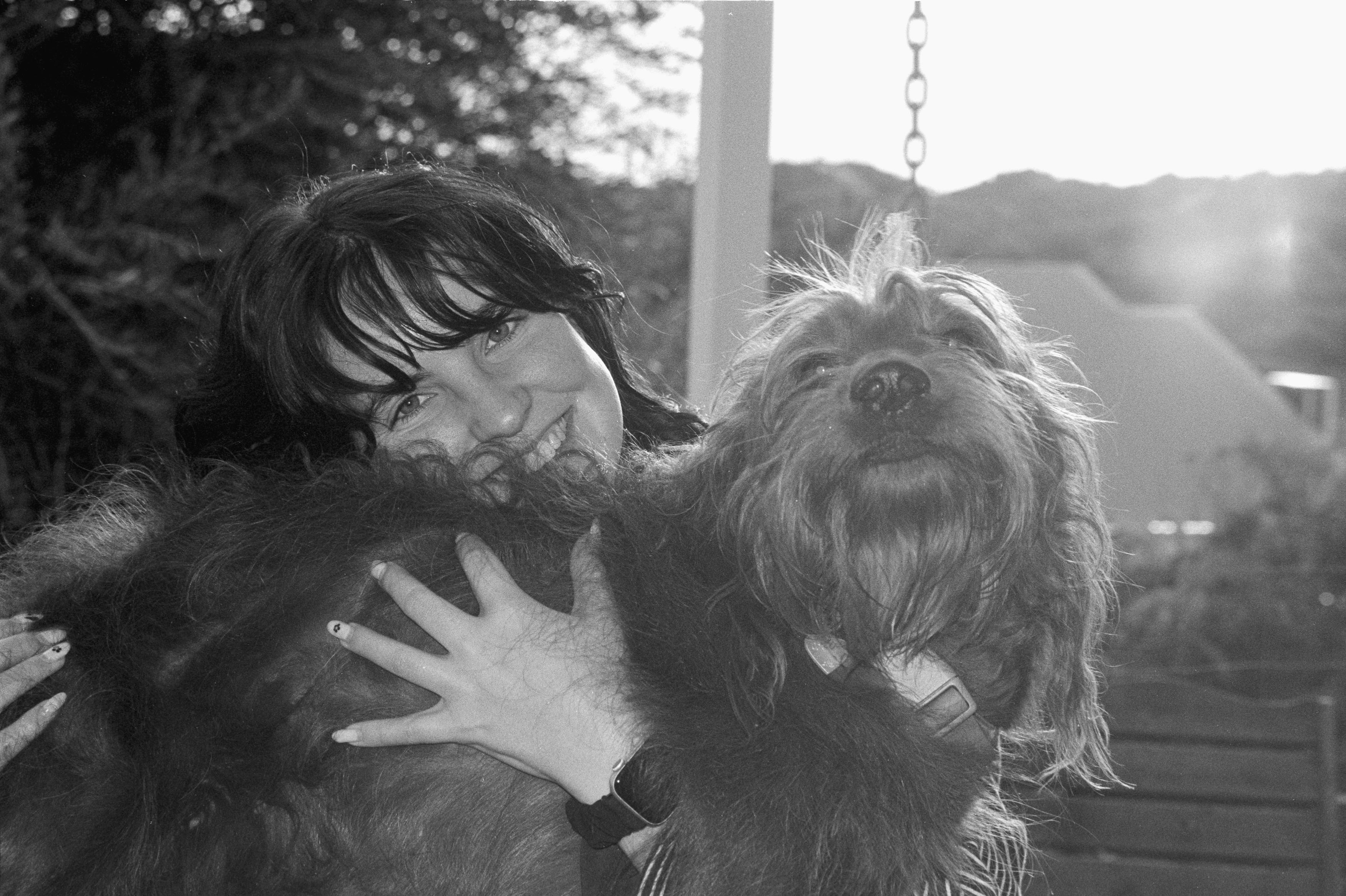
The lens can flare, too. It isn’t a problem in most situations, but there’s a visible veiling haze in some images, probably not surprising given the sophisticated lens design with sixteen elements in four groups. That’s a lot of glass. The subject matter, meanwhile, was considerably less sophisticated.
Shooting black and white was particularly liberating. Every frame of colour feels precious, but with the Kentmere 100 I found myself shooting with a sense of joyful abandon, randomly spattering the scene with black and white film. By the end of the walk, I’d also finished a roll of Kodak Colorplus and had enough material to see what this lumbering beast could actually produce.
The surprising answer is yes. The lens on this thing is sharp, and I found myself wondering whether you could really tell the difference between these photographs and images from an SLR costing considerably more. The obvious compromises are the size, the slow maximum aperture and the fact that you can’t remove the lens and replace it with something faster or wider.
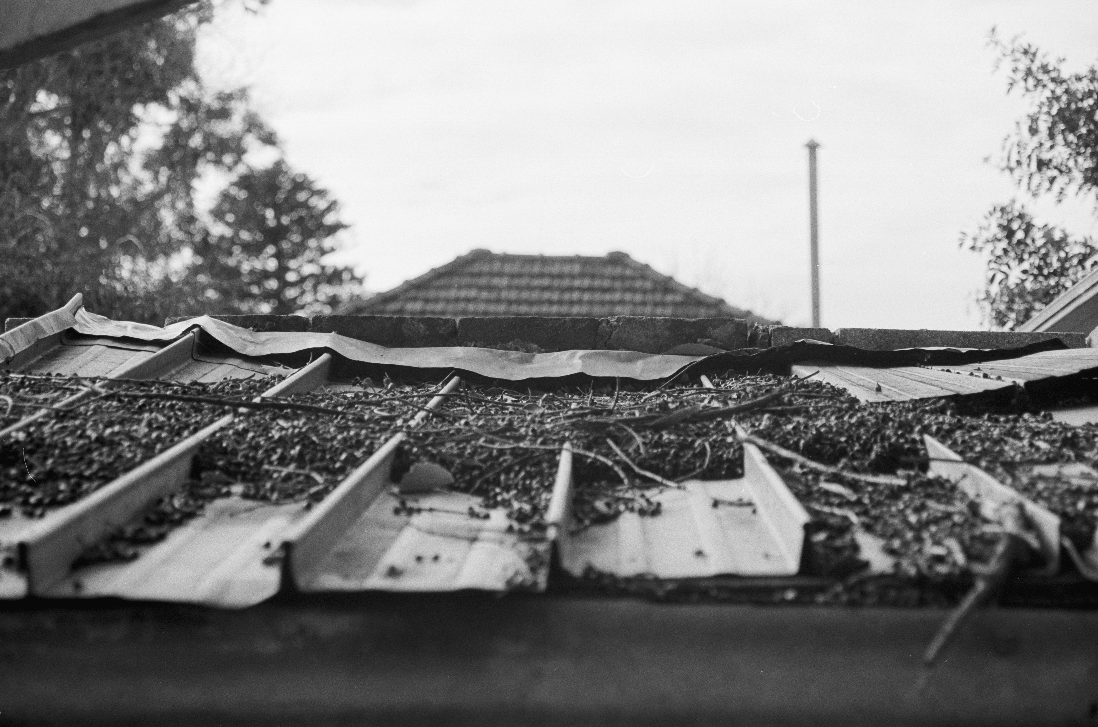
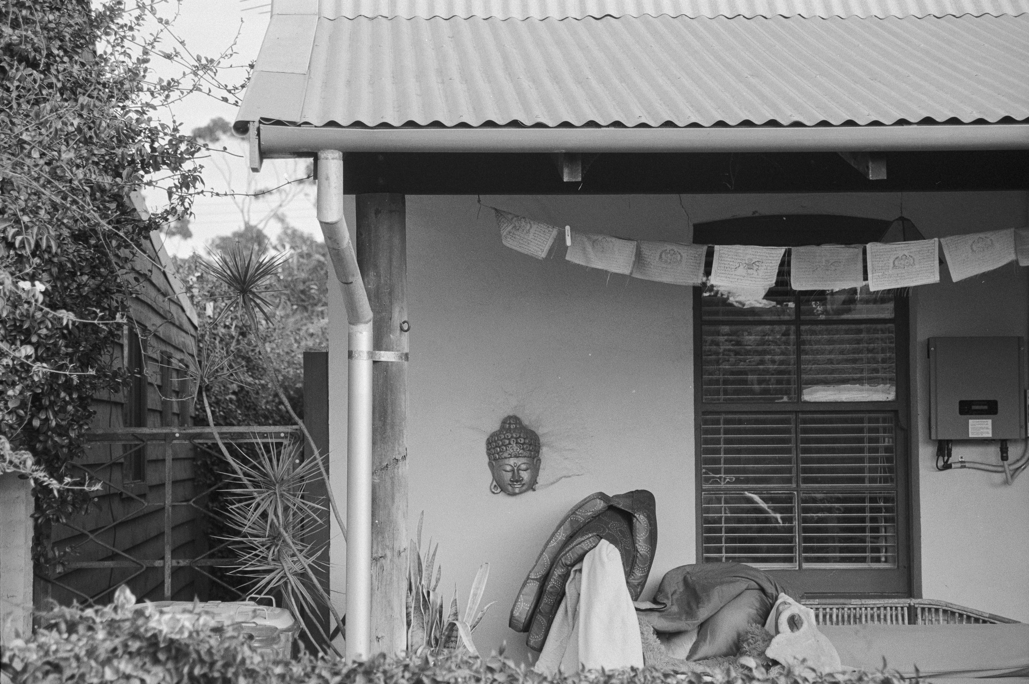
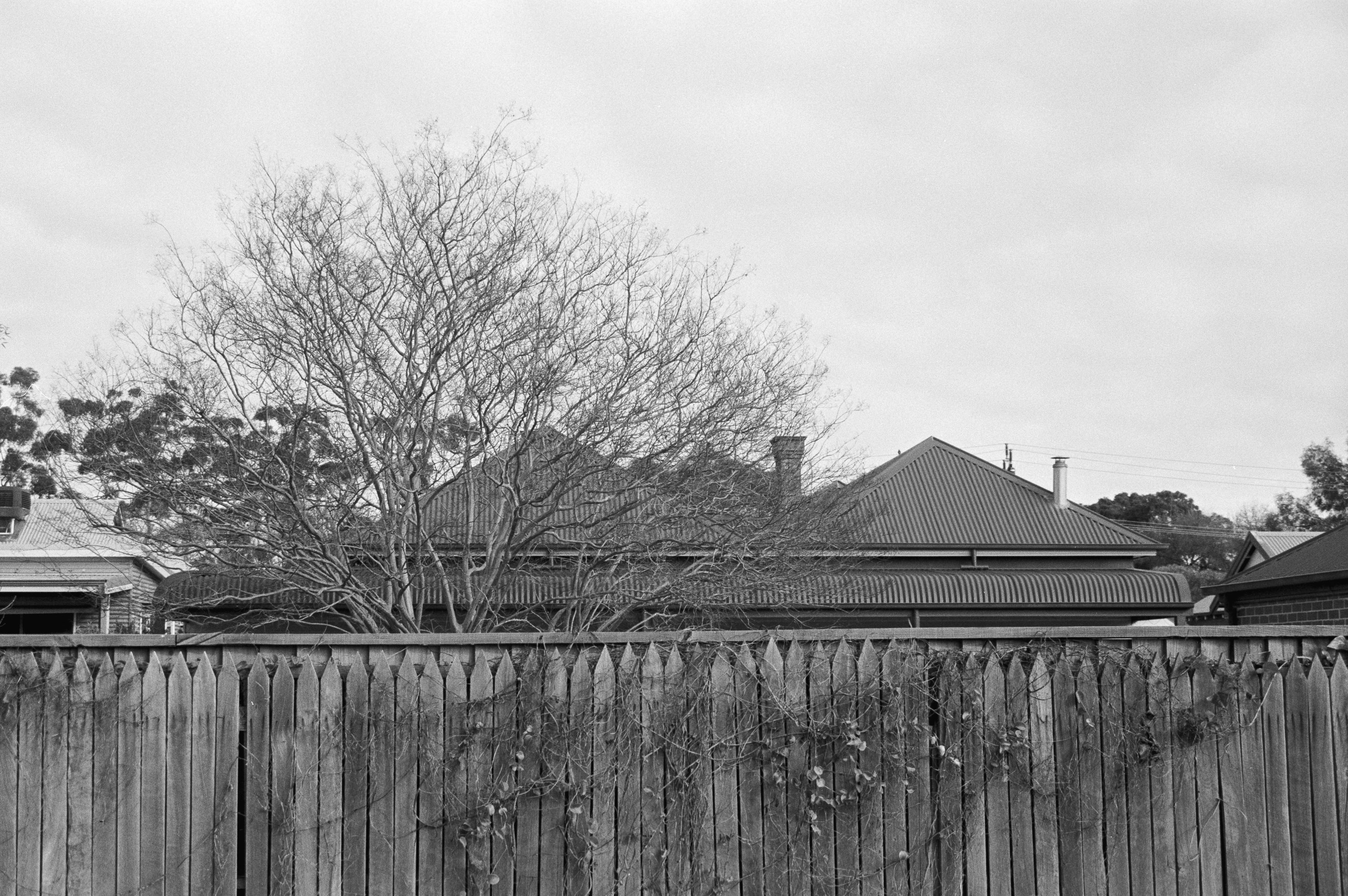
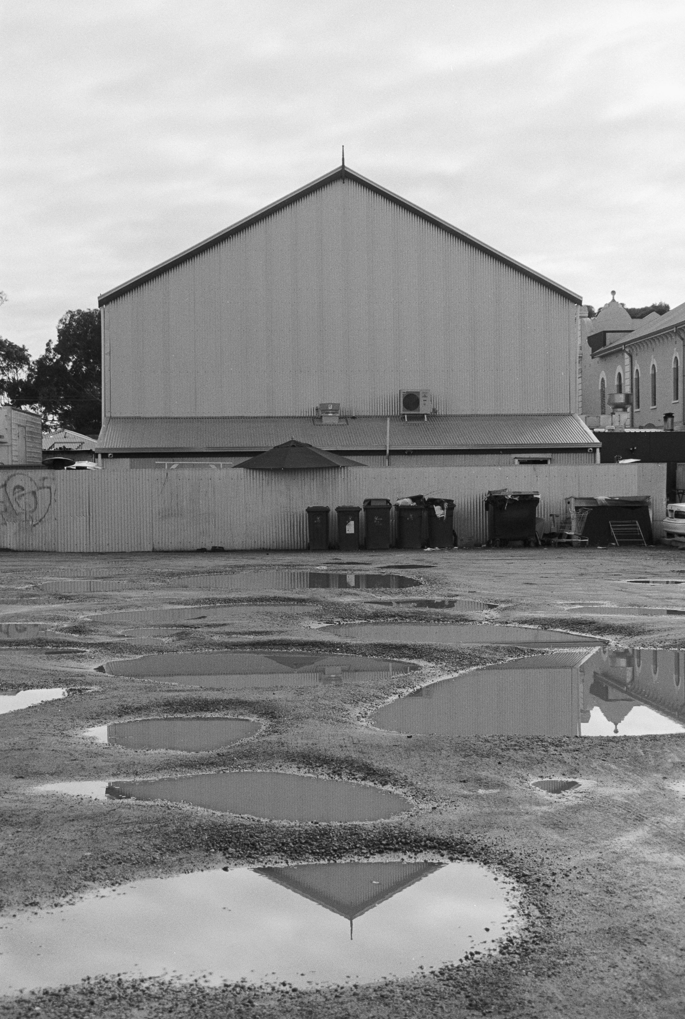
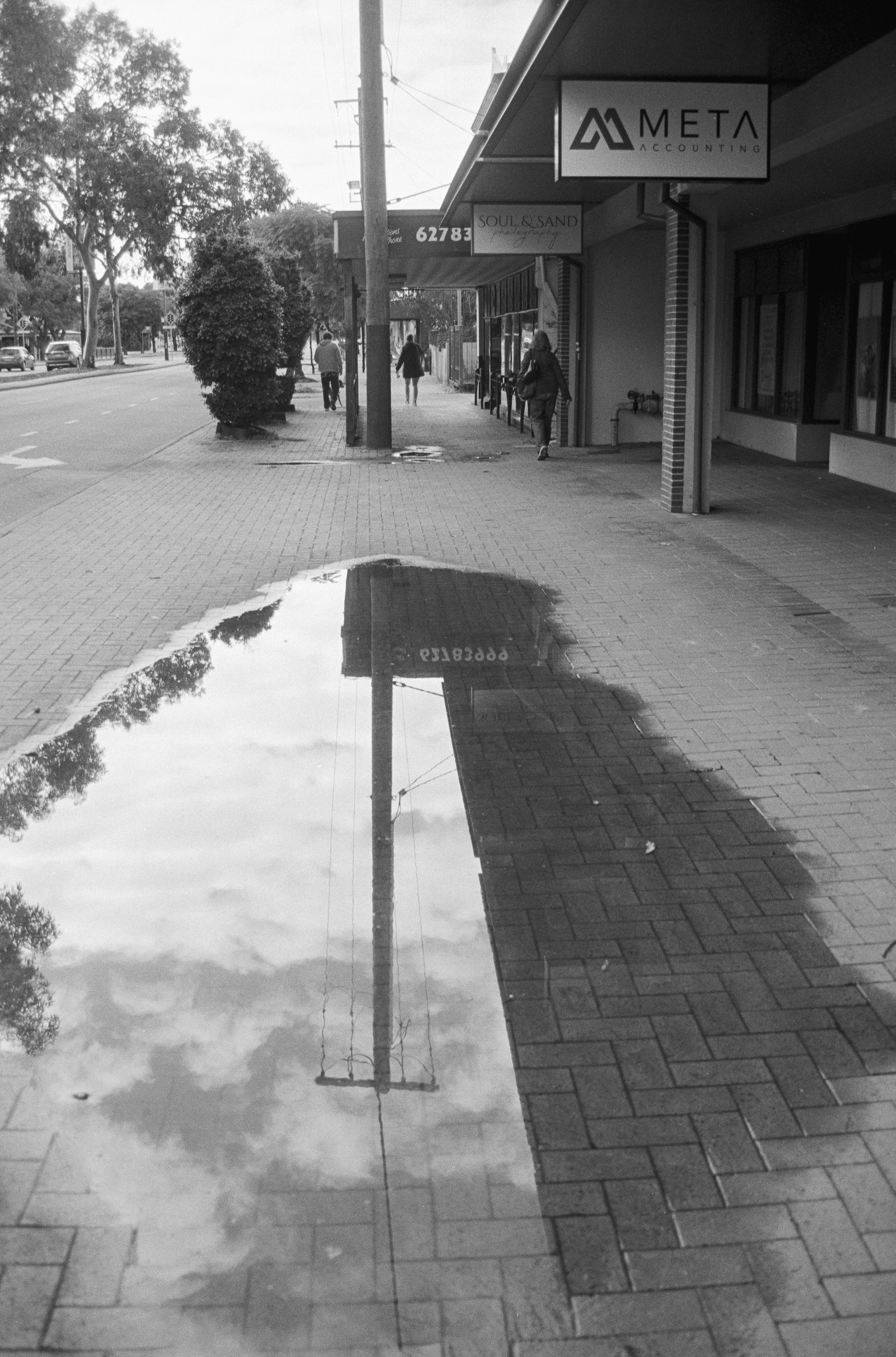
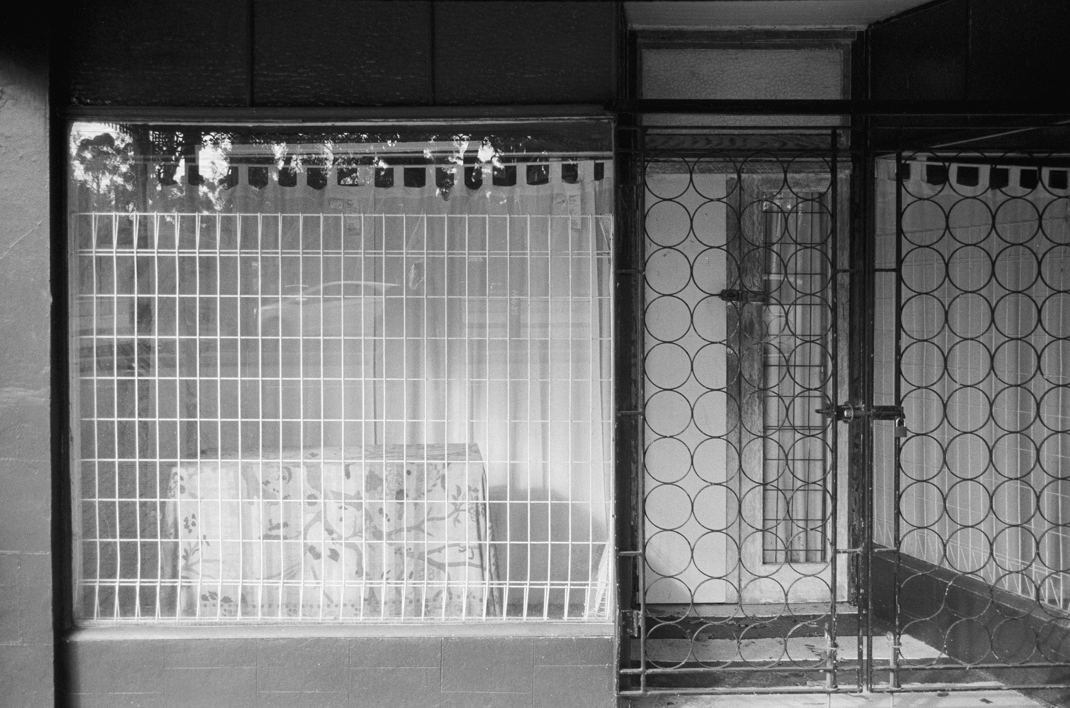
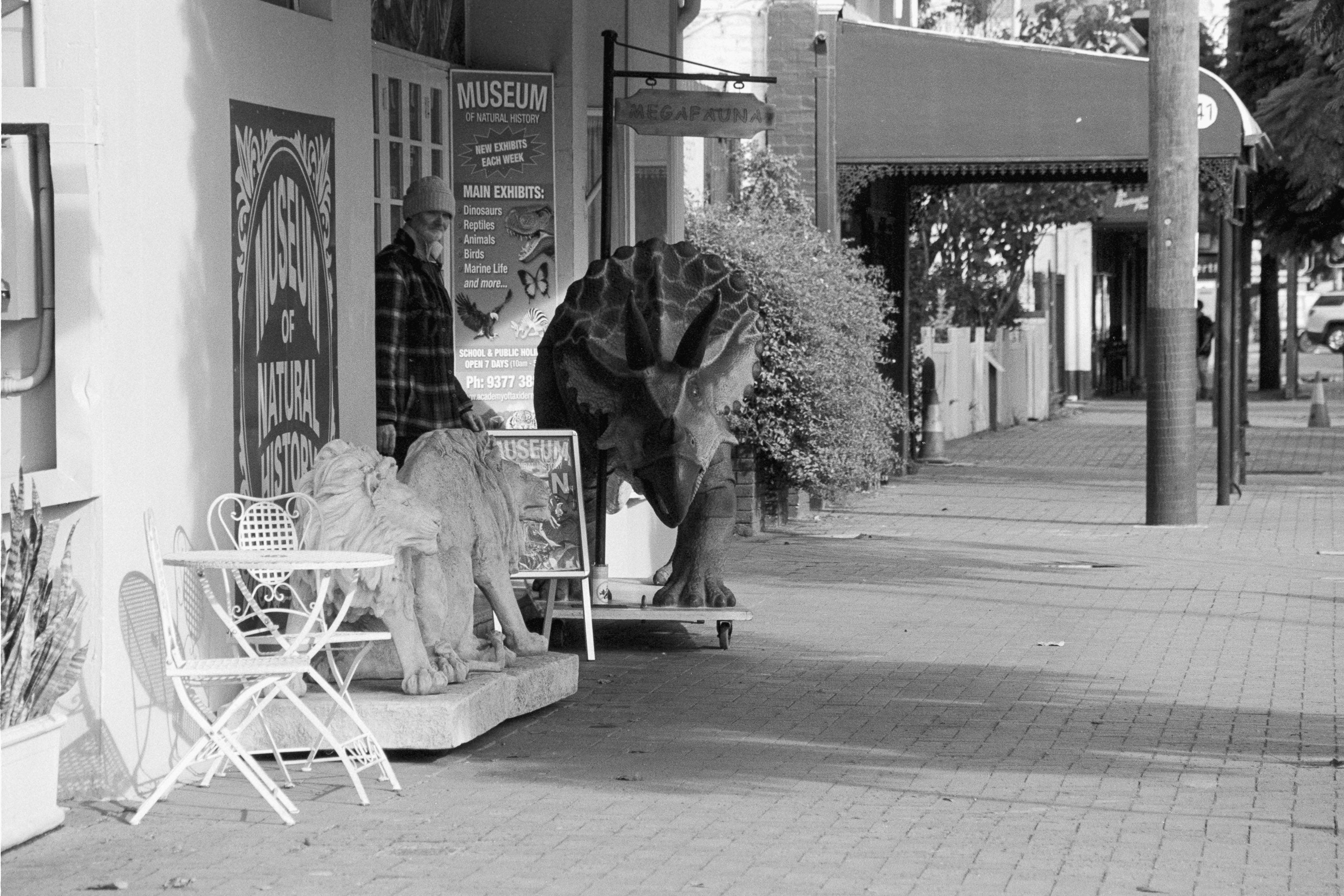
But perhaps that’s the point. Olympus had apparently found that many people were buying SLRs in the early nineties because they wanted better image quality, only to spend most of their time using the kit lens that came with the camera. With the IS-2000, there’s only one lens, but Olympus made it a good one. The 35-135mm range doesn’t show any major weaknesses, and the addition of macro makes it considerably more versatile.
The price is another standout. It’s difficult to argue with the quality of film photographs you can get from an $18 Australian camera. Even if you can’t find one for that price, this class of camera still feels like one of the last true bargains. I would have preferred something wider — 28mm would have made more sense to me for a walkabout camera — but the 135mm telephoto is perfectly usable.
There’s no getting around the cheap-feeling plastic, either, and the size and build quality could be a dealbreaker. I’ve already lamented the slow death of my Fuji GA645Zi medium format camera, and I suspect this Olympus may eventually meet the same fate, becoming one more slab of comically large 90s landfill.
At 18 dollars, though, who cares? This was a dog walk rather than a formal photoshoot, and the photographs are nothing more than snapshots of a part of Perth I rarely visit. Still, the camera delivered where it mattered. I ended up with six Golden moments from Guildford, including the triceratops, a suburban shrine and, very nearly, the back of a sign — a deliberately contrary photograph that I still rather liked.
So these are the six for today: a strange and banal set of photographs from a strange and banal camera. The Olympus IS-2000 may not be something I’m going to pull out to impress the girls at parties, and sometimes size isn’t everything, but in terms of pure image quality, this lumbering beast delivers.
There are many moods to Mark, and I have as many lenses to match them. From 14mm to 600mm, you’d think I should be able to photograph the inside of an arena while simultaneously shooting for the moon, but not every focal length is particularly practical for street photography. I’ve tried most of them, across digital and film, from tiny Rollei 35s to medium format Bronicas, and if there’s one thing I’ve learned, it’s that different focal lengths produce very different results. It’s also taught me that I’m incapable of sticking with anything consistently but that’s another post for another time.
For this particular experiment, I took three Nikon Z-mount lenses onto the streets of Qianmen in Beijing: the Viltrox AF 20mm f/2.8, the Nikon Z 28mm f/2.8 SE and the Nikon Z 40mm f/2 SE. They’re all relatively affordable, compact lenses that lack some of the clinical perfection of their larger and more expensive S-line rivals. But when you’re wandering through filthy streets, surrounded by the stench of humanity, I’m not entirely convinced clinical perfection is what we’re looking for. Though to be fair, Qianmen, like many parts of modern China, is really quite orderly.
The 20mm is definitely wide, and it’s not what I’d call a particularly natural focal length. The difference between 20mm and 28mm is surprisingly dramatic, much more so than the difference between 28mm and 40mm. The wider you go, the more those extra millimetres seem to matter, and suddenly you’re dealing with a completely different way of seeing.
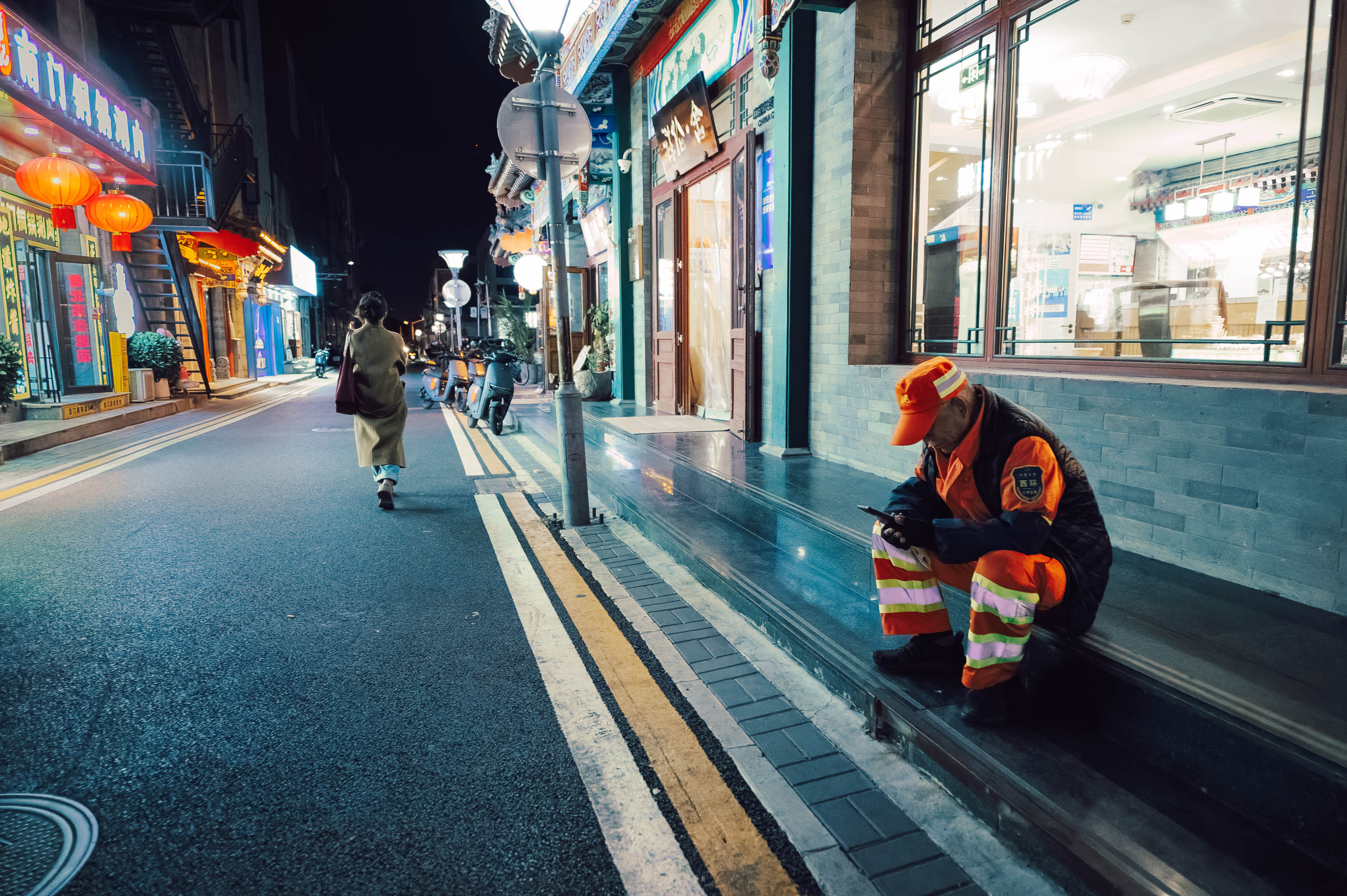
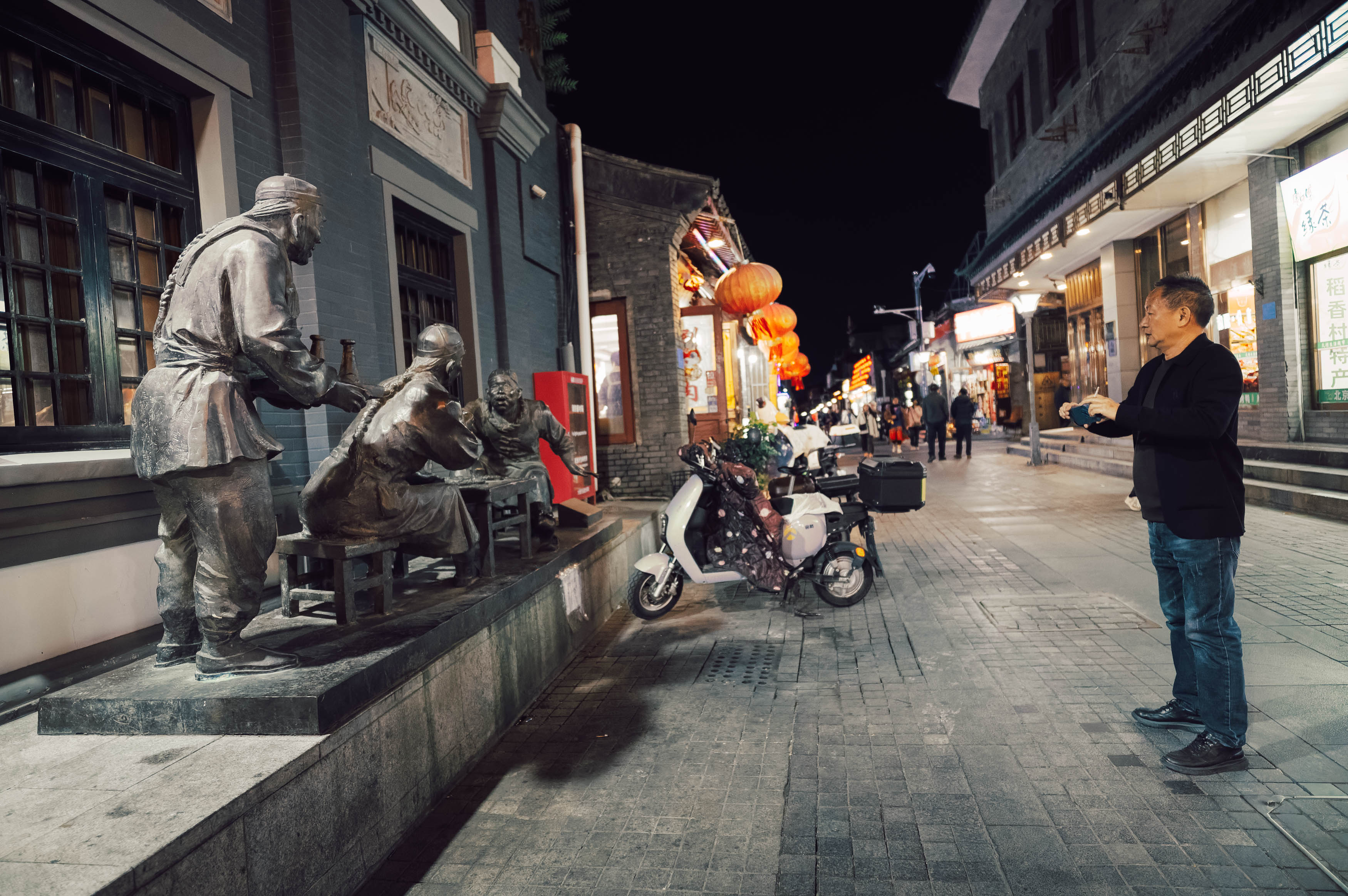
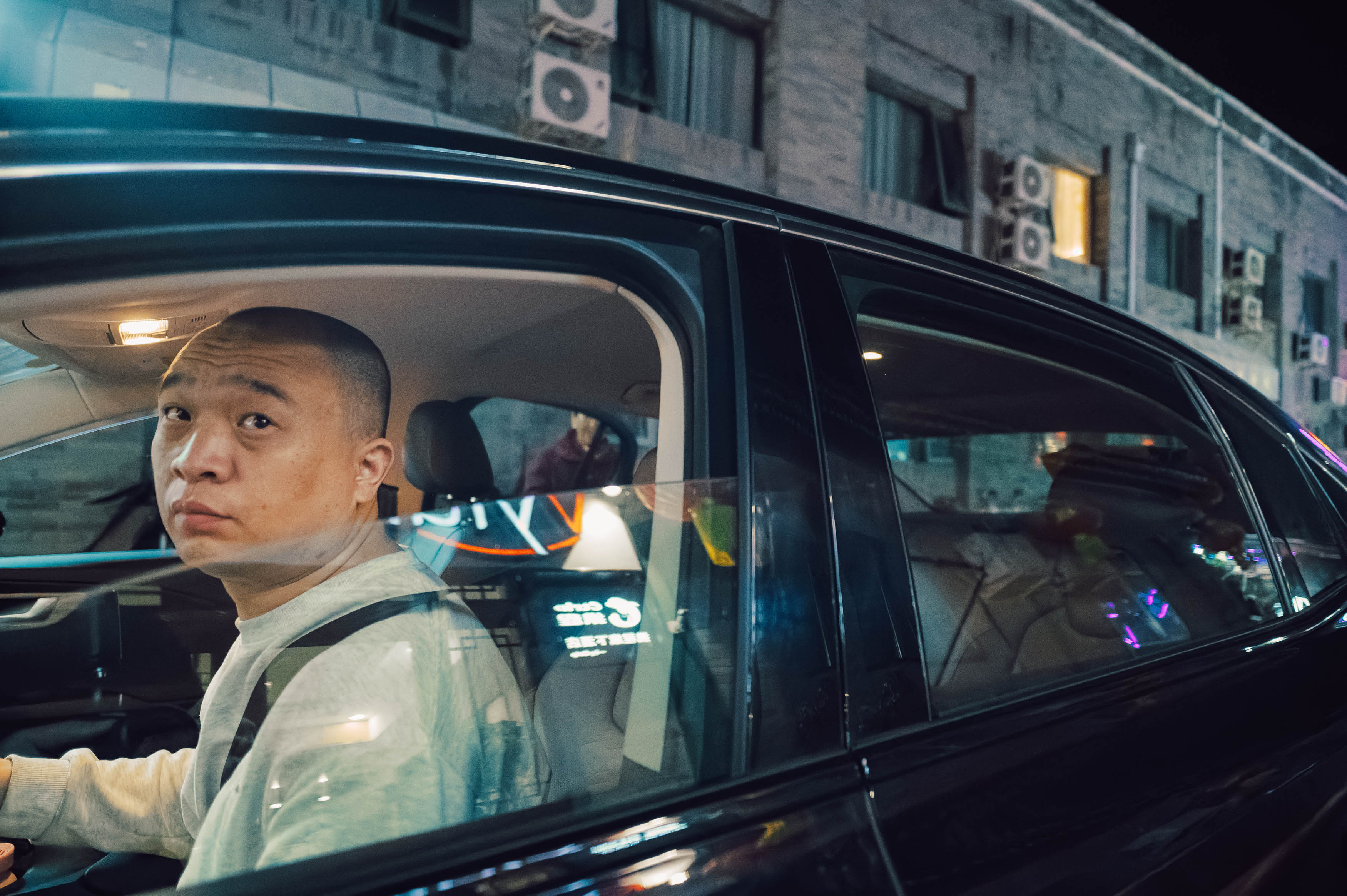
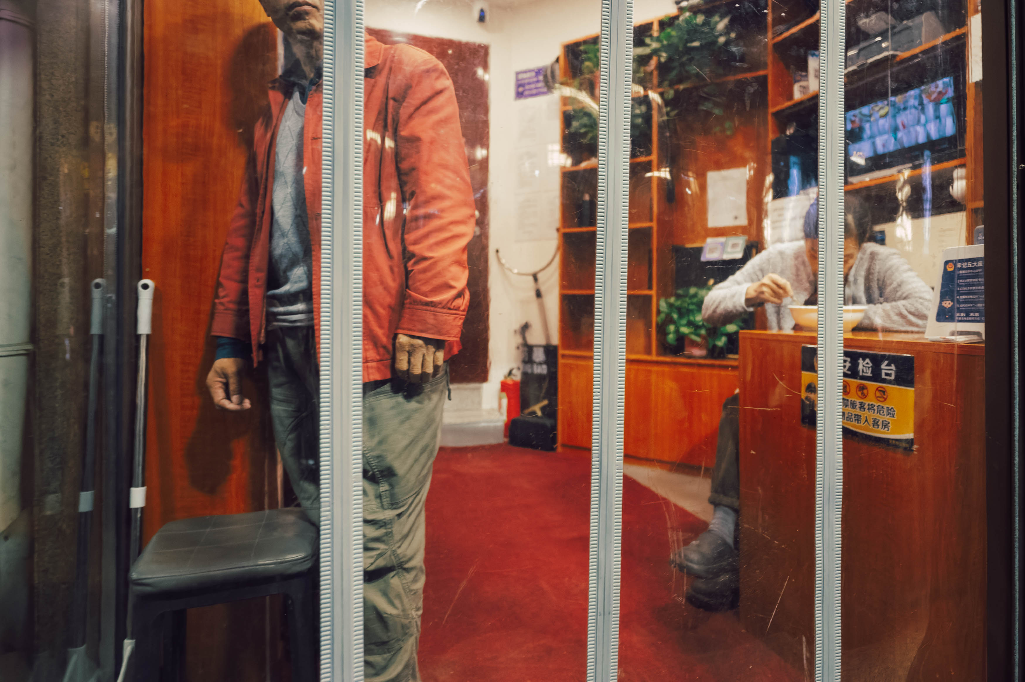
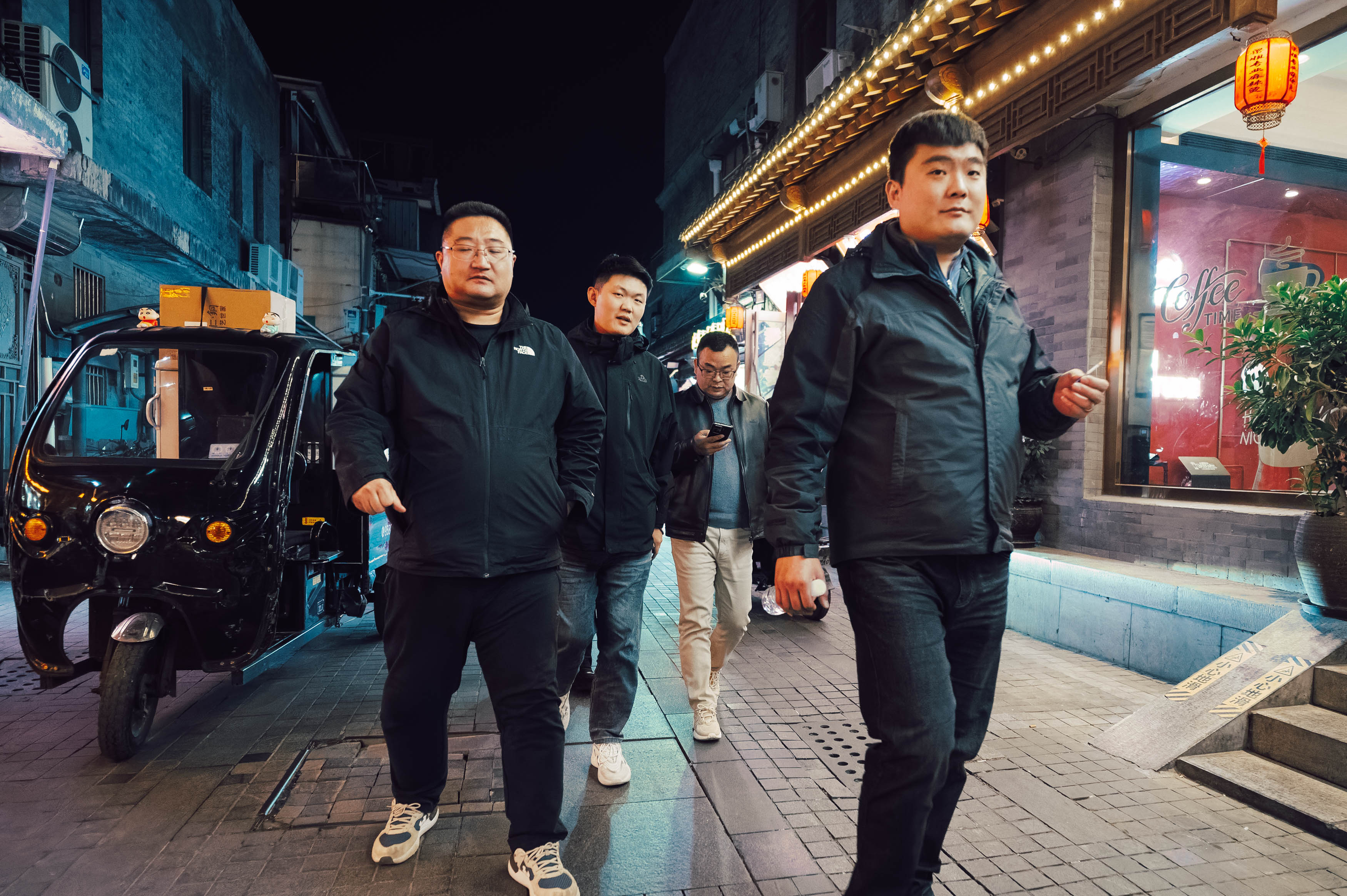
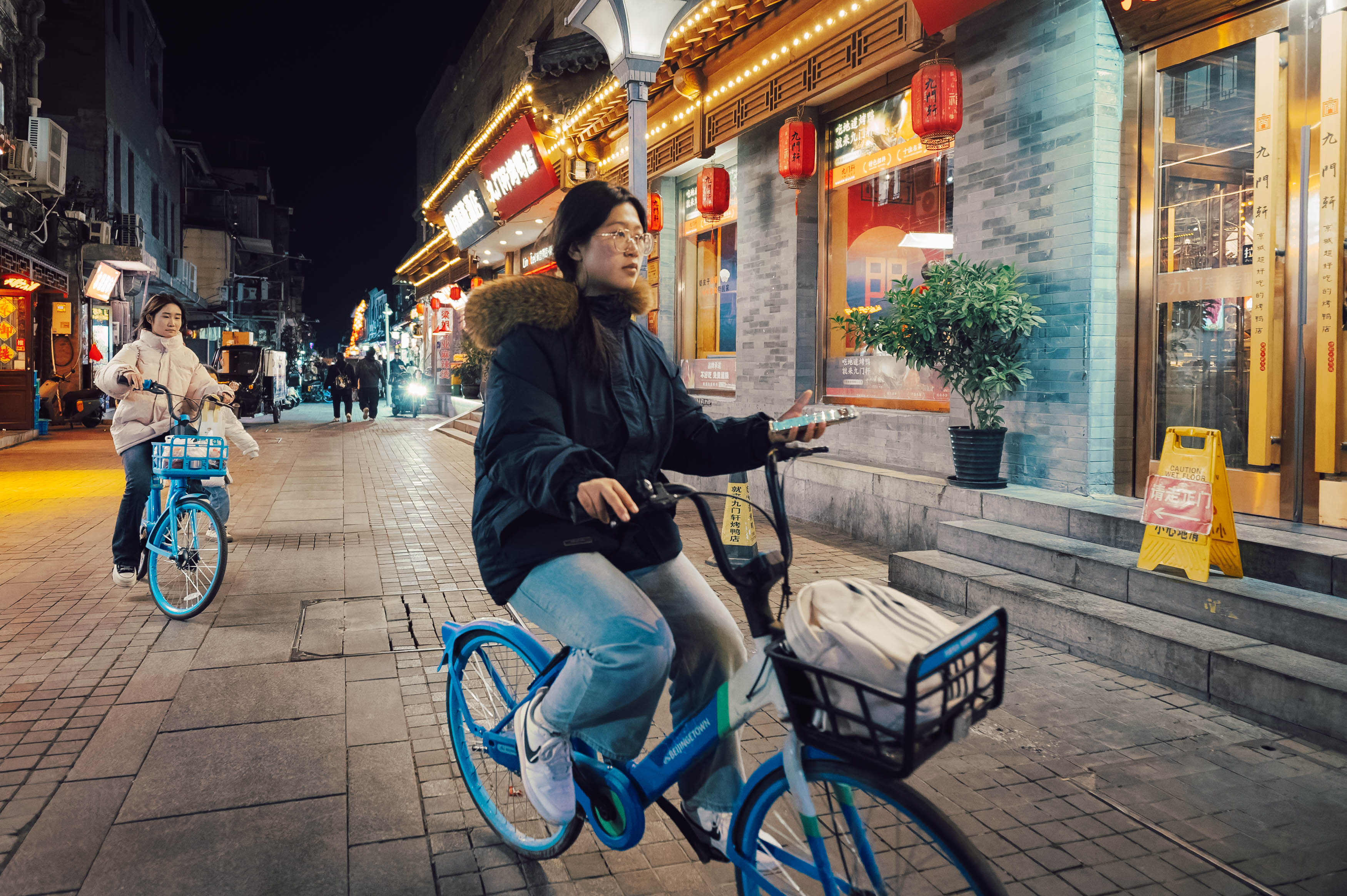
There is plenty to like about that. A wide-angle lens gives you a deep field of focus, plenty of perspective and the ability to layer elements throughout the frame. The distortion can actually add to the drama, making an ordinary street scene feel slightly otherworldly. Eugene Richards used 20mm extensively for documentary work, and you can see how effective that exaggerated perspective can be.
The problem is that 20mm isn’t particularly easy to compose with. You can include an enormous amount of the environment, but unless you’ve got something interesting right up front, your subject can simply disappear into the background. I also found myself cropping out distractions more often than I did with the other lenses. The Viltrox itself is sharp, compact and relatively fast at f/2.8, although its unusual distortion profile does need some correction.
There is also the obvious problem that to make a 20mm work for street photography, you generally need to get quite close to your subject. That’s not necessarily a problem in a crowded tourist destination like Qianmen, but I might feel slightly less enthusiastic about putting it directly in the face of a stranger in Liverpool. Ultimately, 20mm gives you drama and perspective, but it demands that you work for it.
I’ve previously described 28mm as possibly the most boring focal length, largely because it is so close to the way most people experience photography through their phones. That familiarity can make images feel almost generic, and when you scroll through a collection of 28mm photographs it can sometimes feel like an endless Instagram feed.
But there is probably a reason why it’s so popular. The 28mm perspective gives you enough room to establish a location without forcing you to manage the huge amount of visual clutter that comes with something like 20mm. It is a very scenic focal length, and perhaps the best of the three for building a sense of place.
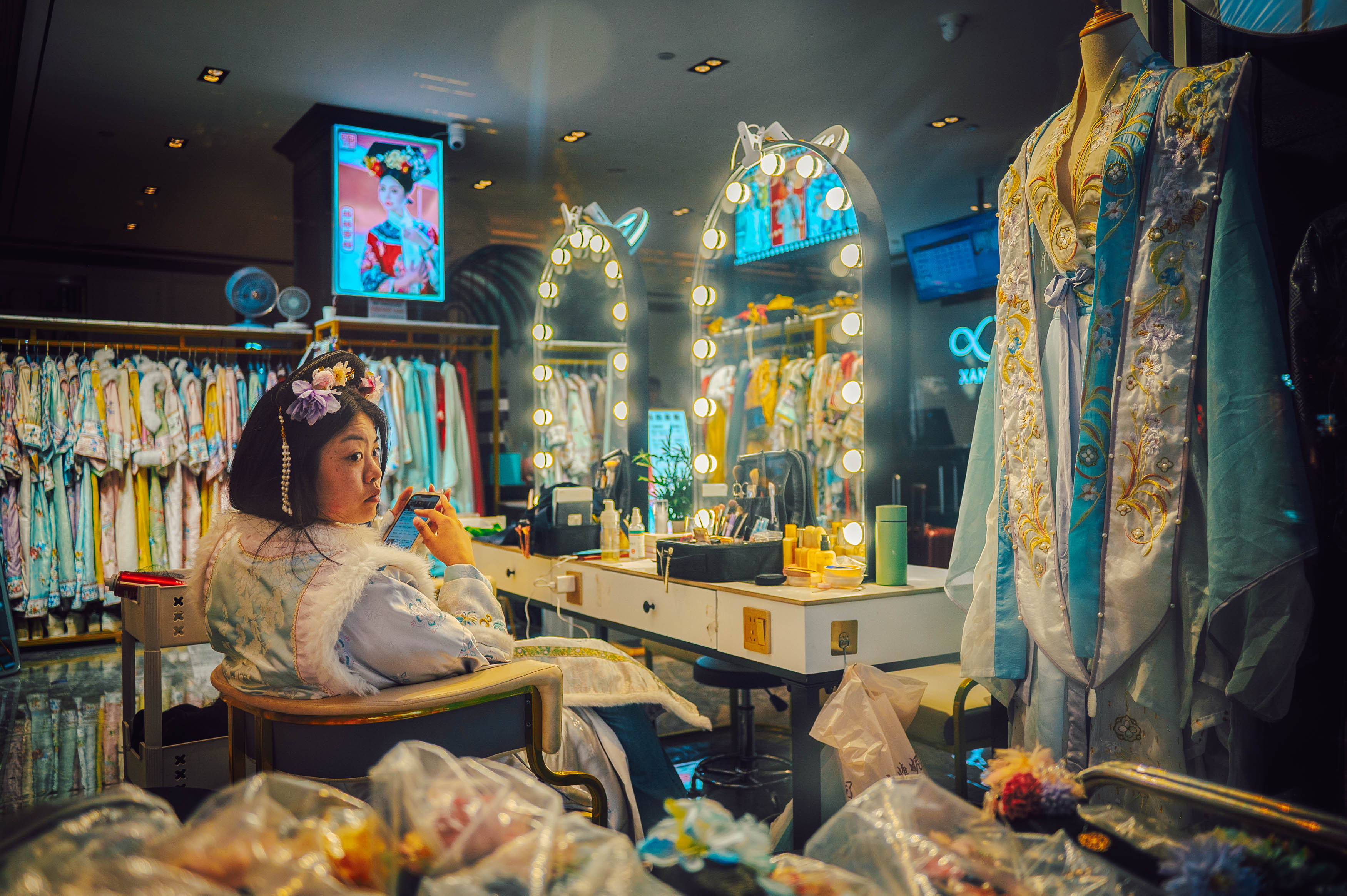
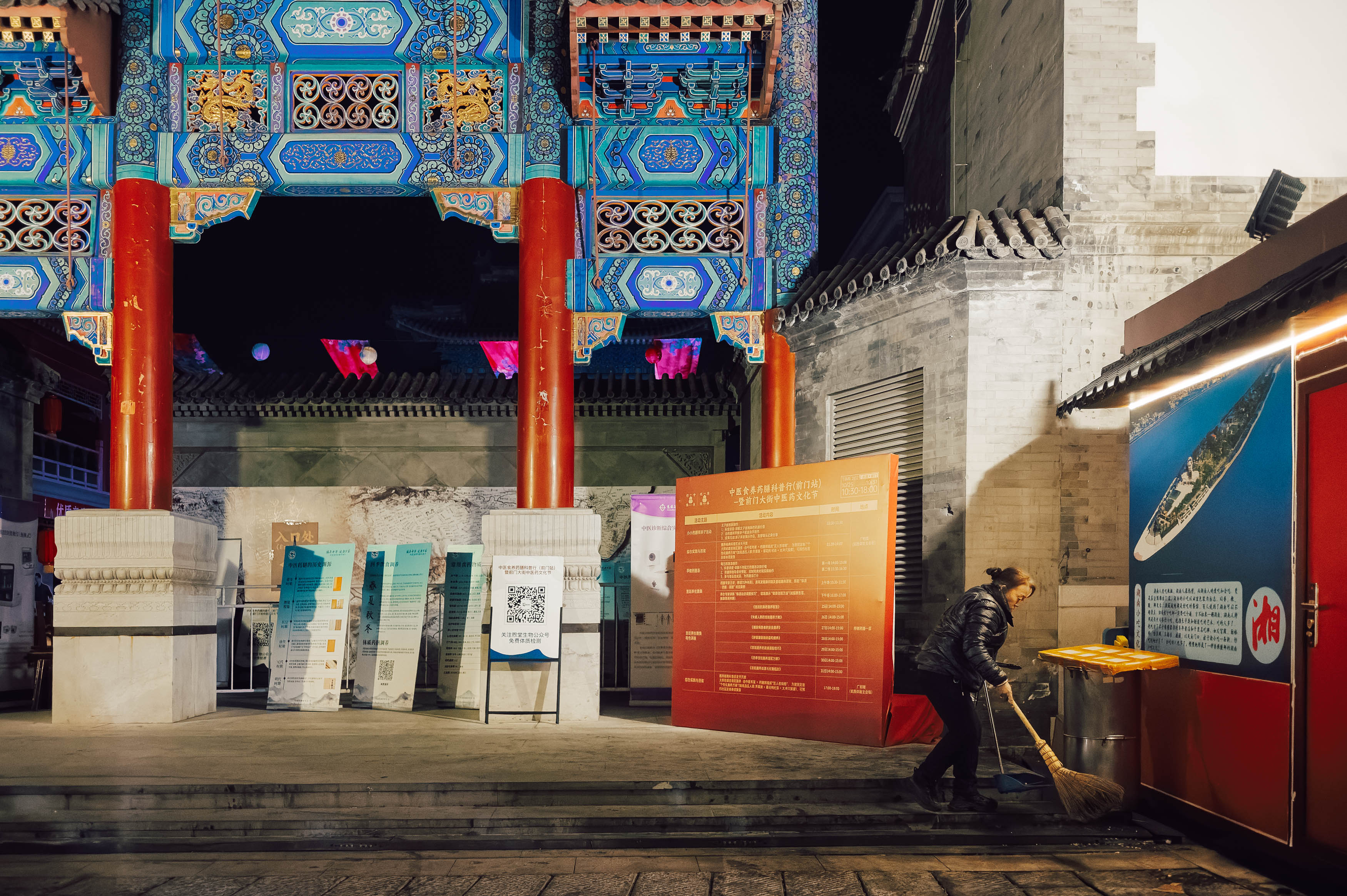
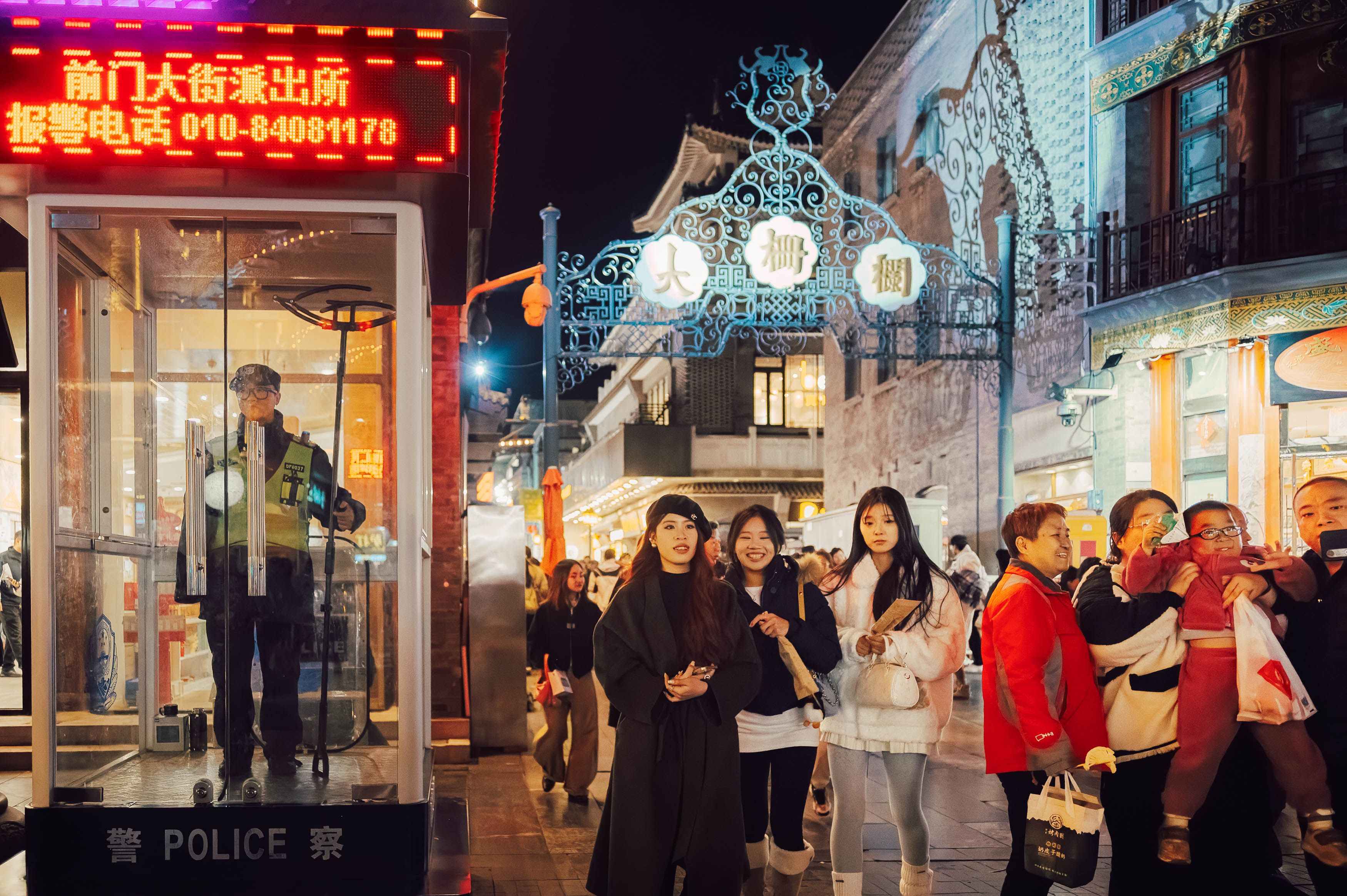
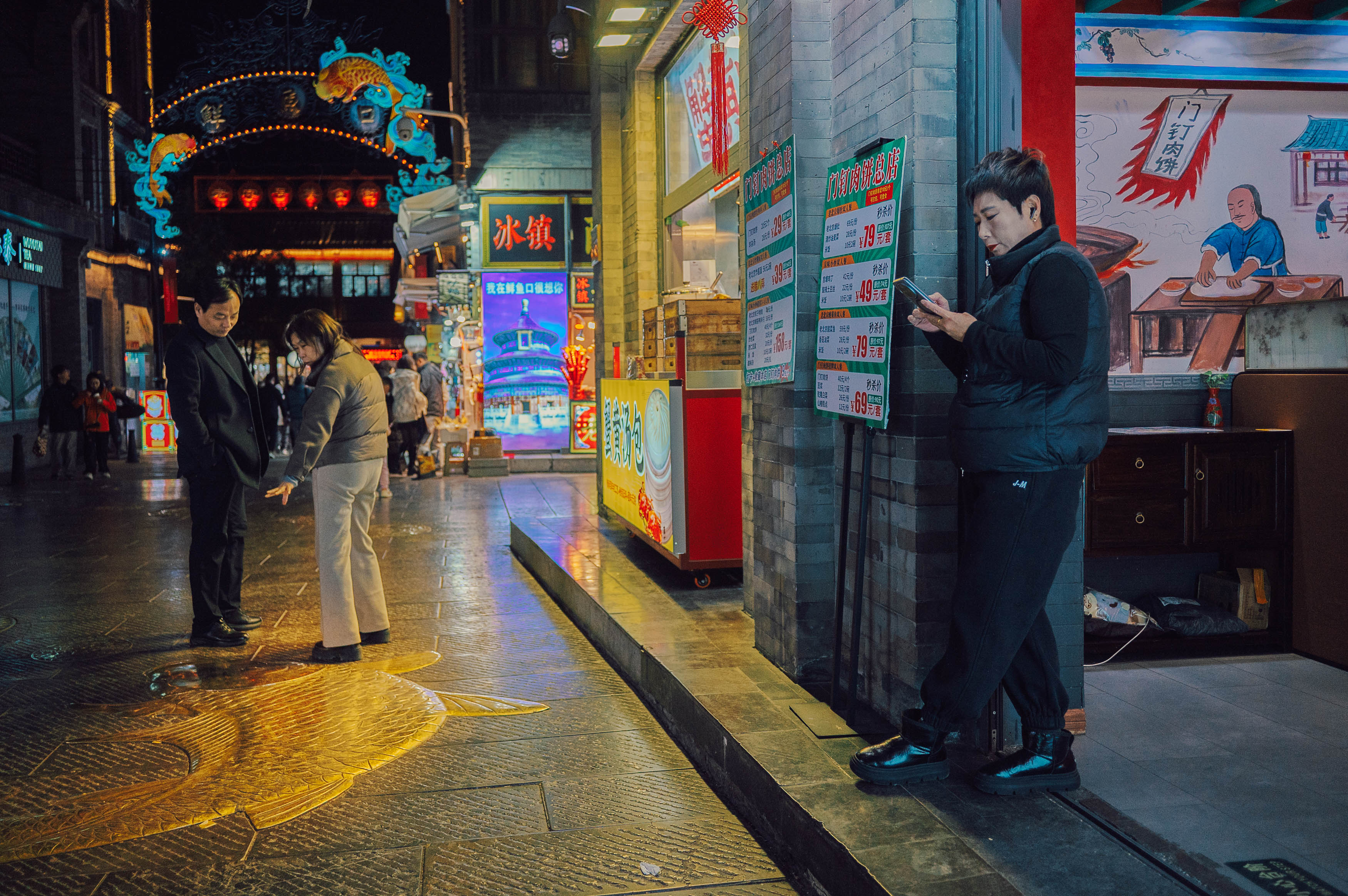
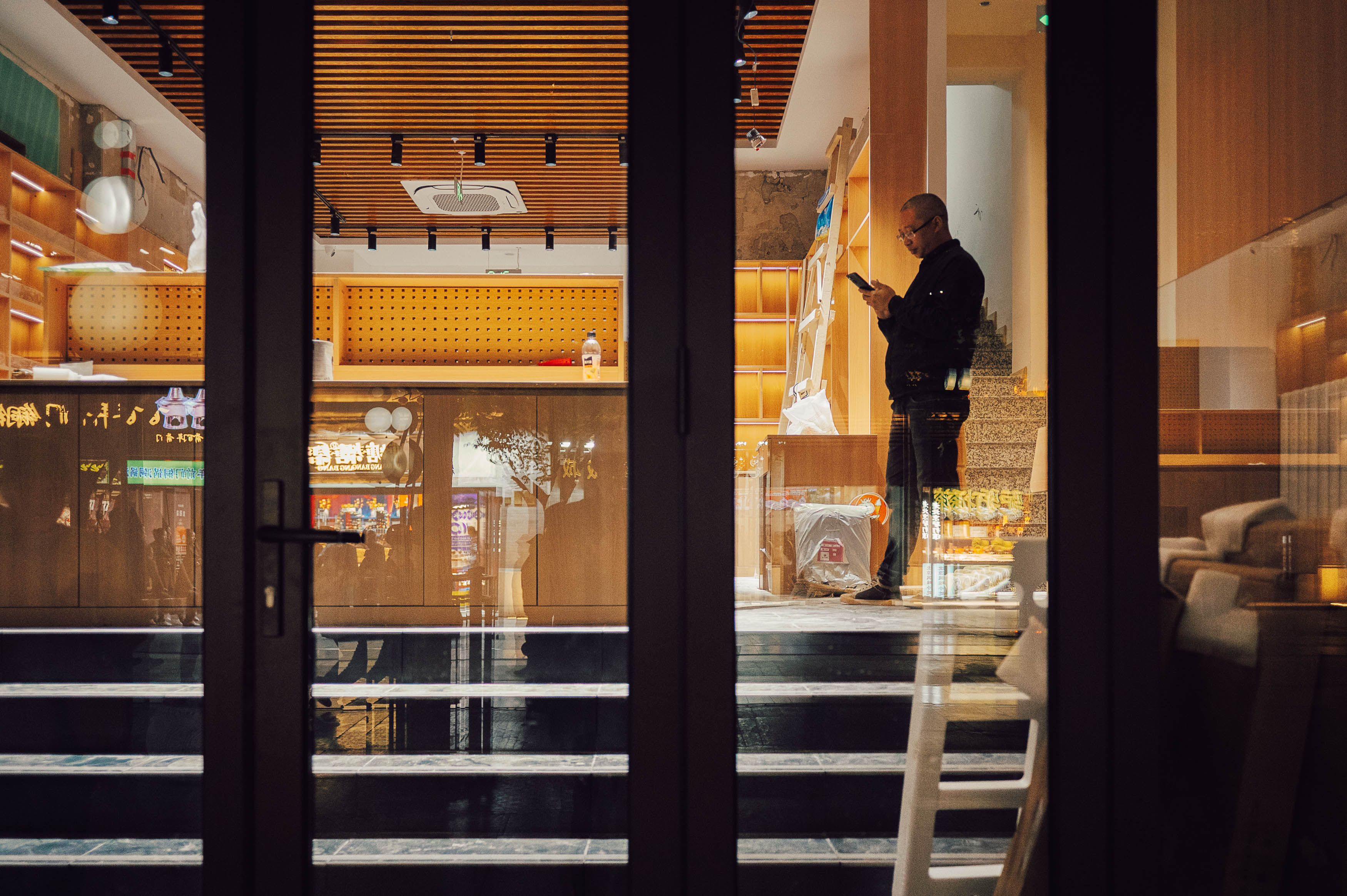

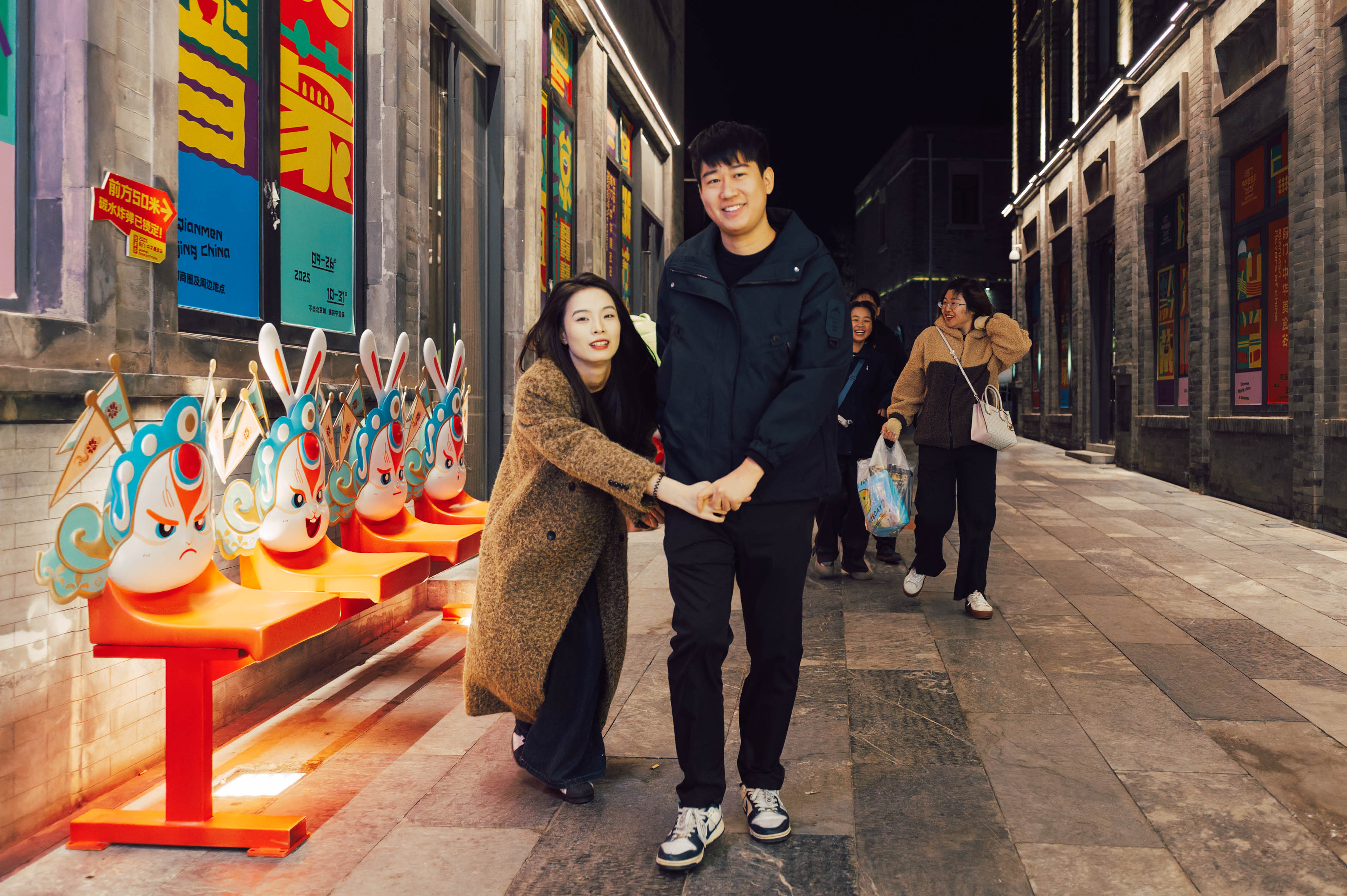
That’s particularly useful for travel and street photography. When I’ve travelled halfway around the world, I don’t necessarily want my photographs to look as though they could have been taken anywhere. The 28mm can include enough of the surrounding architecture, people and atmosphere to tell you where you are, while still allowing the main subject to dominate the image.
Perhaps that familiarity isn’t a weakness after all. It may simply be that 28mm has become the visual language of our generation, and there’s nothing inherently wrong with speaking a language that people already understand.
Of the three focal lengths, 40mm is probably the most comfortable for me. I’ve always liked the way it renders the world, sitting somewhere between the traditional 35mm and 50mm “normal” focal lengths. It’s an unusual focal length, but it’s also one that has a long history in compact film cameras, from the Rollei 35 to the Olympus Trip.
The Nikon Z 40mm f/2 is a particularly nice street photography lens because it combines a compact form with plenty of sharpness and just enough character. It isn’t optically perfect, and that’s part of what I like about it. There can be a little chromatic aberration and some softness in the corners when shooting wide open, but it still has the sharpness you’d expect from a modern Z lens.
More importantly, it gets out of the way. I find it particularly good for environmental portraits because it’s wide enough to provide some context without making the surroundings completely dominant. It also allows me to exclude some of the mess of reality, which suits my deadpan view of the world rather nicely.
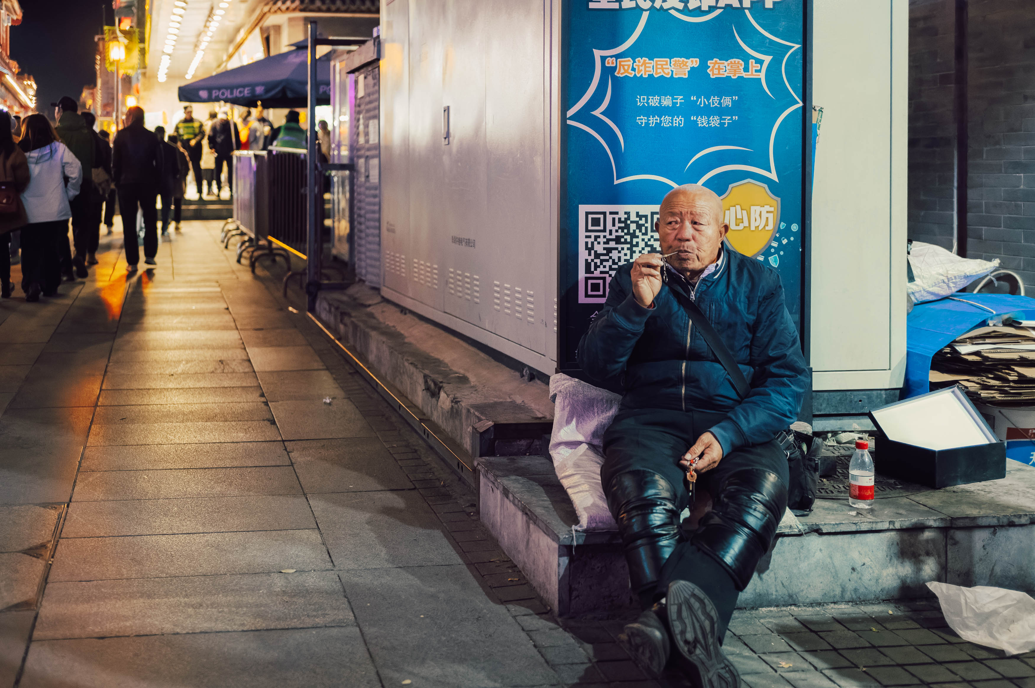

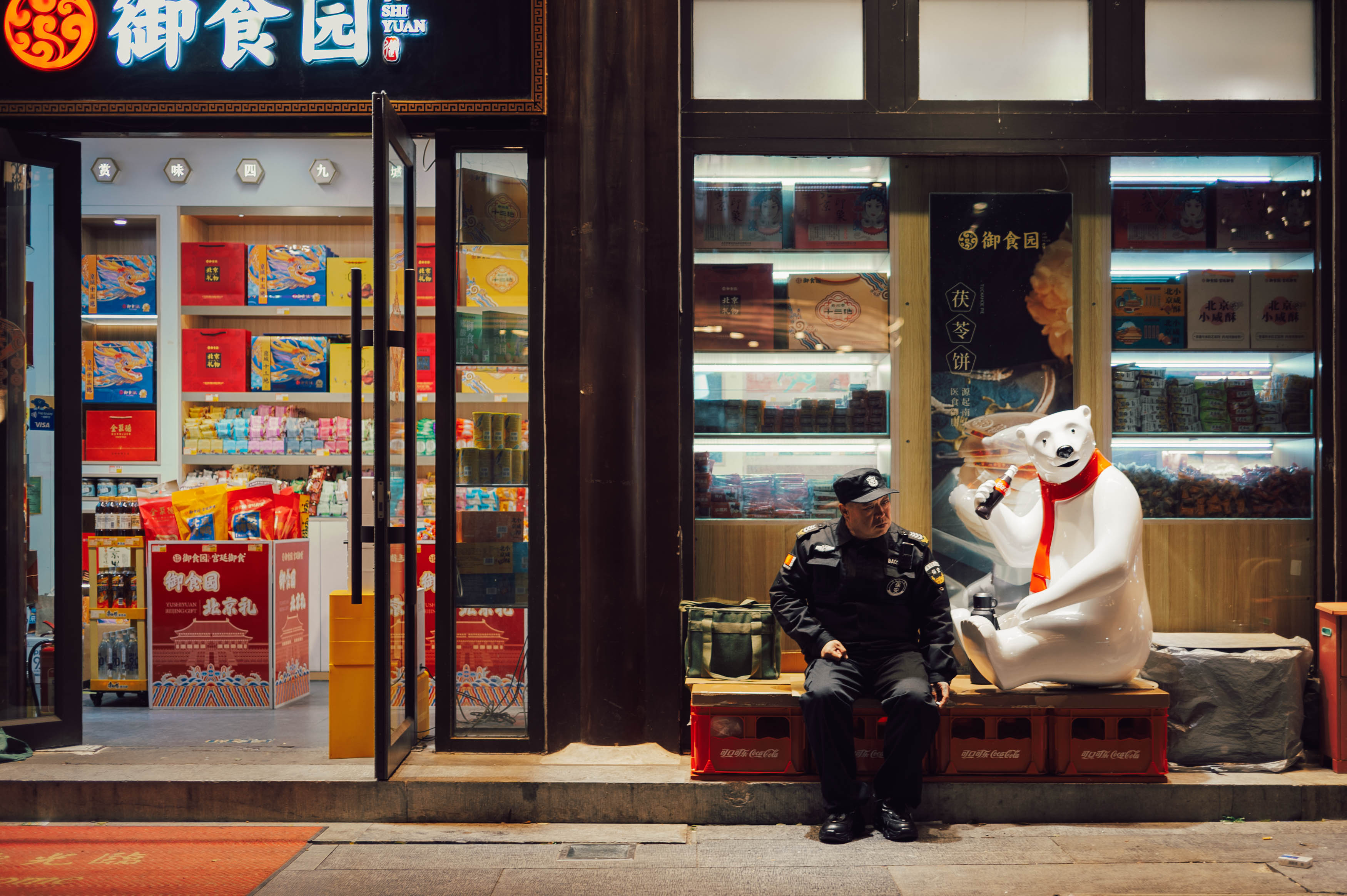
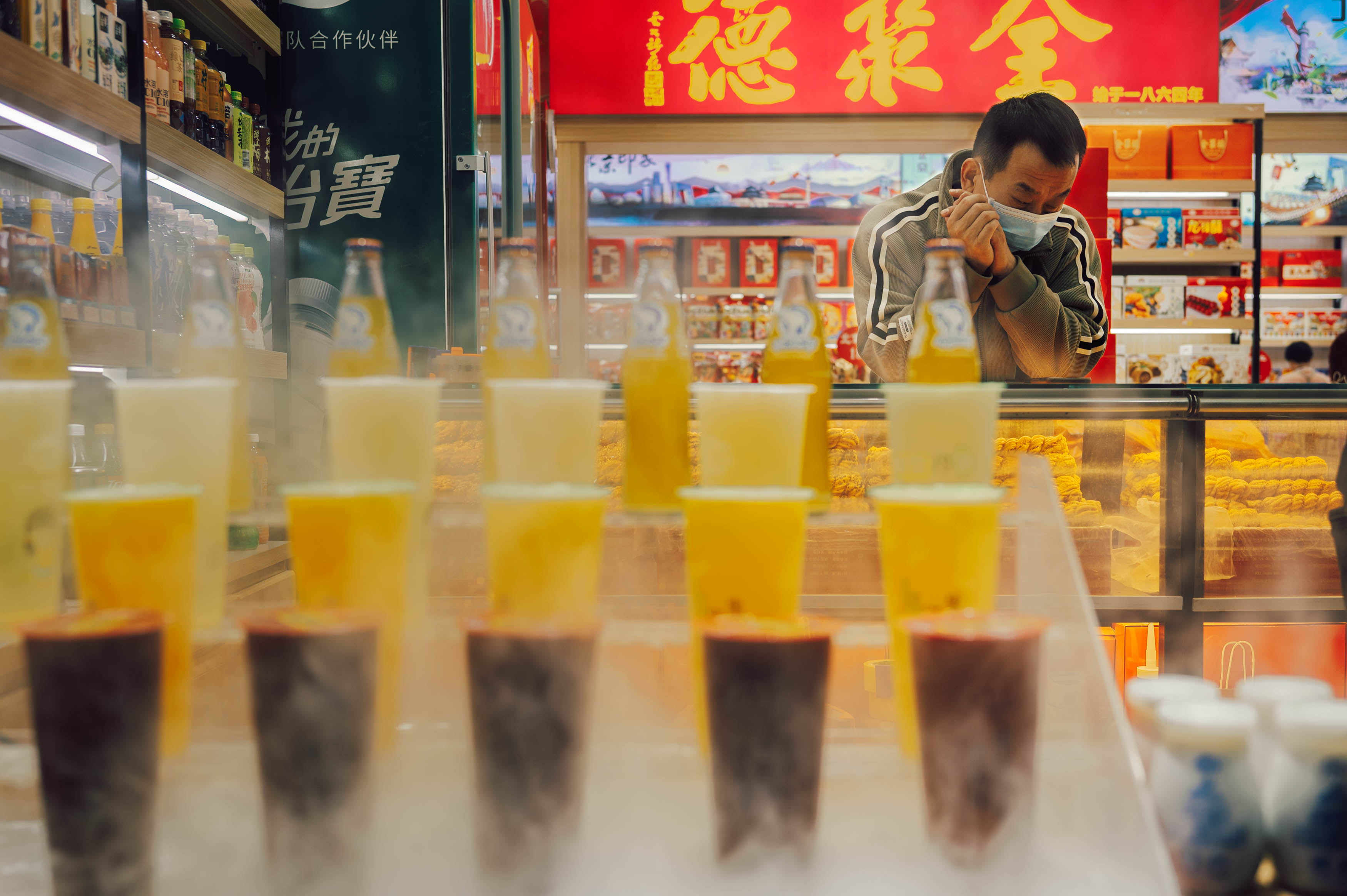
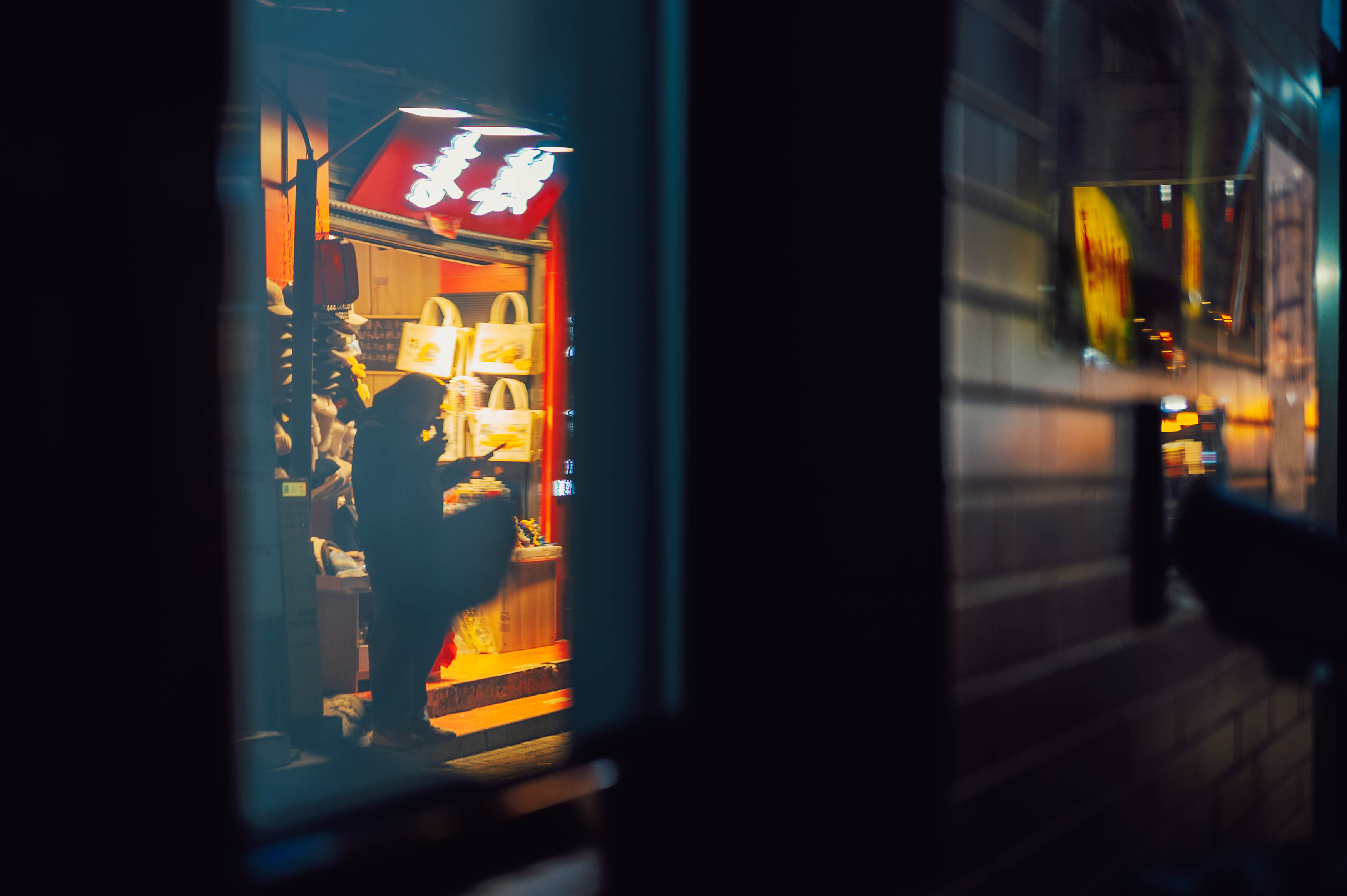
The 40mm has become a regular lens for me on my Nikon Z, largely because of that combination of size, character and perspective. It’s a good reminder not to get too obsessed with pixel peeping, because ultimately a lens that simply lets you concentrate on taking photographs is probably doing exactly what it needs to do.
After wandering around Qianmen at night with all three lenses, I’m still not entirely sure I’ve answered the question. The 20mm gives you exaggerated perspective, angles and drama, and works particularly well when you want to fill the frame with your subject while still showing plenty of the environment. The 28mm is more of a world-building lens, establishing where you are without requiring quite so much compositional gymnastics.
The 40mm is the one I felt most comfortable with. It gives me an intimate view of the world, without being too narrow, and it seems to suit the way I naturally want to photograph. And yet, when I went back through the images from the evening, it was the 28mm that seemed to produce the greatest number of keepers.
So perhaps there isn’t a definitive answer. All three lenses did a good job and I made images I liked from all of them. I’m still leaning towards 40mm as my personal preference but the 28mm clearly has something going for it. Maybe that’s the real lesson: the “best” street photography focal length is probably the one that makes you want to keep walking around and taking photographs.
And once I finally discover the perfect focal length, I’m sure all my images from then on will be gallery-worthy works of art. Obviously.
Yes, I have bought into the Helios hype. Unless you’ve been living in a cave you will probably have heard of the Helios 44, a lens famous for its distinctive swirly bokeh, colourful lens flare and general refusal to behave like a modern optical instrument. It even appeared in The Batman and Dune: Part Two, so its cinematic credentials are now considerably more impressive than mine.
The Helios 44 actually began life as a Soviet version of the Carl Zeiss Biotar 58mm f/2, a lens originally introduced in 1936. The Helios 44 first appeared in 1958 and went through numerous versions before production finally ended in 1999, with millions made along the way. So this isn’t some obscure vintage curiosity that three people on a forum have decided is brilliant; it is a genuinely historic lens with an enormous following.
My particular example came attached to something considerably less celebrated: a Zenit TTL from 1980. The camera has a reputation for being less than delightful, and I initially bought it largely because it was an inexpensive way of acquiring the Helios. Still, there was something irresistible about putting the two together and seeing whether this famously characterful lens could overcome what is widely regarded as a fairly agricultural camera.
The Zenit TTL is heavy, weighing around 684 grams, which isn’t outrageous in isolation but feels substantial compared with contemporary cameras such as the 510-gram Fujica STX-1n. Calling it a tank is tempting, although I think it is more like a Lada Niva: robust, agricultural and apparently designed without anyone becoming overly distracted by things like optimisation or elegance.
The camera does have TTL metering, which sounds promising until you actually try to use it. The meter isn’t coupled to the aperture, so you have to stop the lens down to take a reading. Unfortunately, stopping the lens down also makes the viewfinder considerably darker, making the whole process rather more fiddly than it needs to be. With my Helios 44-2, things became even more complicated because the lens isn’t coupled to the camera either.
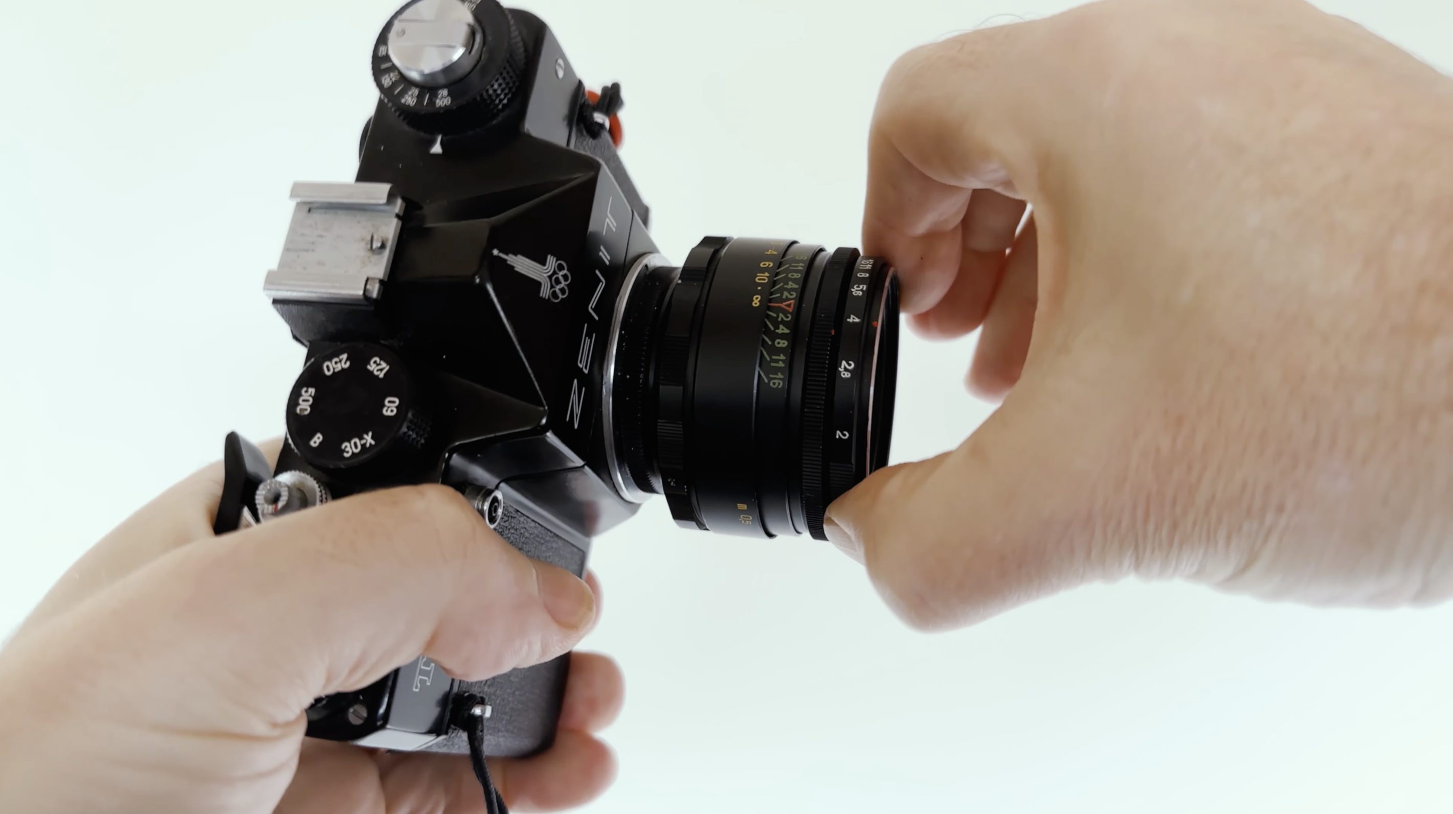
The aperture system itself seems almost deliberately designed to confuse. You set an aperture range using one ring and then use another stepless control to select the actual aperture, with the control working in the opposite direction to what your brain expects. By the time I had finished trying to understand what was happening, I had largely abandoned the camera’s meter and decided that my own brain would be a better exposure system.
That might have worked if I hadn’t also managed to leave the diffuser covering my external light meter. Consequently, I was getting readings that were a stop or two too slow, while simultaneously dealing with the Zenit’s eccentric aperture controls. The inevitable result was a number of overexposed frames, some by several stops.
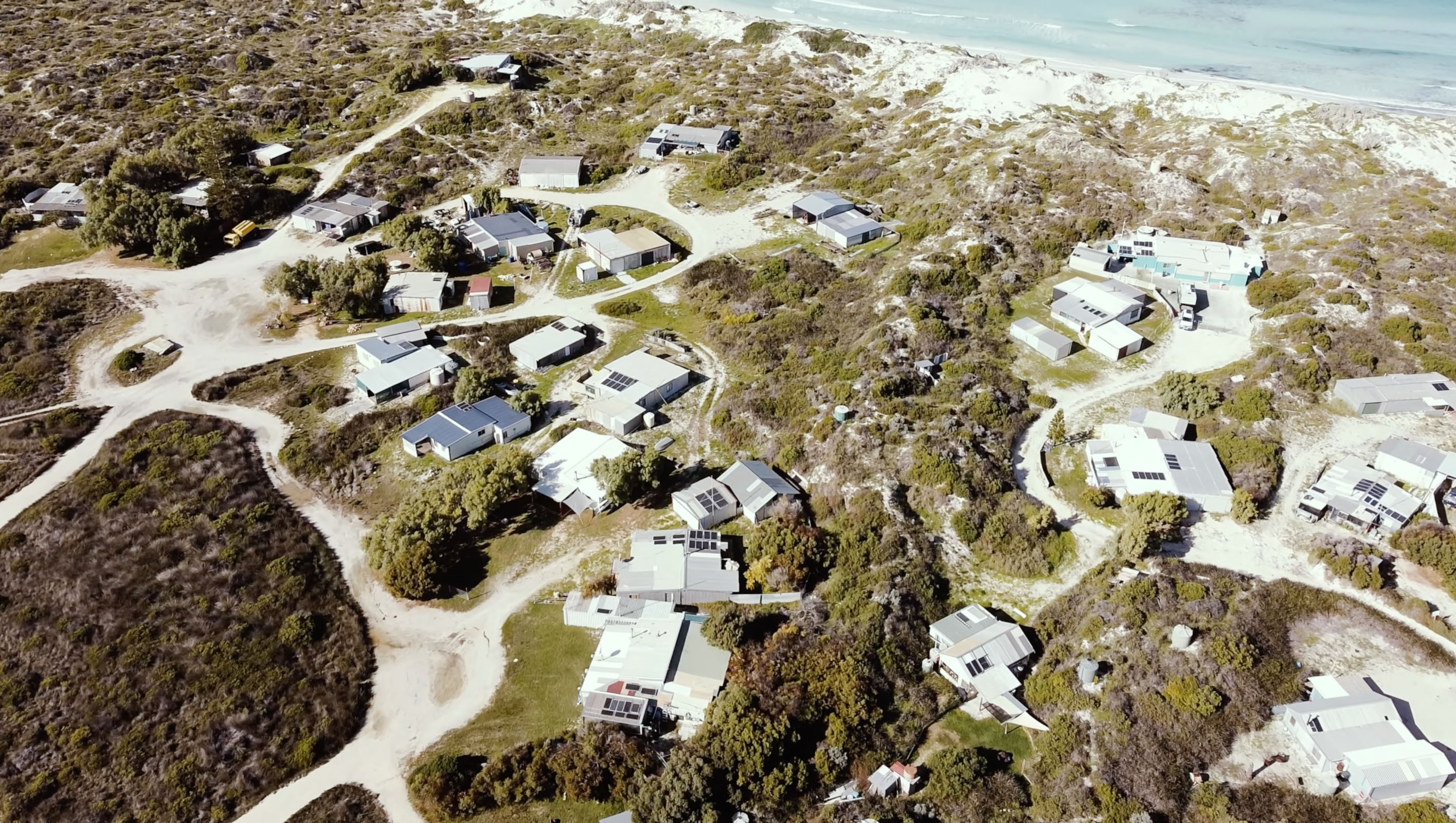
I took this combination to Wedge, one of those remarkable coastal shack communities north of Perth. Wedge has historically been remote, basic and difficult to access, with no electricity, running water or sanitation. Today it is much easier to visit, but it still retains that ramshackle character that makes it such an interesting photographic environment. I loaded up a roll of Ilford HP5 and set out to see what the Zenit and Helios could actually do.
I developed the film in 510 Pyro, partly because I knew by then that my exposures had been all over the place. The developer did a good job of helping preserve some of the highlights, but the combination of overexposure, development and my questionable handling of the camera certainly affected some of the results.
Despite all of that, the pictures actually came out surprisingly well. In ordinary circumstances, the Helios can produce results that aren’t dramatically different from those of a much more modern lens. It is certainly capable of being sharp enough, particularly for portraiture where extreme corner sharpness isn’t especially important. In bright daylight, however, the distinctive character of the lens is harder to see because you simply aren’t going to spend much time shooting wide open.
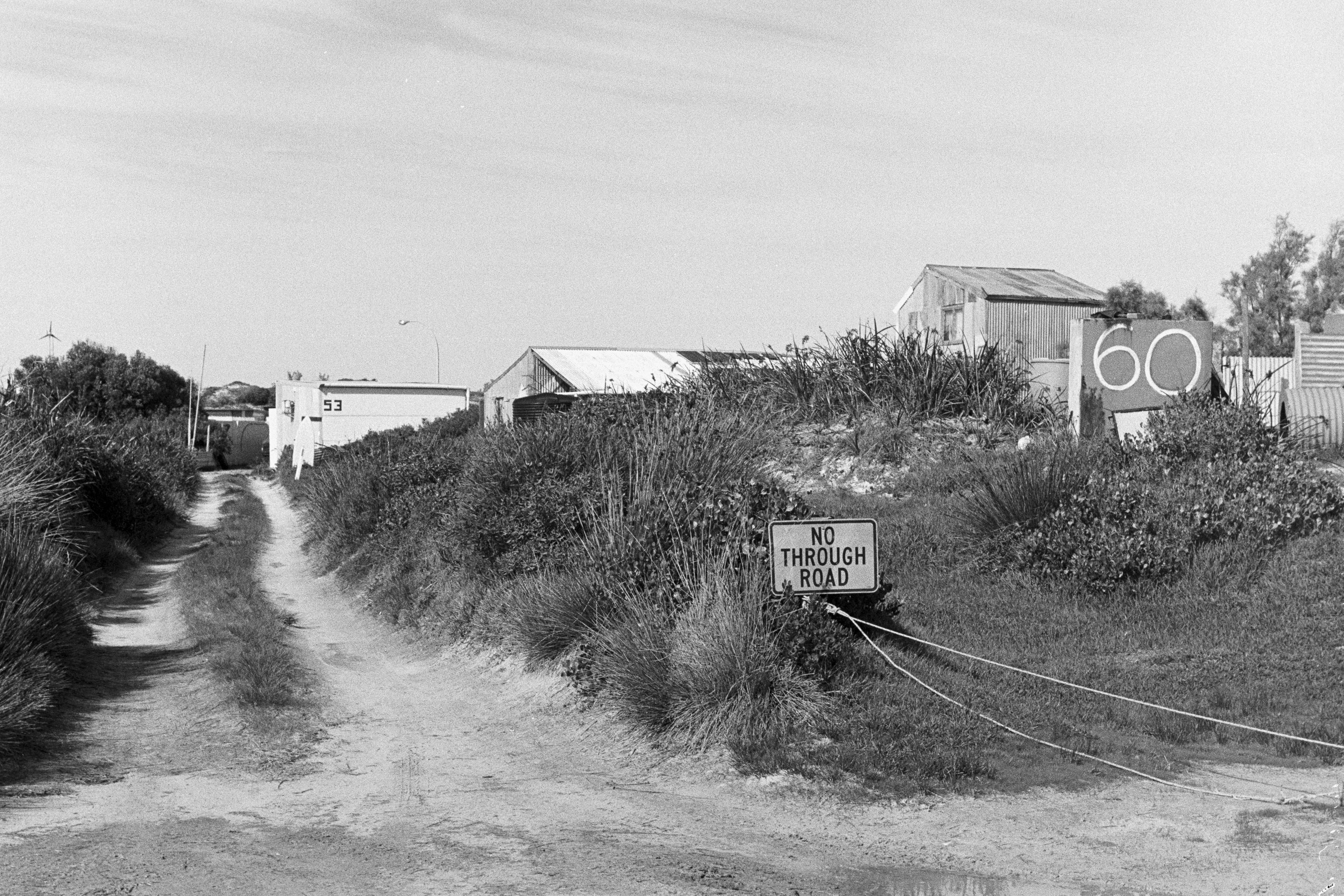
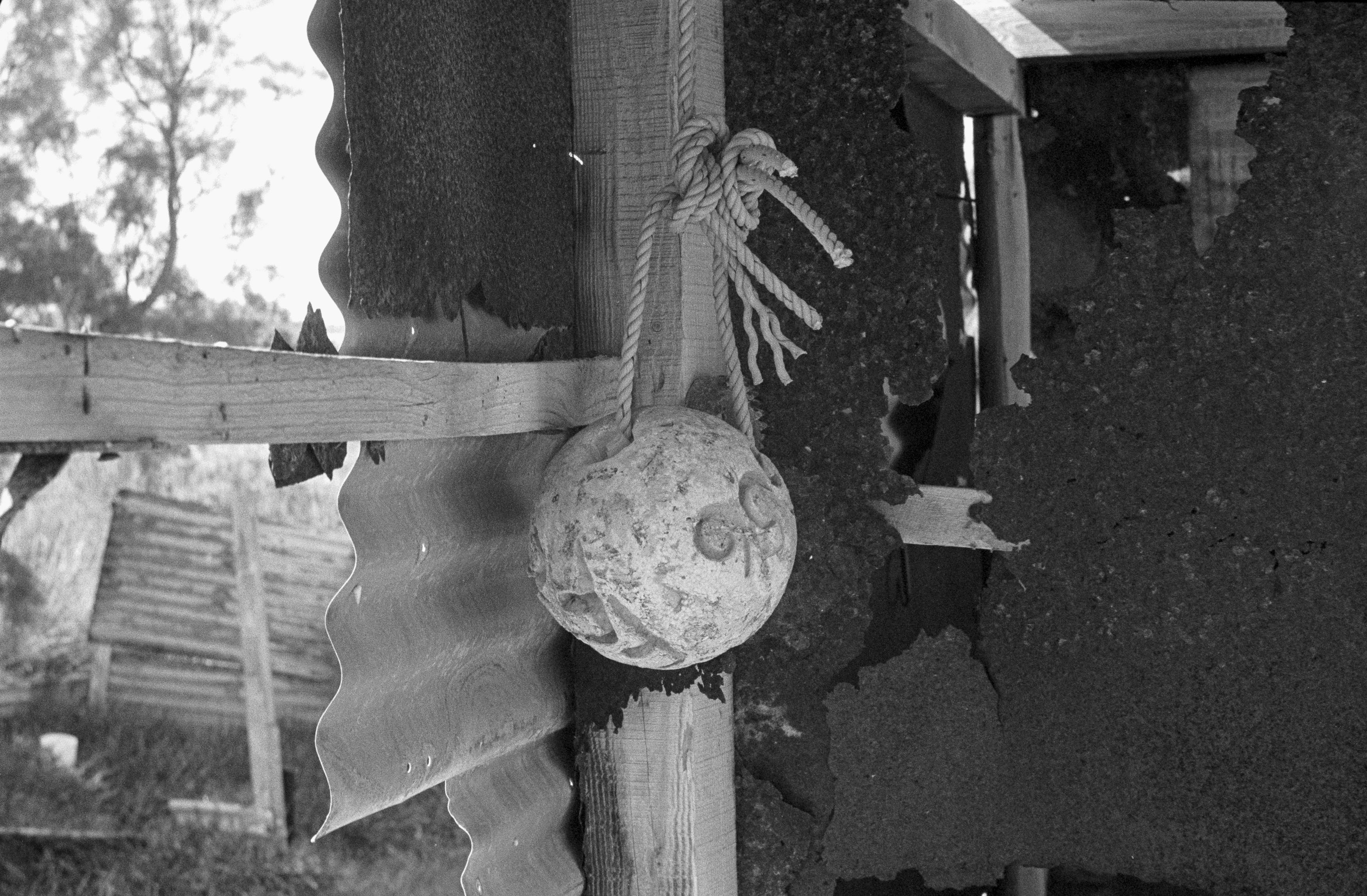
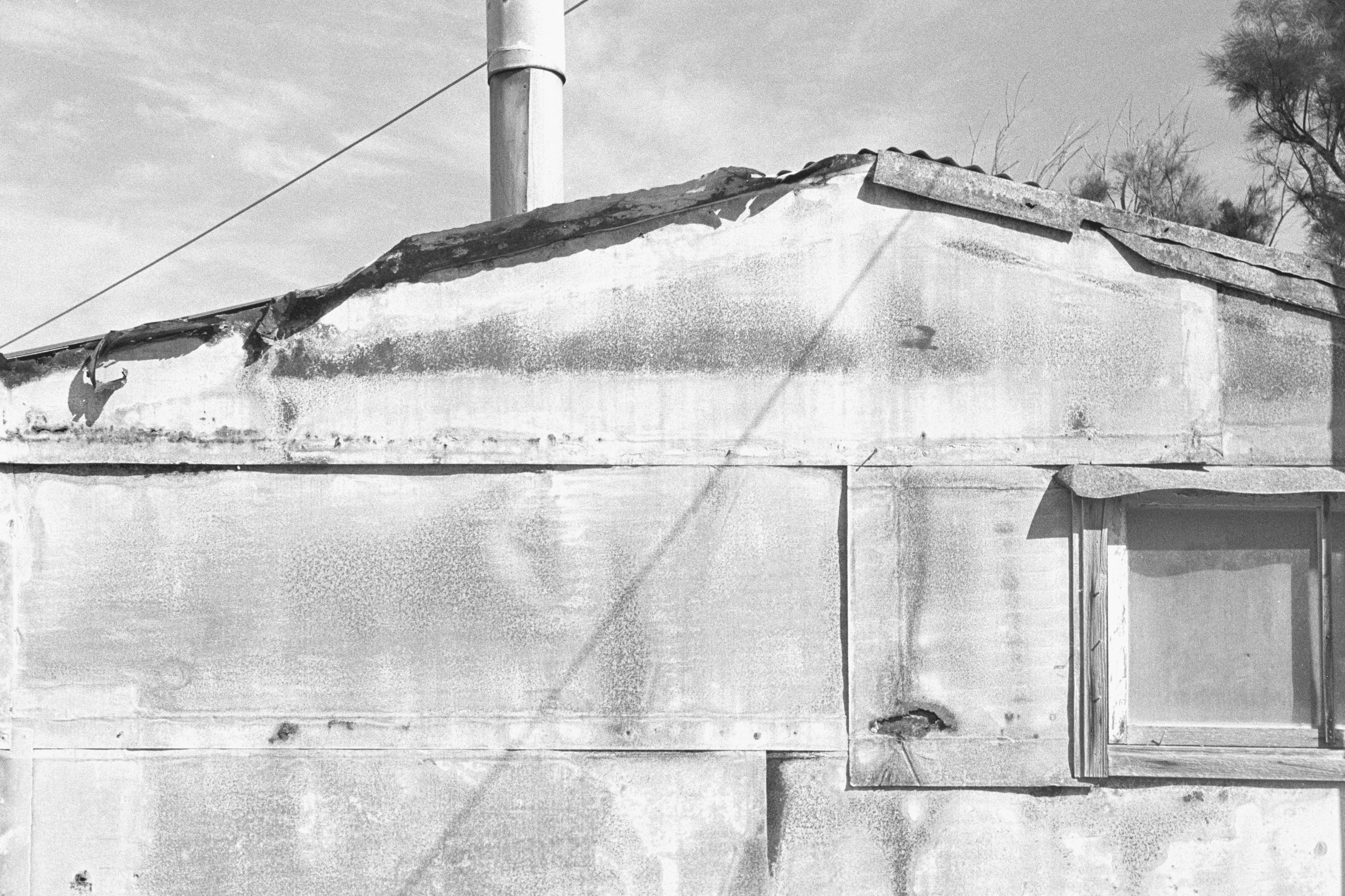
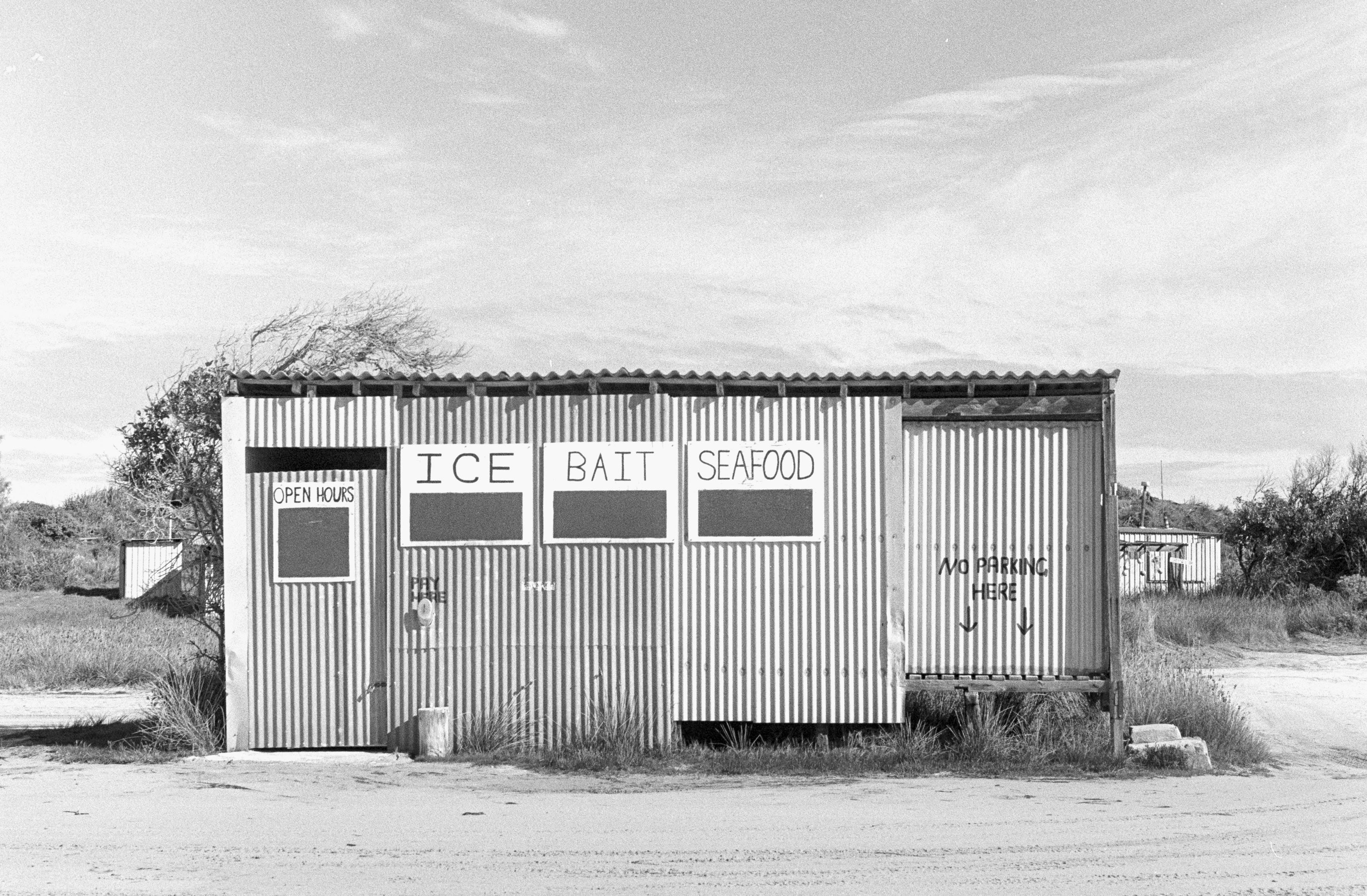
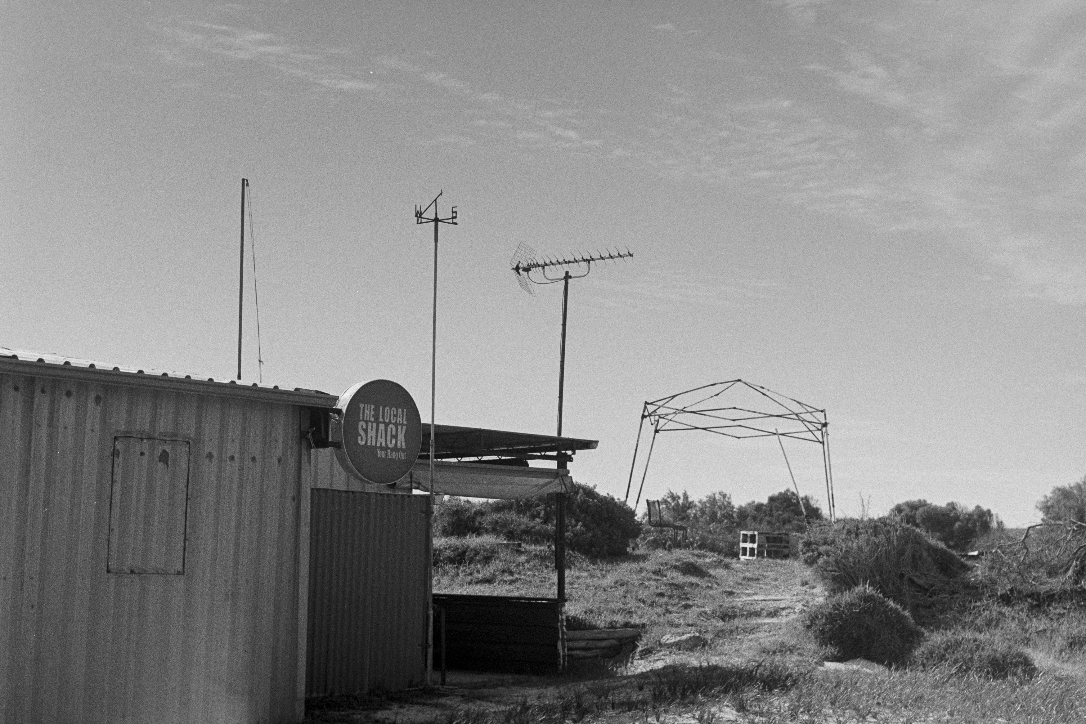
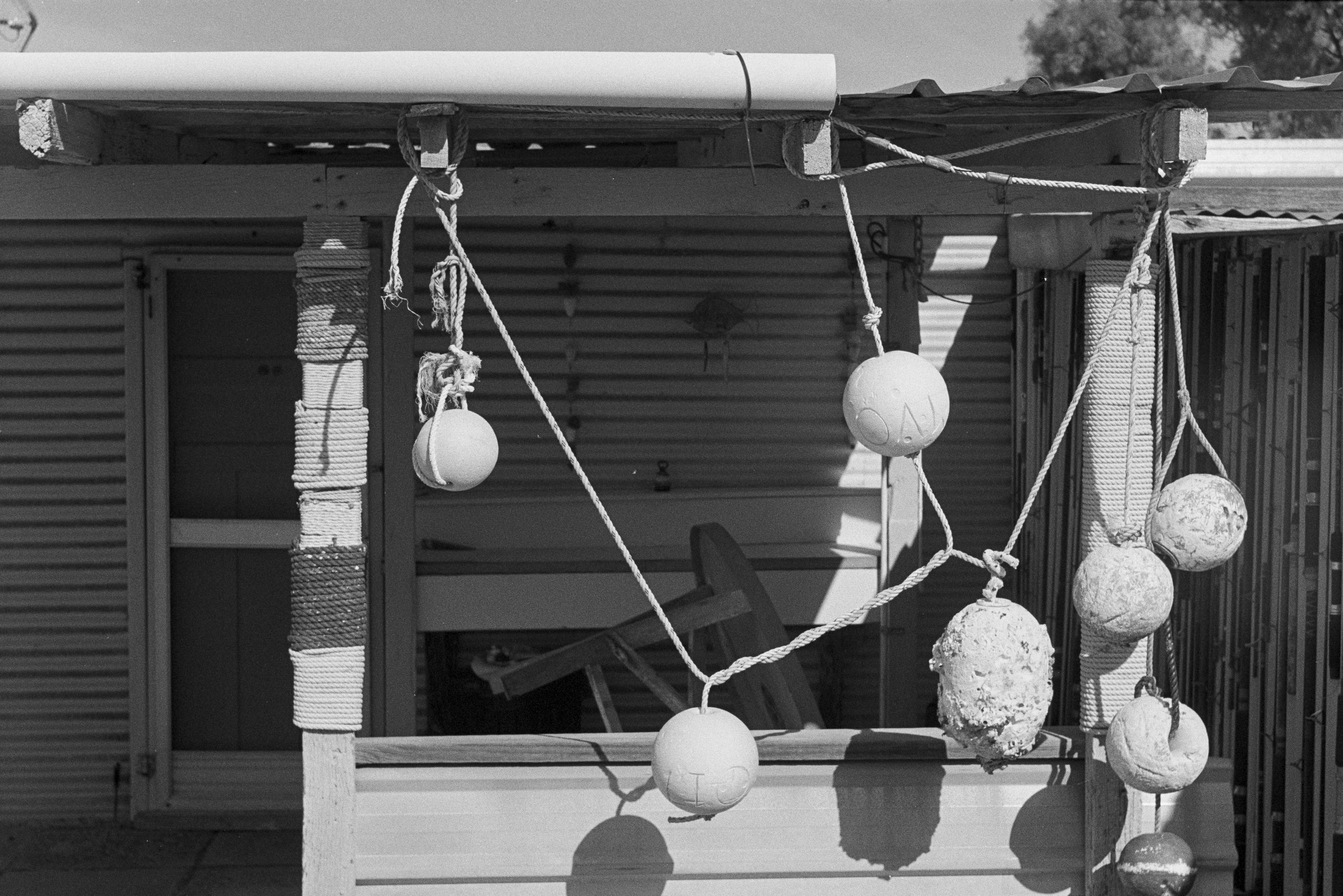
It was later in the day, as the sun began to disappear, that the Helios really started to reveal its personality. Wide open, it becomes an unruly and slightly belligerent lens, producing a frenzy of out-of-focus artefacts that can sometimes compete with the actual subject for attention. If you’re looking for clean, technically perfect images, this isn’t necessarily an advantage. If you’re looking for something with character, however, it is exactly the point.
And then there is the famous swirl. It doesn’t appear in every photograph, but when you get the right combination of subject distance, background and aperture, the bokeh takes on that distinctive elliptical shape and seems to rotate around the subject. Suddenly an ordinary photograph can look as though you’re tunnelling through time and space. It is undoubtedly a gimmick, but it is a remarkably entertaining one.
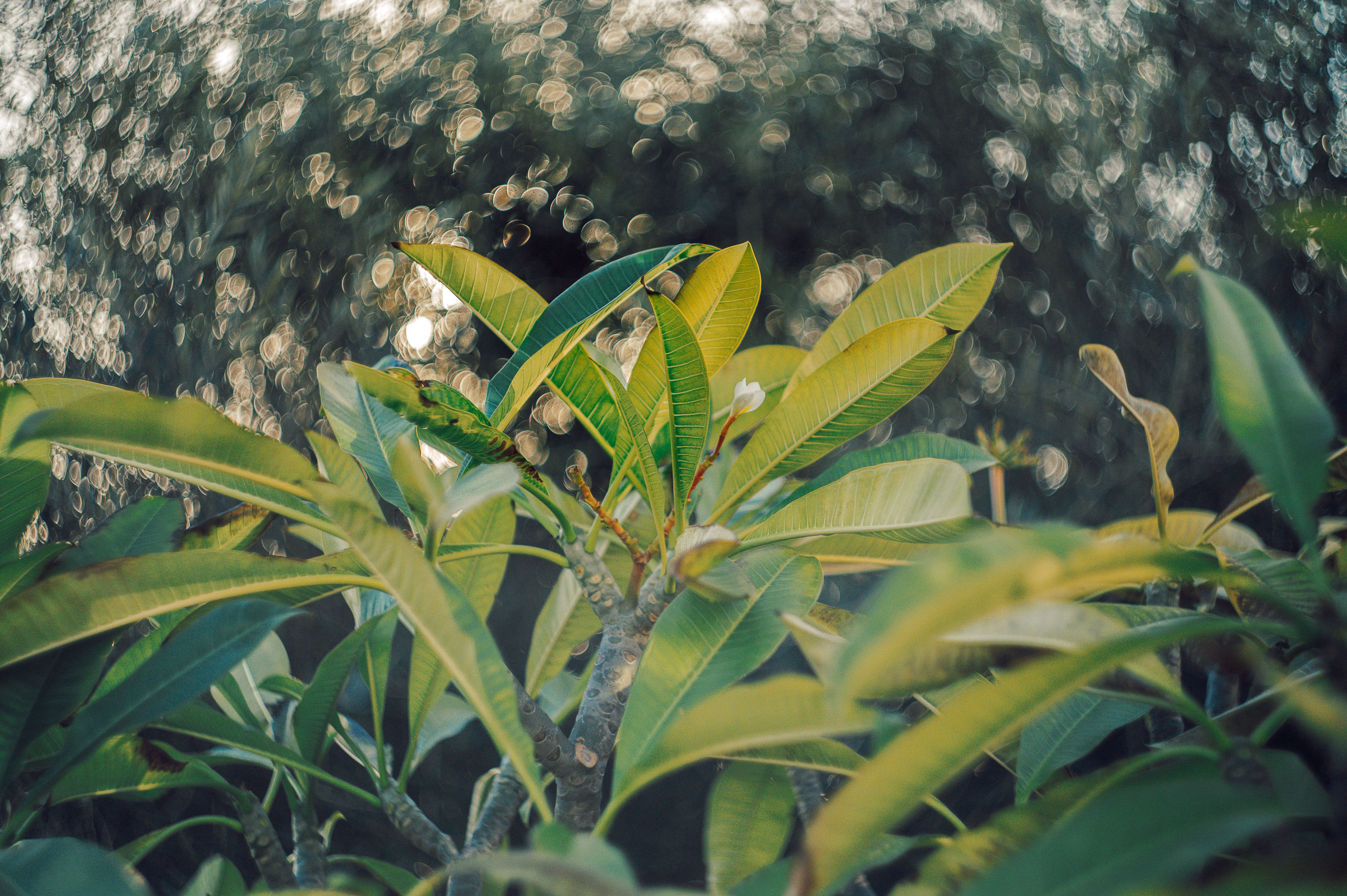
Lens flare is another part of the package. Point the Helios towards a bright light source and it can fill the frame with streaks and artefacts that would make a modern lens designer reach for the nearest emergency brake. Whether that is beautiful or hideous is entirely subjective, but the important thing is that you have the choice.
The irony is that the Helios 44 is probably best appreciated away from the Zenit TTL. Put it on a modern mirrorless camera such as my Nikon Z6 and you can dispense with the Zenit’s eccentric metering system while still enjoying the lens’s optical quirks. You get focus peaking, straightforward exposure control and none of the Soviet-era gymnastics required to take a photograph.
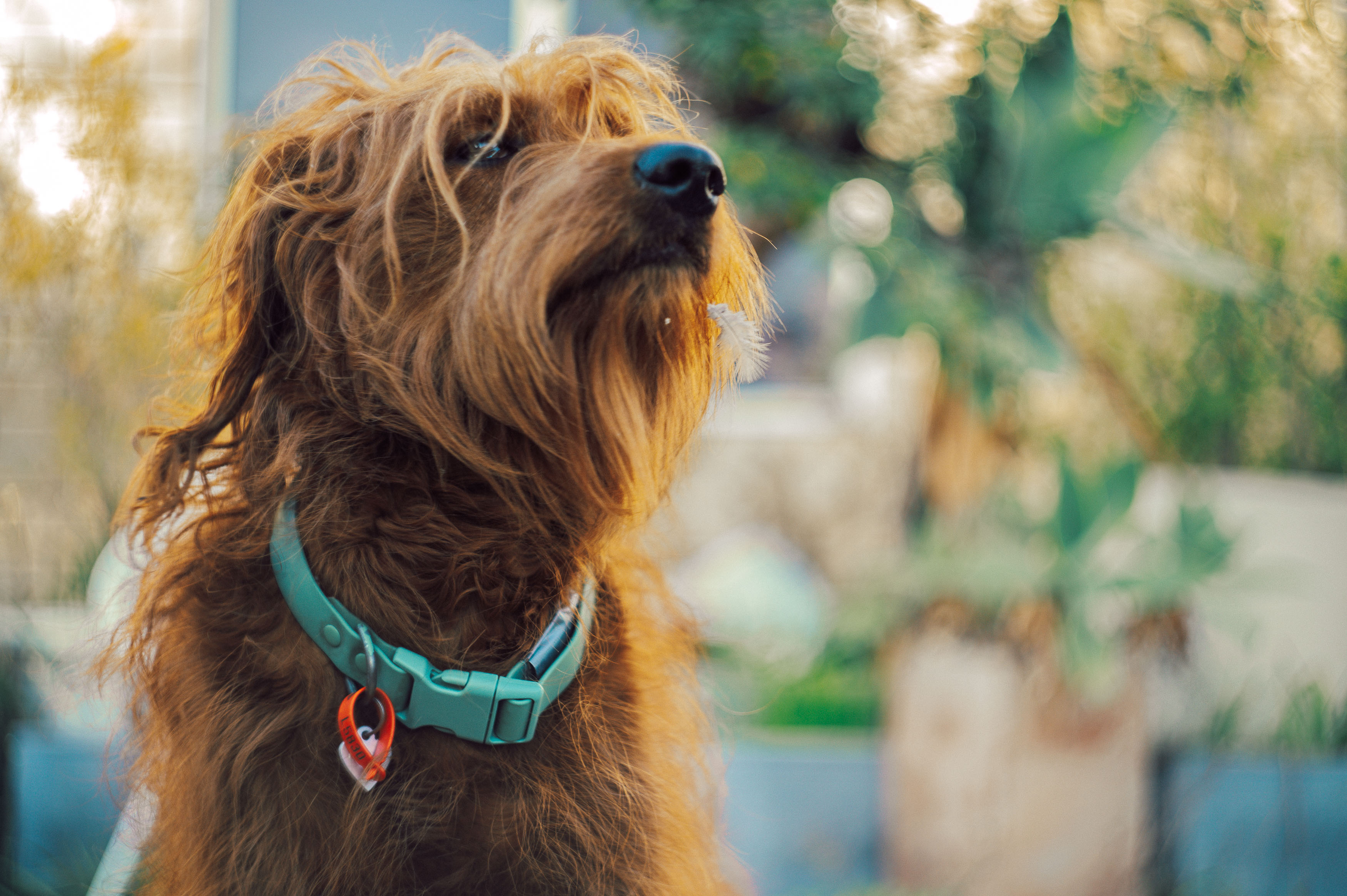
But there is something appealing about using the complete Zenit and Helios combination, even if the experience is considerably less convenient. Both are imperfect, both have plenty of personality and neither is particularly interested in making photography easy. In that respect, they actually fit together rather well.
That is also why I think the combination worked at Wedge. The place itself is rough, rustic and imperfect, with its collection of old shacks and weathered structures scattered through the coastal landscape. It isn’t polished or pristine, but it has character, and that is exactly what the Helios brings to a photograph.
So would I take the Zenit TTL and Helios 44 on a serious photoshoot? Probably not. The camera makes the process unnecessarily difficult, and the lens has such a strong personality that it can easily become the dominant feature of the image. But if the objective is to introduce a little chaos into an otherwise predictable photograph, the Helios is difficult to beat.
It may be old, rough around the edges and about as refined as a Soviet tractor, but that is precisely why I like it. Modern lenses are astonishingly good at removing imperfections from the photographic process. The Helios 44 does the opposite. It gives those imperfections a starring role, and sometimes that’s exactly what a photograph needs.
Are the Nikon N65 and Tamron 28-200mm the peaches-and-cream pairing of budget film photography, or do they clash like toothpaste and orange juice? After taking this decidedly unfashionable combination with me to Tokyo, I think I have a pretty good idea of where it sits in the hierarchy of cheap film cameras.
I travel quite a bit for work, and one of the recurring problems is that my camera collection stubbornly refuses to fit into a suitcase. Eventually, there comes a point where you have to accept that I’m taking one camera and one lens, once you have packed essentials such as a toothbrush, passport and your pet iguana. That makes size, weight, versatility and price rather important considerations.
The Nikon N65, also known as the F65 or Nikon U depending on where you live, is hardly the sort of camera that gets the heart racing. It is a late-era film SLR, made from plastic, finished in a rather unfortunate silver colour and generally ignored by photographers in favour of more glamorous cameras. It is, in other words, absolutely perfect for me.
The camera weighs less than 400 grams, yet manages to pack in an impressive collection of features. You get Program, Shutter Priority, Aperture Priority and Manual modes, along with 3D Matrix metering, exposure compensation, shutter speeds up to 1/2000 second, TTL flash and even deliberate double exposures. It is very much a product of the period when manufacturers had essentially perfected the SLR and were busy figuring out how many features they could squeeze into something ordinary people could afford.
Its biggest problem may simply be that it isn’t cool. The silver plastic body looks more like something you’d find in a child’s dressing-up box than around the neck of a serious photographer. There is a black version if you’re particularly concerned about your sartorial reputation, but the N65 isn’t going to impress anybody at a photography exhibition. Fortunately, I have no reputation to protect.
The other half of the equation is the Tamron 28-200mm f/3.8-5.6 Macro AF Aspherical XR (IF), a lens whose name contains approximately as many acronyms as some entire camera systems. Tamron was one of the pioneers of the all-in-one zoom, producing a 28-200mm as early as 1992 at a time when achieving that kind of focal range without producing complete optical rubbish was a genuine challenge.
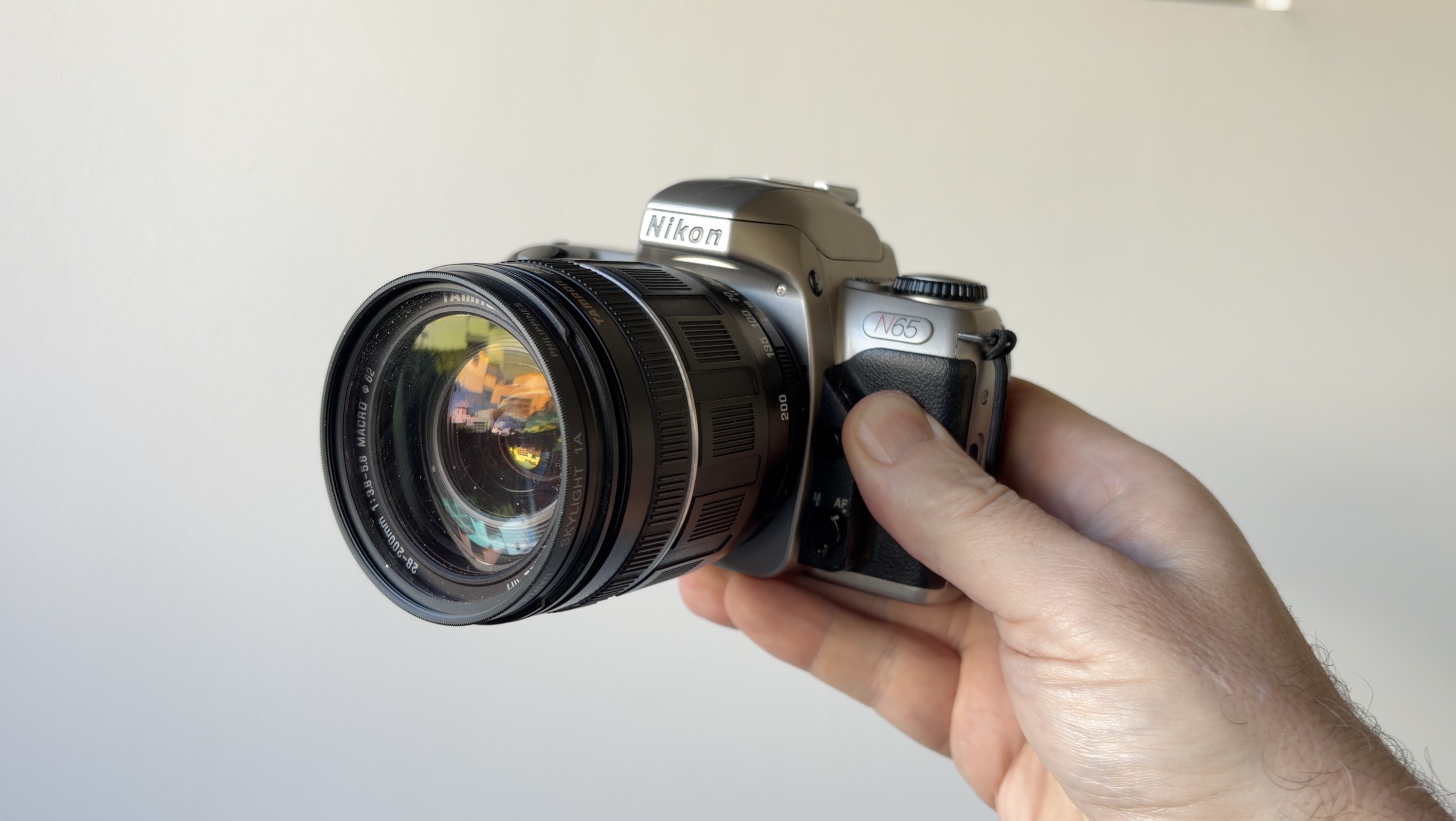
This particular version comes from the later generations of the design and includes aspherical and high-refractive-index elements. It isn’t going to produce the sort of three-dimensional pop that inspires lengthy forum arguments, but it is generally sharp, well corrected and has enough contrast to produce a pleasingly modern-looking image on film.
That’s important because this isn’t really a test of ultimate optical performance. I’m not trying to determine whether the Tamron can defeat a modern professional zoom in a forensic pixel-peeping contest. The whole point is finding the sweet spot between price, size, quality and versatility. A 28-200mm gives me the ability to photograph a cathedral, a street scene or something considerably further away without changing lenses, and that’s enormously useful when travelling.
There are limitations, of course. The relatively slow maximum aperture means this isn’t the lens I’d choose for exploring the darkest corners of Tokyo with ISO 100 film. In those circumstances, a fast 35mm or 50mm prime would be a much better choice. At 200mm, you also need to be careful with camera shake, particularly when shooting slow film such as Kentmere 100.
But when the light is good and I hold the camera properly, the results are more than good enough for my purposes. Some photographs were soft, but that wasn’t necessarily the fault of the lens. At 200mm, a little movement is enough to turn a potentially sharp photograph into something resembling a vague memory of having taken a photograph.
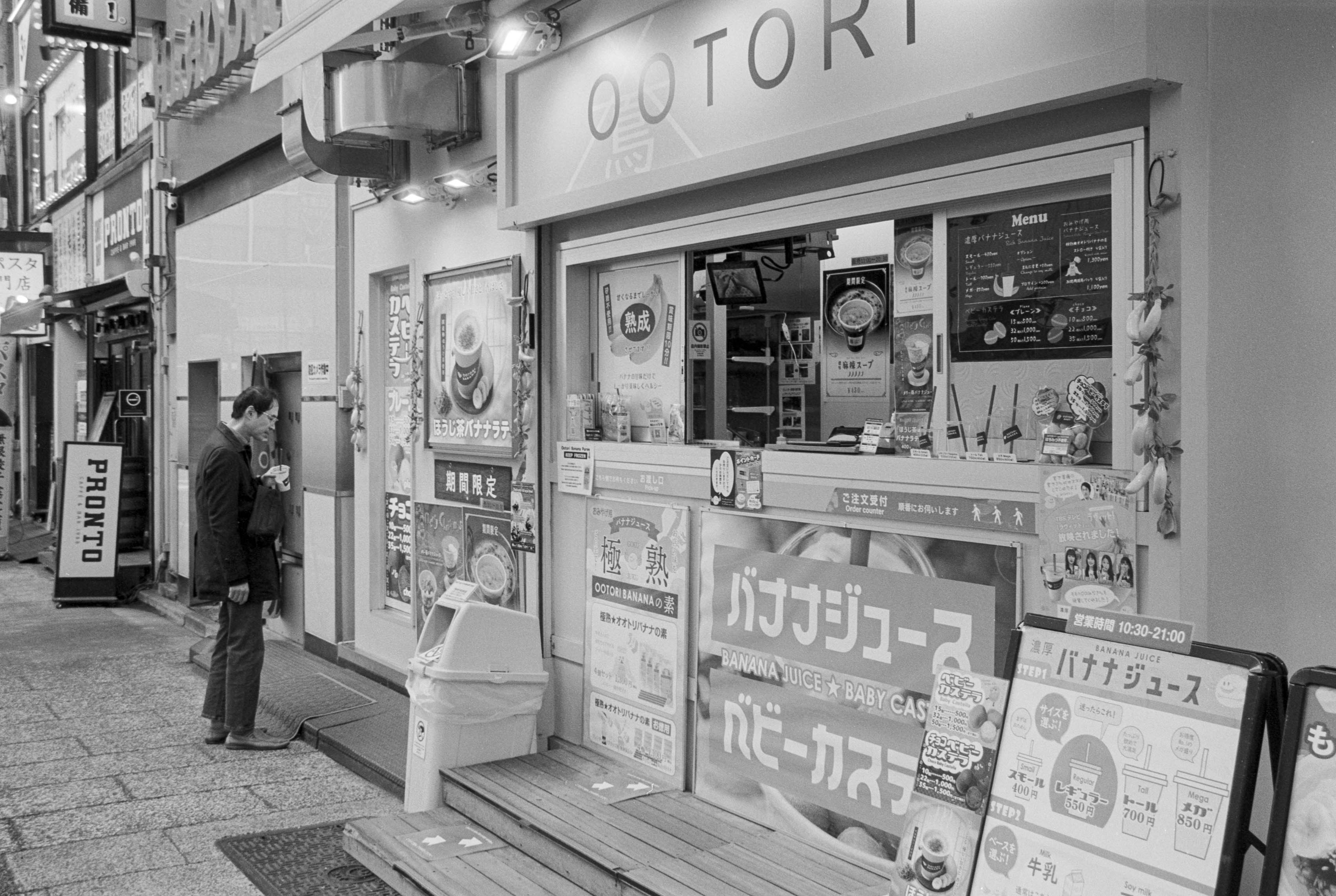
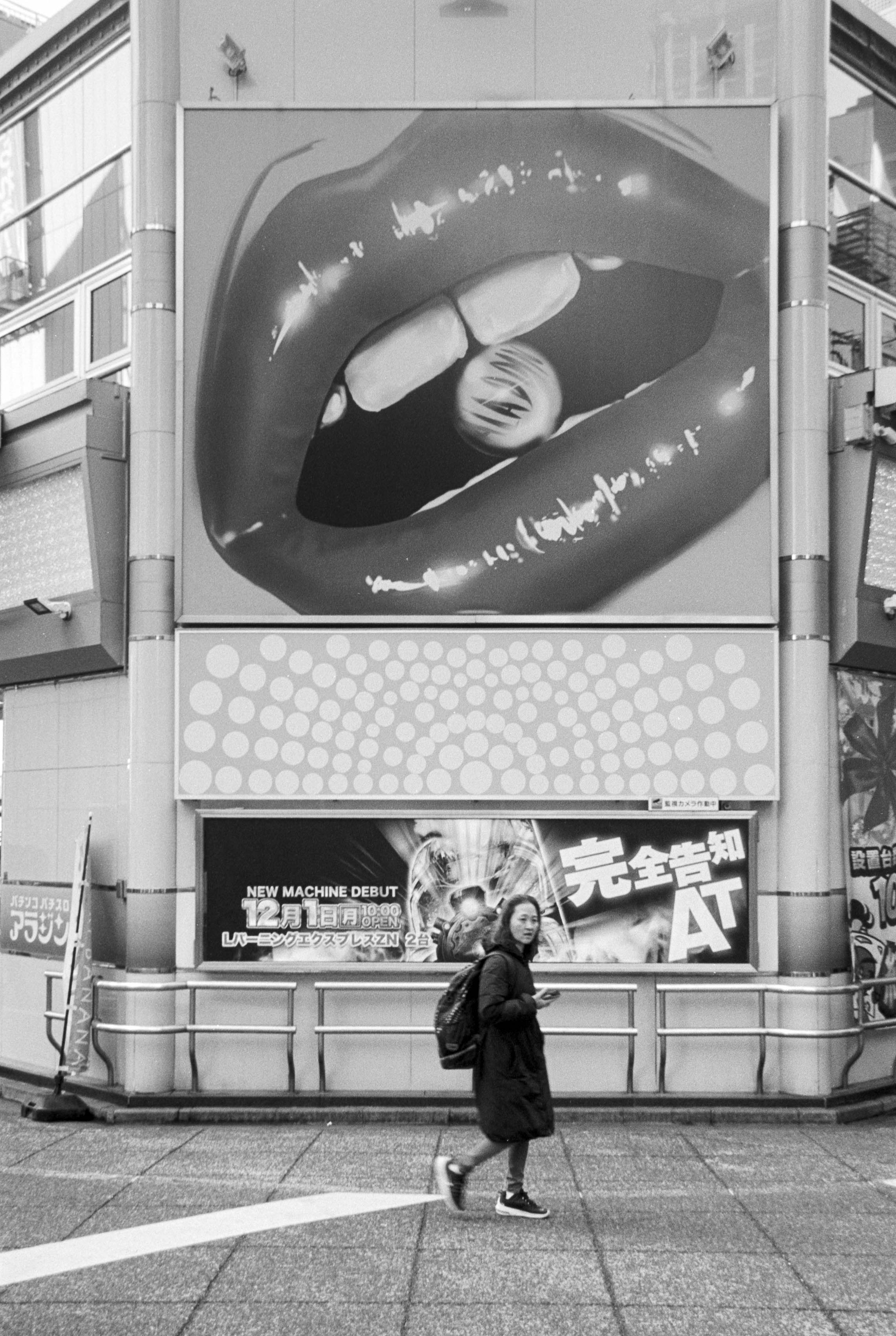
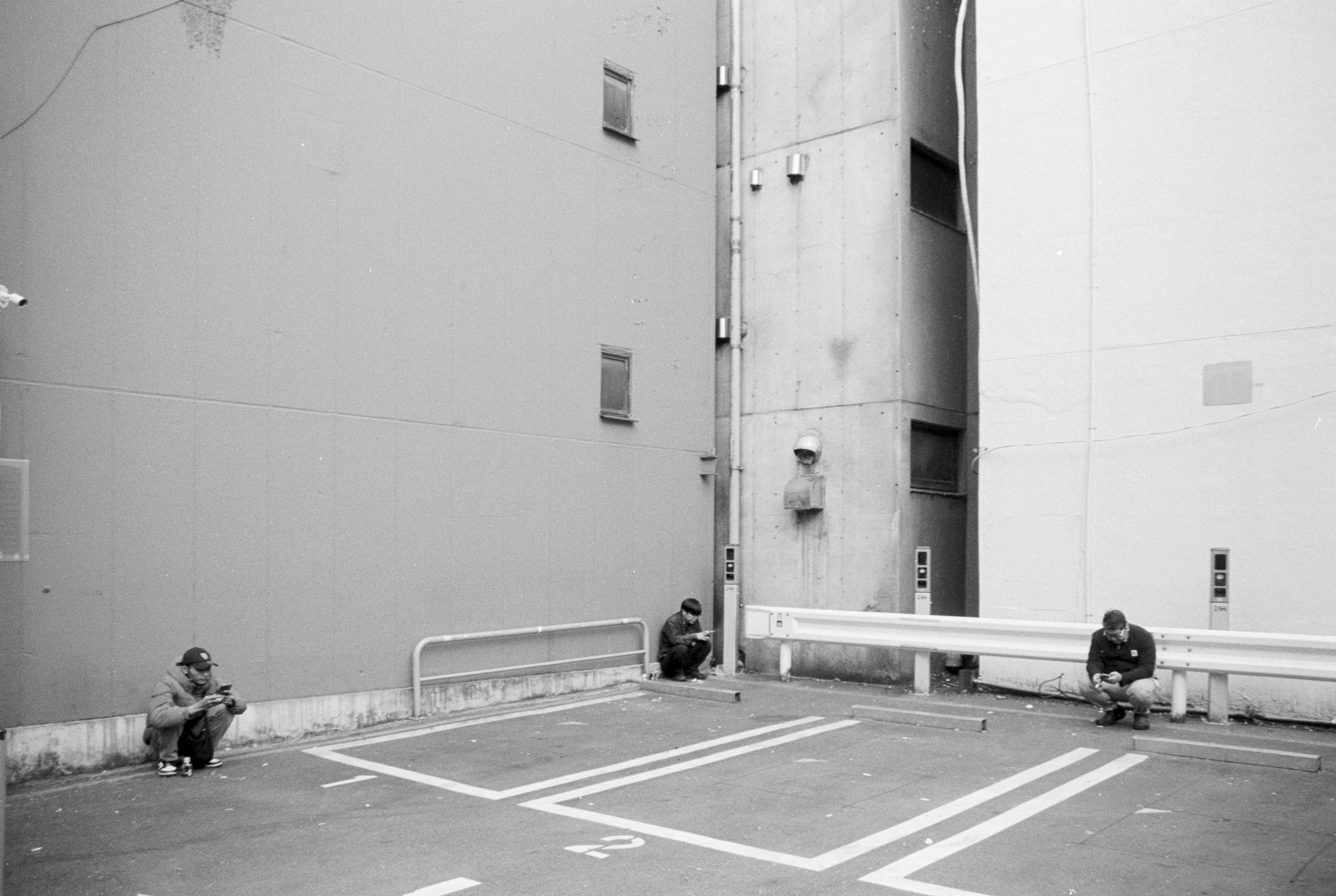
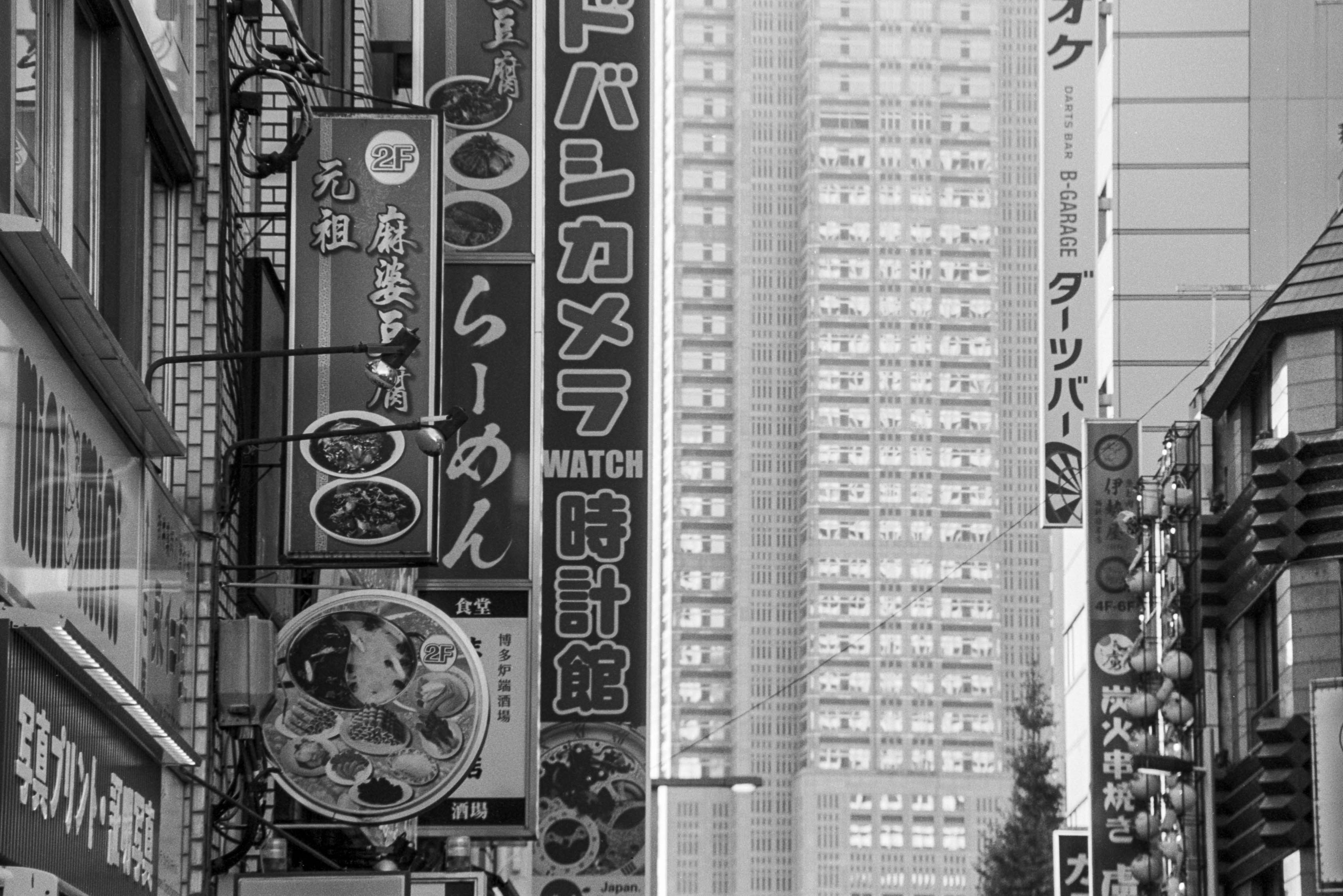
And when everything comes together, the results are surprisingly convincing. Some of the photographs I took in Tokyo was easily sharp enough to have been produced by a much more expensive camera and lens combination, while costing a fraction of the price and weighing considerably less.
Taking the N65 and Tamron together, the entire combination weighs less than about 750 grams. That makes it a remarkably portable package considering the enormous focal-length range it provides. A 28mm isn’t ultra-wide, but it’s wide enough for most street photography without introducing excessive distortion, while 200mm gives you enough reach to isolate details and compress layers in a busy urban environment.
That’s exactly what I found useful in West Shinjuku and Nakano. I wasn’t simply trying to photograph the spectacular parts of Tokyo; I wanted to capture the mixture of business, social life, signage, buildings and random human moments that gives these places their character. The 200mm end of the zoom was particularly useful for compressing layers of windows and billboards, while also allowing me to pick out small moments happening within the chaos.
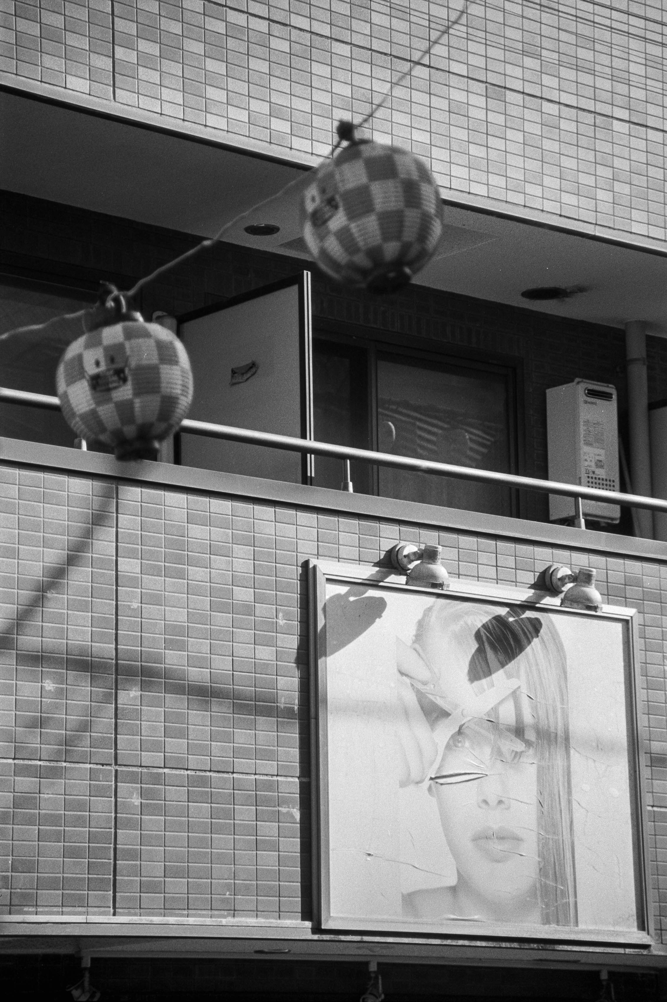
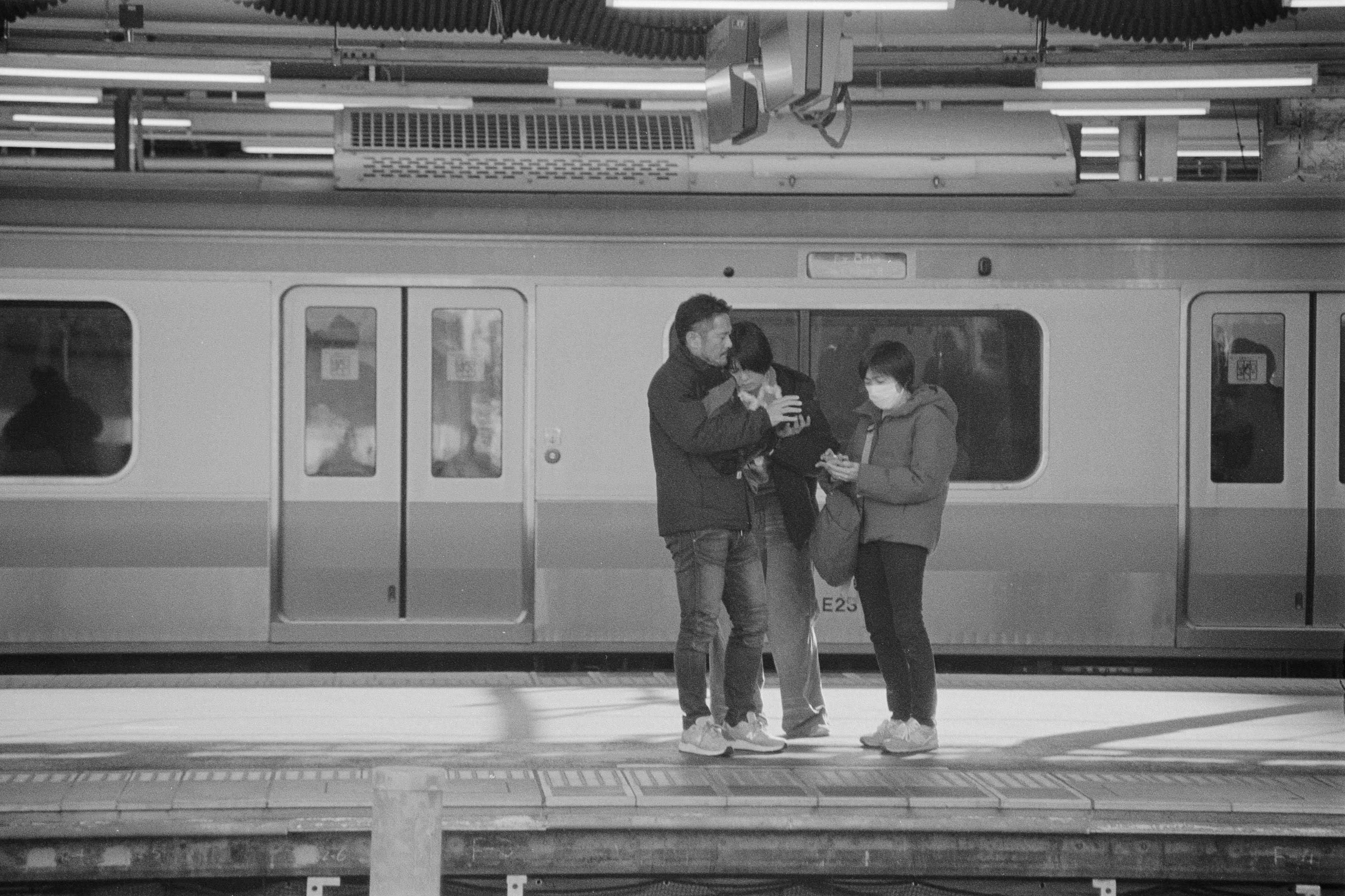
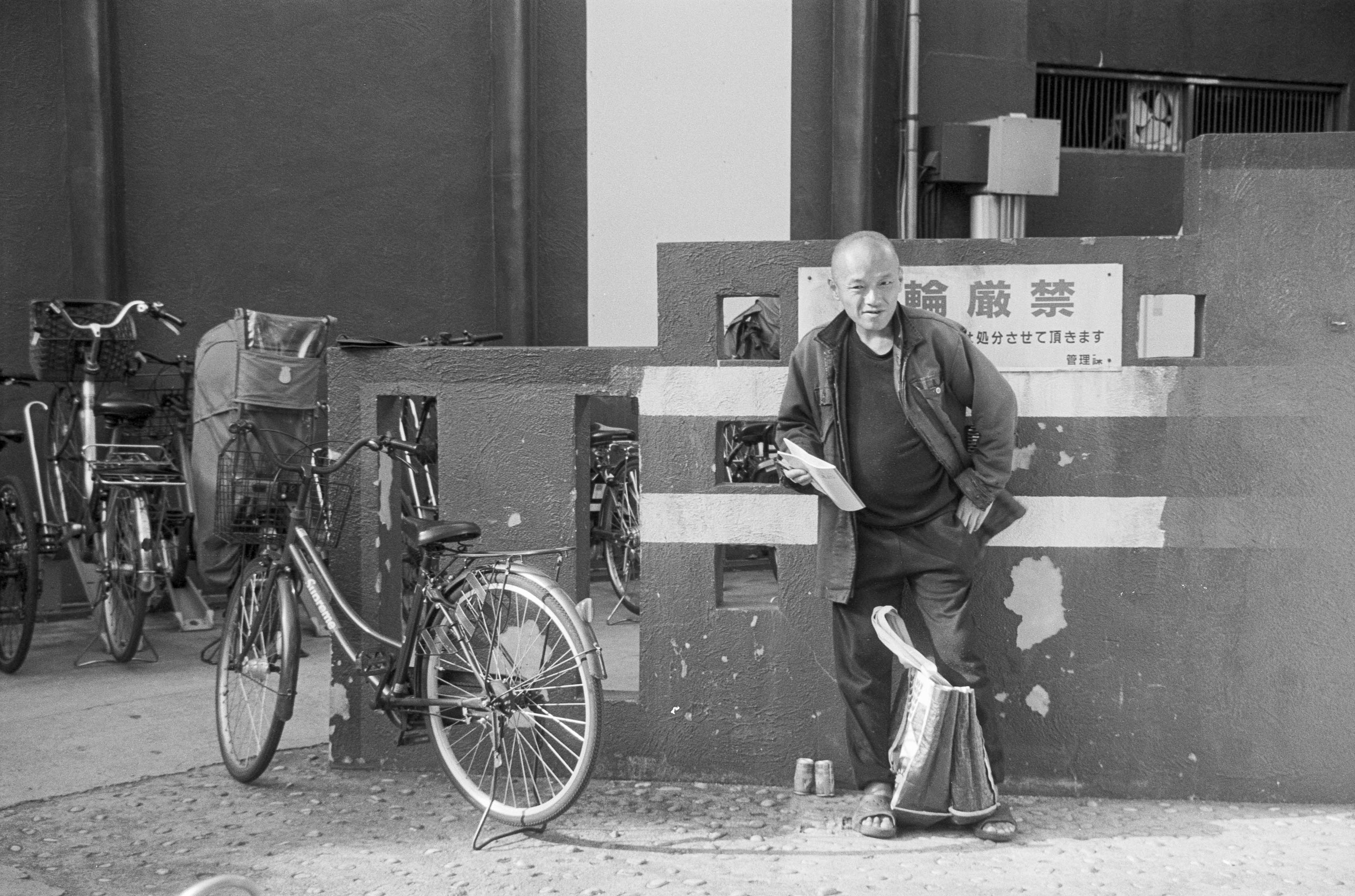
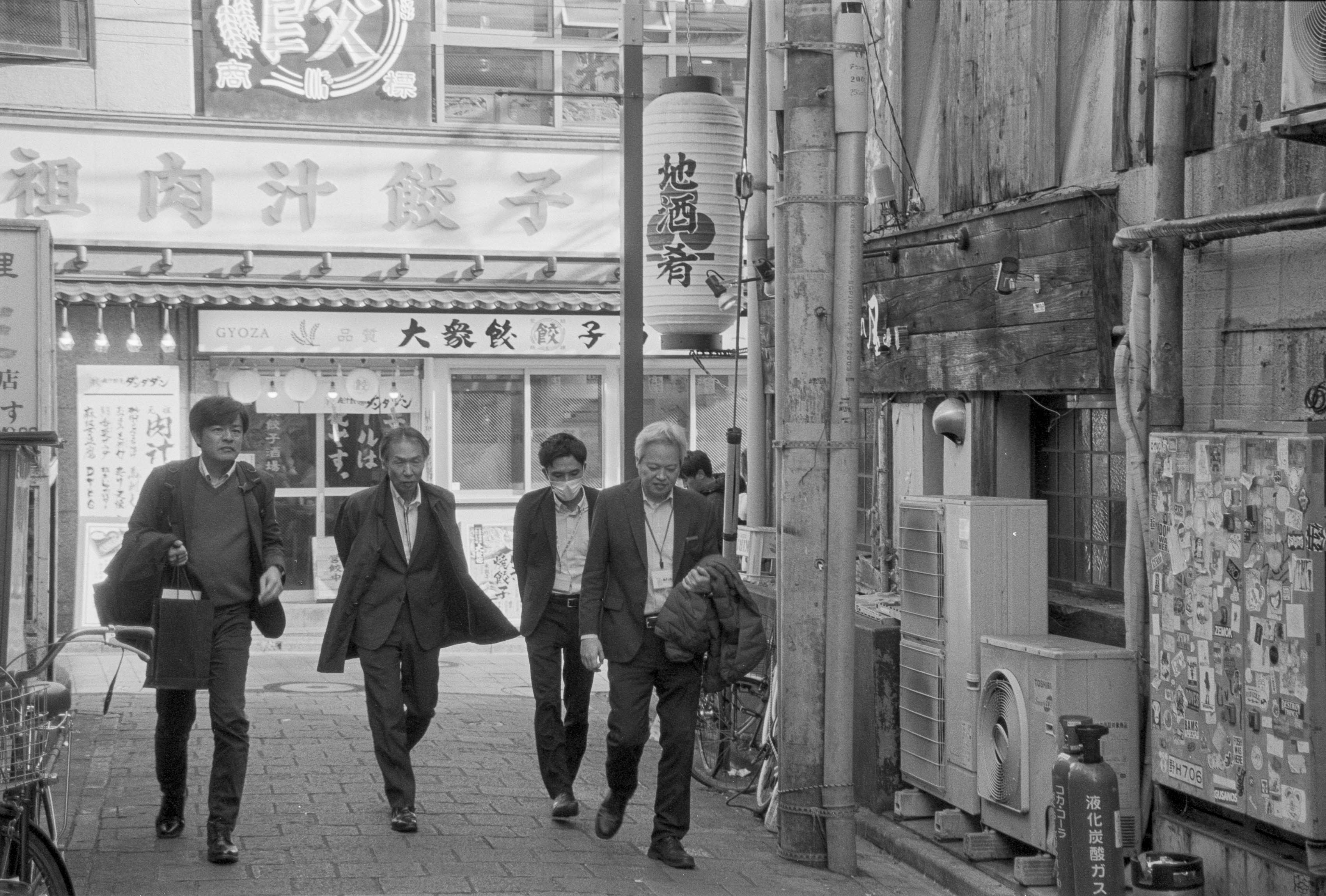
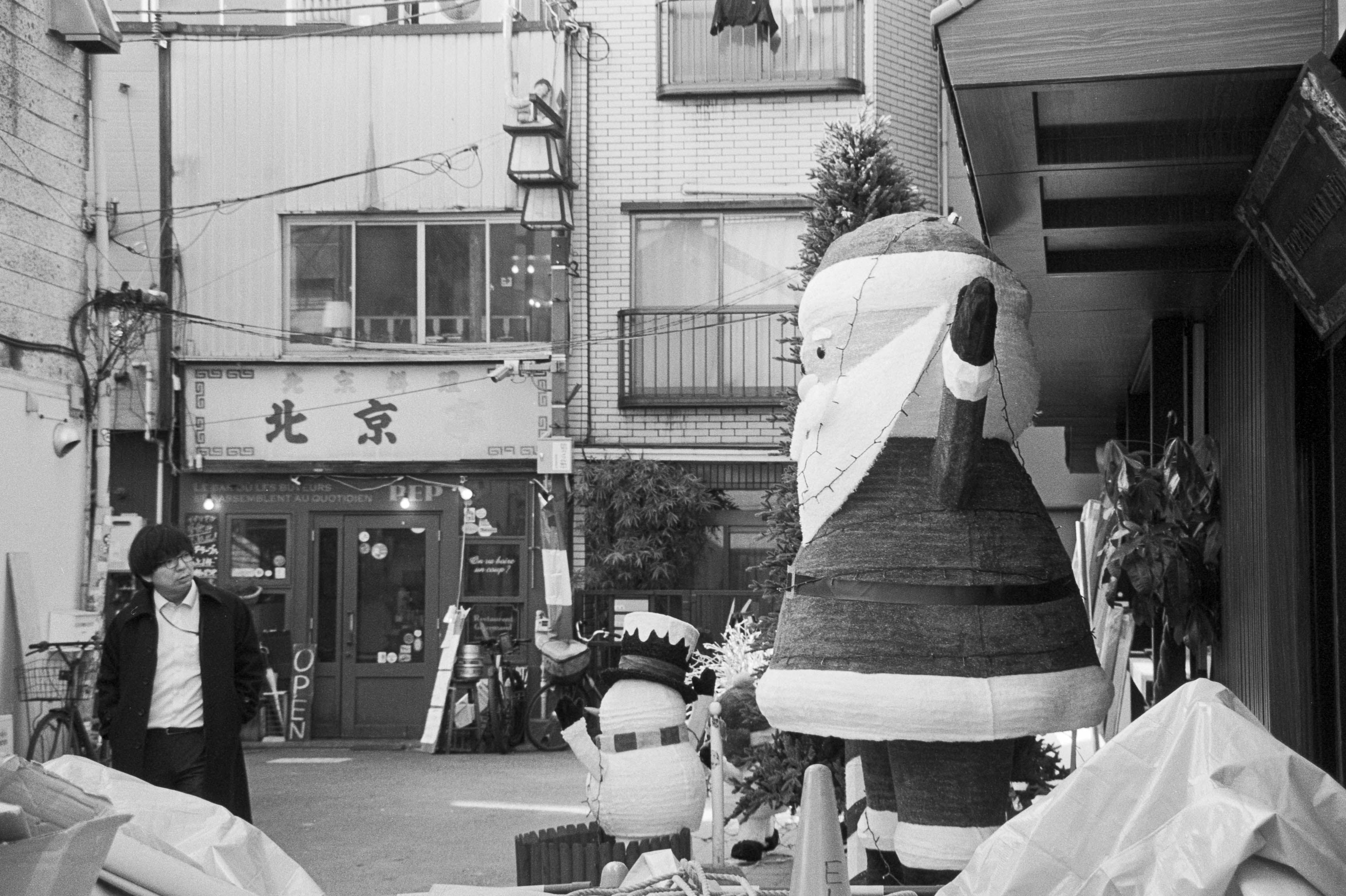
There are alternatives. Nikon’s F75 and F80 are better cameras and solve some of the N65’s irritating quirks, although they are correspondingly more expensive and, in the case of the F80, heavier. The N65’s Dynamic AF can decide to change focusing behaviour when it detects movement, which isn’t particularly helpful when you’re carefully composing something near the edge of the frame. I also find the inability to override DX film coding frustrating.
There are plenty of alternative lenses, too. Nikon’s 28-105mm and 28-85mm are excellent inexpensive choices if you don’t need the 200mm reach, while the humble 28-80mm can provide a remarkably cheap and lightweight solution. There are equivalent combinations from Canon, Pentax, Minolta and others, so this isn’t necessarily a recommendation that everyone should rush out and buy an N65.
For me, though, this combination hits that elusive golden triangle of heft, price and quality remarkably well. It isn’t perfect, and it certainly isn’t glamorous, but that’s not really the point. If I wanted perfection, I wouldn’t be shooting 25-year-old plastic cameras and cheap black-and-white film in the first place.
The N65 and Tamron 28-200mm are cheap, light, versatile and capable of producing photographs that are more than good enough. More importantly, they let me travel with one camera and one lens without feeling as though I’ve sacrificed the ability to photograph whatever happens to come along. In the end, that’s probably a much more useful quality than being cool.
So, will I be taking this combination on my next holiday? Quite possibly. And if that means leaving the expensive digital camera at home while carrying around a silver plastic Nikon that looks like it escaped from a 2000s department store, so be it. Sometimes the cheap seats have a surprisingly good view.
Just as well we have photography and video to memorialise our lives and leave a trace like digital skidmarks over human history. I’m not getting maudlin here, but I’ve been thinking about what photography will mean to me when I’m old. For some photographers, it’s about making art that is unique, groundbreaking and capable of saying something about the human condition that has never been uttered before. For me, though, I suspect I’ll be much more interested in opening an old album and looking at imperfect renderings of perfect personal memories.
That got me thinking about how I could get back to the roots of photography and make images for myself rather than for an imaginary audience. How could I create photographs that invoke the feelings of a particular time and place instead of becoming carefully polished artefacts designed to impress somebody else? The answer, I think, is to embrace imperfection rather than constantly striving to eliminate it.
A recent family trip to Sydney and southern New South Wales became an opportunity to experiment with exactly that idea. It was a low-key holiday, so I decided it deserved some low-key photography. I ended up approaching the whole thing through three pillars: printing, analogue journalling and using deliberately compromised equipment.
The first of these is printing. How many of us actually go through our Lightroom catalogues years later and relive our experiences? I’ve had access to an A2 printer at work and occasionally printed photographs, usually putting them into cheap frames. Part of the problem is that the frames themselves can be rather underwhelming, but there’s also a lingering feeling that my photographs simply aren’t important enough to deserve that much wall space.
More recently, I’ve started thinking about printing in a smaller and more thematic way. I printed a series of Tokyo photographs that concentrated on little details around Shibuya rather than trying to capture the whole city. There’s something satisfying about taking something enormous and making it small enough to hold in your hands.
That eventually led me to a Kodak Mini Shot 2 Retro. It’s a camera, but it’s also a printer, which makes it particularly appealing for this sort of project. I bought mine second-hand because apparently I can’t resist buying photography equipment, but the real attraction is the ability to print photographs almost instantly. I also had a batch of 6×4 prints made at Officeworks, which is the Australian equivalent of Walmart for office supplies, and while they use inkjet rather than wet-lab technology, they’re inexpensive and perfectly adequate for this kind of memory-making.
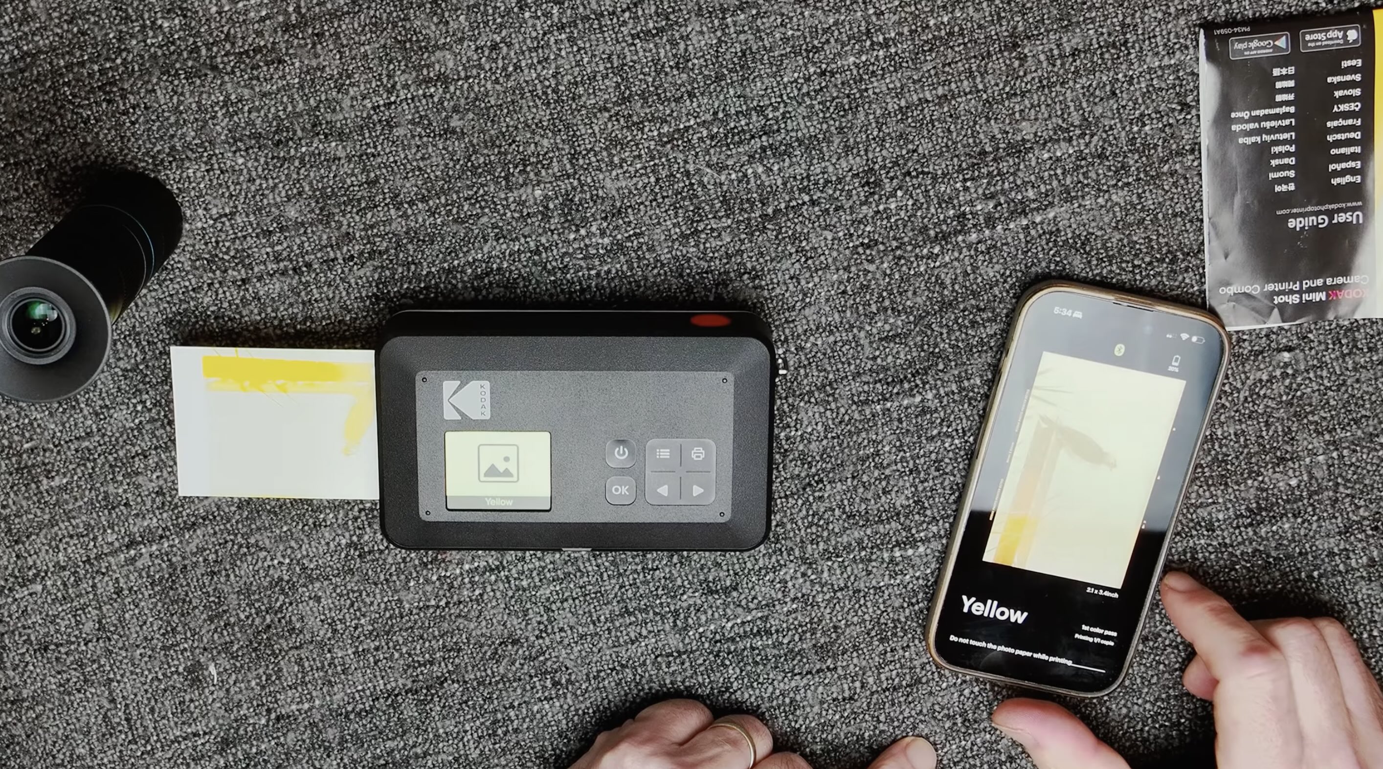
The second pillar was analogue journalling, which turned out to be considerably more frightening than I expected. My wife enjoys sketching and writing, so I thought it would be nice to document the NSW trip together on actual paper. Unfortunately, I can’t draw. My hands have the fine motor skills of a camel hoof, and that’s before we consider the neural spaghetti connecting my eyes to my fingers.
Still, that’s rather the point. This project isn’t about producing beautiful drawings. It’s about engaging with the process and accepting that the result might be terrible. There’s something strangely liberating about deliberately removing the expectation that everything needs to be good.
The third pillar was a tiny piece of equipment that actually prompted this whole experiment: the Apexel APL-T5-10X Variable Telephoto Lens. Apexel sent it to me free of charge and I get to keep it, but there were no conditions attached and my opinion remains entirely my own. The lens is designed to turn your phone into something resembling a 150–300mm telephoto camera, which sounds suspiciously ambitious for something that fits in your pocket.
Surprisingly, it doesn’t feel cheap. It’s a substantial little object with a nicely knurled metal exterior, glass elements and a multi-coated optical system. It weighs around 171 grams and has damped zoom and focus rings with a reasonably long throw. The phone adapter is also much more robust than the usual dog-clip contraptions I’ve encountered with smartphone accessories.
The results, naturally, aren’t going to challenge my full-frame Nikon or even my Micro Four Thirds cameras. There’s some softness, highlights can become a little bloomy and you have to contend with camera shake and a surprisingly narrow plane of focus. But when it gets things right, the images are actually pretty good, especially considering what this thing is. You certainly won’t be making enormous A2 prints from it, but for small prints or a journal, it works remarkably well.
Using the lens around wetlands was fun, although I quickly discovered that phones don’t particularly enjoy shooting telephoto video. A tripod helps, as does using the right camera on the phone, and there can be some circular vignetting if you attach the lens to a wide-angle camera. These are compromises, but that’s exactly what this project was about.
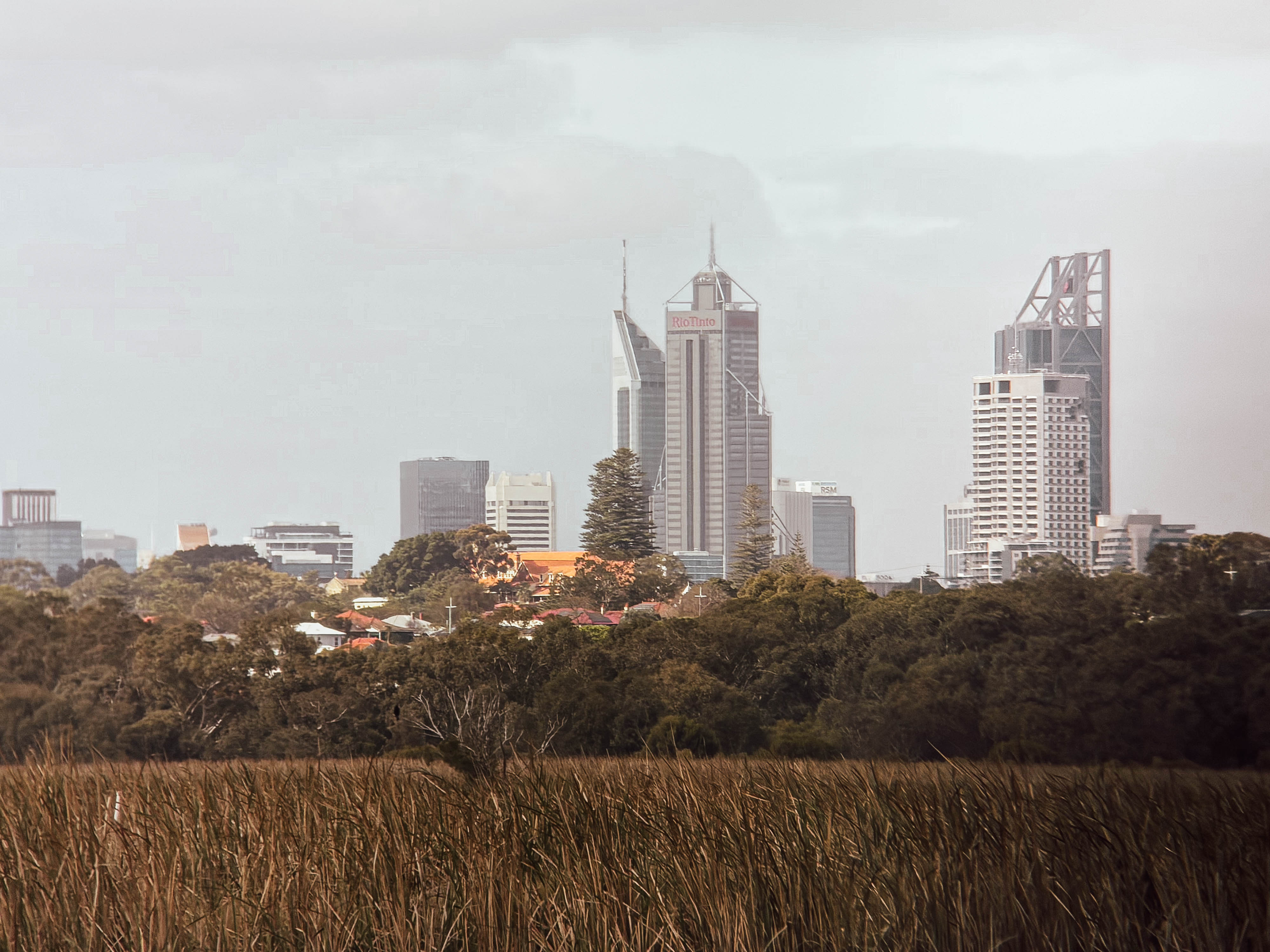
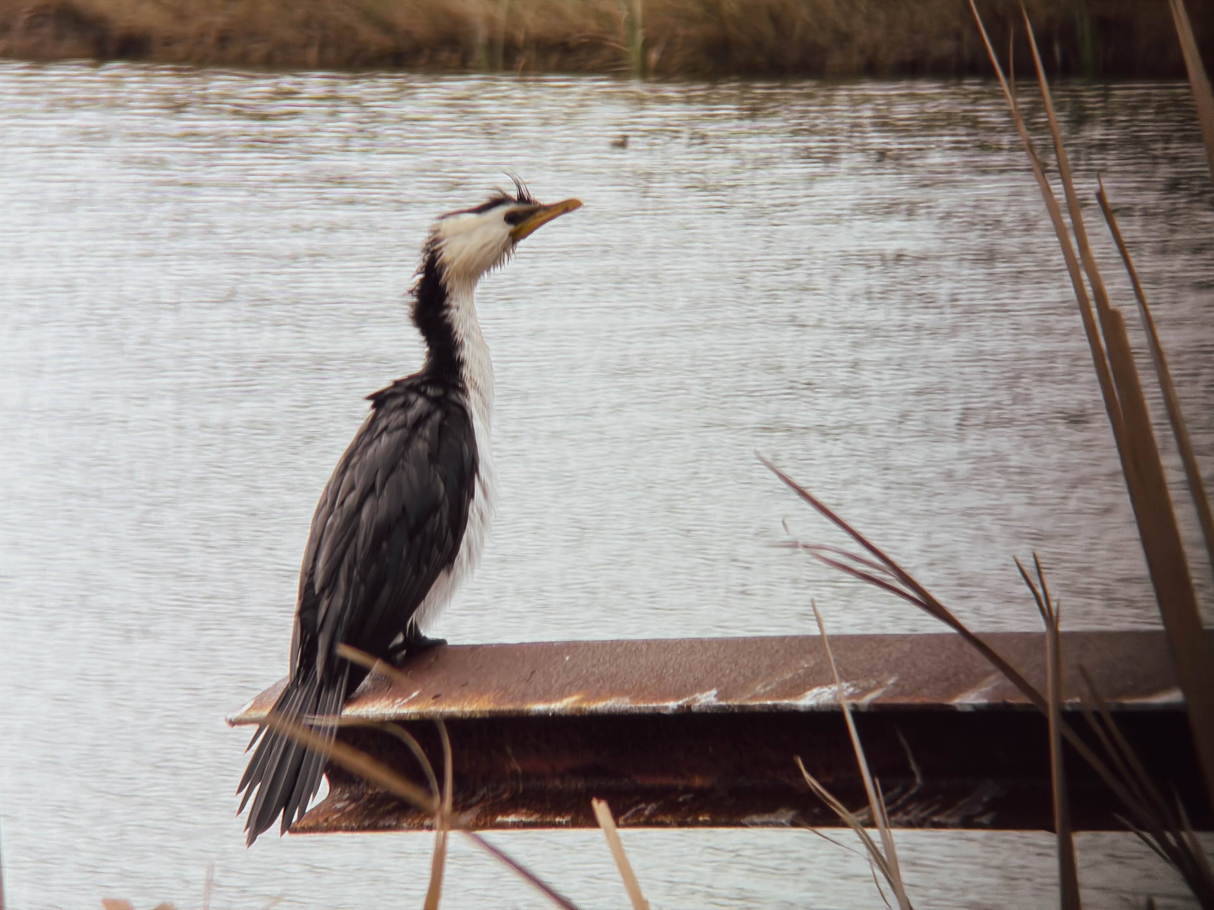

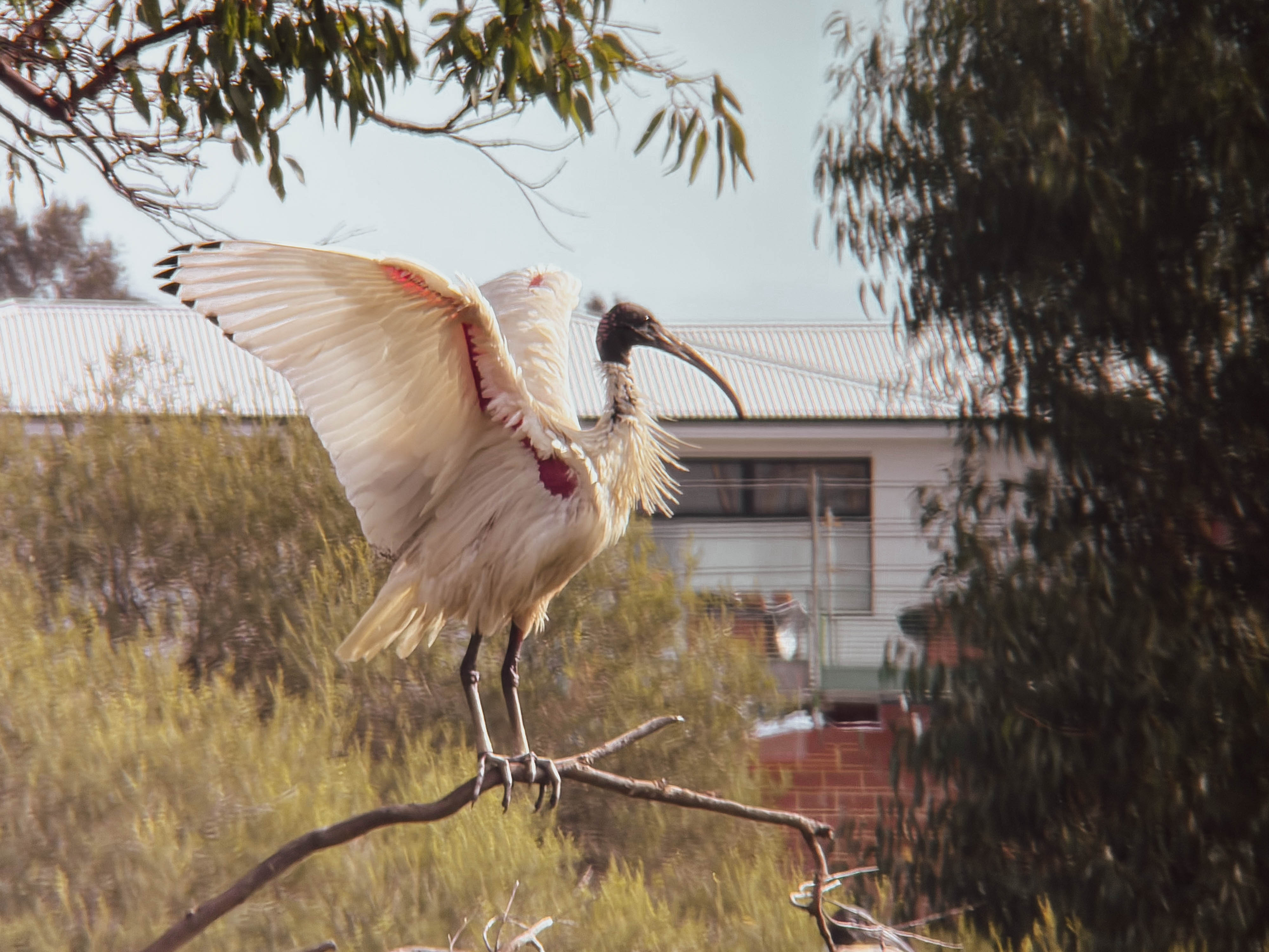
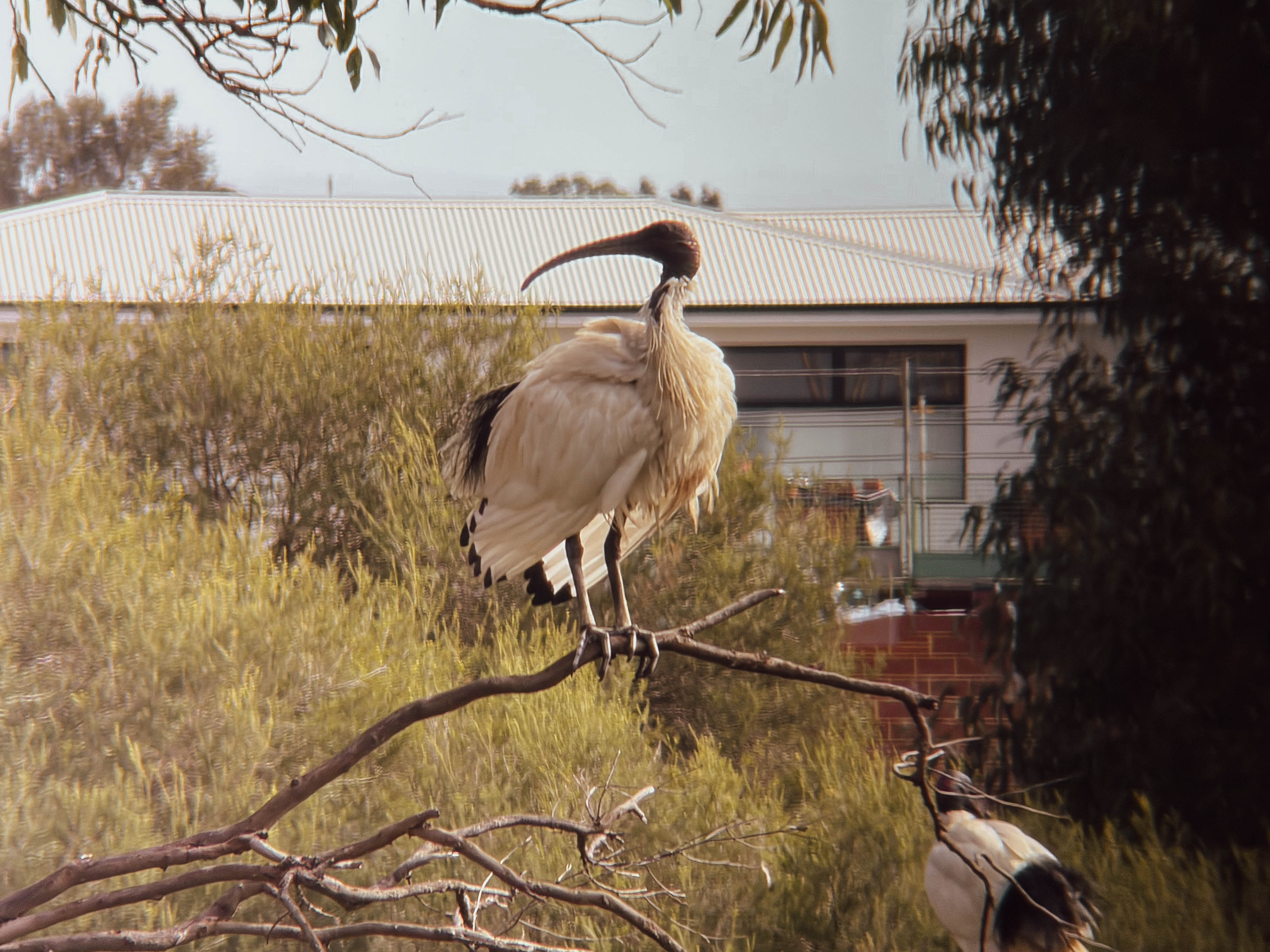
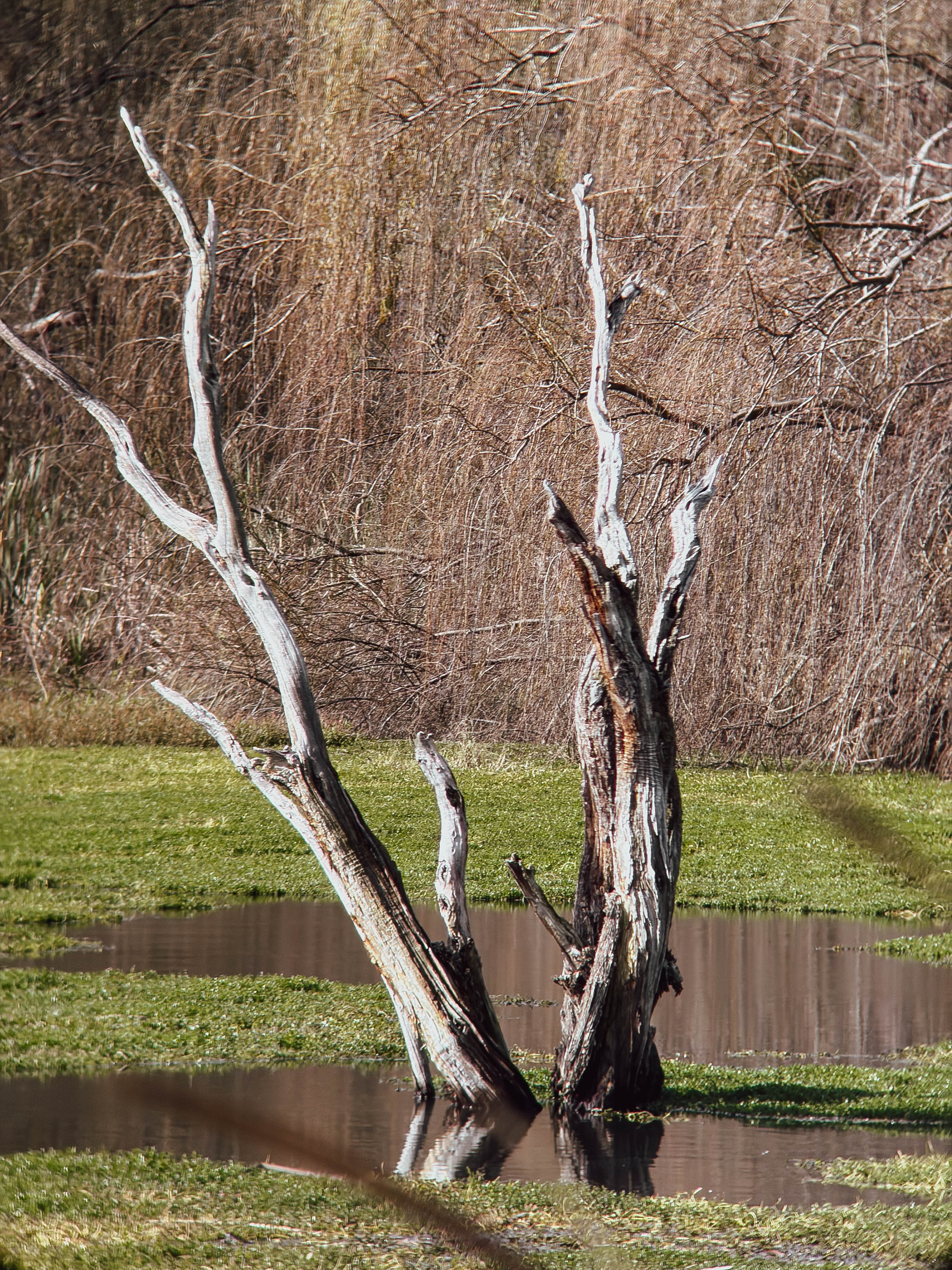
Back in Perth, I continued the journal, adding photographs and attempting to draw a bird that somehow transformed into what looked like a Liverbird on crack. It was not my finest artistic achievement, but it was mine. The important thing was that these imperfect tools forced me to slow down and actually consider what I was doing.
That might be the biggest benefit of all. The Kodak printer, the Apexel lens, the pen and the paper are all relatively cheap and accessible, but they also introduce friction into the creative process. You have to think, plan and physically engage with what you’re making. A blank page is intimidating, but somehow it becomes less intimidating when you give yourself permission to make something bad.
I’ve realised that reconnecting with analogue processes has made me feel creatively engaged in a way I wasn’t expecting. Perfection is highly overrated. The world is already full of perfectly manufactured objects and clinically perfect images that can sometimes feel more like products of mass production than things made by an individual.
When I travel, I’d much rather eat a home-cooked meal than a Michelin-starred dish, and believe me, when I cook, perfection is not exactly on the menu. But something made with love and consideration carries memories and feelings that have value far beyond any objective measurement.
That’s probably what I want from my photography too. I might not draw in this journal every day, and I may never become remotely competent at sketching, but when I return to it years from now, I’ll remember the trip. The crooked drawings, cheap prints and imperfect photographs will probably mean more to me than the technically flawless images ever could.
In a strange way, this also connects back to YouTube. Taking photographs, curating them and turning them into a story helps me relive my experiences, while sharing them allows those memories to become something communal. I’ve been thinking about doing something similar with my accumulated photographs from Japan, perhaps turning them into a book or zine around ideas such as wabi-sabi—finding beauty in imperfection—and ikigai, engaging with activities for their intrinsic pleasure.
Perhaps that’s where this whole experiment is heading. Maybe it’s a little bit of Shu-Ha-Ri: learning the basics, absorbing the experience and eventually finding your own creative trajectory. For me, at least, that trajectory seems to involve fewer demands for perfection, more tangible creativity and, most importantly, enjoying the process along the way.
The recent demise of my beloved Fuji medium format point-and-shoot left me with photographic trauma that still hasn’t quite healed. If there were anything capable of adding fresh scars to that emotional damage, it would surely be expired film. After all, paying good money for something that’s already gone off feels completely irrational. I wouldn’t eat a mouldy sandwich that’s been sitting in a school bag for twenty years, so why would I willingly load twenty-year-old film into a camera?
Yet expired film has an undeniable appeal. Plenty of photographers swear by its unpredictable character, embracing colour shifts, grain and imperfections as part of the experience. I’ve never really belonged to that particular camp. If expired film were dramatically cheaper than fresh stock, I might understand the attraction, but these days many old rolls cost almost as much as new ones.
Fortunately, I didn’t have to buy this roll. My brother-in-law picked up some AgfaColor XRG 200 while visiting Spain several years ago and kindly passed a few rolls on to me. So, armed with film that expired in 2001 and expectations hovering somewhere below sea level, it was time to see whether this forgotten emulsion still had anything left to offer.
The original plan involved an early morning trip to Perth’s beaches, but the weather had other ideas. Rain is such a novelty in Perth that the first shower feels almost like a public celebration. Once the excitement wears off, though, you’re simply wet, so I postponed the outing and instead headed into the city under far more typical blue skies.
Conventional wisdom suggests overexposing expired colour negative film by roughly one stop for every decade past its expiry date. At 21 years old, that meant treating this ISO 200 film as roughly ISO 50, while also remaining willing to give it even more light if conditions allowed.
I also tried to stack the odds in my favour by using a Nikon N80, whose Matrix metering was considered impressively sophisticated when both the camera and this film were new. Paired with Nikon’s versatile 28-300mm zoom, it offered the flexibility to photograph whatever caught my eye, even if the relatively slow aperture wasn’t ideal for ageing film.
I’d never been particularly fond of Agfa’s colour films, even when they were fresh. Compared to Kodak or Fuji, I’ve always found Agfa prone to muddy shadows and an overly magenta colour palette. Naturally, I expected two decades of ageing to make those weaknesses even worse.
Instead, I was greeted with something unexpected.
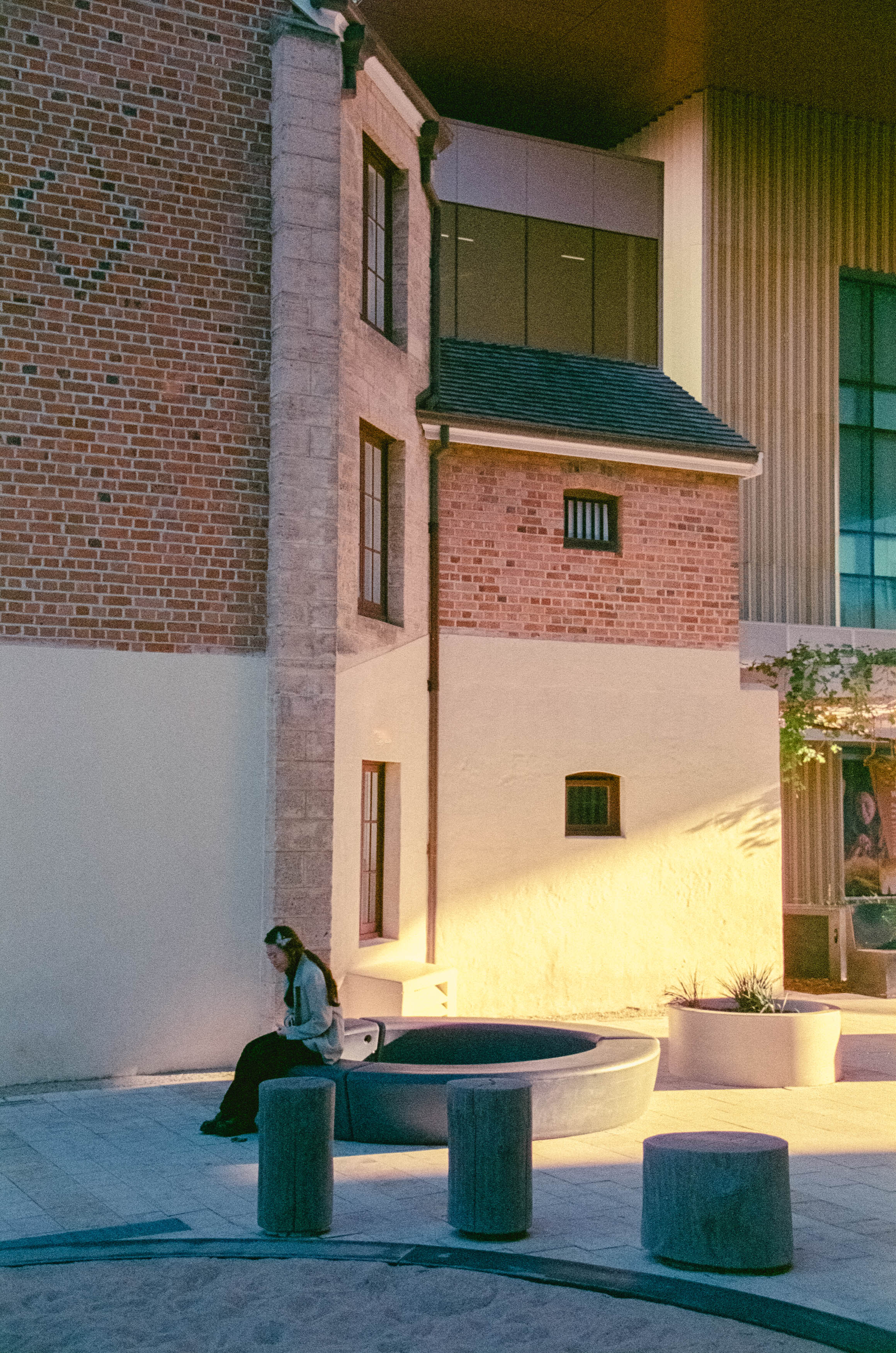
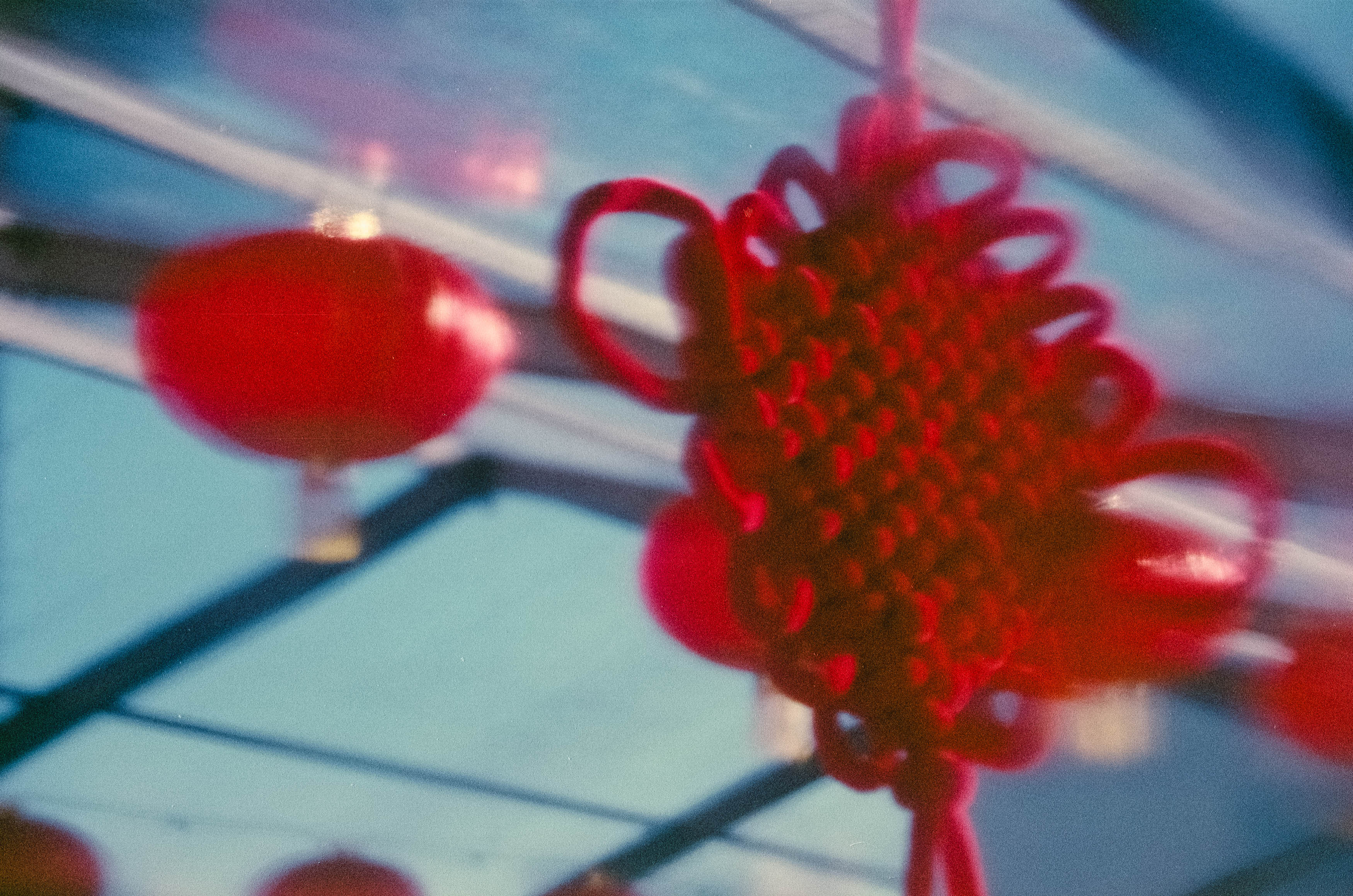
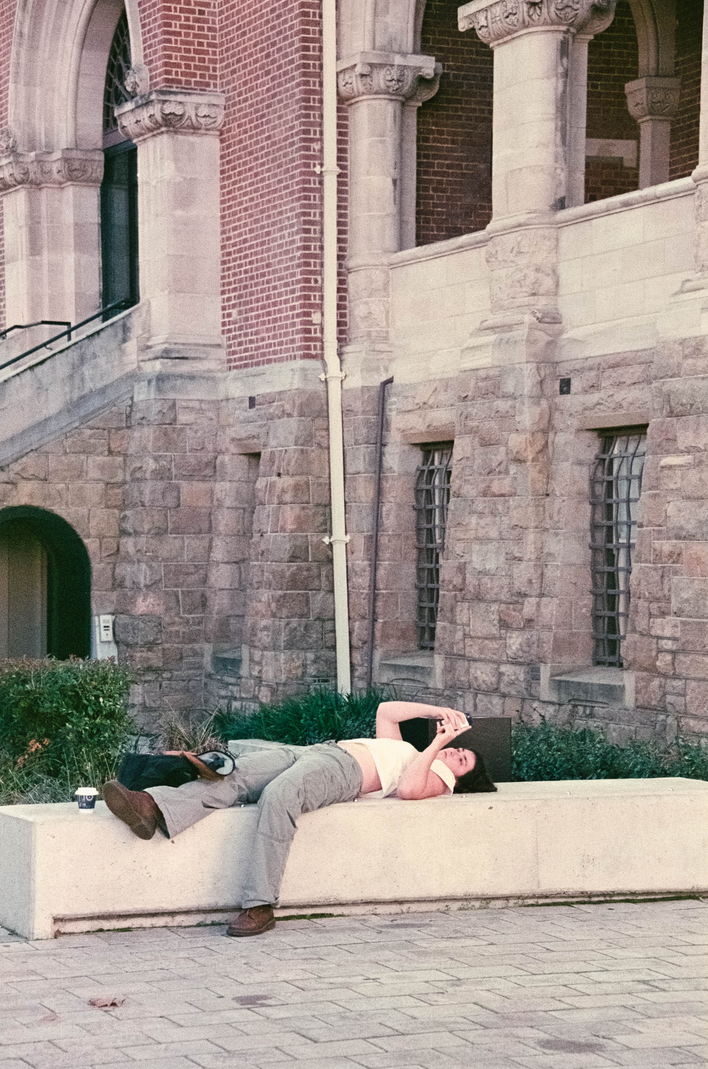
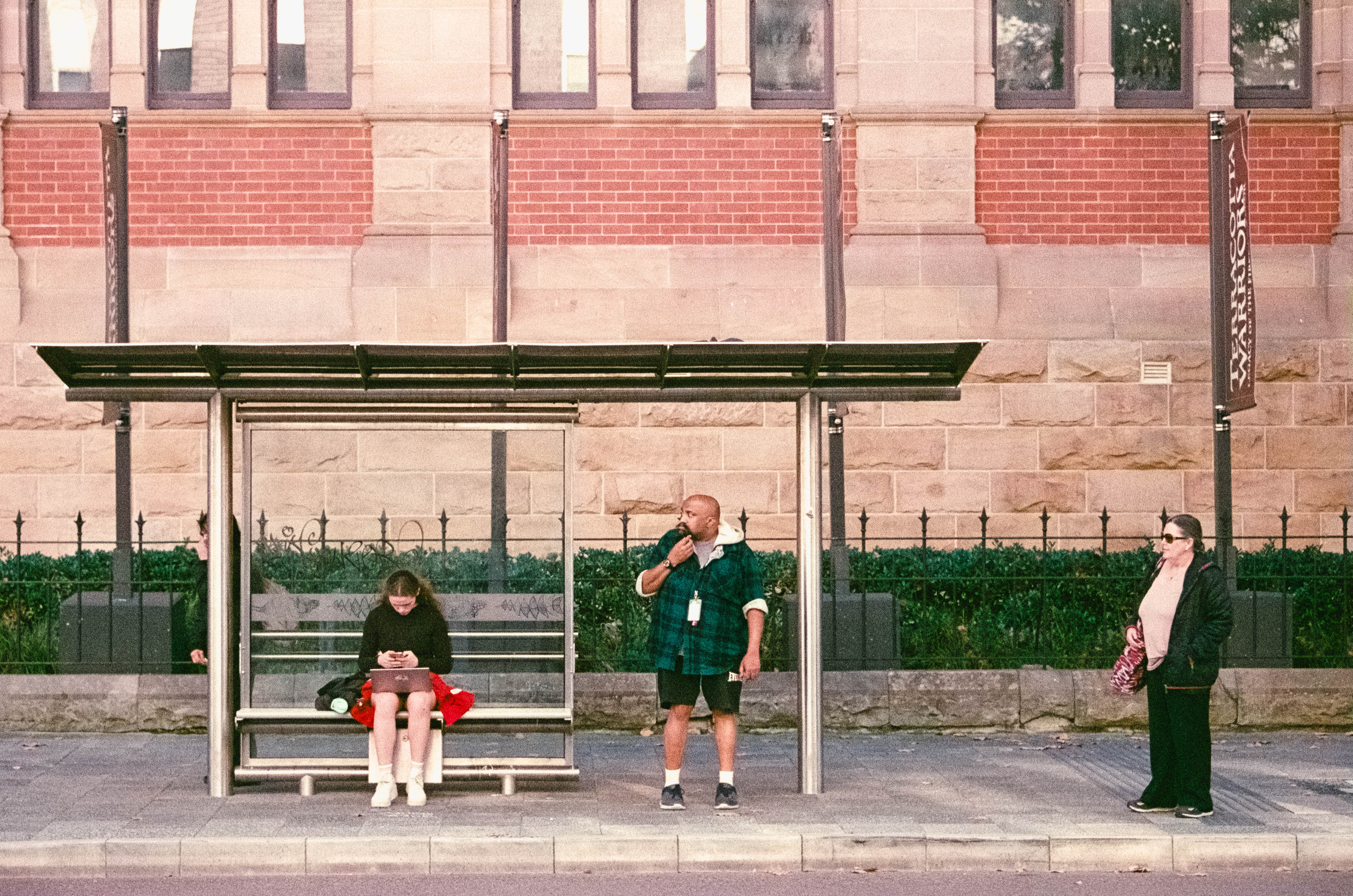
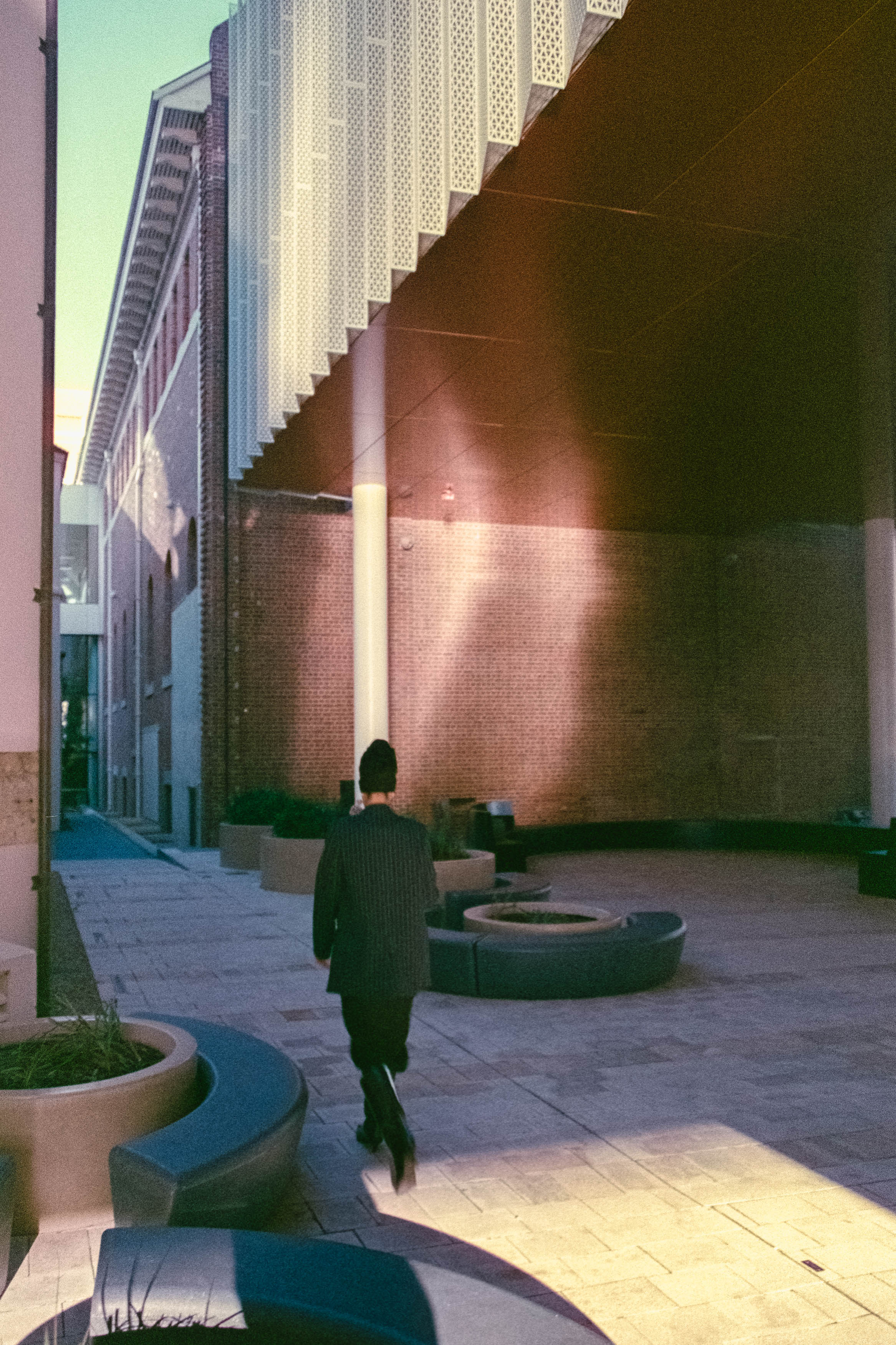
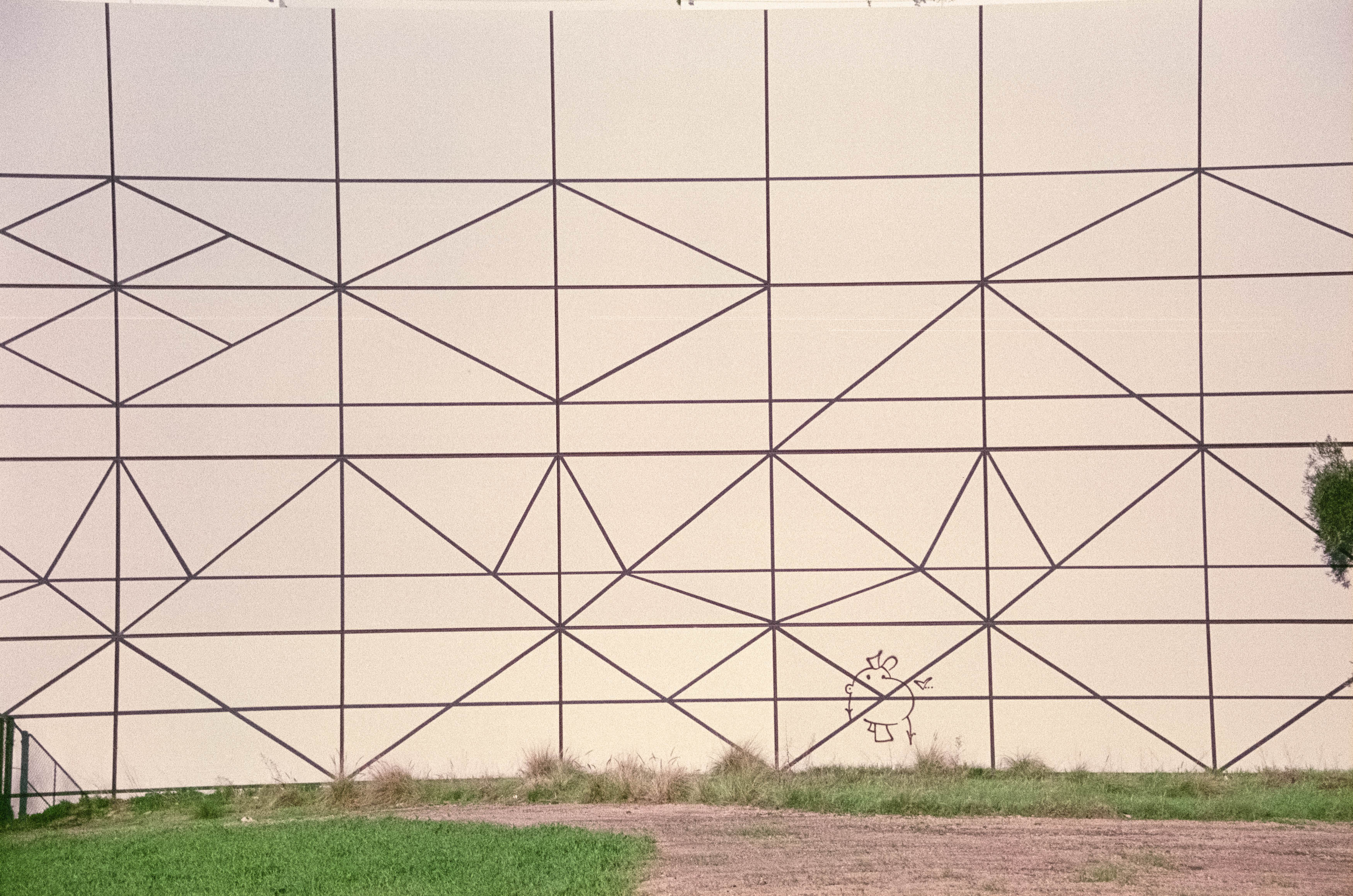
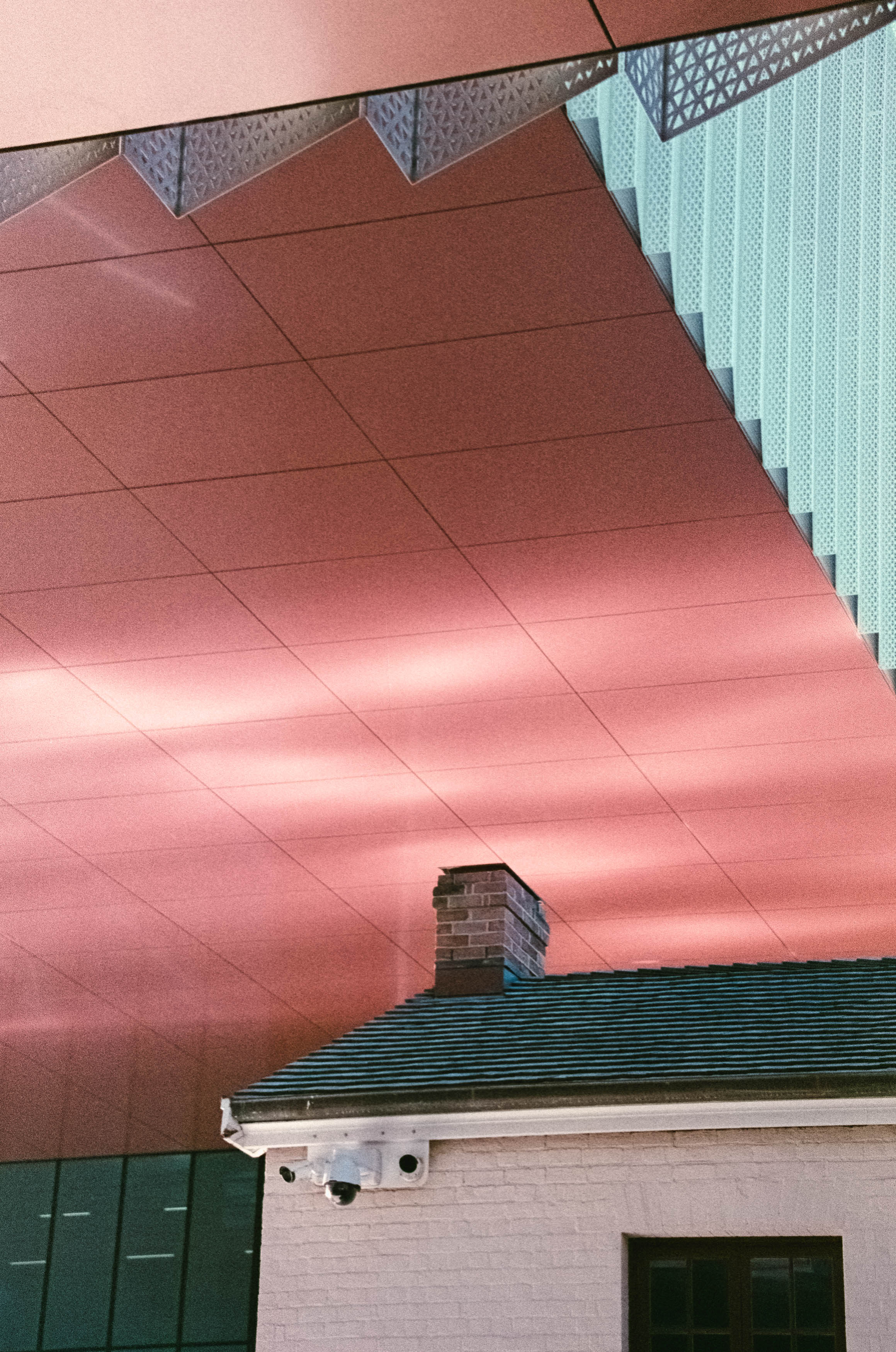
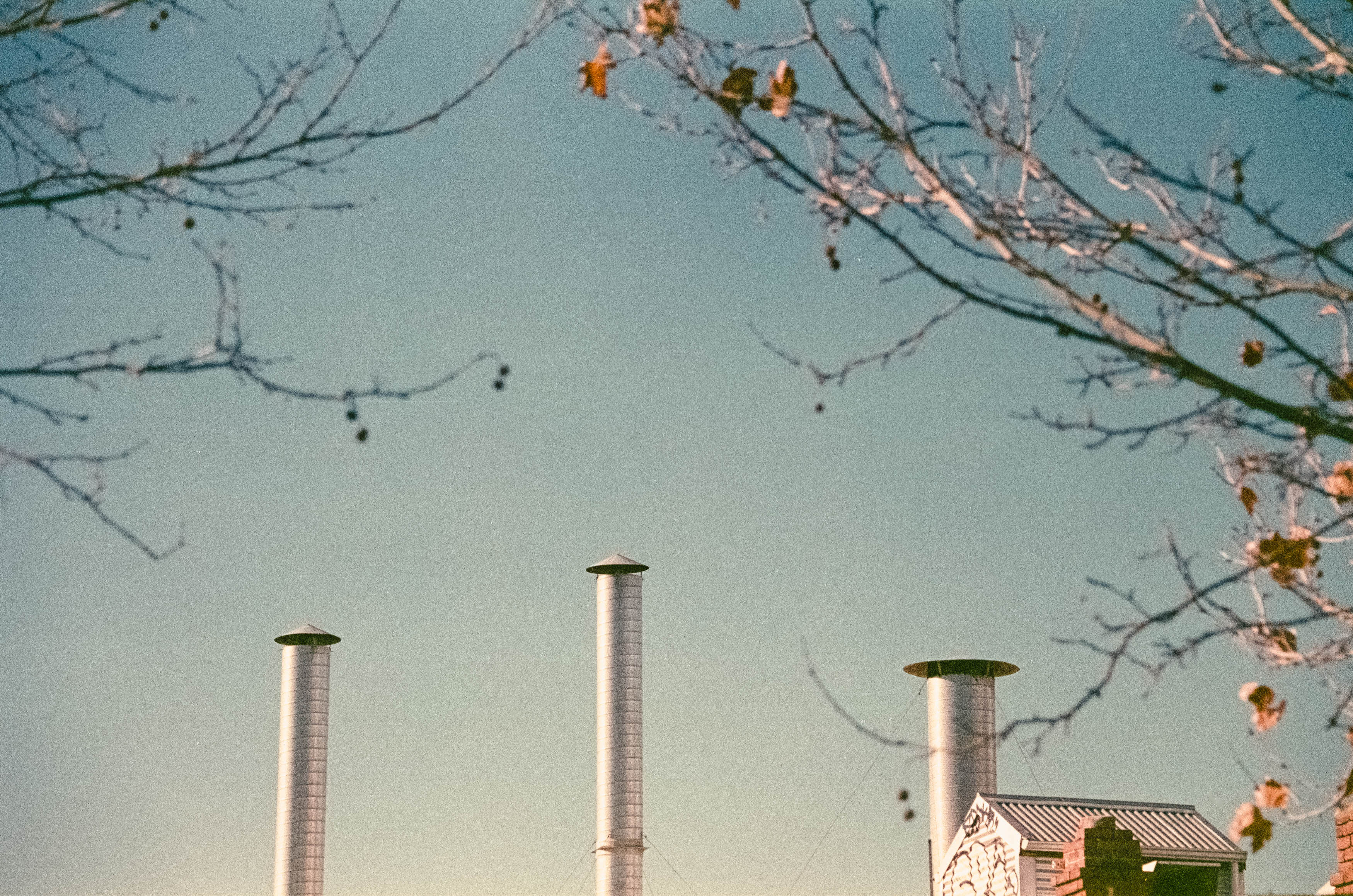
The first victory was simply that the film worked at all. Given my previous encounters with expired film, I’d fully expected another disaster. Instead, the generous exposure produced enough image density to cut through the inevitable base fog, leaving negatives that scanned surprisingly well.
There was certainly evidence of the film’s age. Grain was more noticeable, colours had shifted slightly and contrast wasn’t quite what fresh film would deliver. Even so, the results were far more usable than I’d anticipated. Static subjects came out especially well, while moving subjects occasionally defeated both the ageing emulsion and the slower zoom lens. Rather than feeling ruined, though, some of those imperfect frames developed a charm all of their own.
Reviewing my favourite images, I realised I’d accidentally assembled a mixture of street photography, architecture, minimalism and abstract compositions. More importantly, I genuinely liked several of them. Considering how low my expectations had been, that felt like a genuine success.
Expired film may never replace fresh stock in my camera bag, and I’m still not convinced it’s worth today’s inflated prices. However, this roll reminded me that photography doesn’t always reward certainty. Sometimes lowering your expectations leaves plenty of room to be pleasantly surprised.
Unlike my dearly departed Fuji GA645Zi, this ancient roll of Agfa actually delivered. That’s enough to spare it from photographic damnation, at least for now. As for me, I may be approaching my own use-by date, but there are still plenty more questionable photographic adventures waiting just around the corner. If nothing else, they should provide fresh material for the next chapter of my ongoing catalogue of photographic misadventures.
The beginning of the end for my Fujifilm GA645Zi can be traced back to Berlin in mid-2024. After spending several miserable days confined to a hotel room with COVID, my final evening brought just enough recovery to venture outside. Alexanderplatz seemed like the perfect place to stretch both my legs and the shutter of a camera that had travelled with me for the better part of a decade.
The GA645Zi is an unusual machine. It’s a medium format point-and-shoot from 1998 that somehow combines professional image quality with the appearance of an oversized family holiday camera. It shoots 6×4.5 negatives, which may be the smallest of the medium format options, but they’re still enormous compared to 35mm film. That extra real estate gives your photographs an incredible amount of detail while still allowing a reasonably compact camera to accompany you on your travels.
Of course, not every photograph from Berlin was a masterpiece. That’s partly because photography is an excellent way to discover your own shortcomings on a regular basis, but the camera itself deserves some of the blame. On paper, the specifications don’t exactly inspire confidence. The 55-90mm zoom translates to roughly 34-56mm in 35mm terms, with only four zoom positions to choose from. At the long end, the maximum aperture falls to a leisurely f/6.9, leaving very little room for low-light photography while still giving you all the opportunities for camera shake that come with a 90mm lens.
Despite those limitations, the lens itself is astonishingly sharp. The GA645Zi was never a cheap camera, and while the body feels disappointingly plasticky, the negatives it produces are spectacular. Zooming into the scans reveals detail that seems almost endless, reminding you why photographers continue to pay increasingly eye-watering prices for these cameras today. I bought mine around ten years ago for roughly a quarter of what they’re worth now, and for years it rewarded me with images that justified every compromise.
As the Berlin sun disappeared, so too did my confidence in the camera’s future. The notorious weakness of the GA645Zi is its rear LCD panel, connected by a ribbon cable that flexes every time the camera is opened for loading film. Eventually that cable fails, and mine began displaying the first telltale flickers that countless owners before me had documented online.
The camera still functioned, so I loaded another roll and headed into the gathering darkness. Night photography with this Fuji was always going to be challenging. Ilford HP5 pushed to ISO 1600 has served me well in other cities, and I’ve even shot colour film after dark in places like Shinjuku and South Korean markets. Berlin, however, felt different. Empty squares, dim lighting and reflective surfaces made flash photography more frustrating than helpful, while my own developing mistakes probably didn’t do the negatives any favours.
Rather than fight the darkness, I eventually decided to embrace it. Cropping away unnecessary empty space and leaning into deep shadows produced images that felt more atmospheric than documentary. Streetlights reflecting from tram tracks, isolated figures disappearing into blackness and fragments of illuminated architecture became studies in mood rather than perfect technical photographs. Some images asked viewers to complete the story themselves, filling the darkness with their own interpretation.
The GA645Zi wasn’t finished just yet. On a later trip through China, the LCD had deteriorated so badly that I could barely read it, but I managed to improvise. By comparing the camera’s exposure readings against a phone light meter, I convinced myself that as long as the ISO setting matched, perhaps the missing display wasn’t the end of the world.
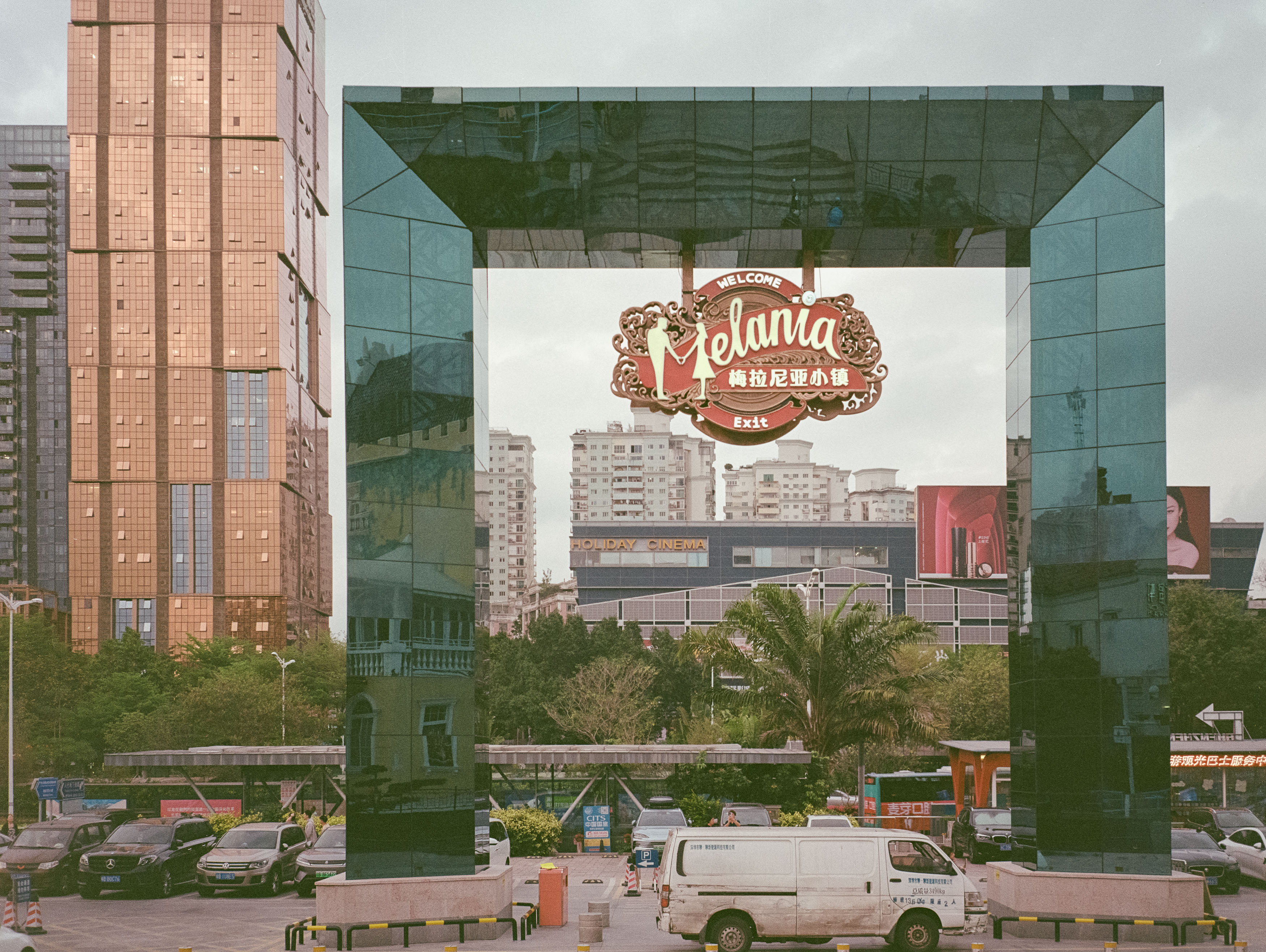
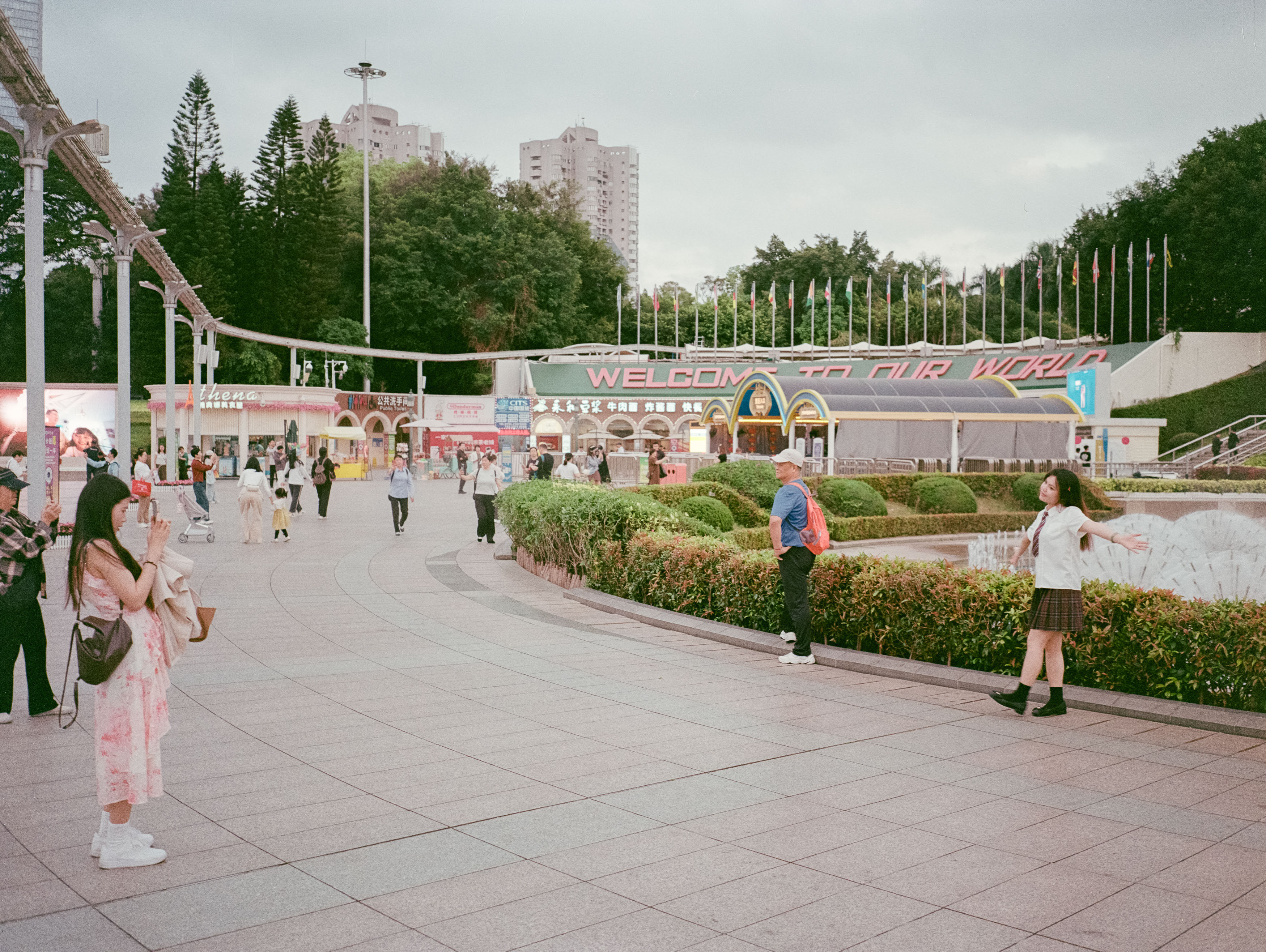
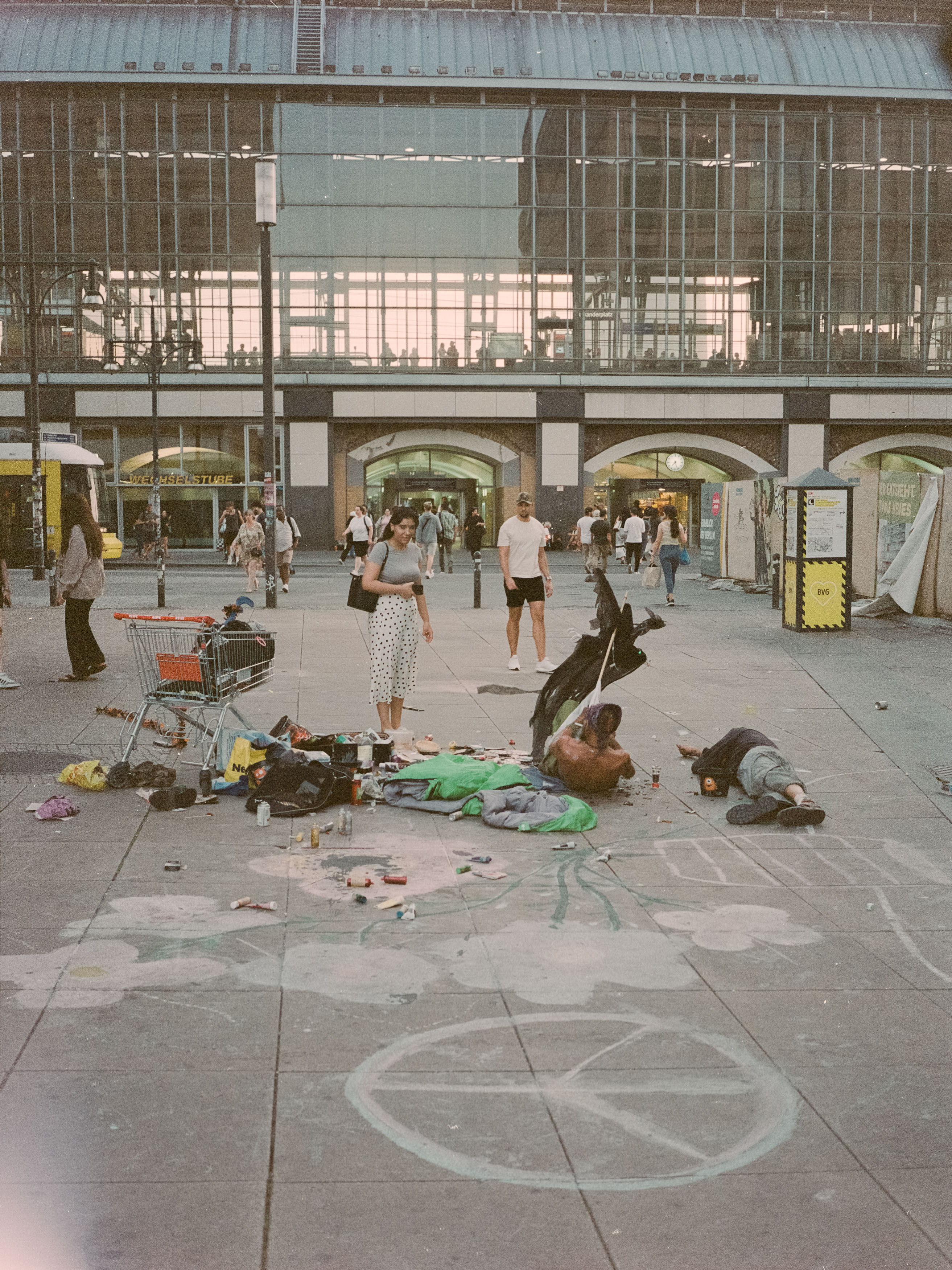
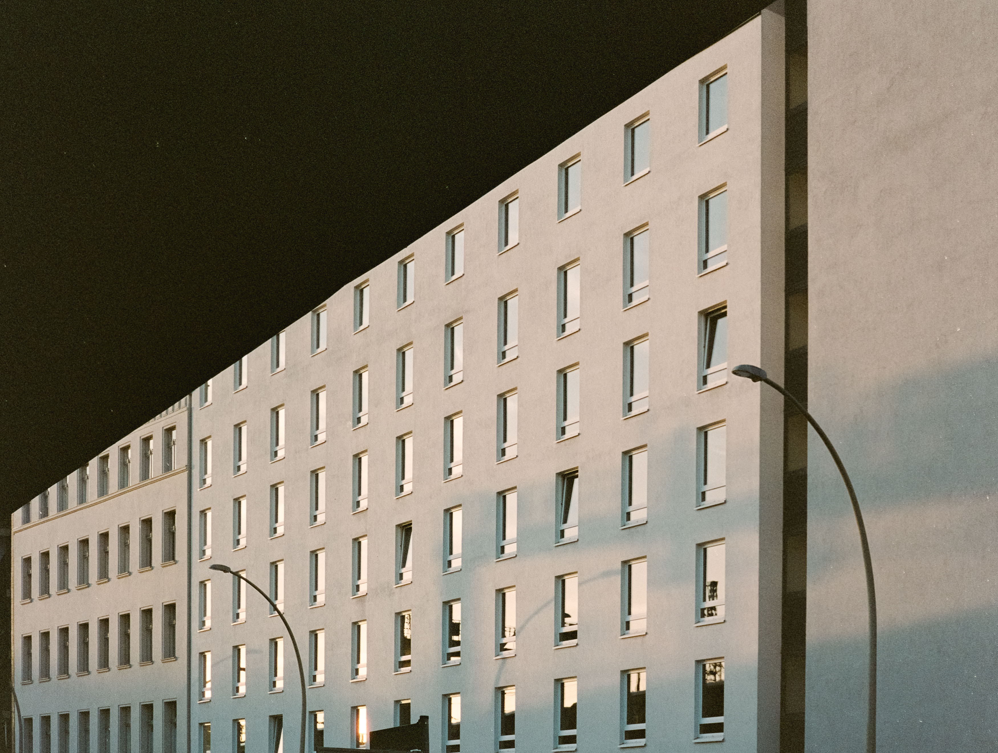
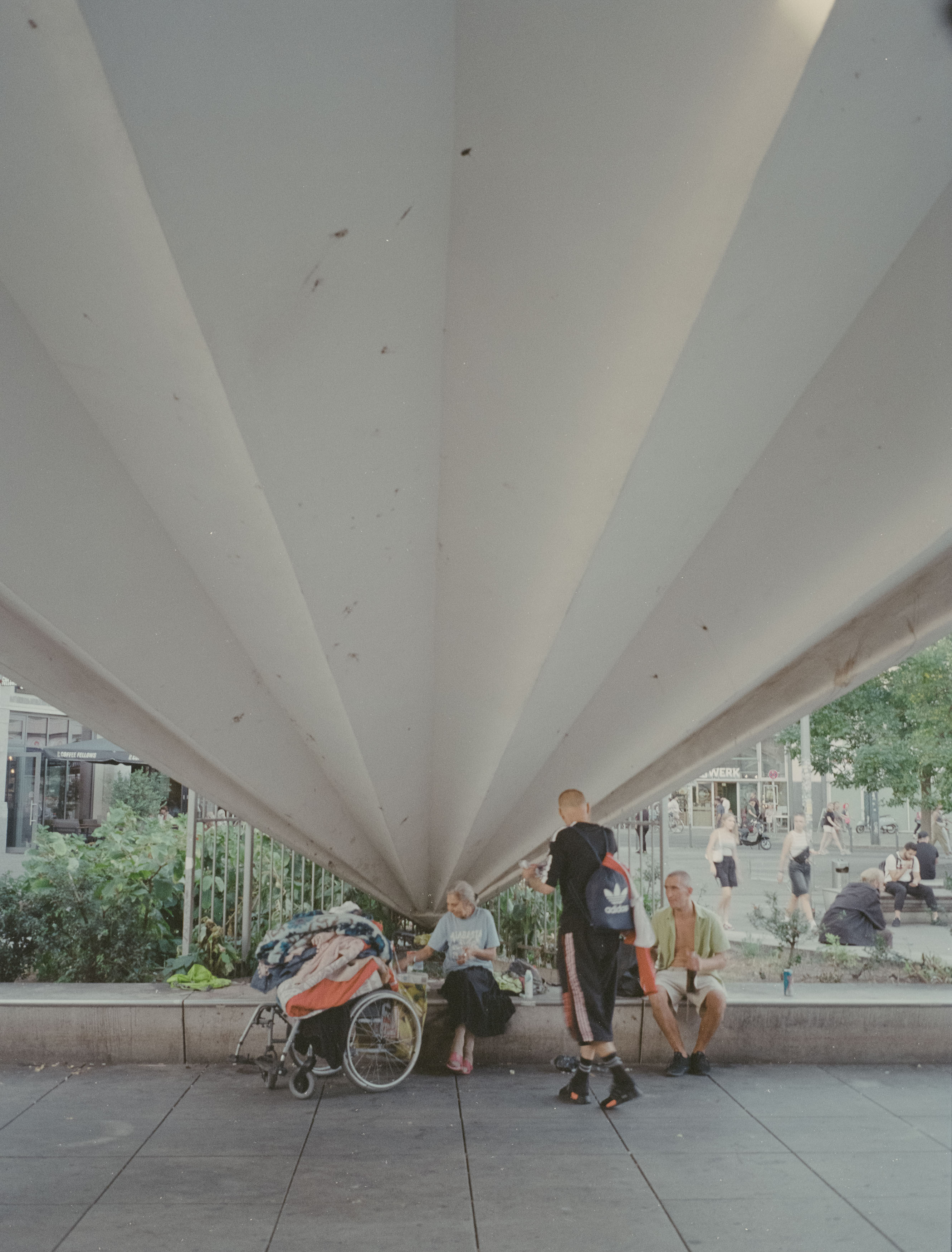

After all, the qualities that make this camera special remained intact. The viewfinder still displays shutter speed and aperture information, which is essential given the relatively slow lens and the razor-thin depth of field that medium format provides. When the autofocus gets things right, the results are genuinely superb.
Unfortunately, “when” is doing a lot of work in that sentence. The autofocus has always been somewhat optimistic about its own abilities, occasionally deciding that somewhere near your intended subject is close enough. The camera is also painfully slow. Switching it on feels remarkably similar to trying to wake a teenager for school. It pauses, contemplates life for a moment, and then reluctantly gets moving with as much complaining as possible.
That makes it a poor choice for decisive street photography, yet somehow it still produced some of my favourite travel images. Whether wandering through Vietnam, Japan, Barcelona or elsewhere, the combination of medium format resolution and an unobtrusive automatic camera often resulted in photographs that simply felt different. Massive negatives are arguably better suited to sweeping architecture, dramatic landscapes and iconic locations than everyday street scenes, but the GA645Zi always tempted me to use it for everything.
One of its final adventures took place in Shenzhen’s Overseas Chinese Town, where replicas of famous landmarks from around the world provided an appropriately surreal setting for a camera that itself seemed full of contradictions. A sophisticated medium format system disguised as a disposable point-and-shoot felt perfectly at home photographing imitation Venice inside one of the world’s youngest megacities.
By the end of that trip, the LCD had finally died completely. Unfortunately, the problem turned out to be more serious than simply losing information on the display. Whatever electronics had failed also prevented the film from advancing correctly. Film would load, exposure compensation still functioned, but the camera simply refused to wind on. After years of faithful service, it had reached the end of the road.
Over the past decade this Fuji accompanied me across Europe and Asia. It documented family history, quiet personal moments and famous destinations alike. It visited places connected to my family’s experiences during the First World War, wandered through Aix-en-Provence, Kuala Lumpur, Japan and countless other cities, while also recording the ordinary family photographs that often become the most precious years later. Medium format has a wonderful way of preserving tiny details that you barely notice at the time but come to treasure with hindsight.
Looking back through its final rolls, there are still plenty of photographs worth celebrating. As always, they combine people, architecture and those odd little moments that somehow define travel better than famous landmarks ever could. The camera occasionally produced technical disasters alongside genuine gems, but perhaps that’s part of its charm.
I’ll genuinely miss the Fujifilm GA645Zi, although not enough to pay today’s inflated prices for another one. Losing it felt surprisingly similar to saying goodbye to an ageing pet: increasingly slow, occasionally unreliable and prone to little accidents, yet a loyal companion that had been there for some remarkable experiences.
Thankfully, medium format photography doesn’t end here. There are other cameras waiting for future adventures, including one substantially larger beast with enormous 6×9 negatives and, perhaps most importantly, absolutely no electronics waiting to self-destruct. It may make me look even more ridiculous carrying it through airports and city streets, but at least I won’t be worrying about ribbon cables every time I load a roll of film.
There are lenses you use every day, and then there are lenses that completely change the way you see the world. The Voigtländer 15mm Super Wide-Heliar f/4.5 LTM definitely falls into the second category.
I recently packed it for a trip to Vienna, partly because the city’s grand architecture seemed like the perfect playground for an ultra-wide lens, and partly because I wanted to see whether this quirky little optic still deserved its reputation. After spending time with it on both my Leica M2 and Nikon Z6, I came away impressed—but also reminded that a 15mm lens demands far more from the photographer than most people realise.
This isn’t the sort of lens you casually leave on your camera. It’s more like a special occasion lens that rewards patience, careful composition and a willingness to embrace the strange.
Fifteen millimetres is unbelievably wide. Point it at a scene and it doesn’t simply capture what’s in front of you—it seems to swallow everything around it as well.
The first thing you notice is how dramatically it changes perspective. Objects close to the camera become enormous, while anything further away quickly shrinks into the distance. Straightforward compositions suddenly become much more complicated because every corner of the frame starts demanding your attention. If there isn’t something interesting happening throughout the image, you’ll often end up with a photograph that contains an awful lot of… well… not very much.
That’s why using this lens feels like learning photography all over again. You can’t rely on the habits you’ve built shooting 35mm or 50mm lenses. Instead, you have to train yourself to notice foreground subjects, converging lines and the relationships between objects across the entire frame.
Vienna turned out to be the ideal place to practise. The city is packed with grand Baroque and Neoclassical buildings, wide boulevards and impressive public spaces that suit this kind of exaggerated perspective beautifully. Even ordinary streets can suddenly feel dramatic when viewed through such an expansive field of view.
Not every outing went entirely to plan, though. During one photo walk I accidentally wandered into what appeared to be the filming of a historical production and quickly realised I wasn’t quite as welcome as I thought. I made a fairly discreet exit, although not before managing to expose a few frames that will probably confuse future historians if anyone ever discovers the negatives.
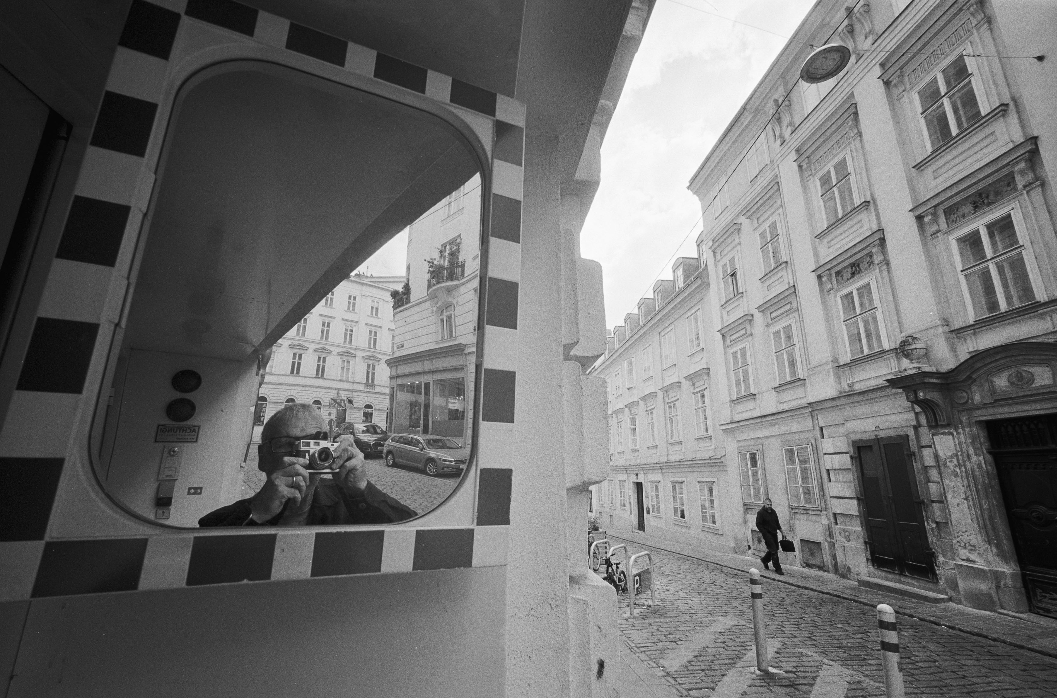
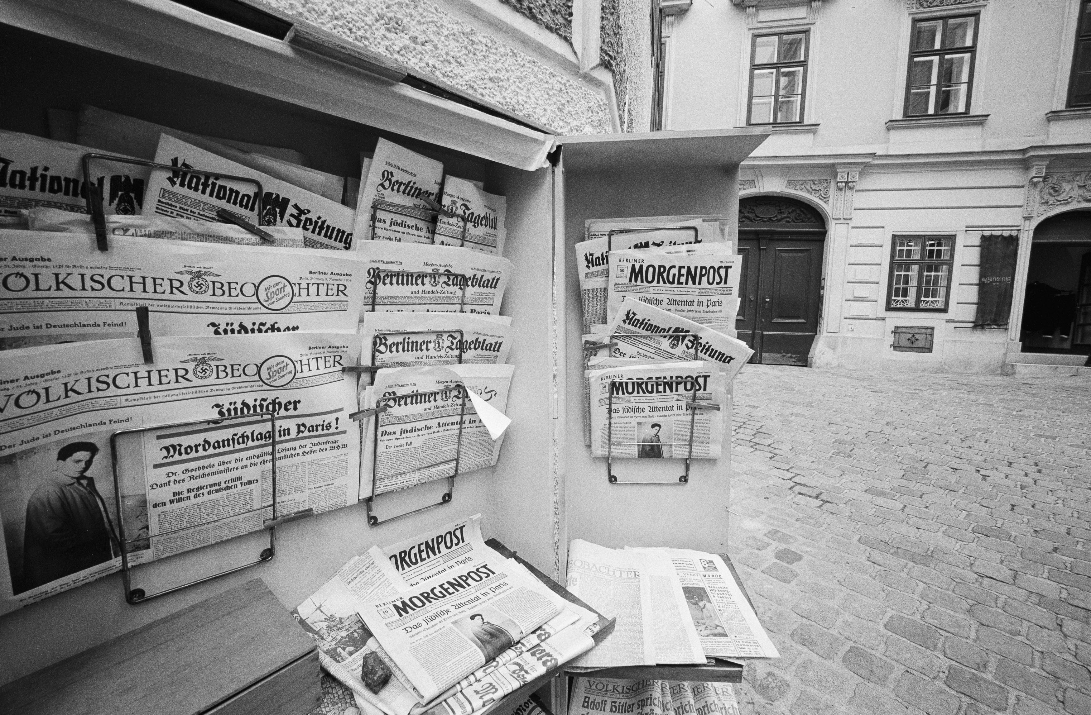
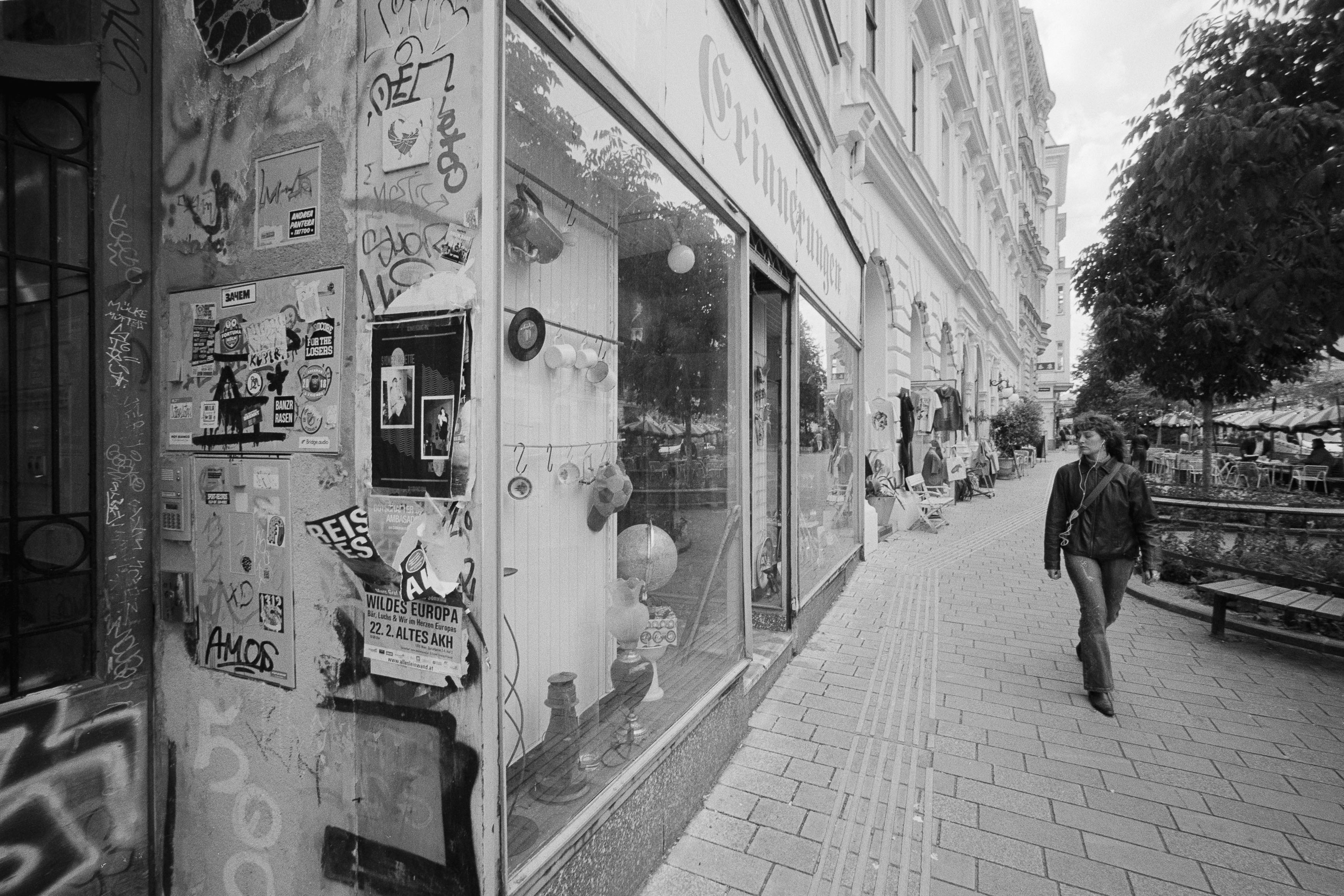
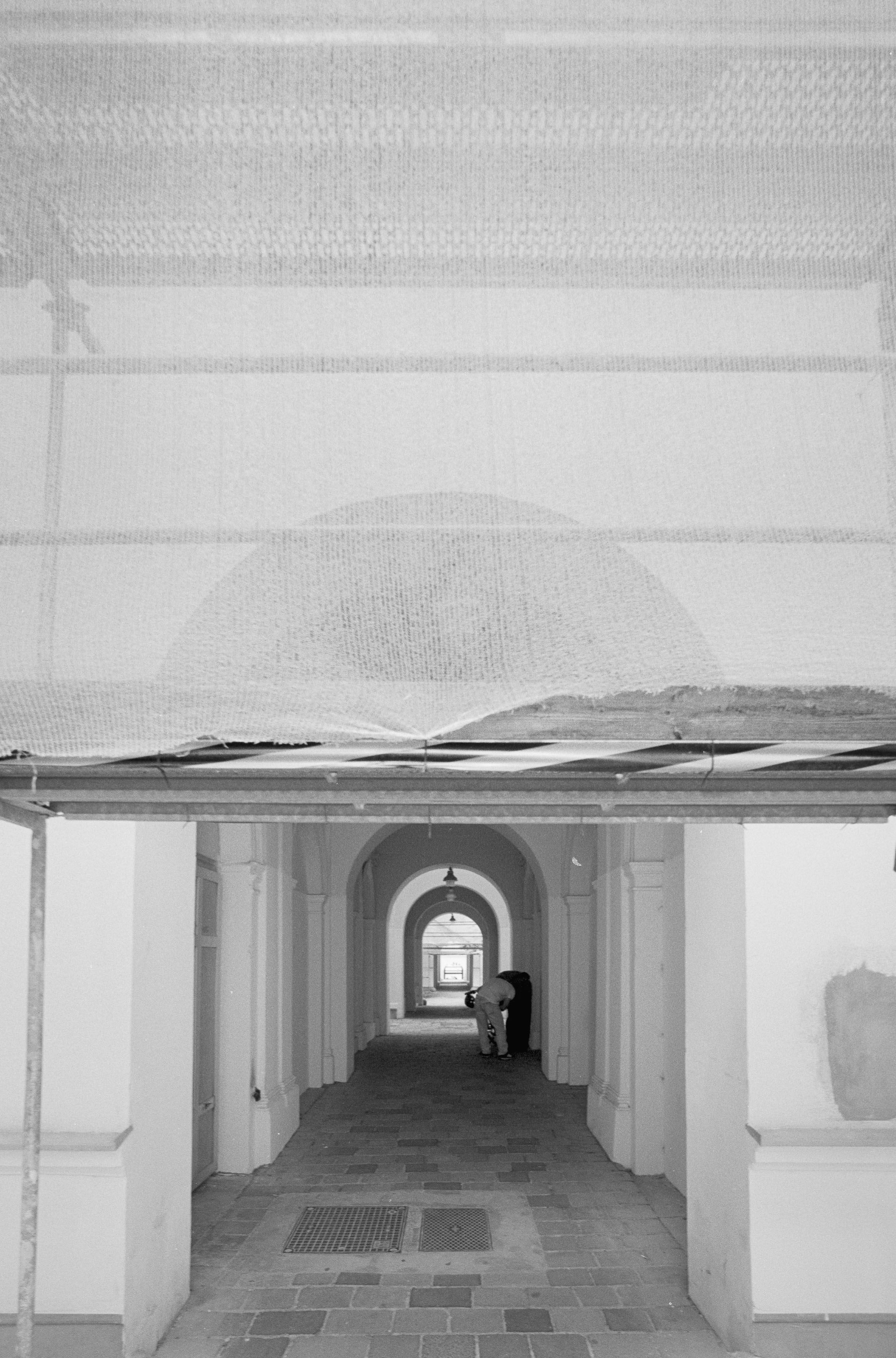
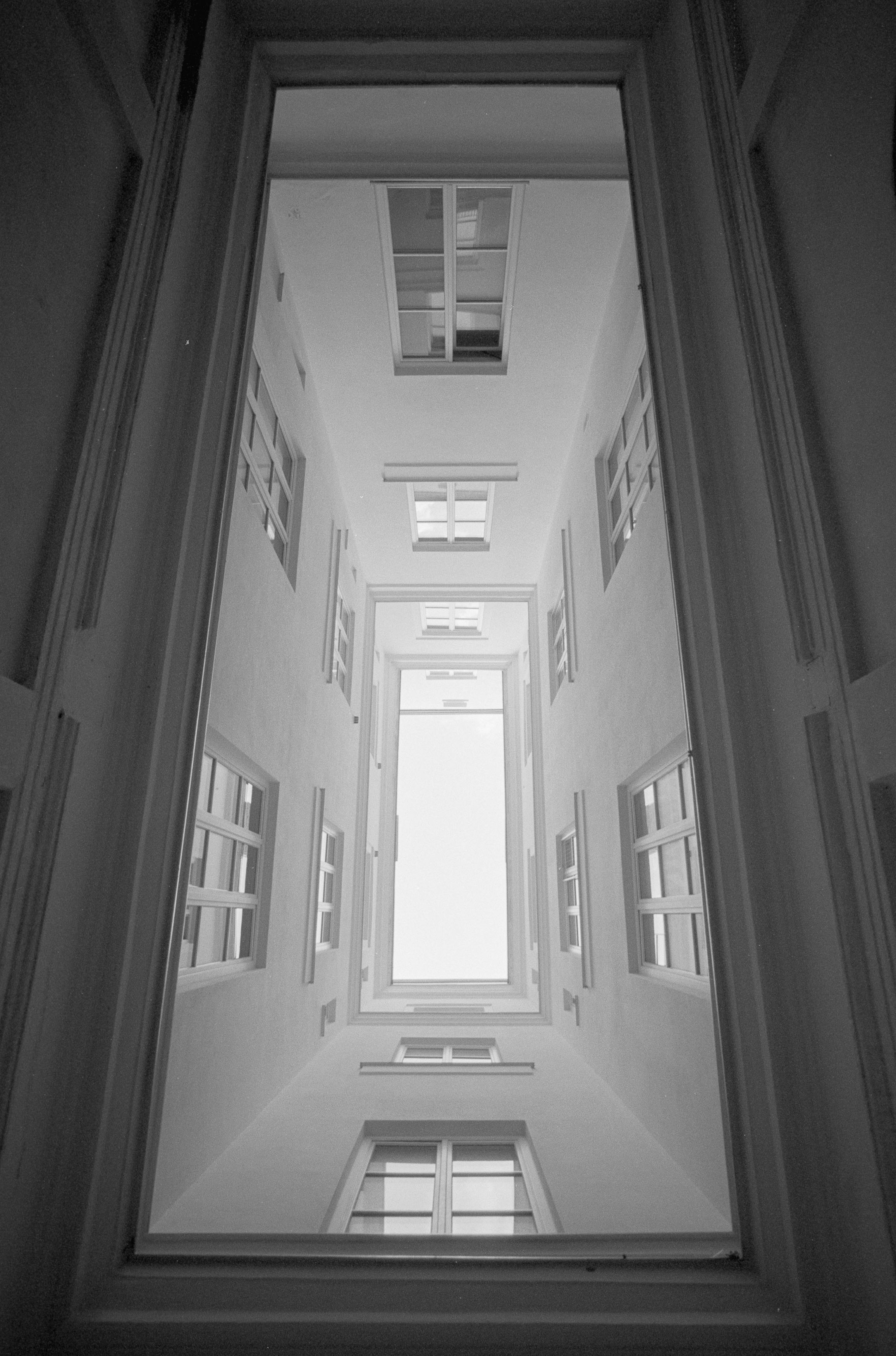
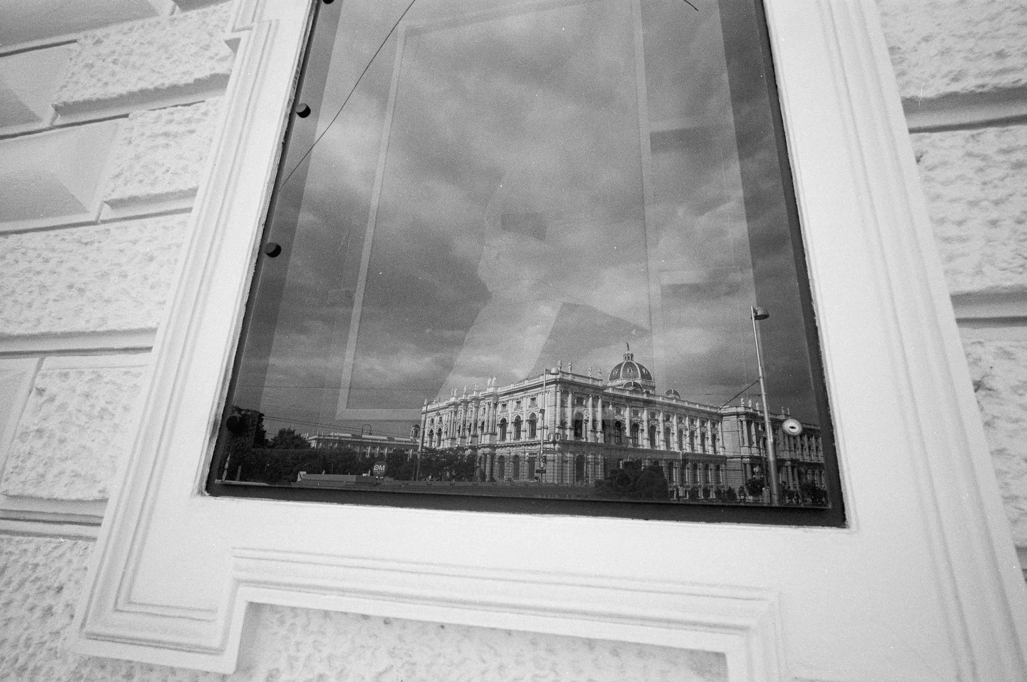
One of the most surprising things about the Voigtländer is just how tiny it is. Despite its compact dimensions, it feels reassuringly solid rather than toy-like. At around 190 grams it’s light enough to carry all day without thinking about it, yet substantial enough to inspire confidence.
Mine is the original Leica Thread Mount version, first released in 1999 alongside Voigtländer’s Bessa cameras. It’s actually relatively modern by Leica screw mount standards, although prices have climbed dramatically since I bought mine back in 2017.
The design is remarkably clever. The aperture ring sits at the front of the lens, which initially feels unusual, but makes perfect sense given how compact everything is. With such a wide focal length, depth of field is enormous anyway, so you’re rarely making huge focus adjustments.
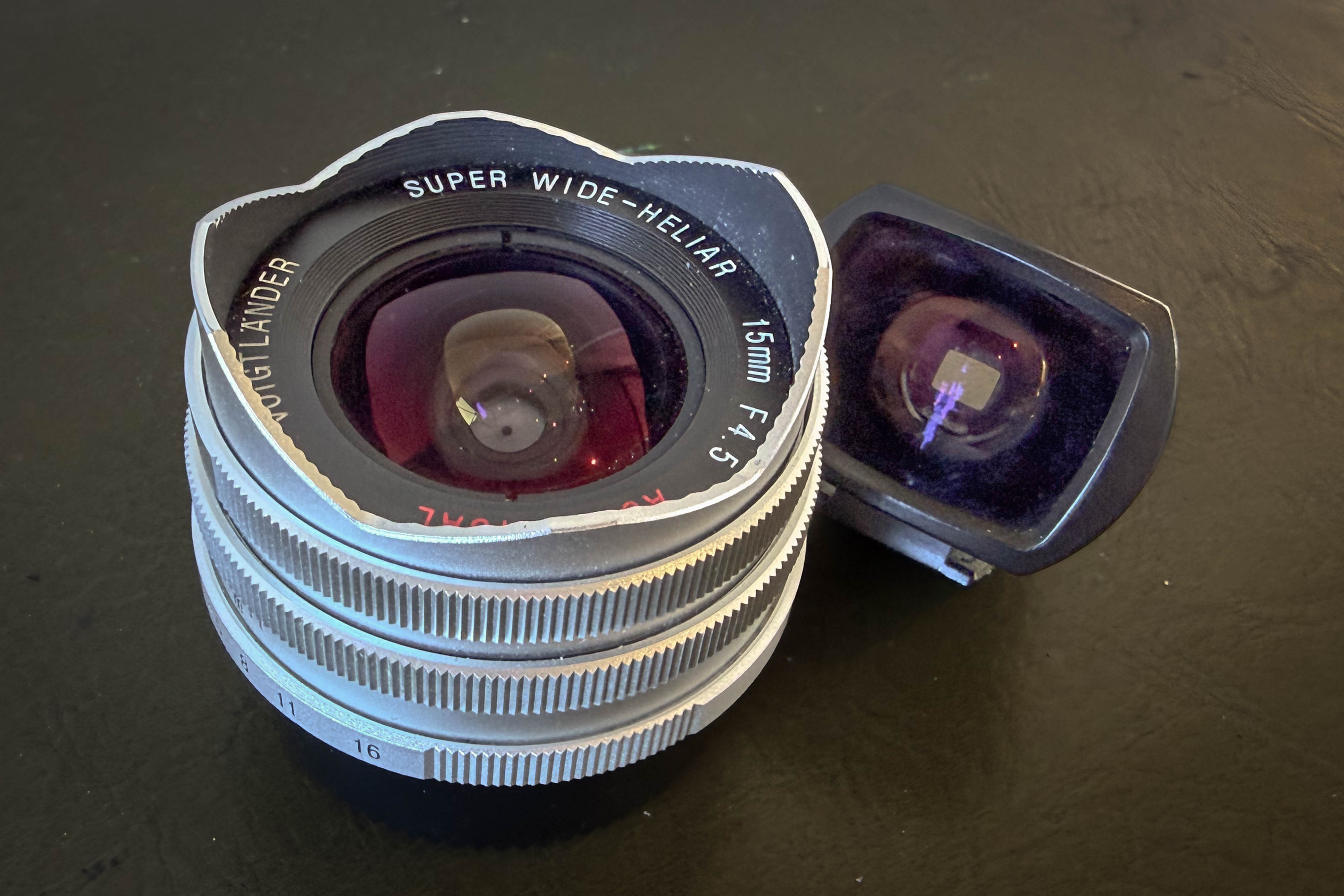
There are a few compromises. The fixed lens hood means you can’t easily use filters, and it requires a slip-on lens cap that looks lovely but costs a frightening amount to replace if it disappears somewhere on your travels.
What continues to impress me, though, is how well the optics behave. Considering just how absurdly wide this lens is, it does an excellent job of keeping straight lines straight. That’s a genuine engineering achievement and makes it much more useful for architectural photography than many people might expect.
Using the lens on my Leica M2 produced exactly the sort of images I’d hoped for. The negatives showed plenty of character, dramatic perspective and surprisingly clean rendering across the frame. Things became a little more complicated once I mounted it on my Nikon Z6.
This isn’t really the lens’s fault. Older ultra-wide lenses were designed for film, not modern digital sensors, and the way light reaches a sensor is quite different. On digital cameras you can end up with colour casts, heavier vignetting and smeared corners, particularly towards the edges of the frame.
Some of my digital images definitely showed those characteristics. In certain photographs the cooler colour shifts actually added atmosphere, especially during Vienna’s blue hour, but after a while they became distracting enough that I enabled lens corrections in Lightroom. That’s something I rarely do because I generally prefer working with a lens’s quirks rather than correcting them away, but in this case the adjustments helped produce more natural-looking files while still preserving plenty of the lens’s personality.
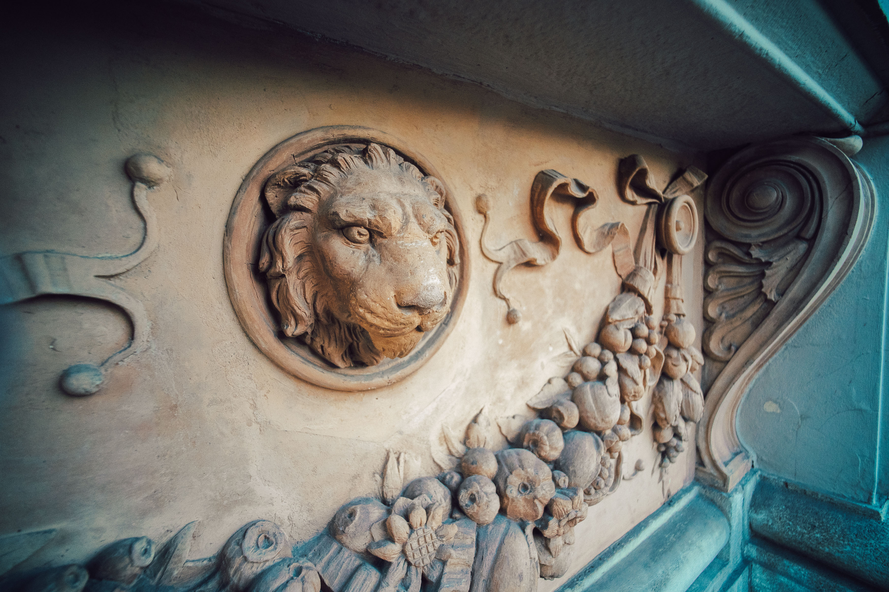
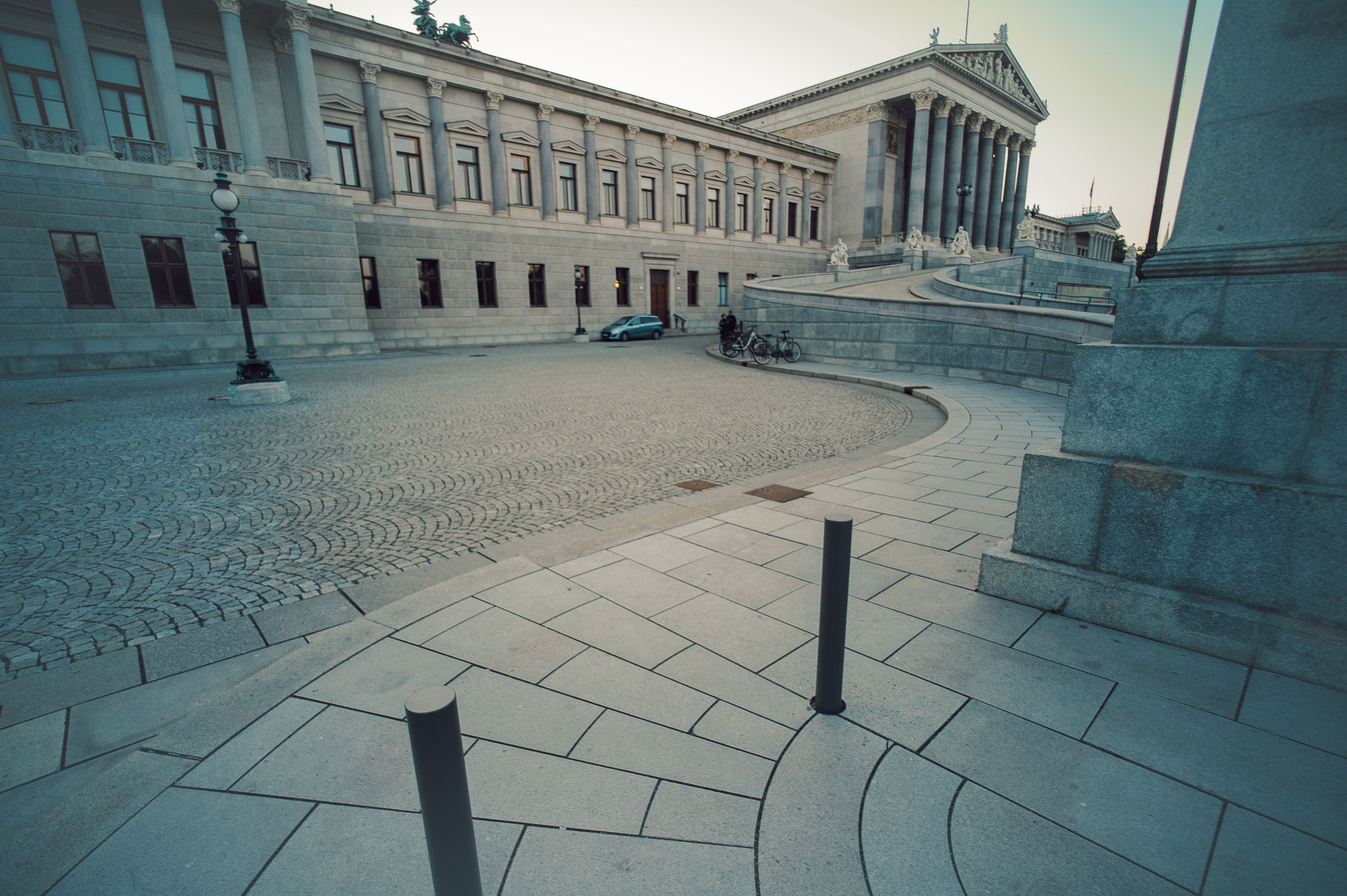
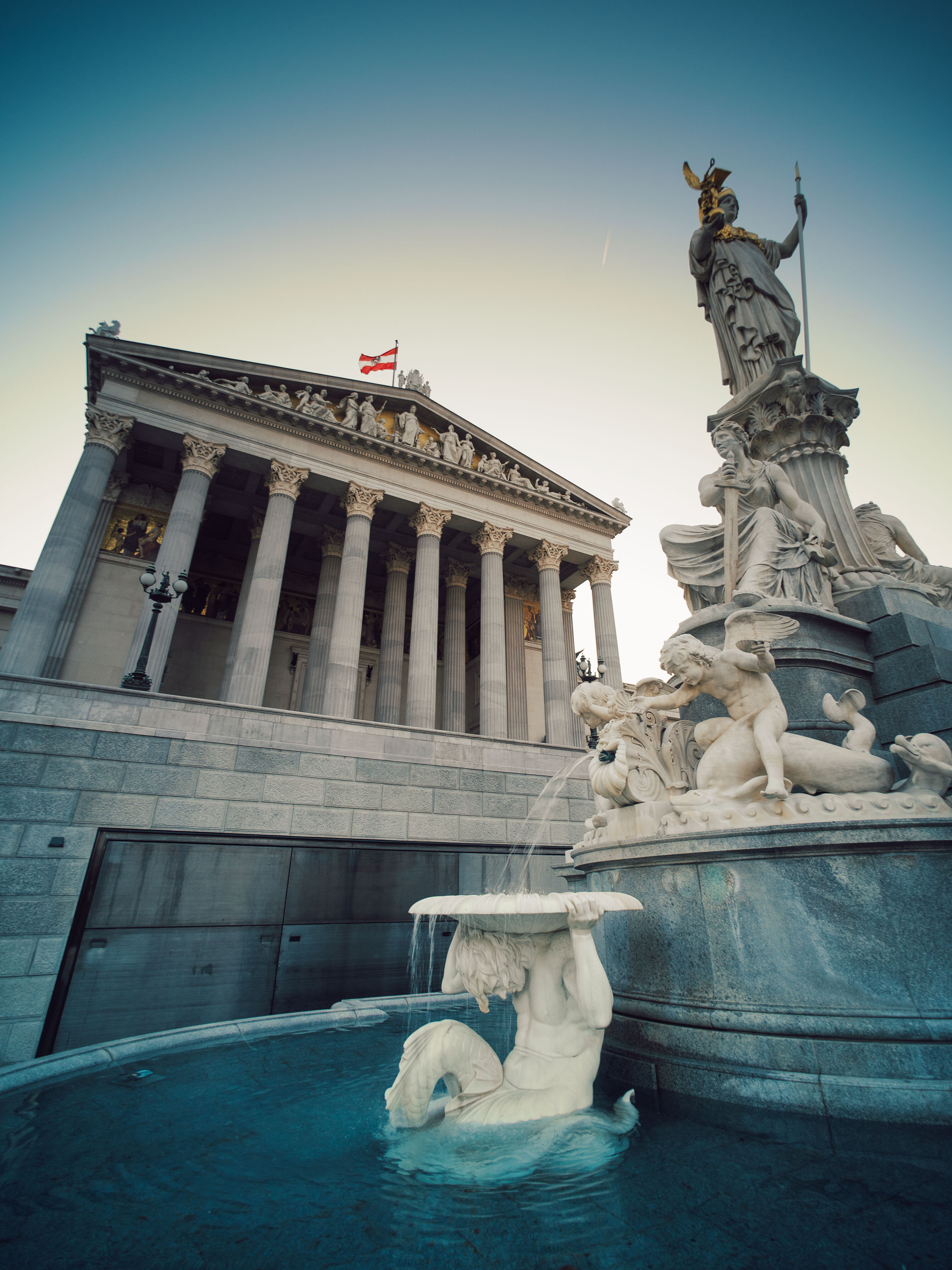
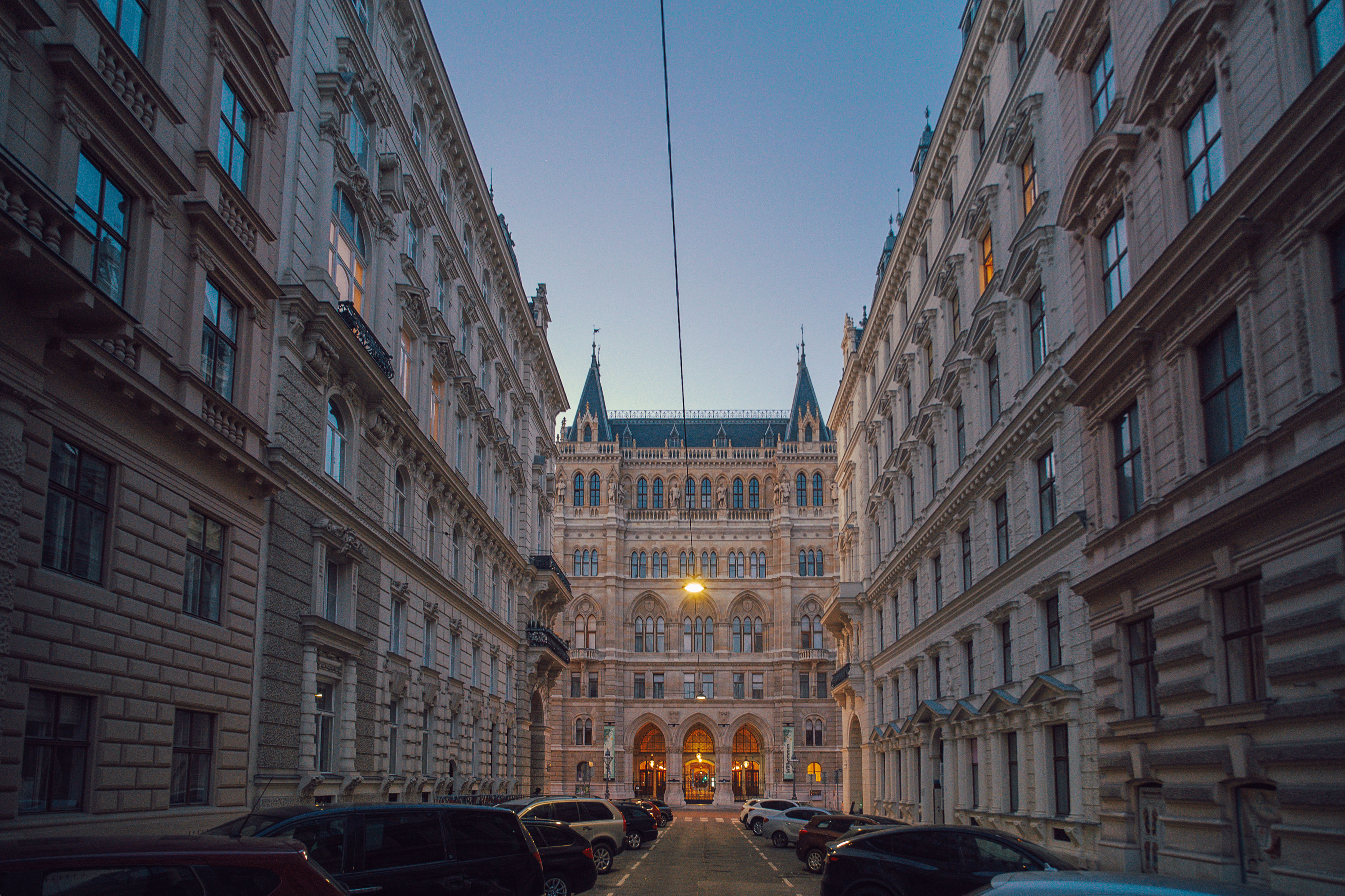
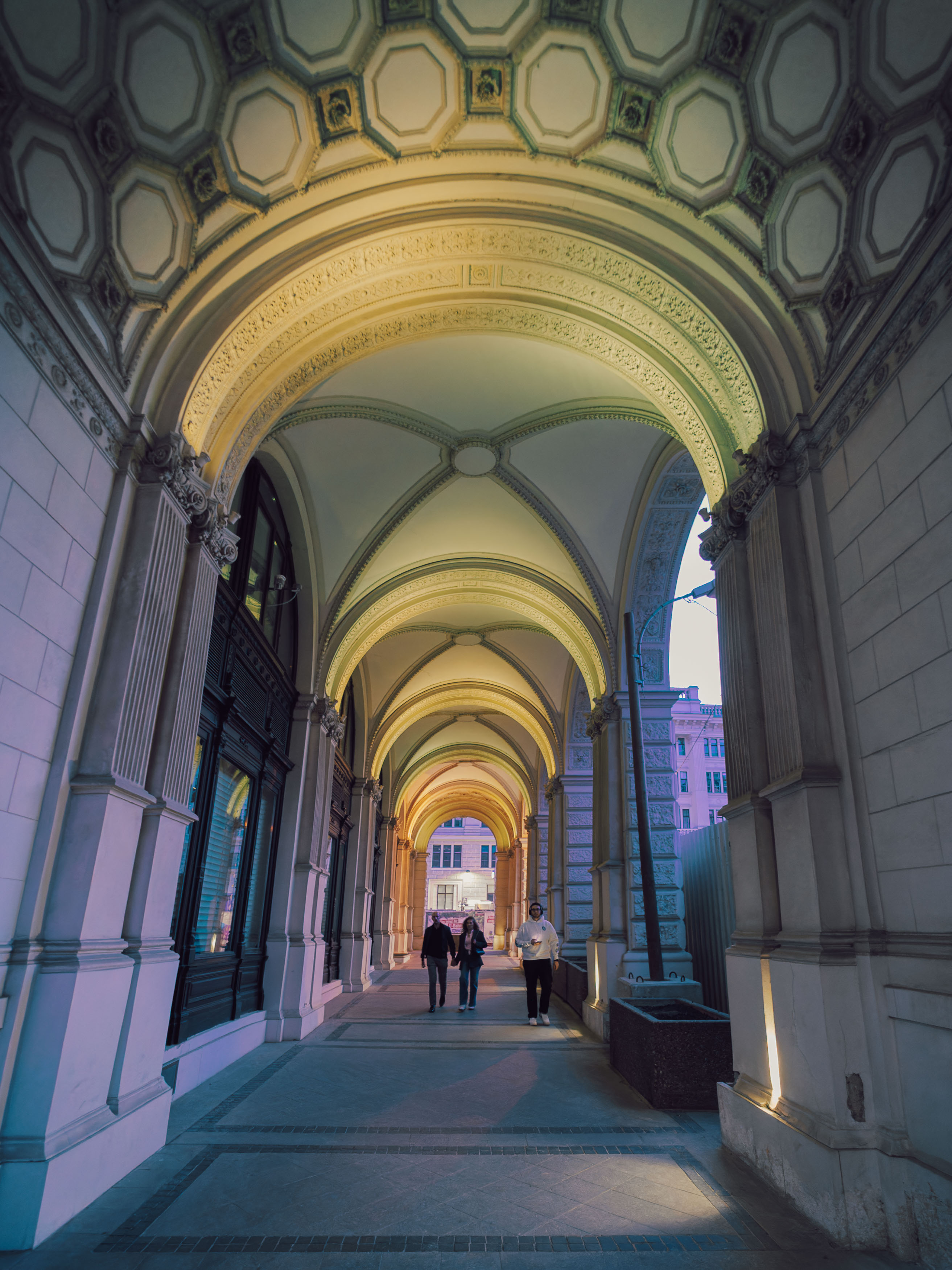
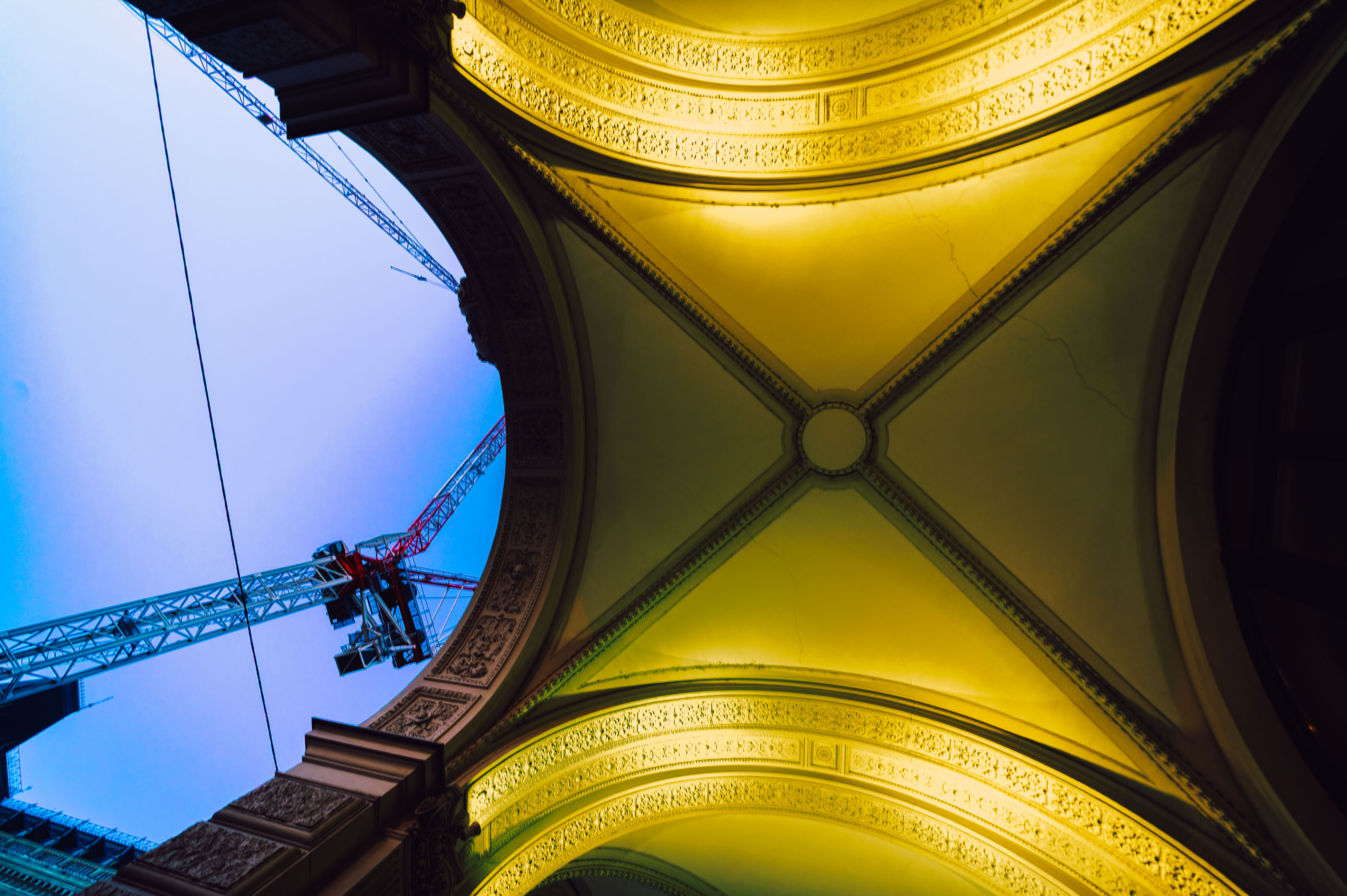
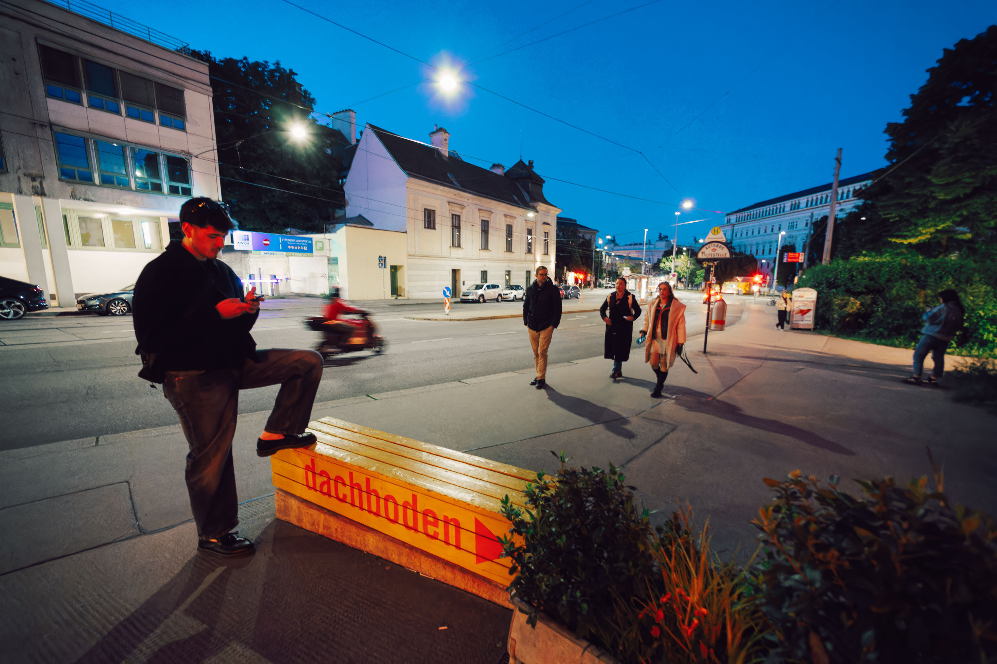
Interestingly, those same issues simply weren’t present on film. Looking at the Leica negatives afterwards reinforced my feeling that this first-generation version of the 15mm still feels most at home on analogue cameras.
The biggest challenge with the Voigtländer isn’t sharpness or build quality. It’s simply the focal length. Fifteen millimetres can produce wonderfully dramatic photographs, but only when you have a composition that deserves it. Without a strong foreground subject or carefully arranged scene, everything risks becoming small and insignificant. It’s surprisingly easy to fill a frame with lots of space and very little interest.
There’s also the occasional occupational hazard of photographing your own fingers. When the lens is this wide, it’s alarmingly easy to discover afterwards that part of your hand has made an unexpected guest appearance in the corner of the frame.
Even so, I can’t help liking this peculiar little lens. It encourages experimentation, rewards careful observation and produces photographs that don’t look quite like those from anything else in my collection.
Would I recommend it? Absolutely, but only if you understand what you’re getting into. This isn’t an everyday walk-around lens, and it isn’t designed to make photography easier. What it does offer is a genuinely different way of seeing the world, and sometimes that’s exactly the creative challenge you need.
If you’re prepared to work with its quirks rather than against them, the Voigtländer 15mm Super Wide-Heliar remains one of the most entertaining ultra-wide lenses you can mount on a film camera.
Twelve years is a surprisingly long time. When I first visited Stockholm in 2013, my children were younger, my hair contained considerably less grey, and I approached photography with the kind of wide-eyed enthusiasm that only comes from exploring somewhere completely new. Returning for a brief 24-hour visit felt like stepping into a time machine—not just to revisit Sweden, but to confront an awkward question I’d been quietly avoiding: after more than a decade behind the camera, have I actually become a better photographer?
It’s the sort of question that’s difficult to answer objectively. Experience should bring improvement, but creativity doesn’t always follow a neat upward trajectory. As I wandered through the cobbled streets of Gamla Stan, Stockholm’s wonderfully preserved old town, I couldn’t help wondering whether my photography had continued to evolve or whether I’d simply become older, more cautious, and perhaps a little too comfortable with my own habits.
My journey began in appropriately chaotic fashion when I managed to board a train in completely the wrong direction. While I’d love to pretend this was some profound metaphor about life and artistic growth, it really was nothing more than another demonstration of my famously terrible sense of direction. Fortunately, even mistakes can become opportunities, and the unexpected detour delivered a train station that looked like an 8-bit video game, complete with geometric tiles and an almost surreal atmosphere.
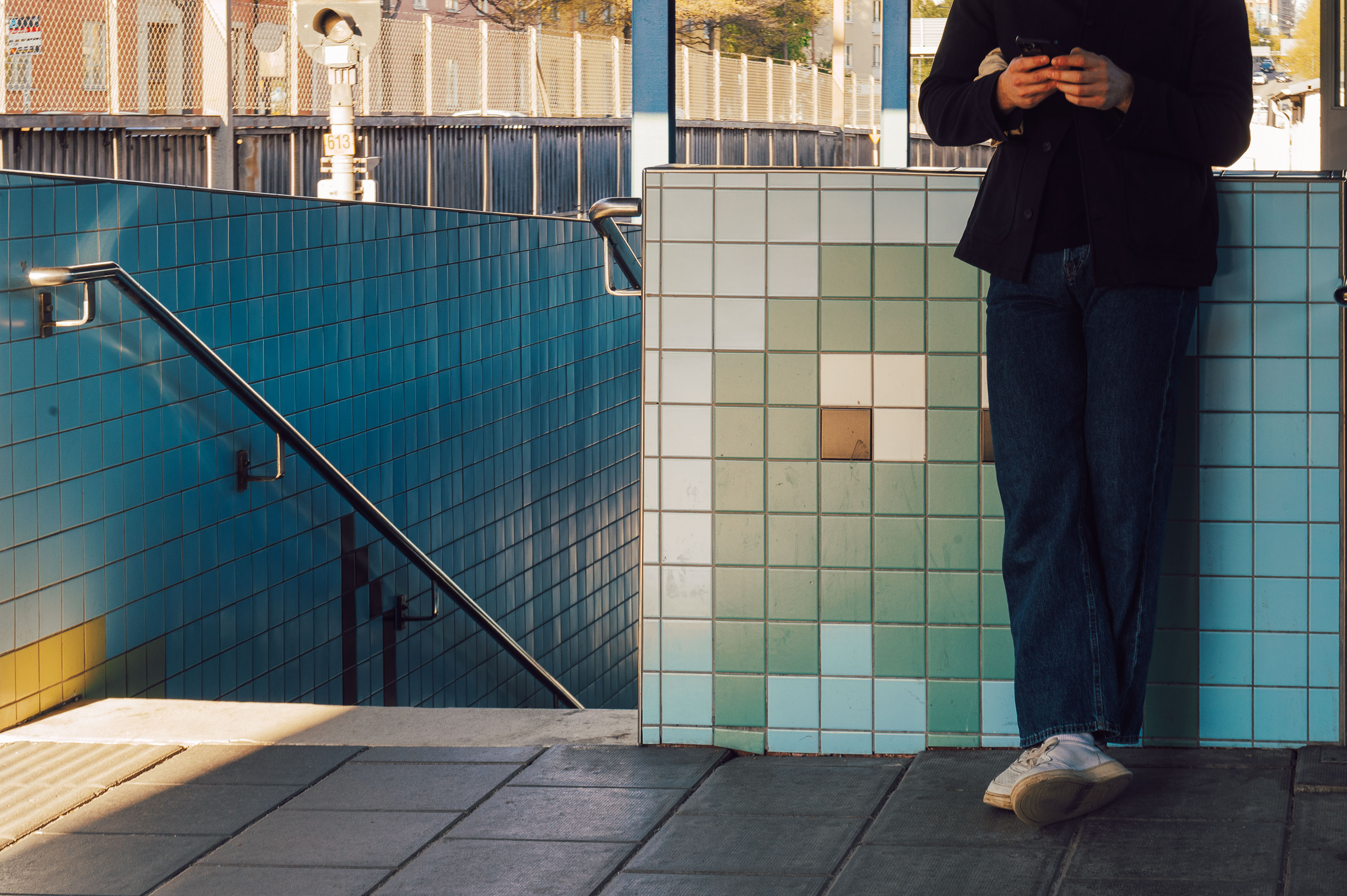
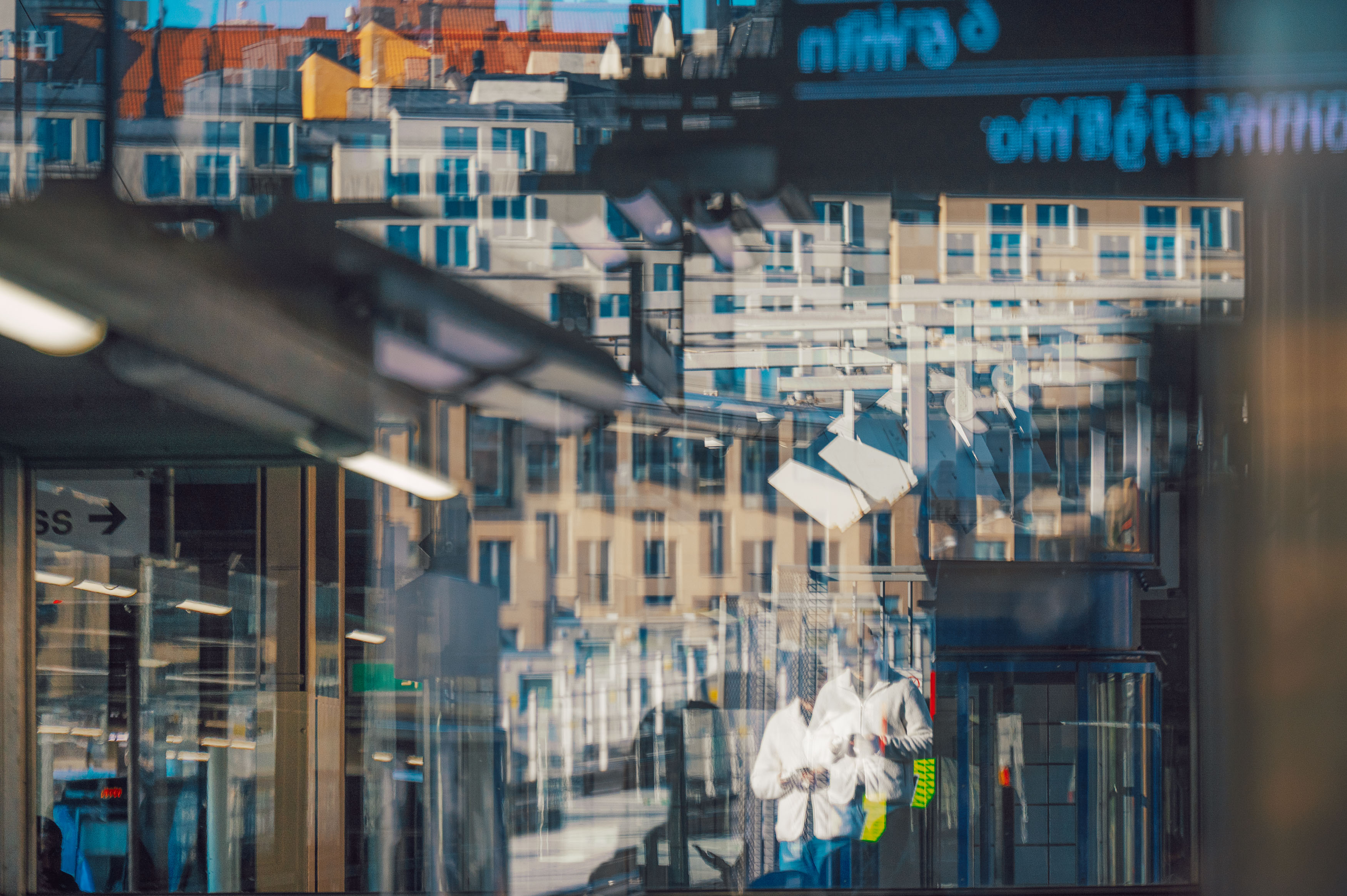
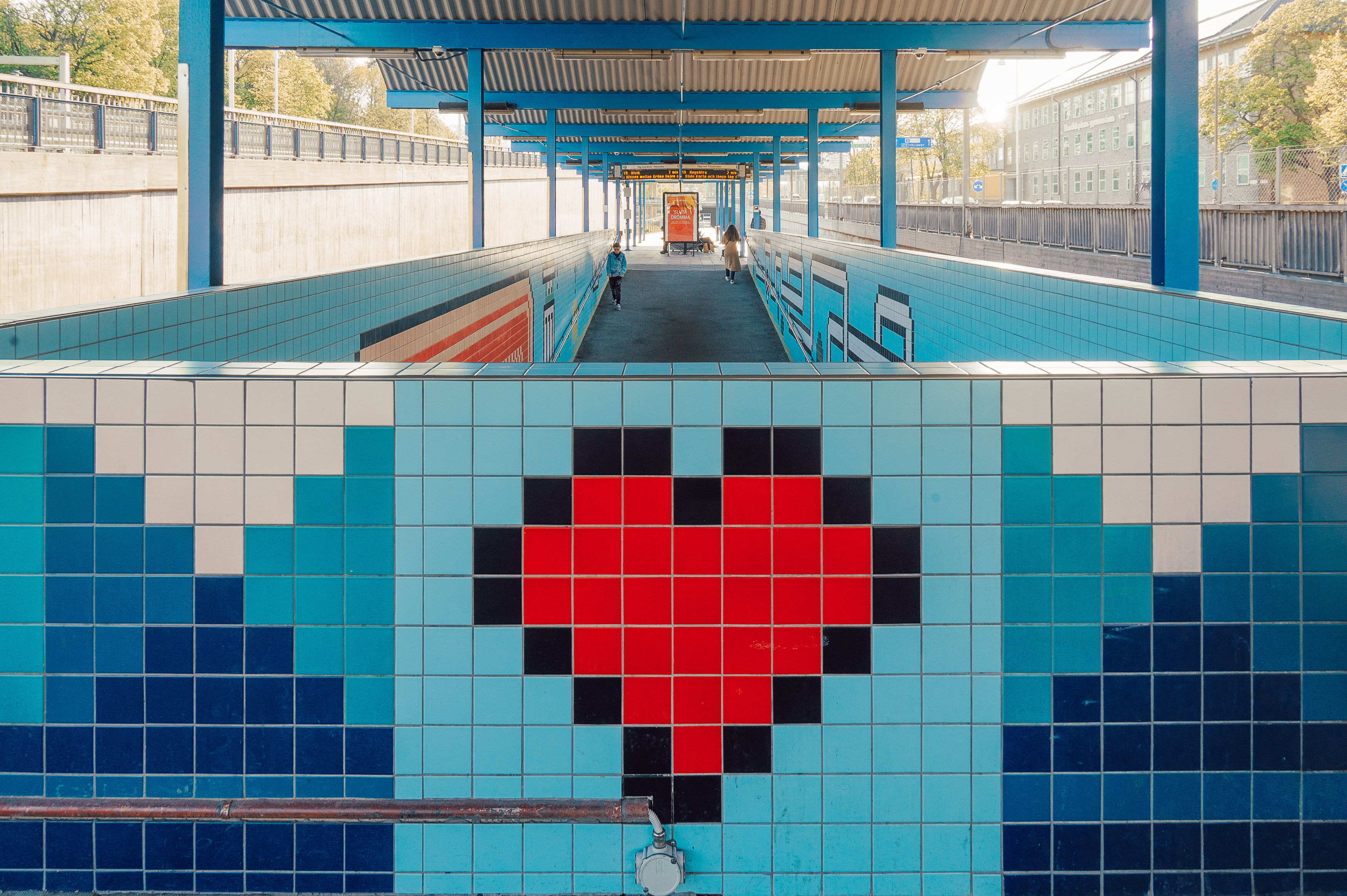
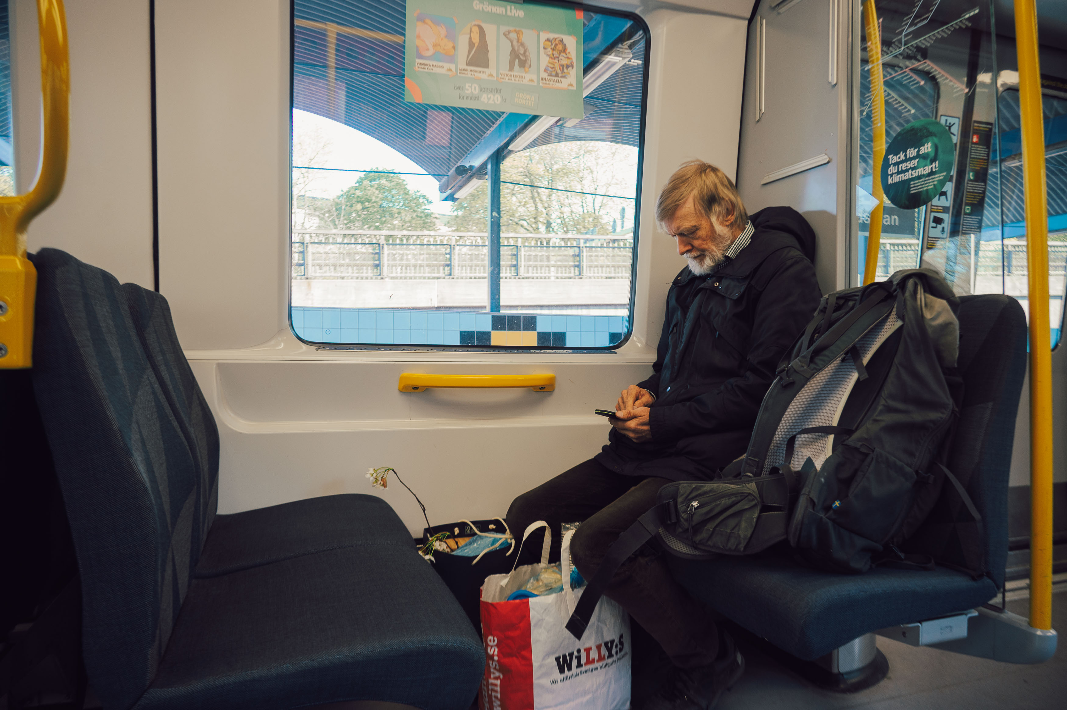
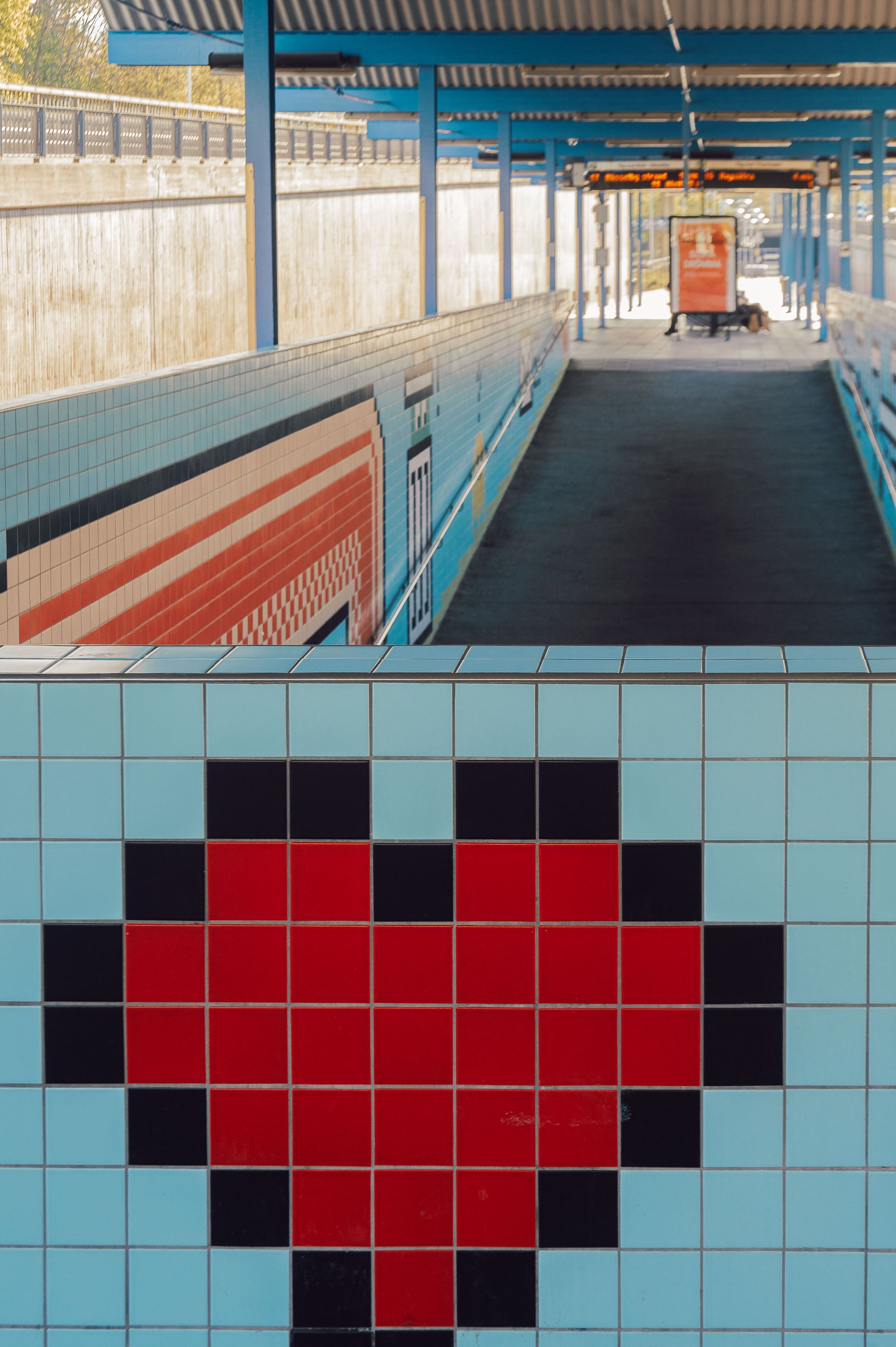
Eventually I escaped my accidental journey into Tron and arrived in Gamla Stan. Emerging from the station felt like walking straight into the 14th century, albeit one populated by tourists armed with smartphones and takeaway coffee. Stockholm itself hadn’t changed dramatically over the years, but my relationship with photographing it certainly had.
Looking back at my original visit revealed just how much both photography and technology have evolved. In 2013 my camera of choice was the humble Lumix GF1, a Micro Four Thirds camera whose autofocus could generously be described as leisurely. Today I shoot with a Nikon Z6 paired with a versatile 24-200mm lens, giving me vastly superior image quality and low-light performance, even if the autofocus still occasionally reminds me not to become too complacent.
Ironically, despite carrying far more capable equipment today, I’ve also embraced older photographic practices. My favourite camera doesn’t even shoot video or include a built-in light meter. In some ways, my technical journey has become less about chasing newer features and more about rediscovering slower, simpler ways of working.
Perhaps the biggest difference between my old work and my current photography lies in the editing. Revisiting my 2013 images was a sobering reminder that I, like so many photographers of the era, was hopelessly addicted to HDR. Every image seemed determined to display every possible shadow, highlight and colour simultaneously, often resulting in pictures that looked less like reality and more like someone had dropped a rainbow into a blender.
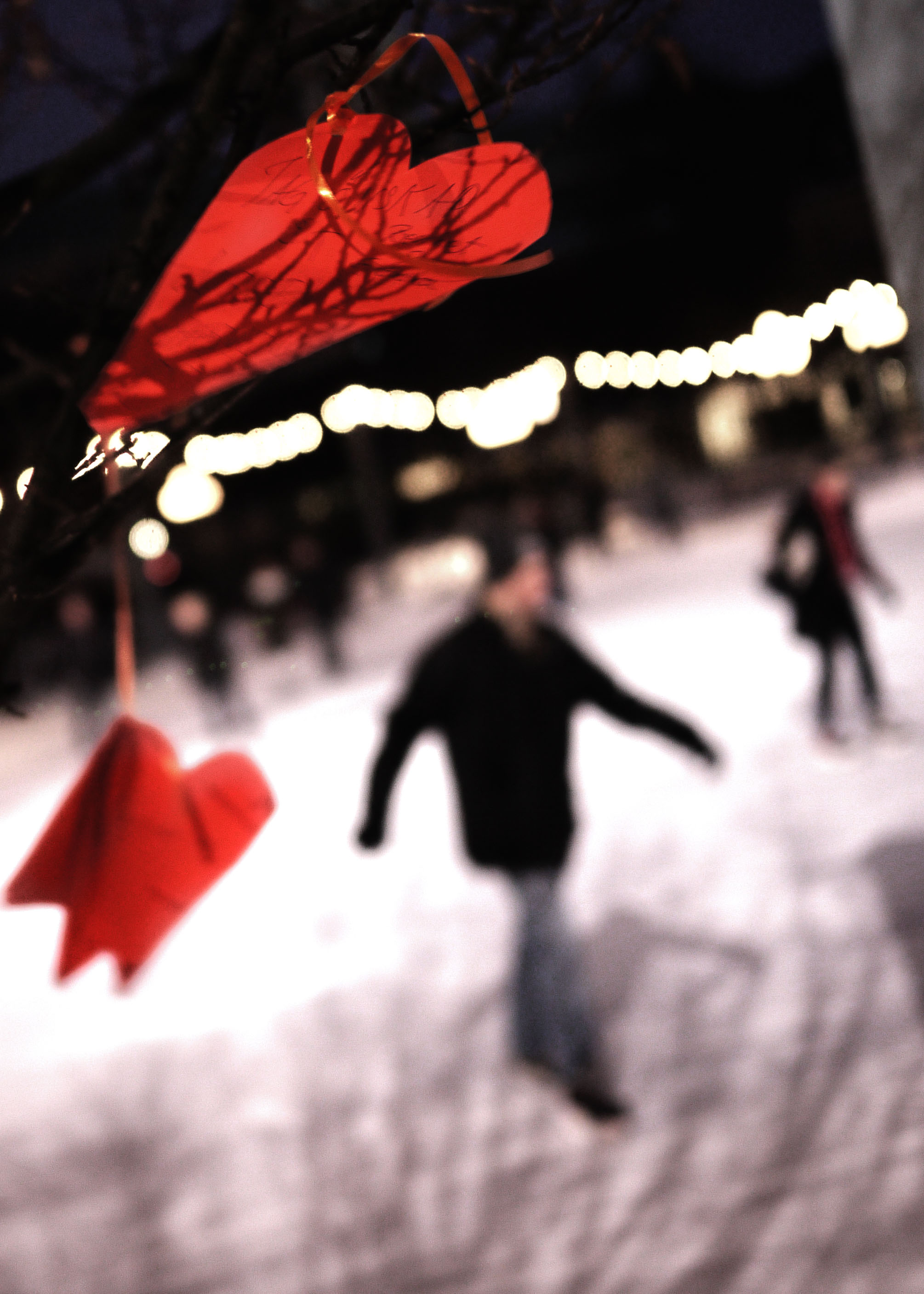
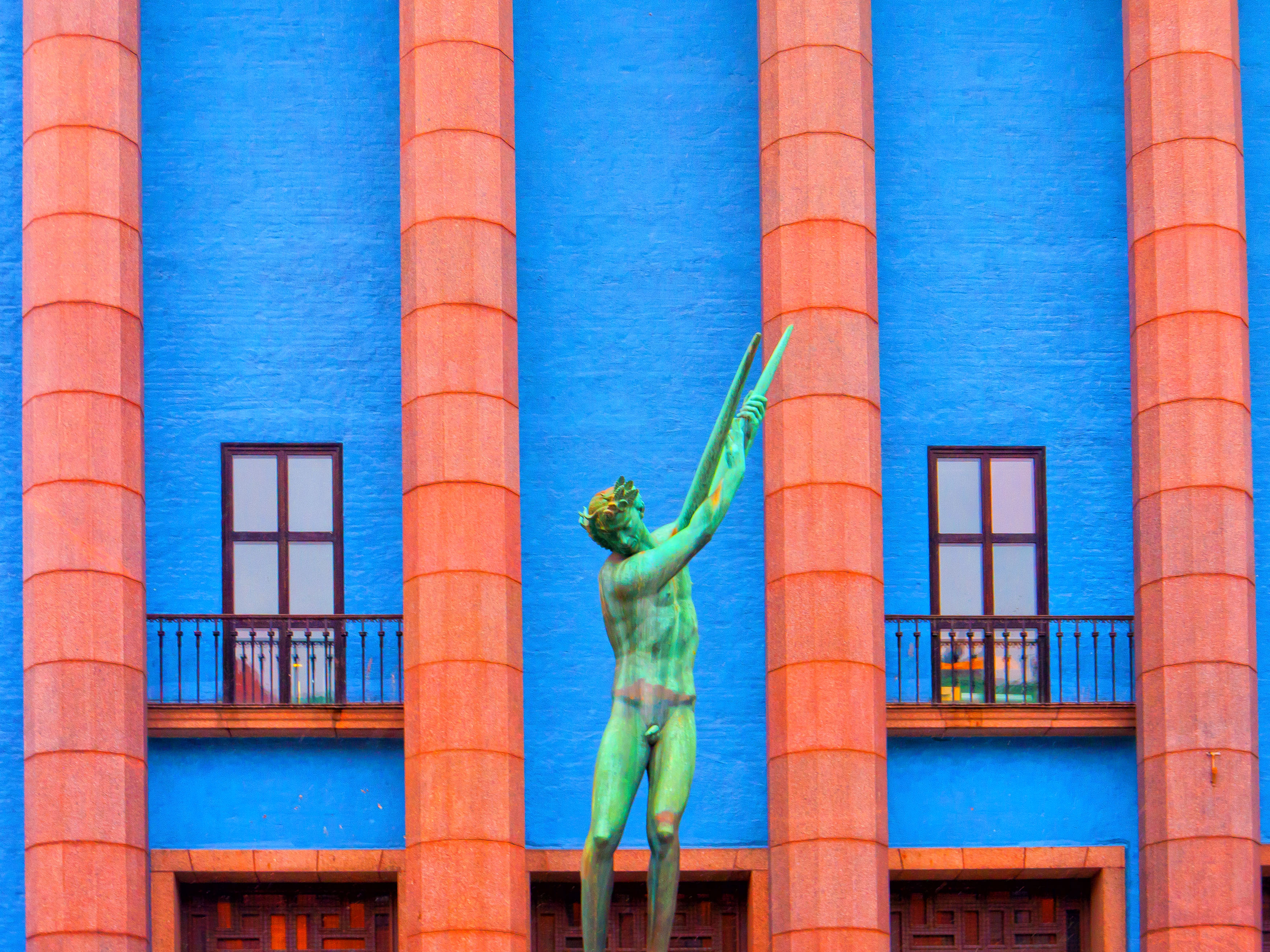
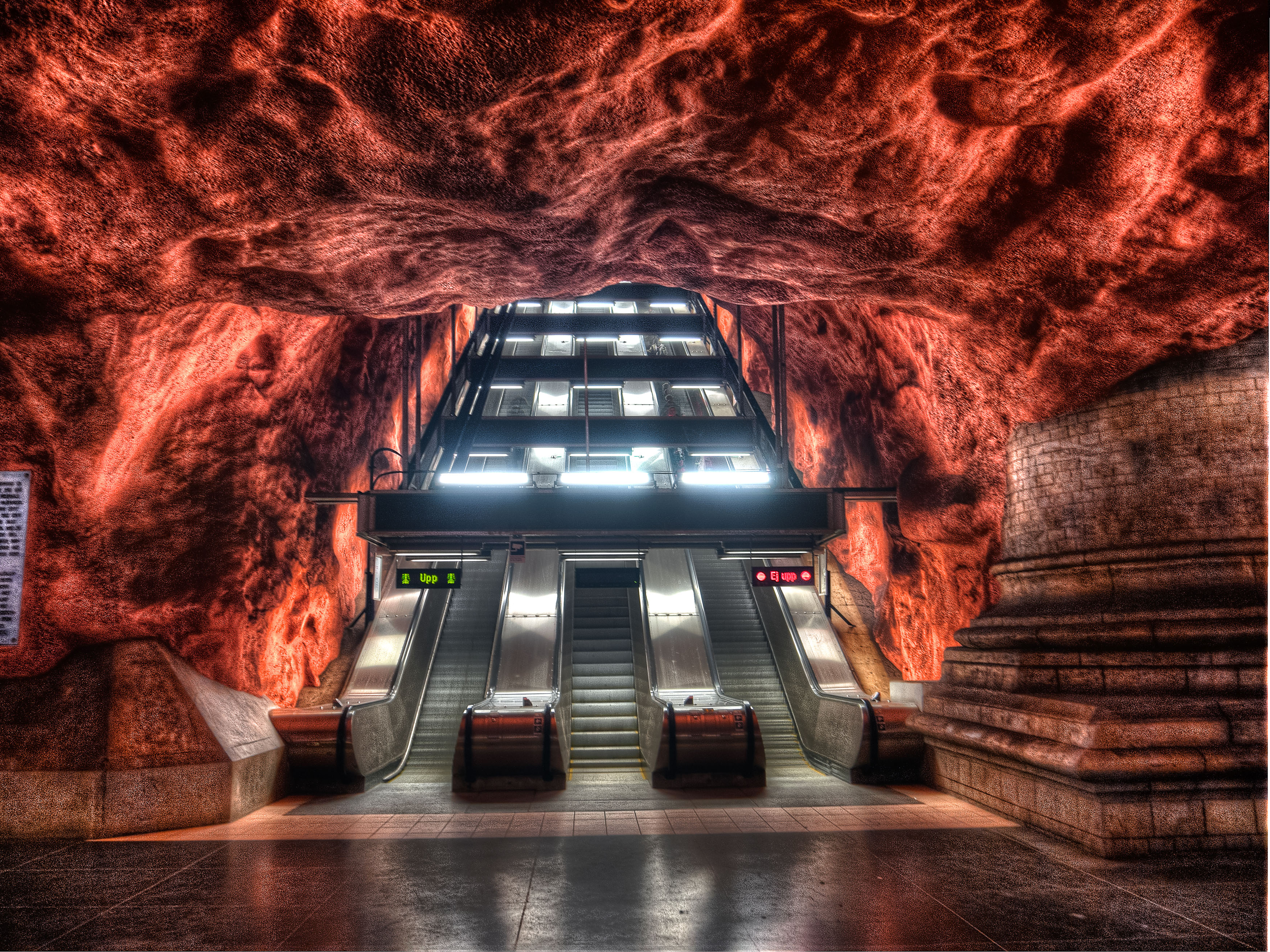


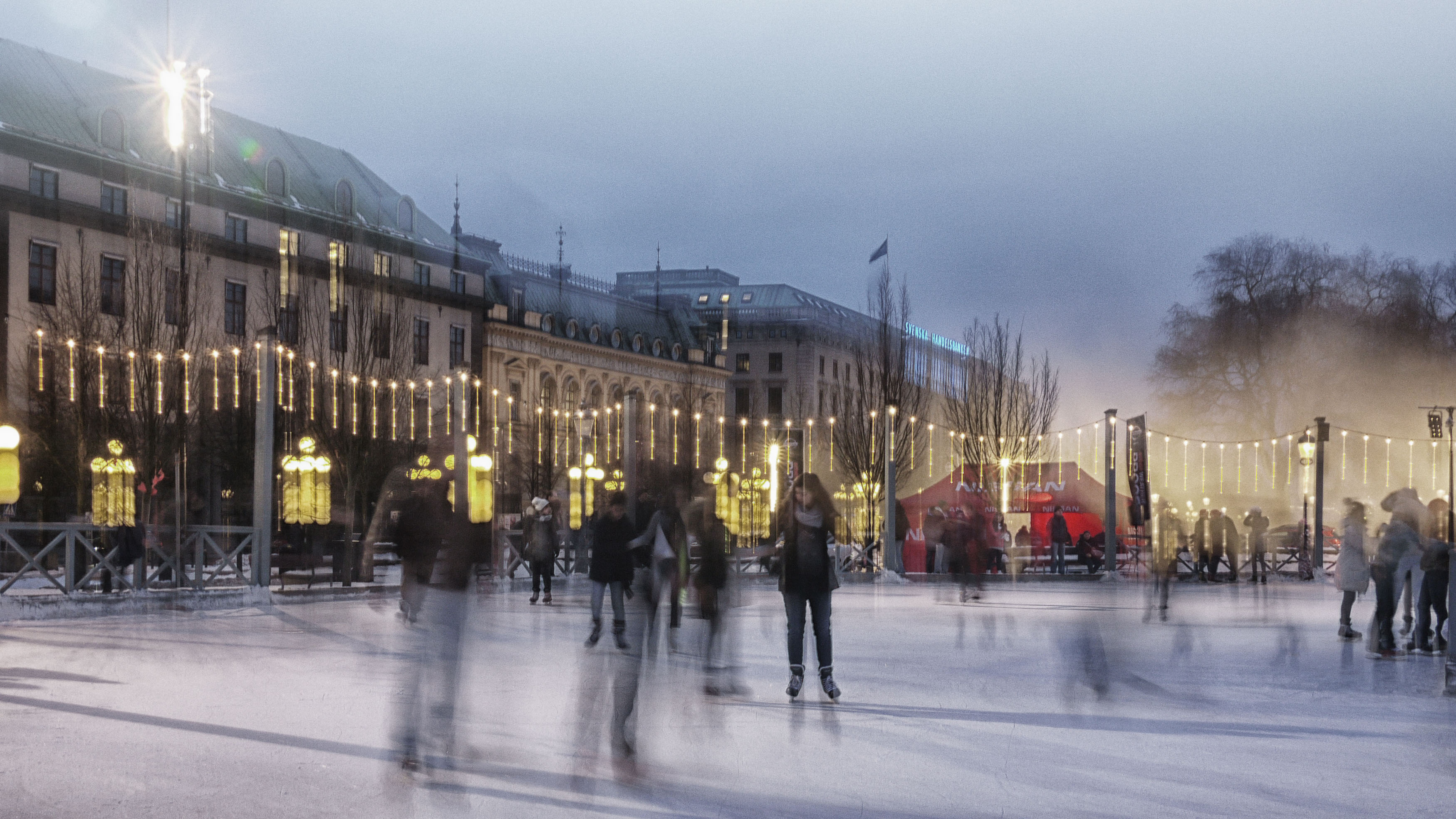
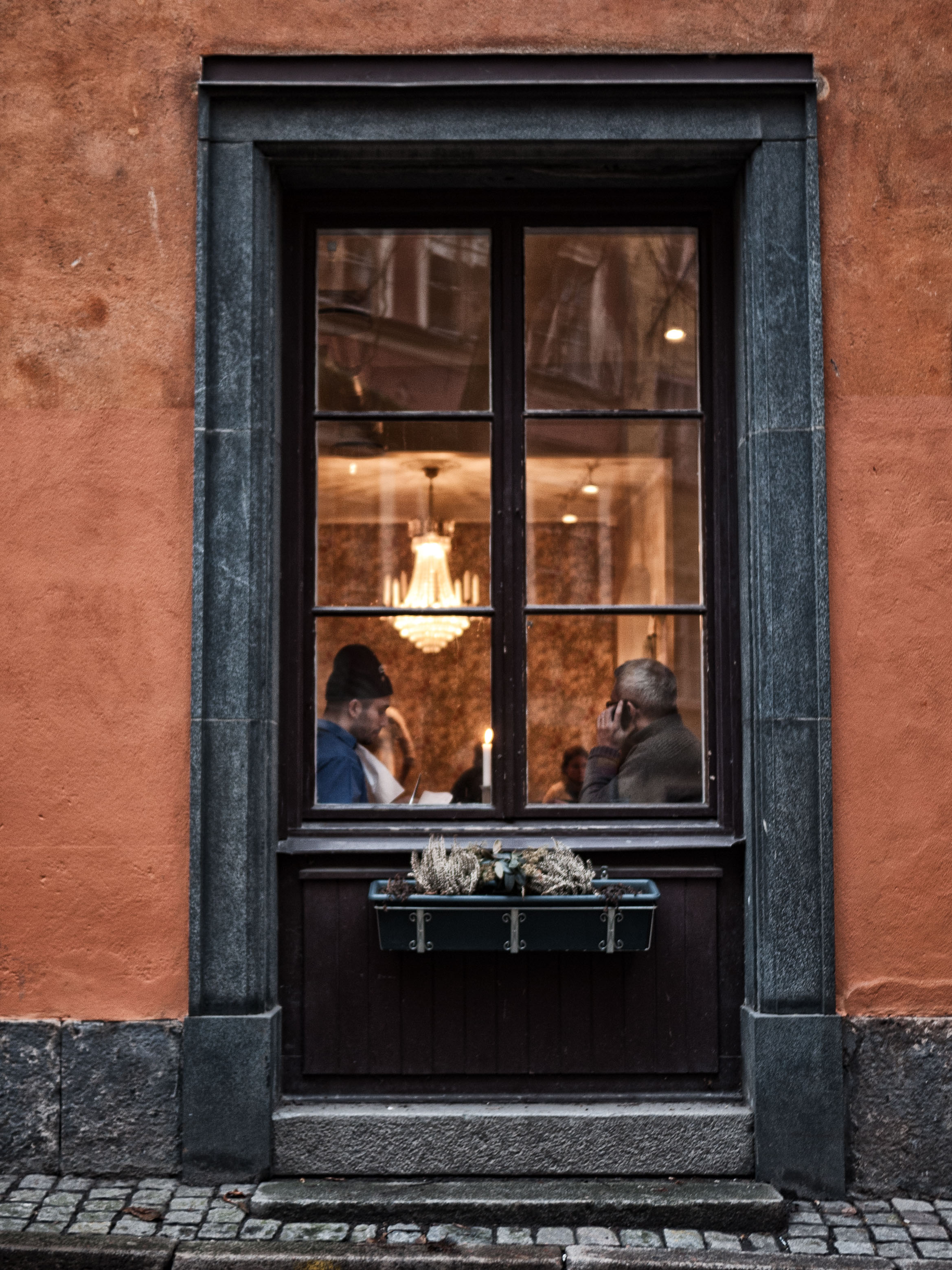
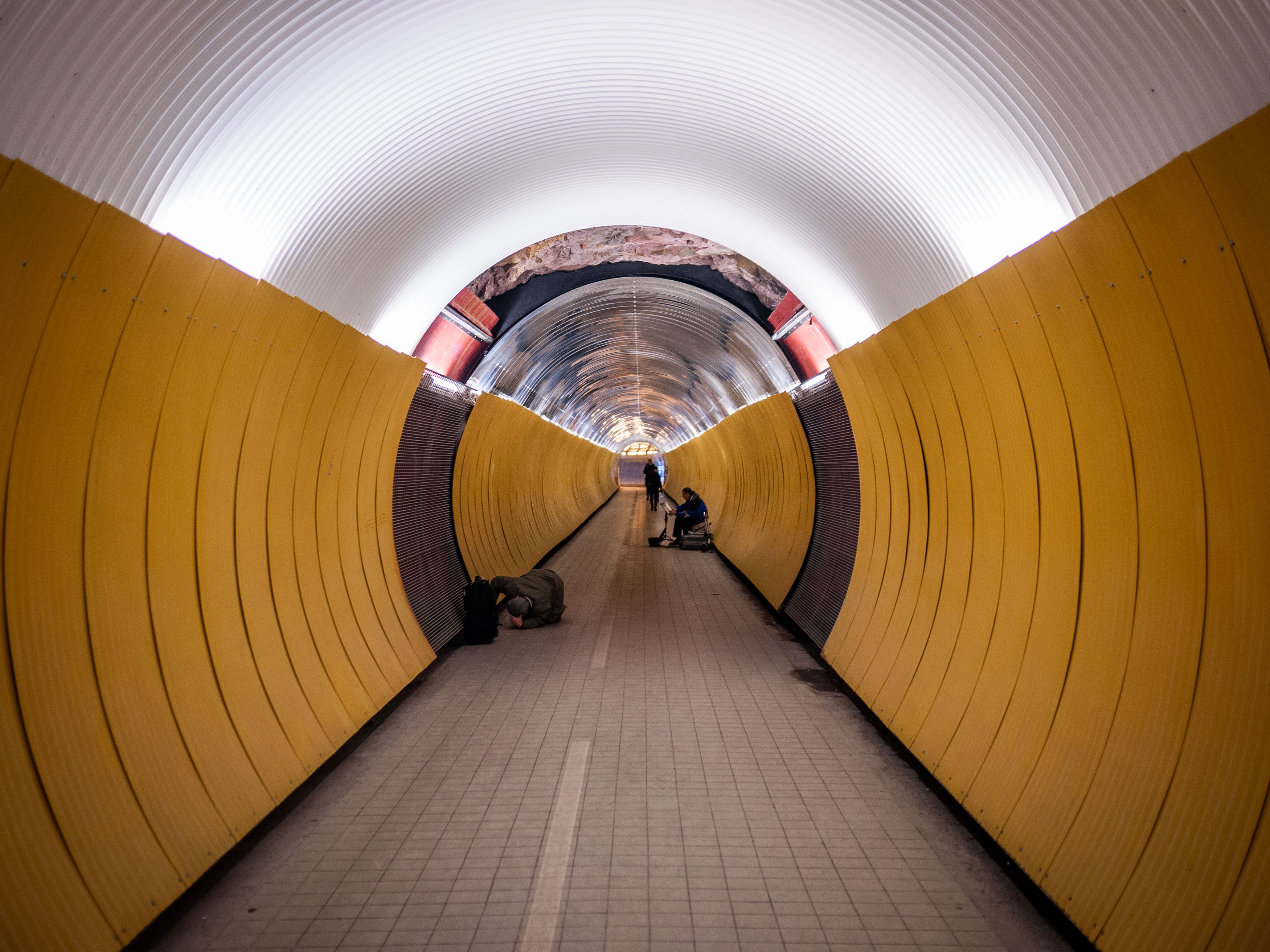
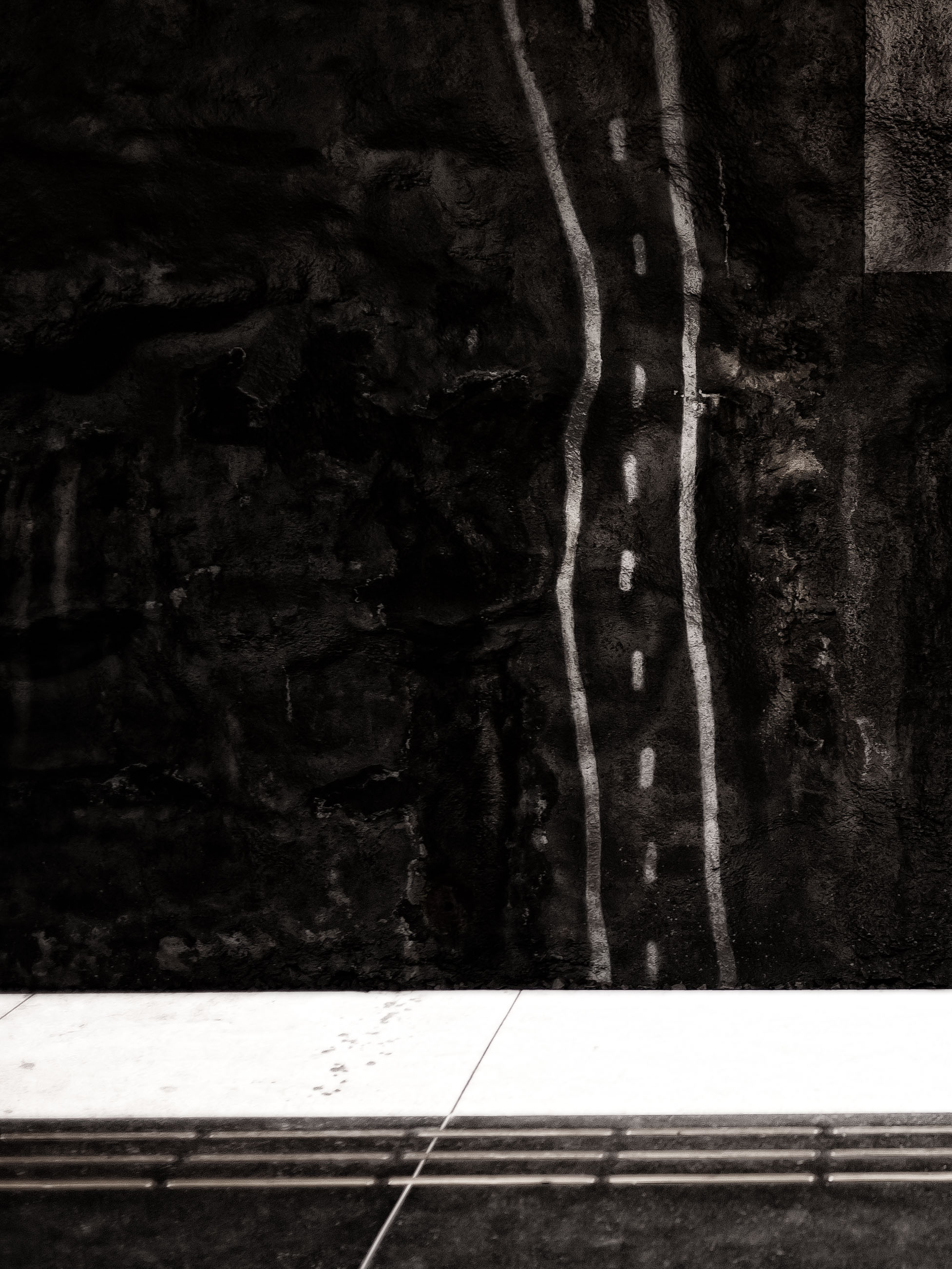
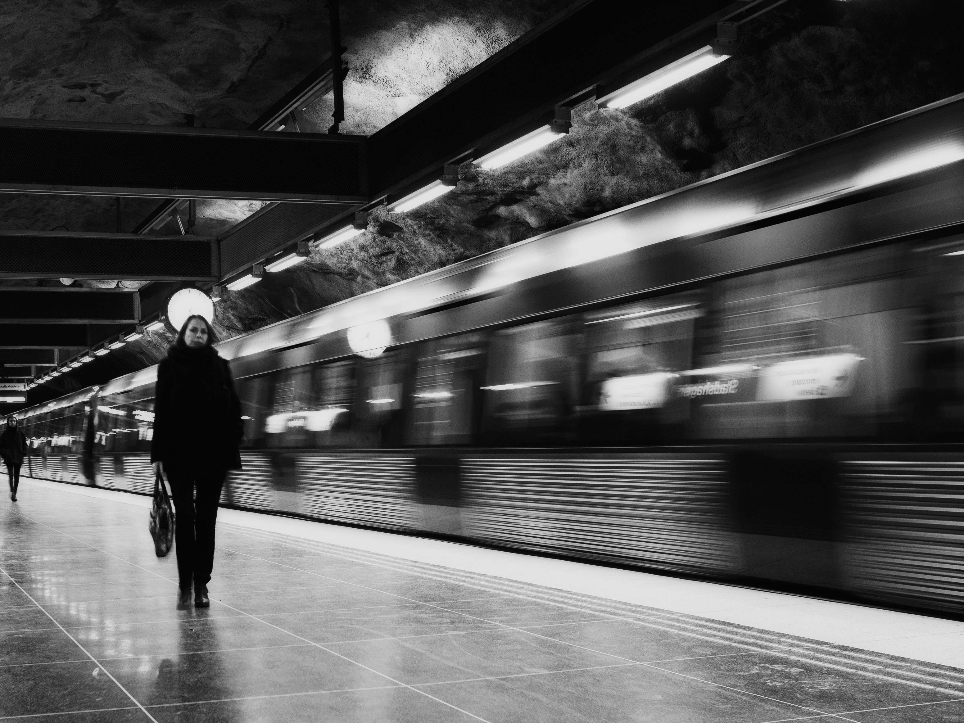
To be fair, cameras at the time genuinely struggled with dynamic range, and HDR techniques often solved real technical limitations. Unfortunately, somewhere along the way, subtlety was abandoned in favour of aggressively saturated skies, exaggerated textures and every filter available in software like Photomatix and the Nik Collection. If the software offered a dramatic effect, I was almost certainly going to apply it.
Thankfully, both technology and my own tastes have matured. Modern full-frame sensors capture an astonishing amount of information without elaborate processing, meaning there’s far less need to rescue an image in post-production. More importantly, I’ve come to appreciate restraint. Rather than chasing dramatic effects, I now find myself drawn to quieter, more natural edits with a gentle, almost Kodachrome-inspired warmth that allows the subject to speak for itself.
Not everything has changed, however. Looking through my old photographs revealed several themes that have remained remarkably consistent throughout my photographic life. I’ve always been fascinated by geometry, architecture and the patterns created by the built environment. Whether it’s staircases, railway stations or the narrow streets of an old city, strong shapes continue to draw my attention.
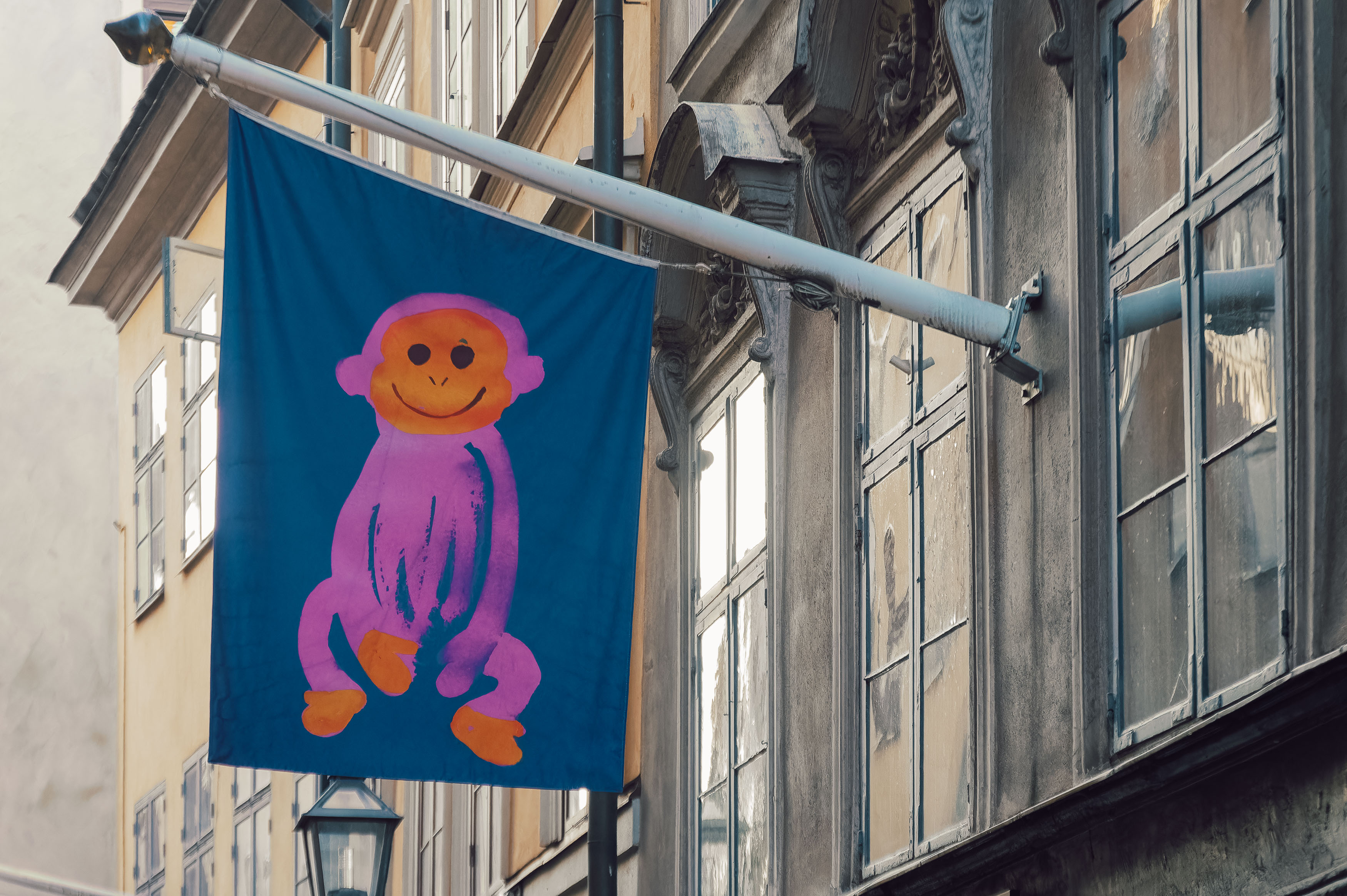
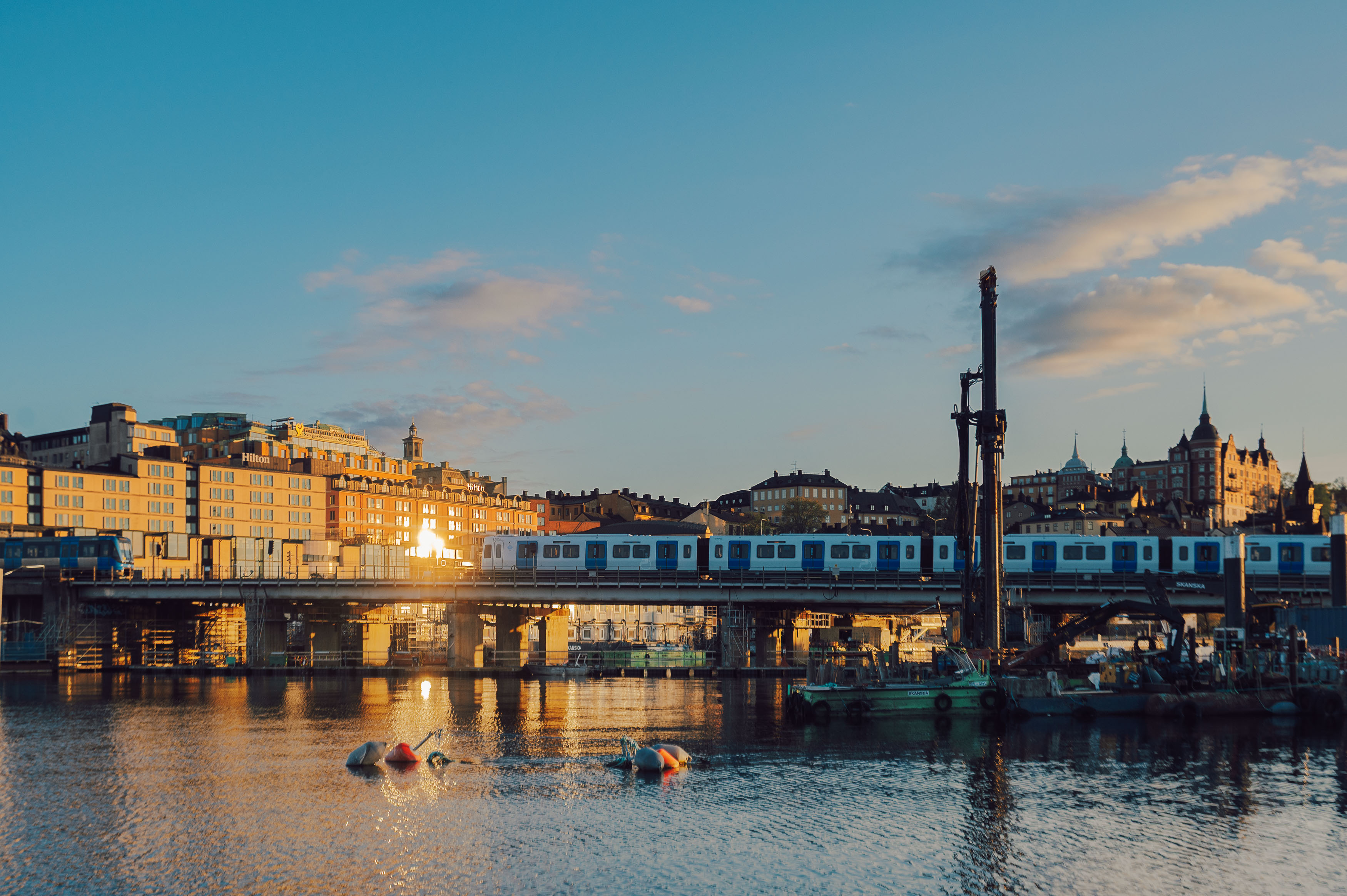
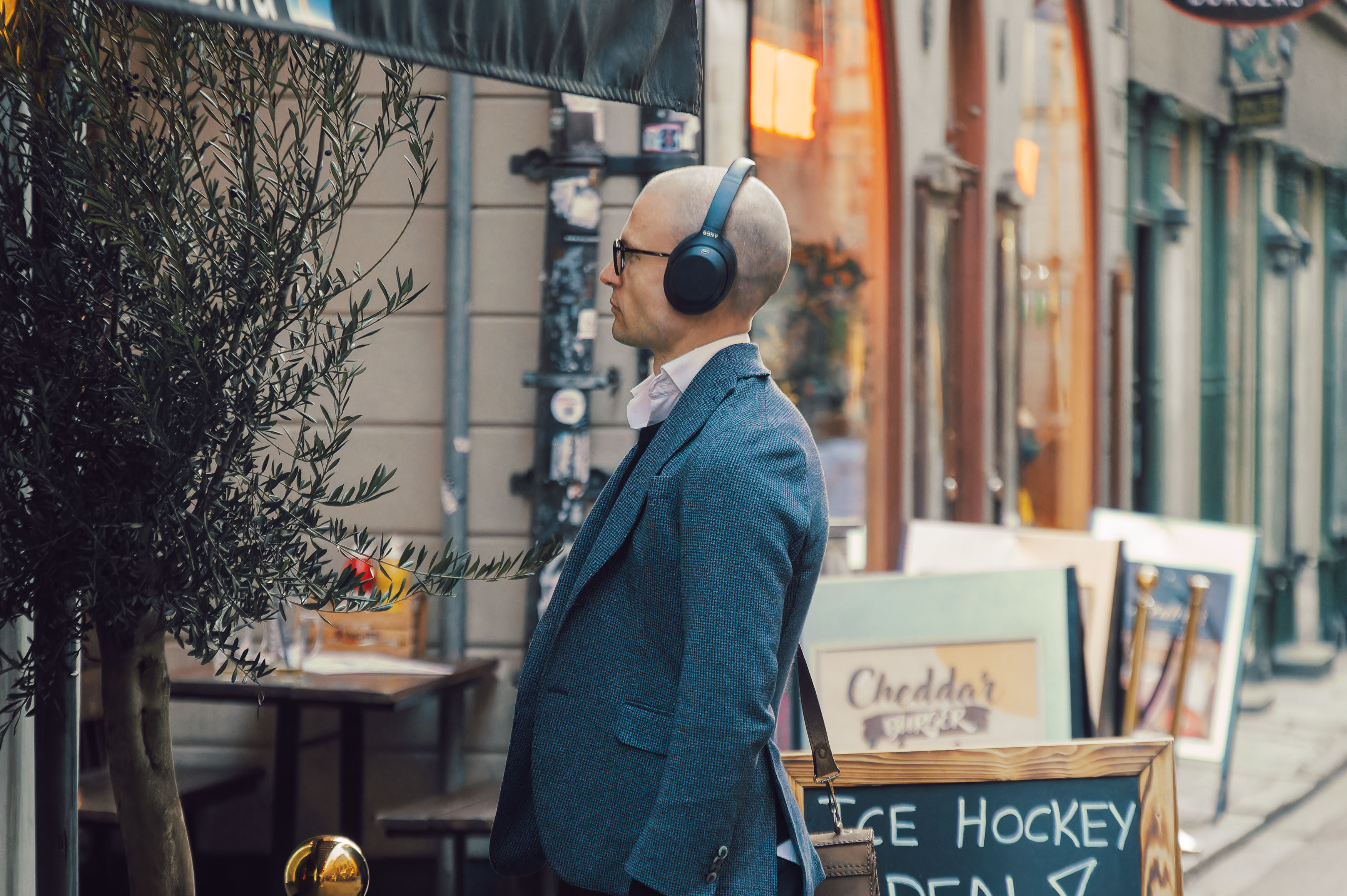
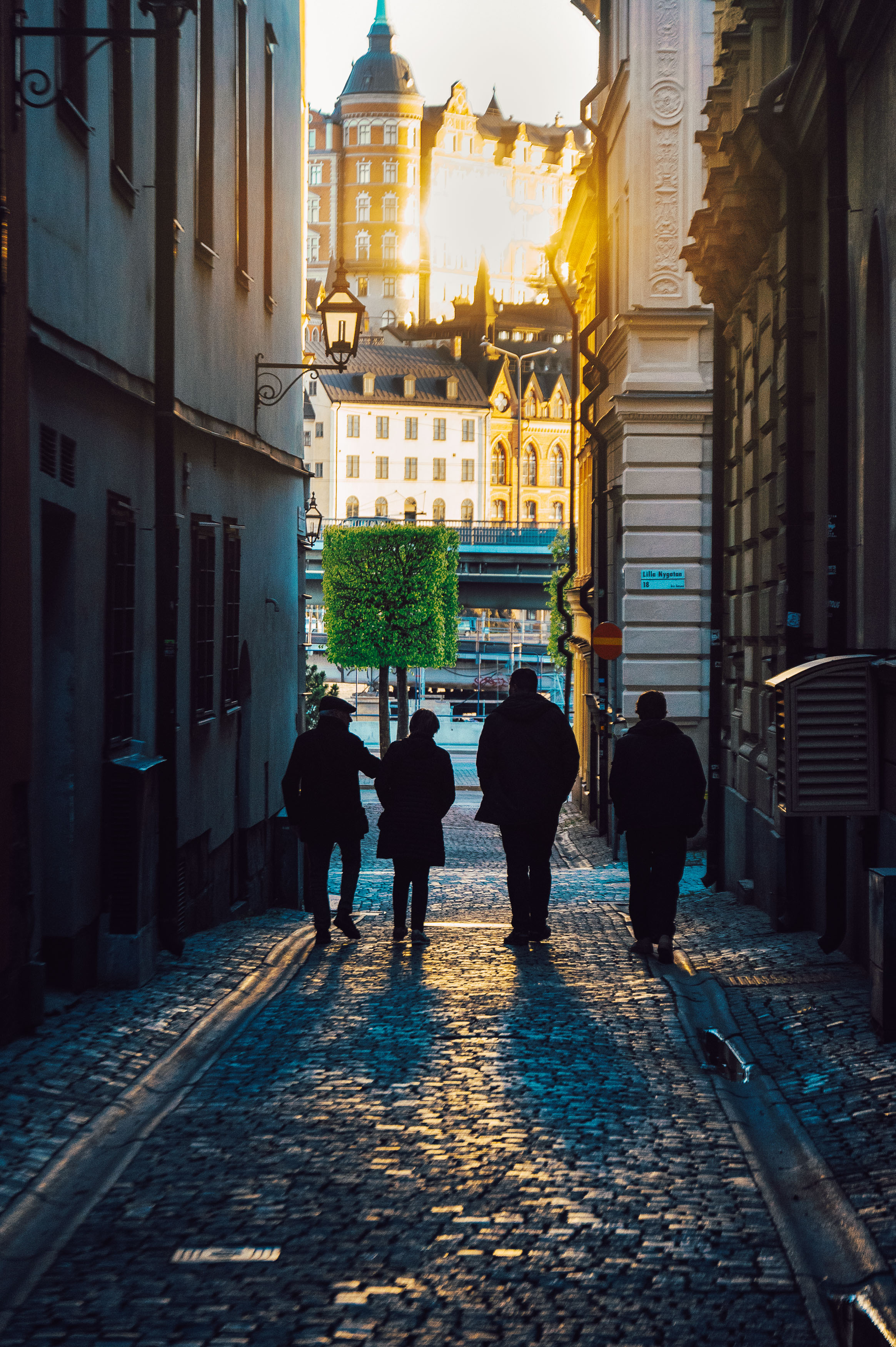
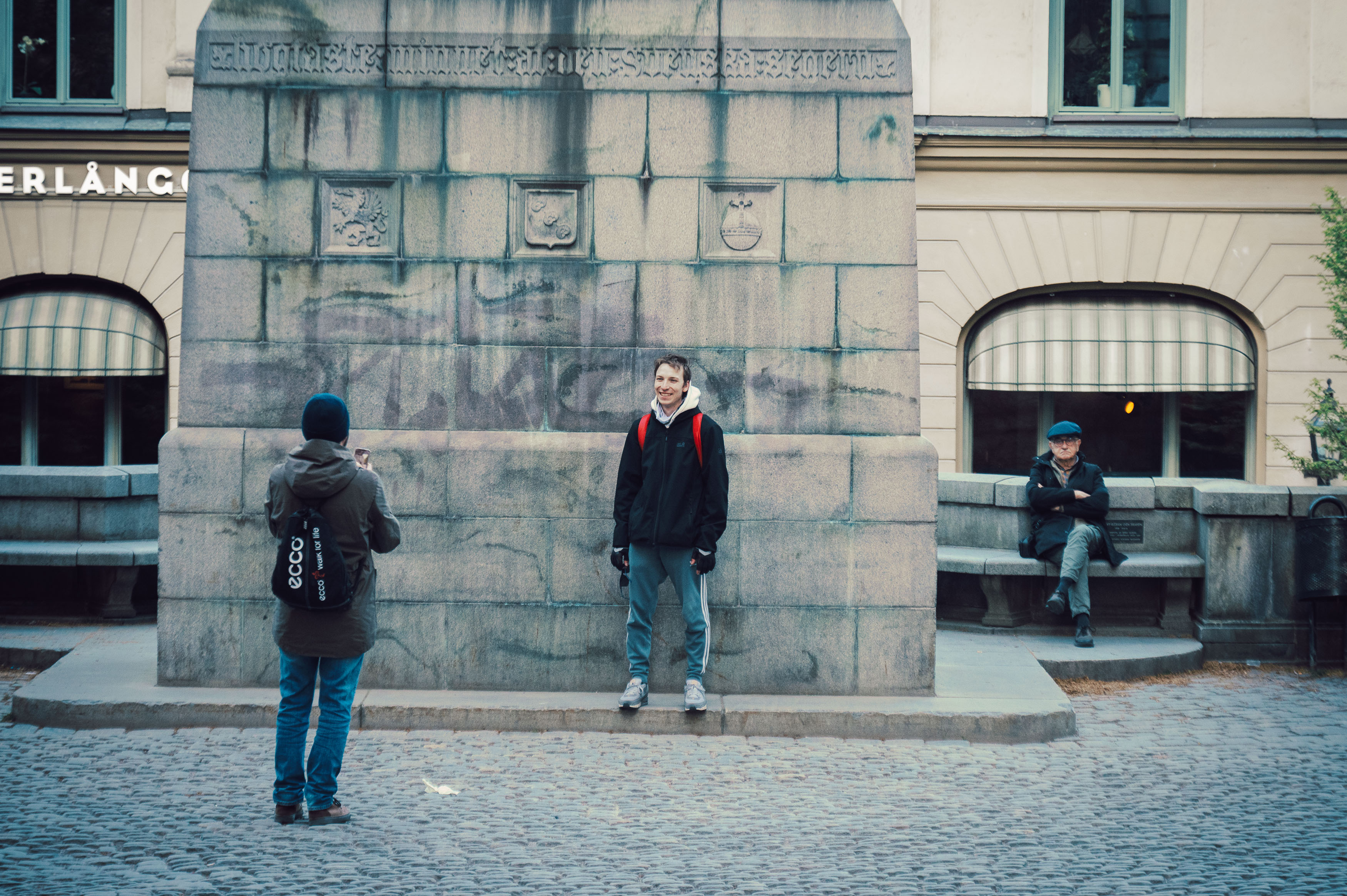
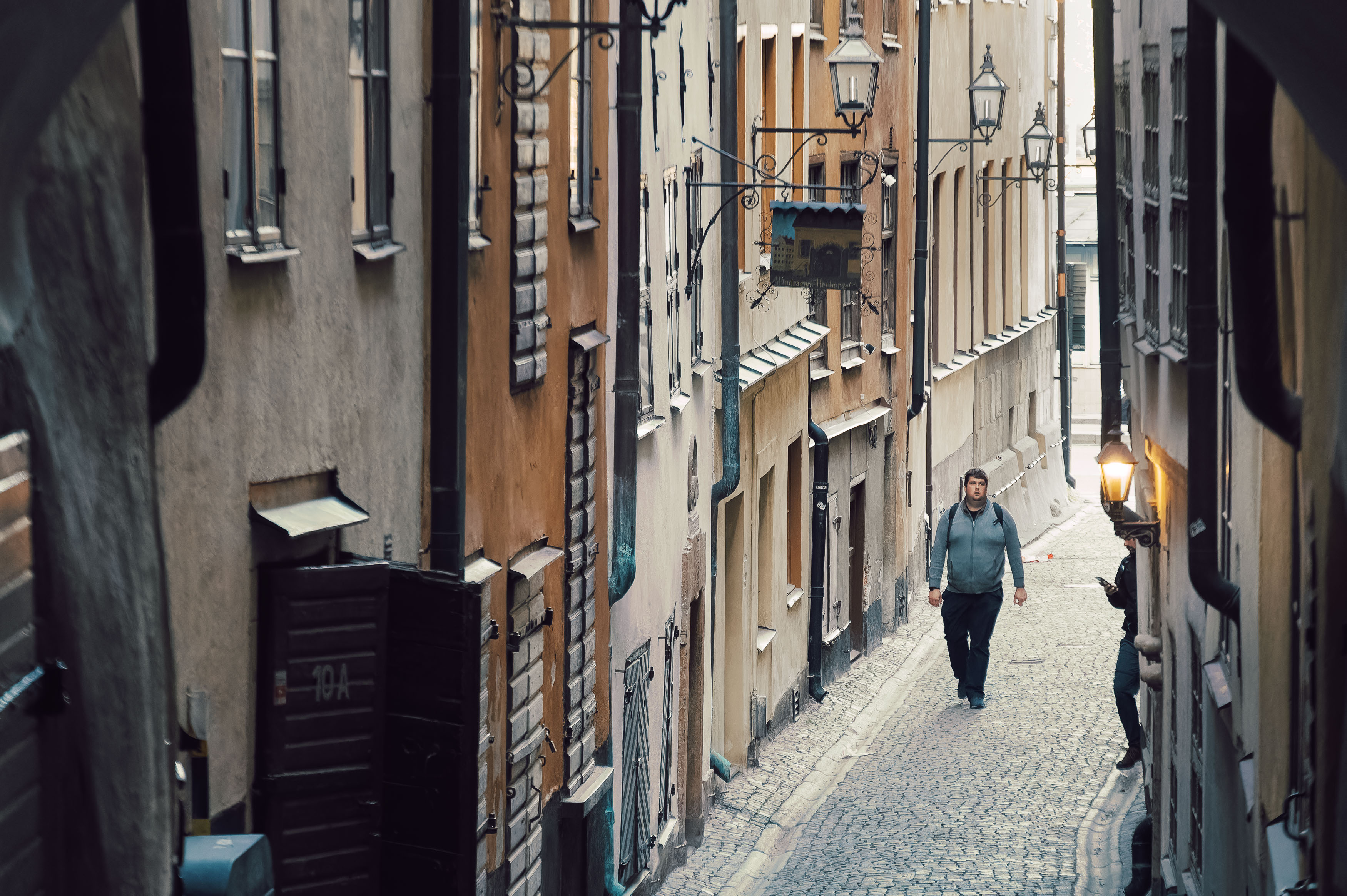
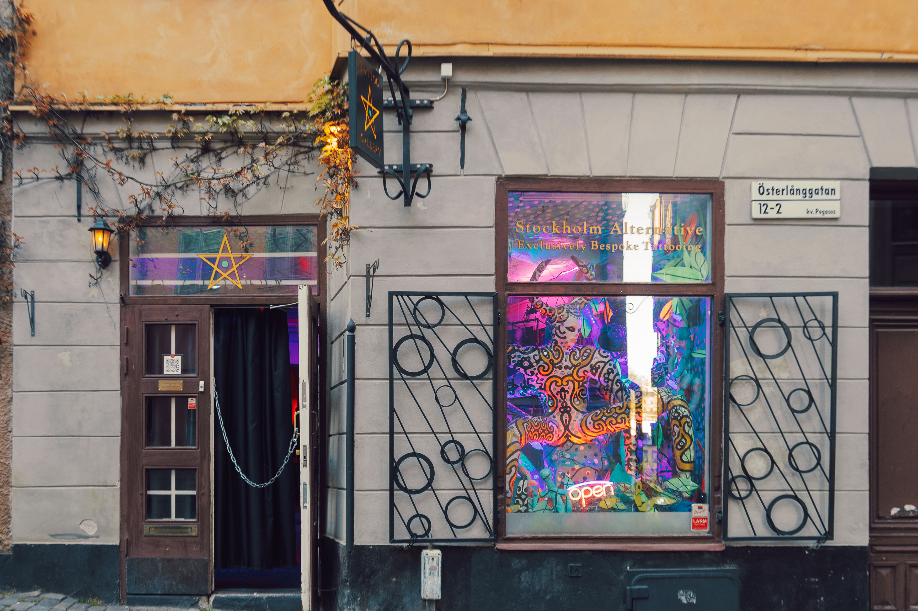
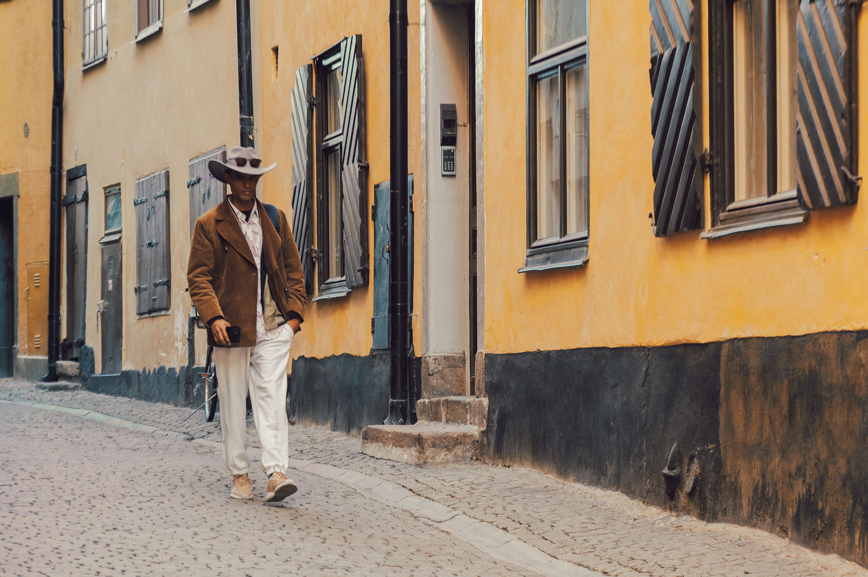
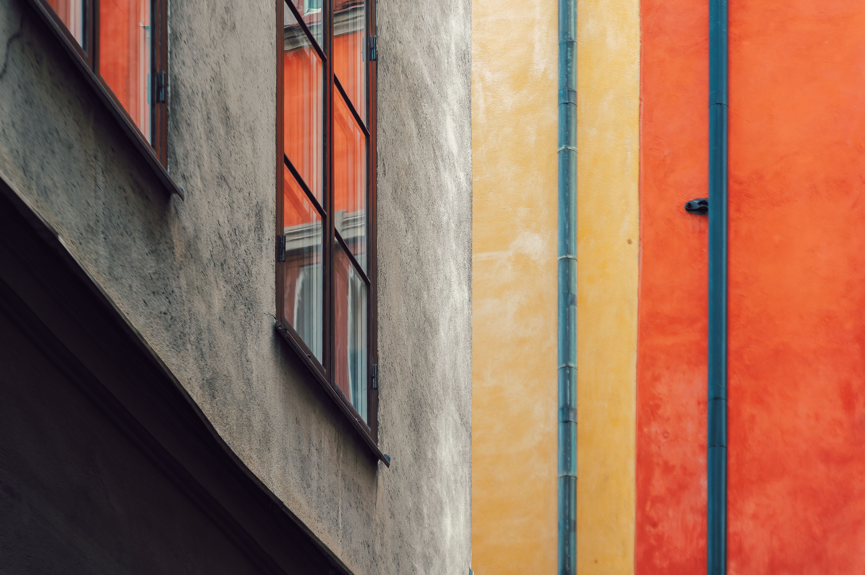
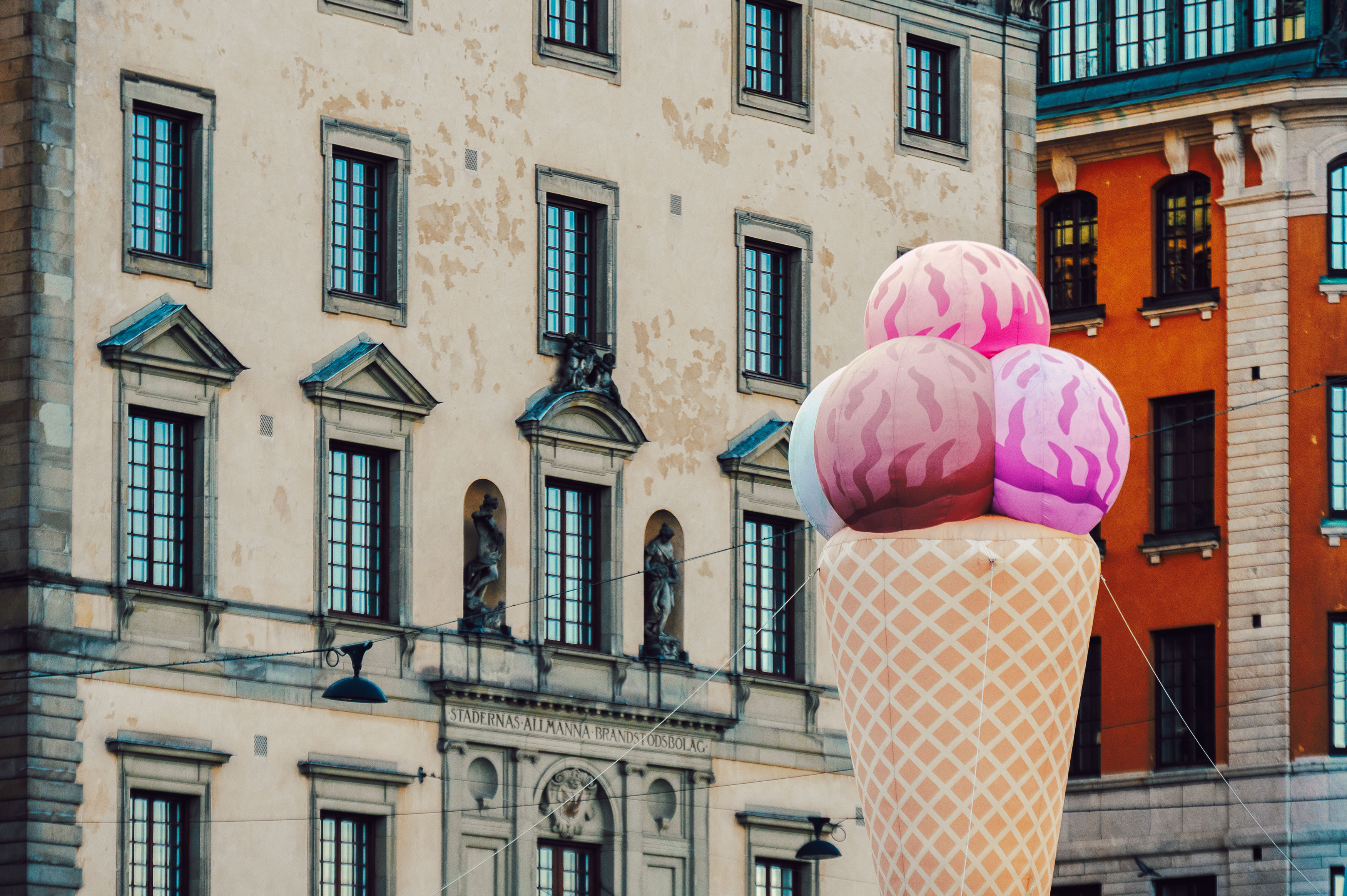
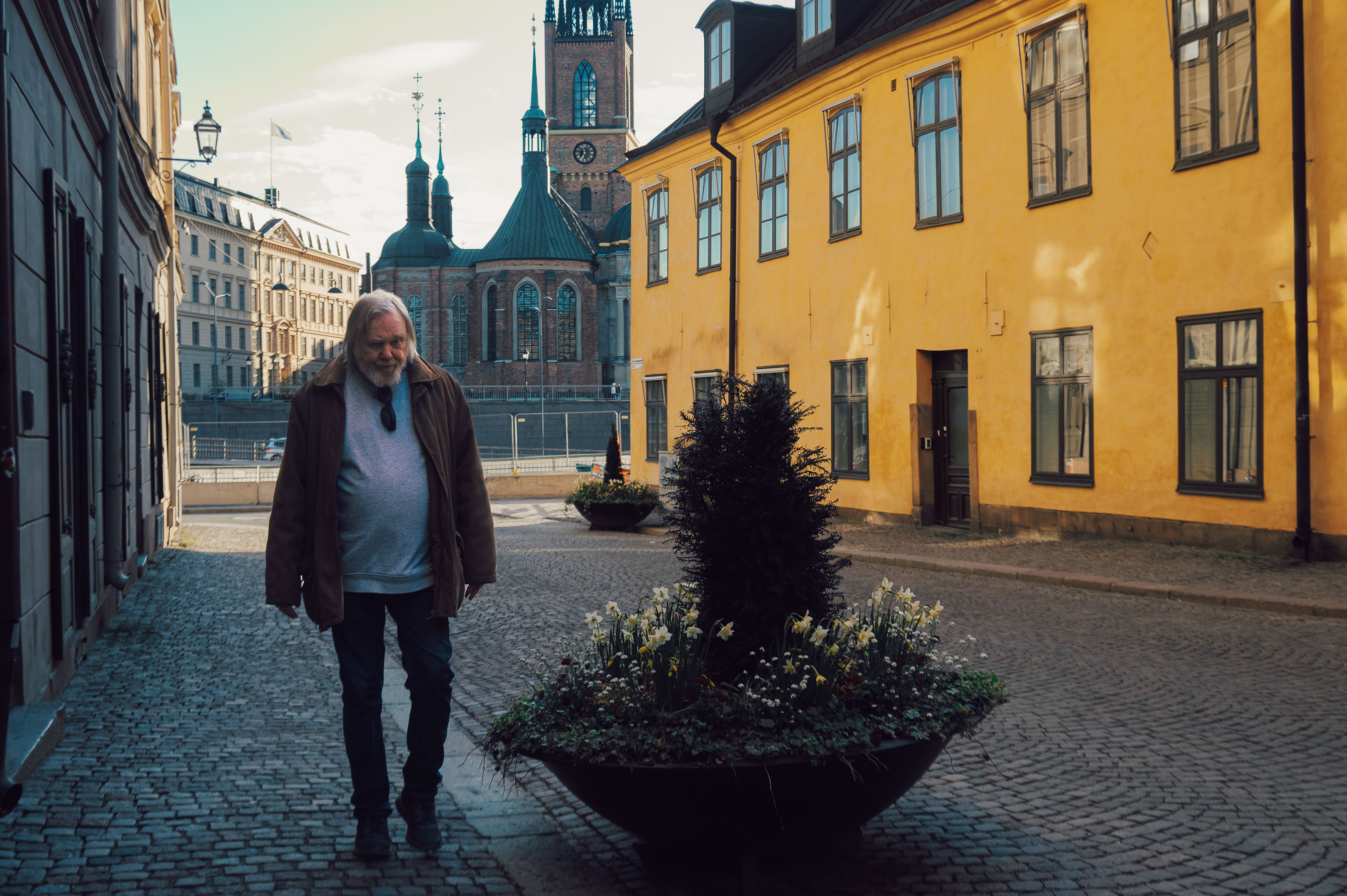
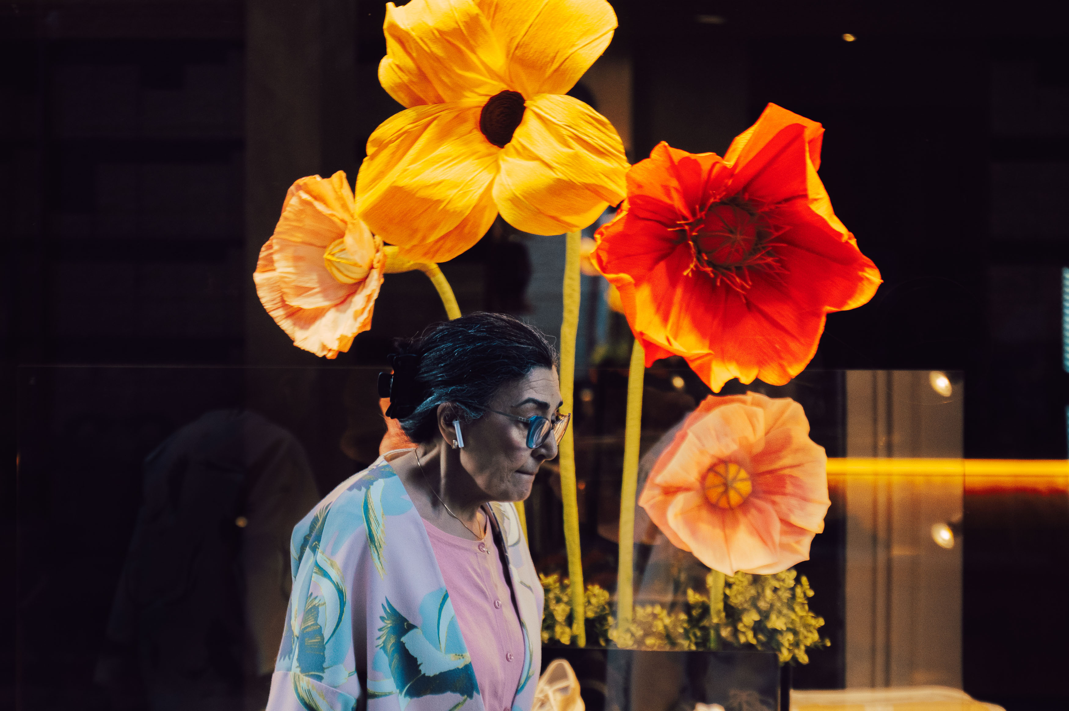
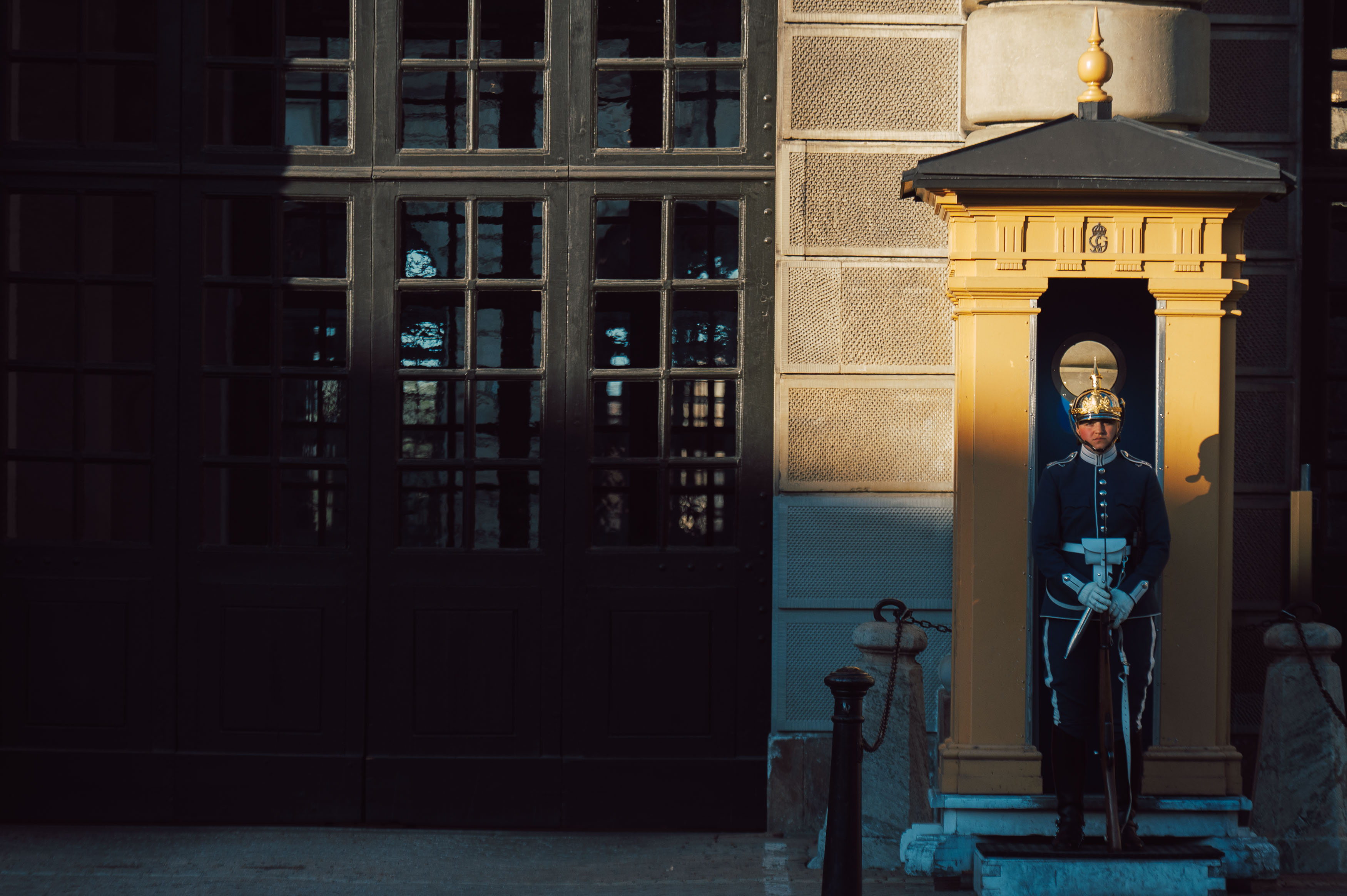
I’ve also always enjoyed finding humour and unexpected visual juxtapositions. Some of my favourite images are those that invite viewers to pause for a second and ask themselves exactly what’s happening. Street photography rarely hands you those moments on a plate, but they’re immensely satisfying when everything aligns.
One area where I have changed significantly is my attitude towards obvious tourist photographs. Twelve years ago, photographing famous viewpoints felt fresh and exciting. Today those same locations have been documented millions of times across social media, making it increasingly difficult to create something that feels original. It’s not that these places have become less beautiful—they’ve simply become visually familiar.
That realisation has encouraged me to search for smaller stories instead of iconic postcards. Rather than collecting landmarks, I’m more interested in collecting moments.
Comparing six photographs from my recent visit with those from 2013 produced an unexpected conclusion. Technically, my modern images are undoubtedly stronger. The compositions are cleaner, the editing is more restrained and there’s a greater consistency throughout the collection. Yet I can’t completely dismiss the older photographs.
There was an exuberance to my earlier work that I sometimes miss. I experimented more freely with unusual angles, slower shutter speeds and motion blur, unconcerned about whether everything fitted neatly into a recognisable personal style. Perhaps experience has improved my judgment, but maybe it has also made me a little more cautious.
One change genuinely stands out, though. My newer photographs contain more people, and those people feel less like decorative elements placed within an architectural composition. Increasingly, they have become the subject rather than simply part of the scenery. Their expressions, gestures and interactions bring warmth and humanity that my earlier work often lacked.
Photography has always acted as both a shield and a bridge for me. A camera creates distance, offering a comfortable excuse to observe the world without fully participating in it. At the same time, it can become a surprisingly effective way of connecting with people and making sense of the wonderfully awkward complexity of human interaction.
Perhaps that’s the real evolution after all. Maybe becoming a better photographer isn’t simply about mastering composition or choosing more tasteful editing techniques. Maybe it’s about gradually becoming more curious, more empathetic and more willing to see the people behind the photographs.
Of course, it’s entirely possible that in another twelve years I’ll look back at my 2025 images and cringe just as enthusiastically as I now do at my HDR experiments. If that happens, perhaps it will simply be proof that the journey is still continuing—and that’s probably exactly how it should be.
I’ve complained before that 28mm is probably the most boring focal length in photography. It’s the optical equivalent of plain toast: perfectly serviceable but rarely exciting. It sits somewhere between the intimacy of a 35mm and the drama of something genuinely wide, making it feel suspiciously similar to the field of view on your phone. If nothing else, it’s useful for photographing your lunch.
Despite my lack of enthusiasm, there was one obvious gap in my rangefinder kit. Finding a good 28mm lens for the Leica Thread Mount isn’t exactly easy because wide-angle lens design in the 1950s involved plenty of optical compromises. The obvious budget option is the Soviet Orion-15, but its relatively slow f/5.6 aperture and steadily rising second-hand prices meant it wasn’t quite what I was looking for. At the other end of the spectrum sat Leica’s own Elmarit, but buying one of those would probably have required selling one of my children, and they’re now old enough to understand employment law.
Instead, while wandering around Shinjuku in search of something completely different, I stumbled across the Canon 28mm f/2.8. It struck a happy compromise between affordability and quality, and although it lacks the red dot that causes photographers to lose all sense of financial responsibility, it still feels wonderfully substantial. Built from brass and glass, it’s compact, beautifully made and just heavy enough to remind you that cameras used to be engineered rather than assembled.
Its pedigree isn’t exactly shabby either. This was one of the lenses favoured by Garry Winogrand as he documented post-war America, producing one of the most influential bodies of street photography ever assembled. Winogrand died at just fifty-six, leaving behind thousands of undeveloped rolls of film. I’ve somehow managed to outlive him already, although my own contribution to photographic history currently consists of a steadily growing archive of YouTube videos that algorithmically disappear into the digital abyss.
Still, one or two people are watching, so I thought it was finally time to give this little Canon the outing it deserved.
Like many of my photography trips, this one began with work rather than art. An overnight business trip to Shenzhen left just enough time for an hour wandering through Happy Valley, which, despite its cheerful name, possessed the slightly unsettling atmosphere of an abandoned theme park. It felt strangely appropriate to photograph it on black-and-white Kentmere 100 using my Leica M2, allowing the stark architecture and empty spaces to become the real subject rather than the colours themselves.
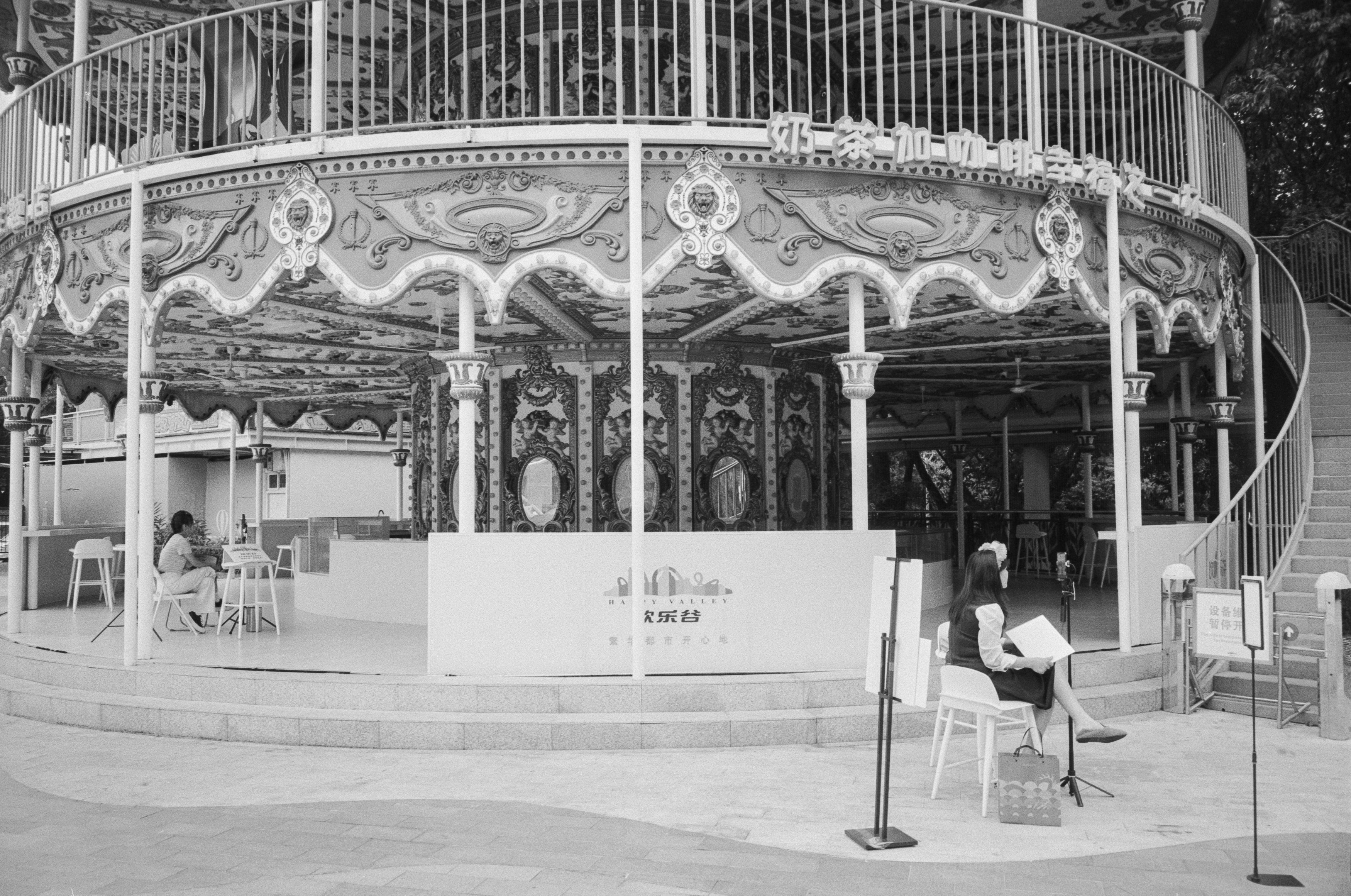
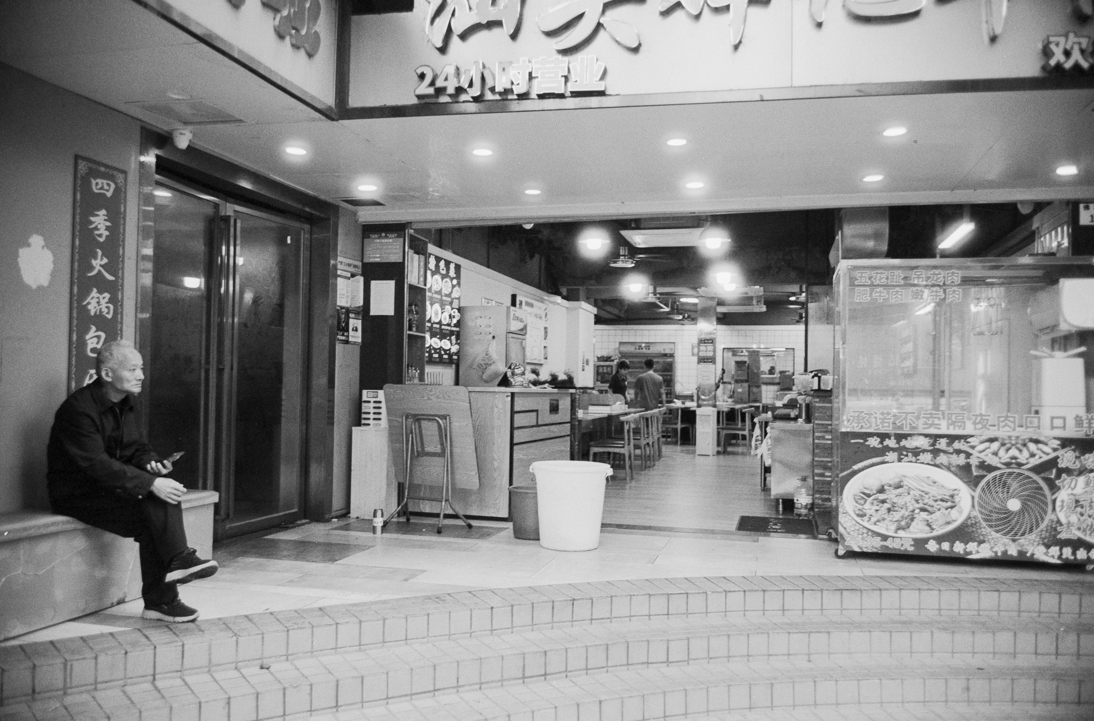
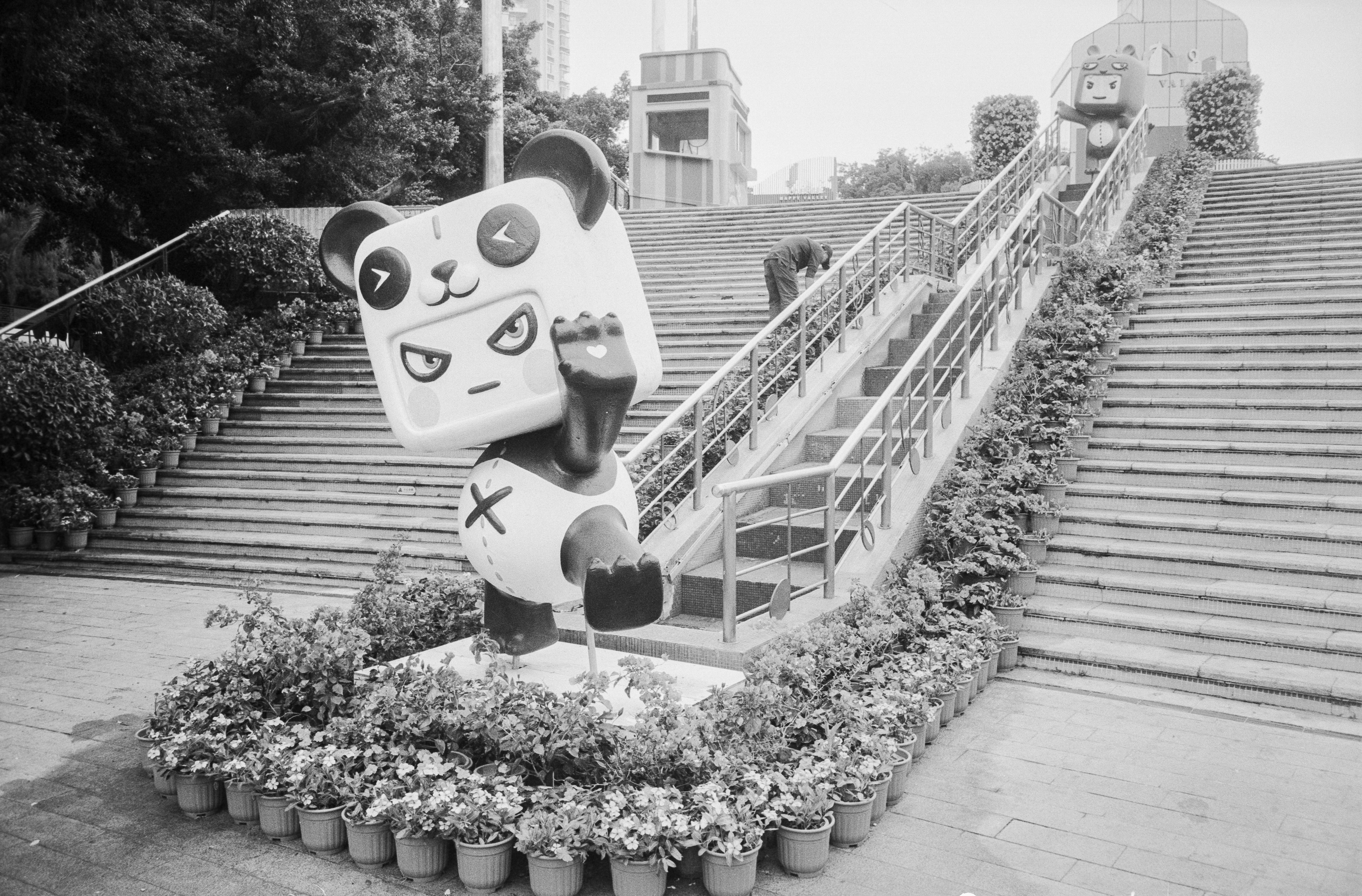
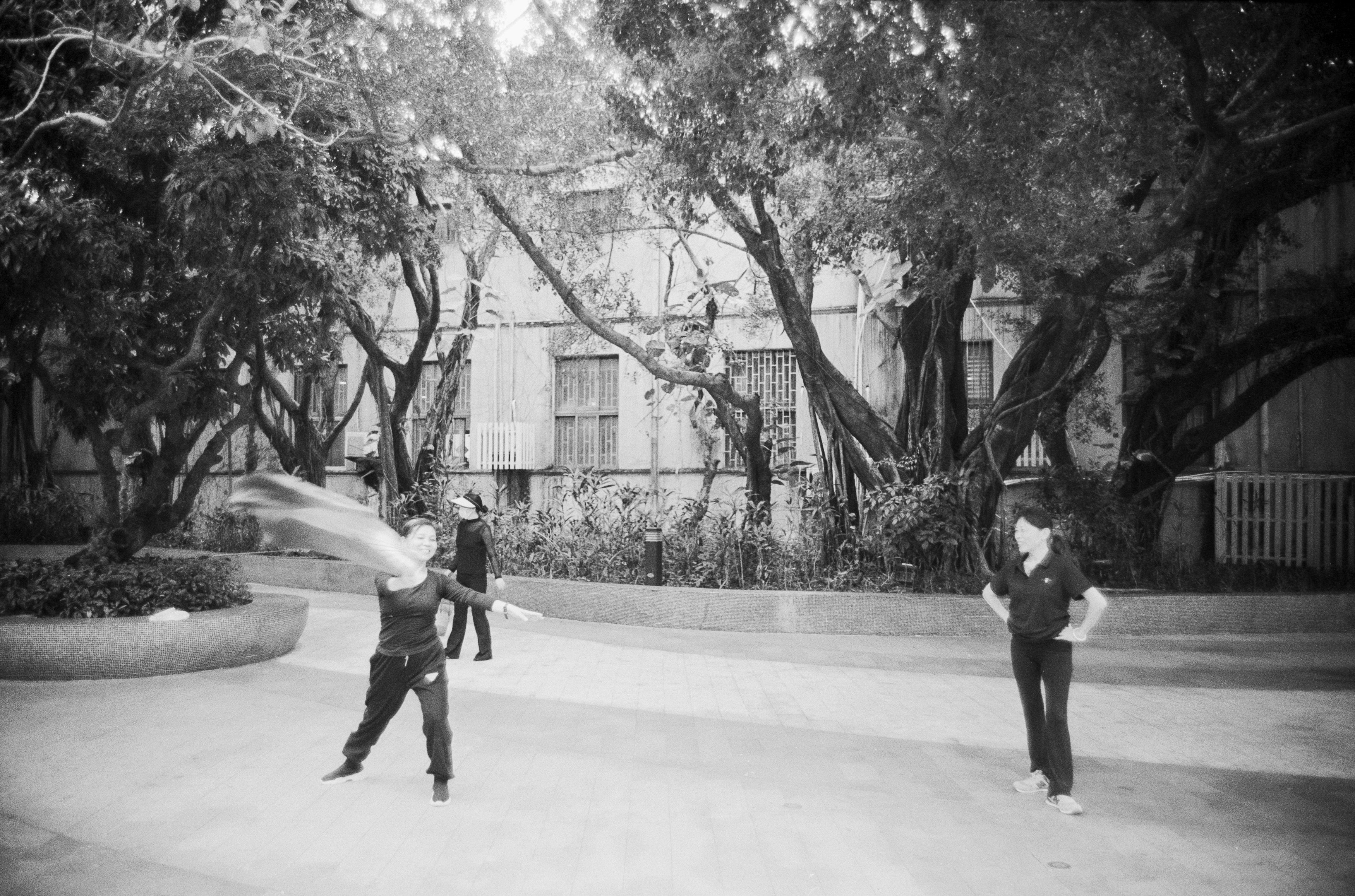
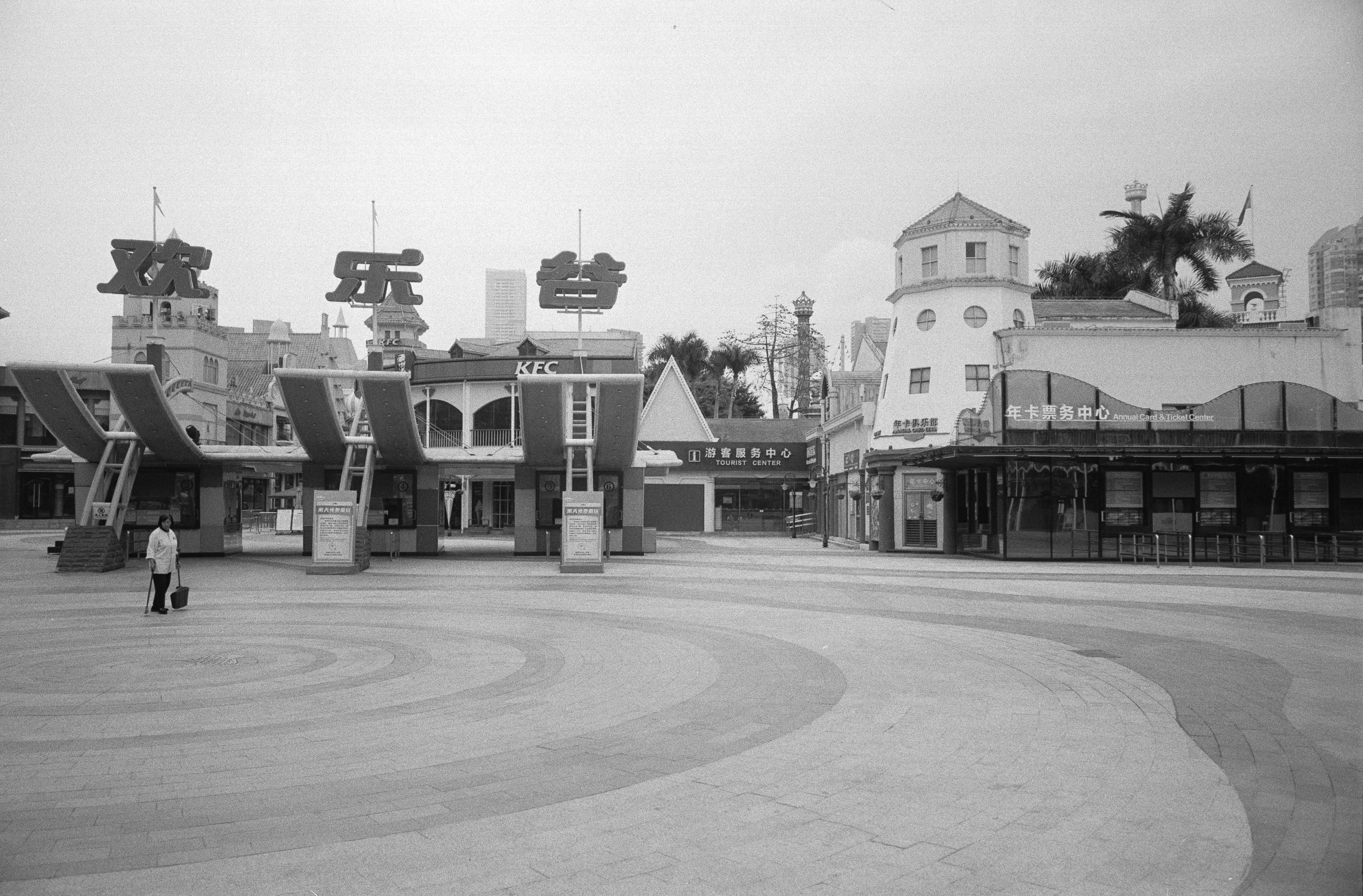
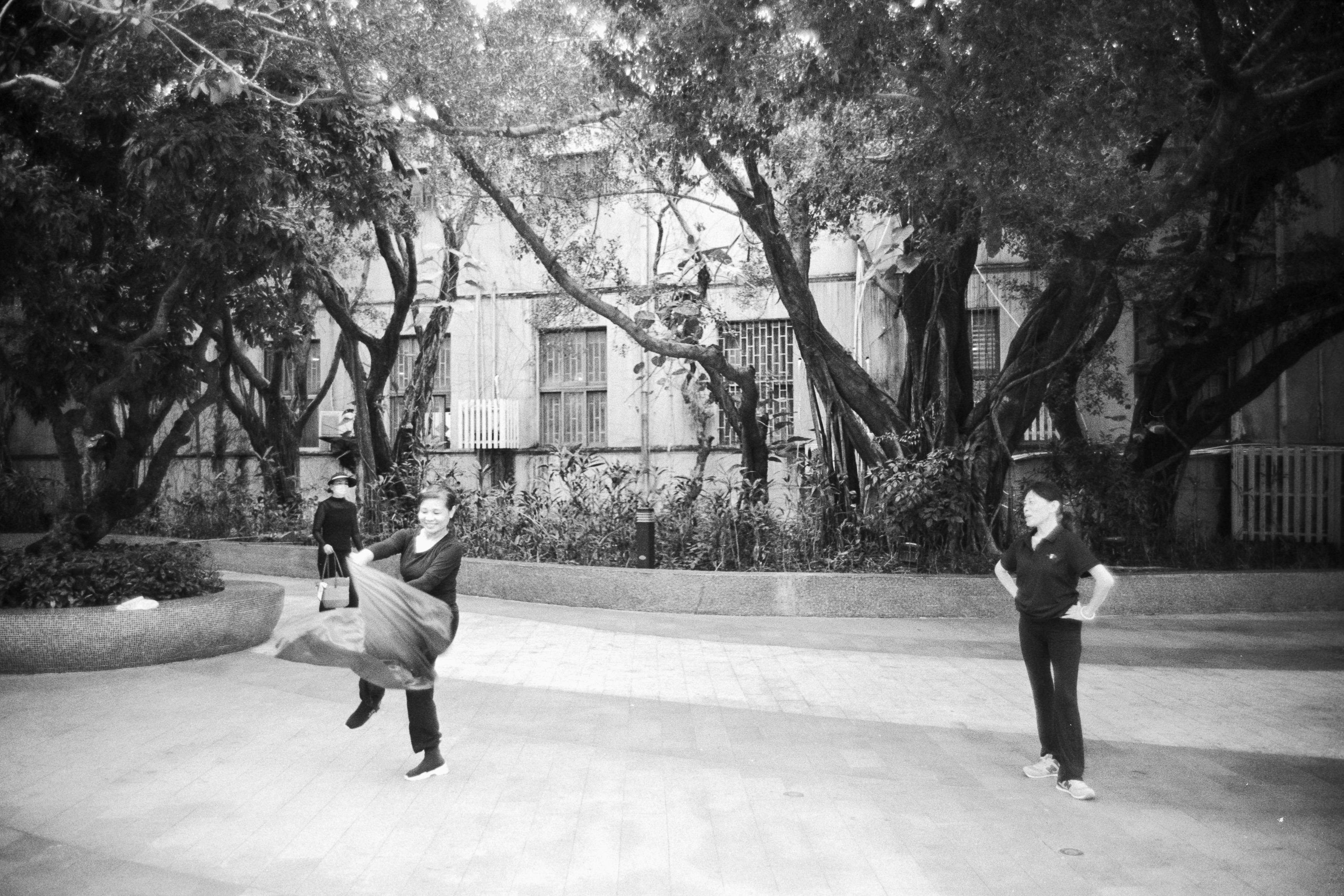
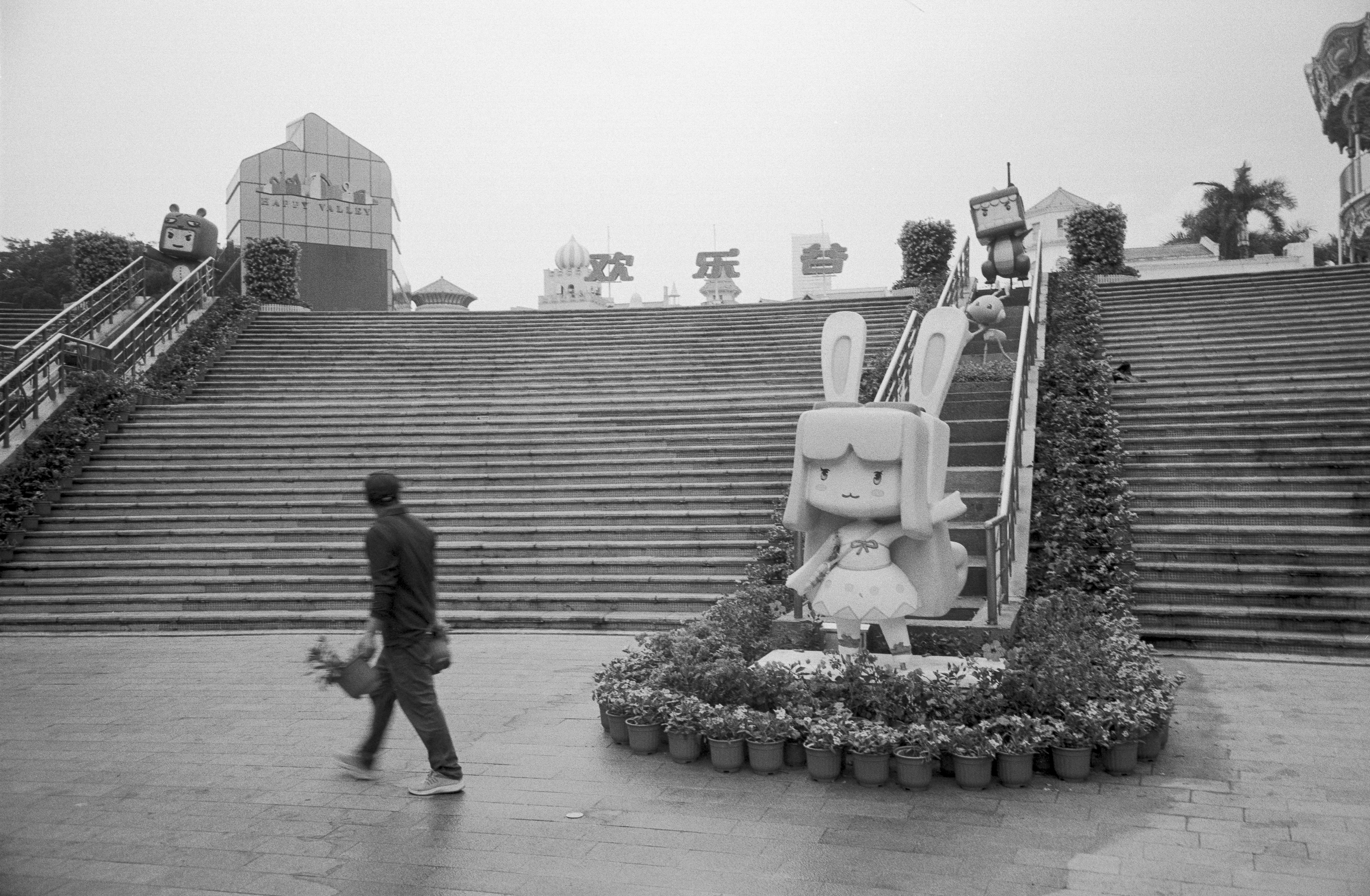
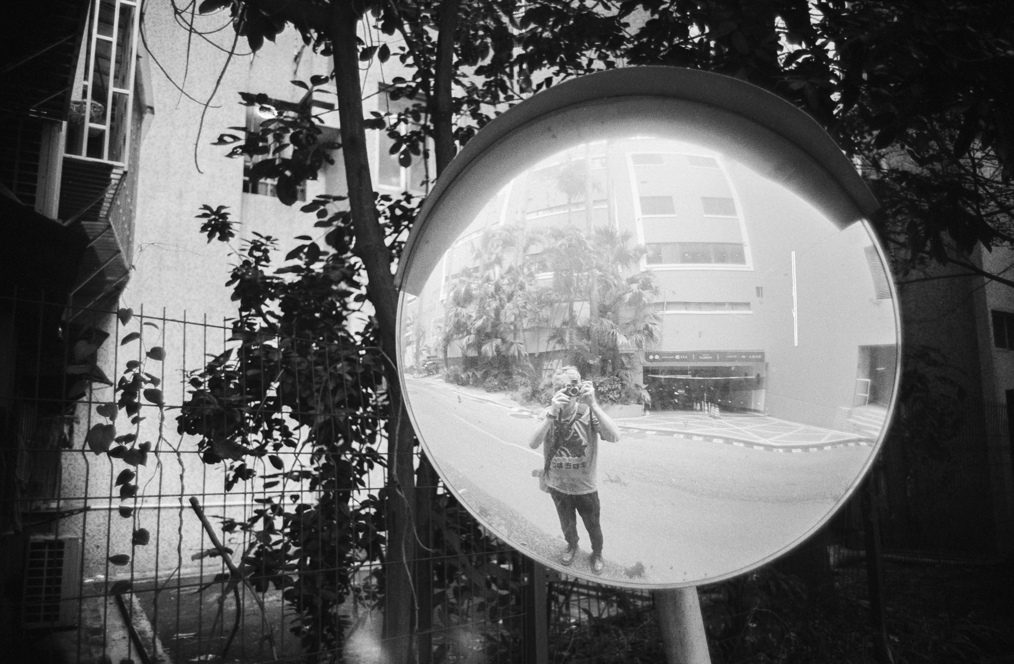
The Canon immediately makes a good first impression. It’s tiny enough to disappear onto the front of the Leica, yet the focus ring remains easy to grip. It features Canon’s familiar infinity lock, which has a reputation for annoying photographers but quickly becomes second nature once you’ve spent some time with it. Likewise, the front-mounted aperture ring works surprisingly well because the clicks are lighter than the focus action, allowing exposure adjustments without accidentally throwing focus out.
Internally, though, this is unmistakably a product of the 1950s. The six-element design lacks the sophisticated corrections of modern optics, and nobody is going to mistake it for a clinically perfect contemporary lens. Instead, it embraces the sort of imperfections that vintage lens enthusiasts spend their lives romanticising. This lens wasn’t designed to chase laboratory sharpness charts; it was designed to make photographs.
Its age also makes it feel perfectly at home on film. Introduced in 1957, it predates many of the modern photographic conventions we now take for granted, and pairing it with a mechanical Leica feels entirely natural. Ironically, my first experiences with it weren’t on the Leica at all but on my Canon P, until that camera developed a dragging shutter caused by loose stitching on the shutter curtain. The repair proved rather more delicate than these sausage fingers were prepared to attempt, and the whole episode ultimately nudged me towards buying the Leica M2 instead.
One pleasant surprise is how well the M2 accommodates the lens despite lacking dedicated 28mm framelines. By simply using almost the entire viewfinder, the framing becomes remarkably accurate, even if it occasionally requires removing my glasses and pressing my face uncomfortably close to the camera.
Of course, adapting the lens to a modern mirrorless body removes all of those compromises. Mounted on my Nikon Z6 with a simple adapter during a walk through Vienna’s Museum Quarter and Naschmarkt, the Canon suddenly had focus peaking, magnification and a high-resolution sensor revealing every one of its strengths and weaknesses in glorious detail.
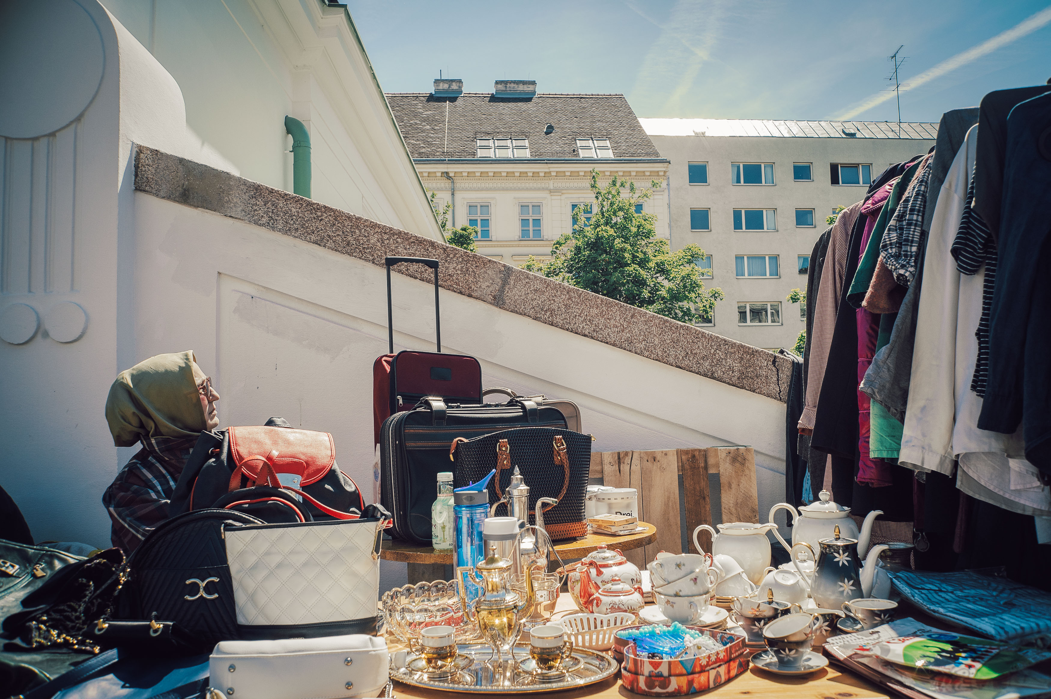
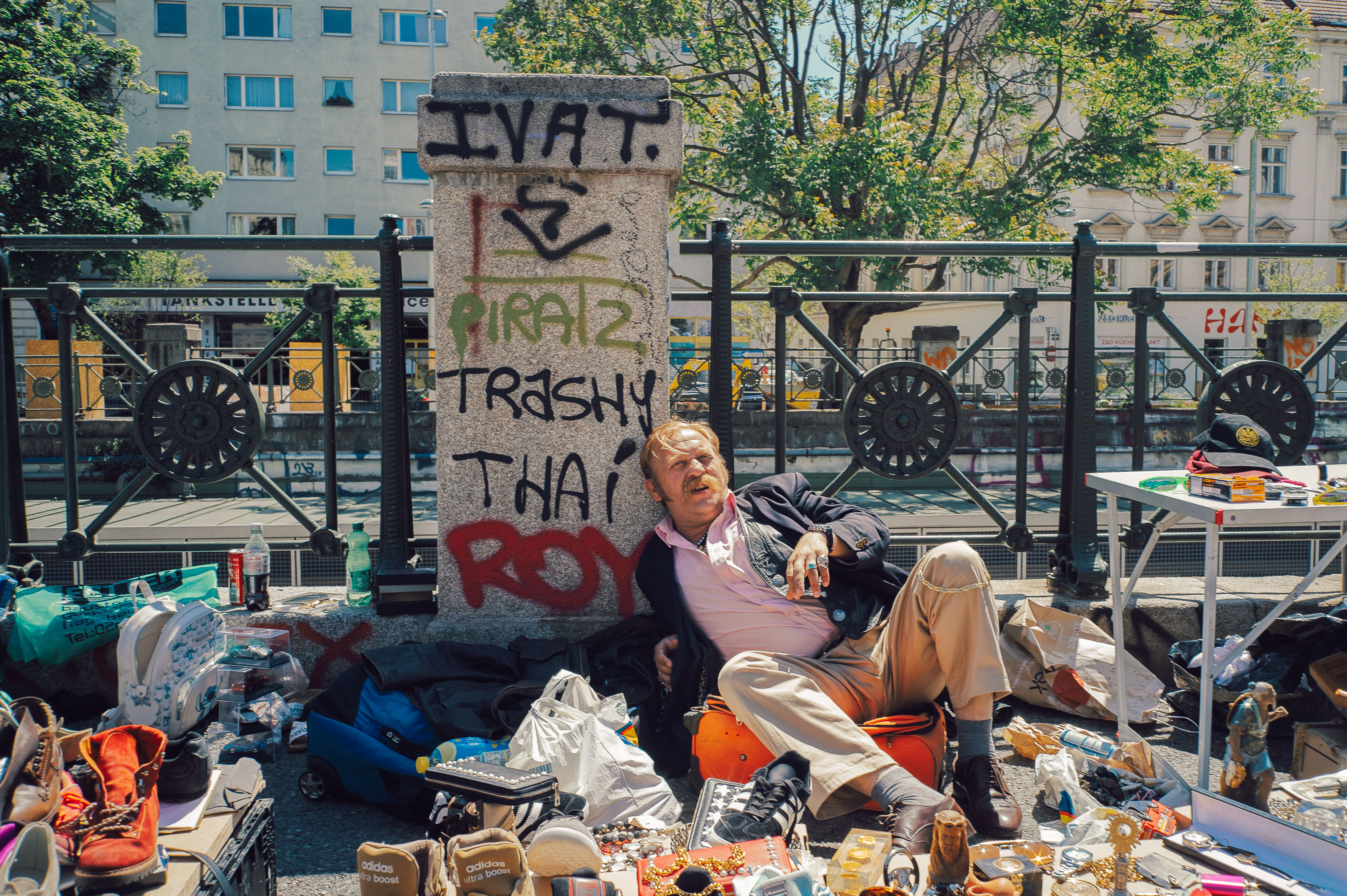
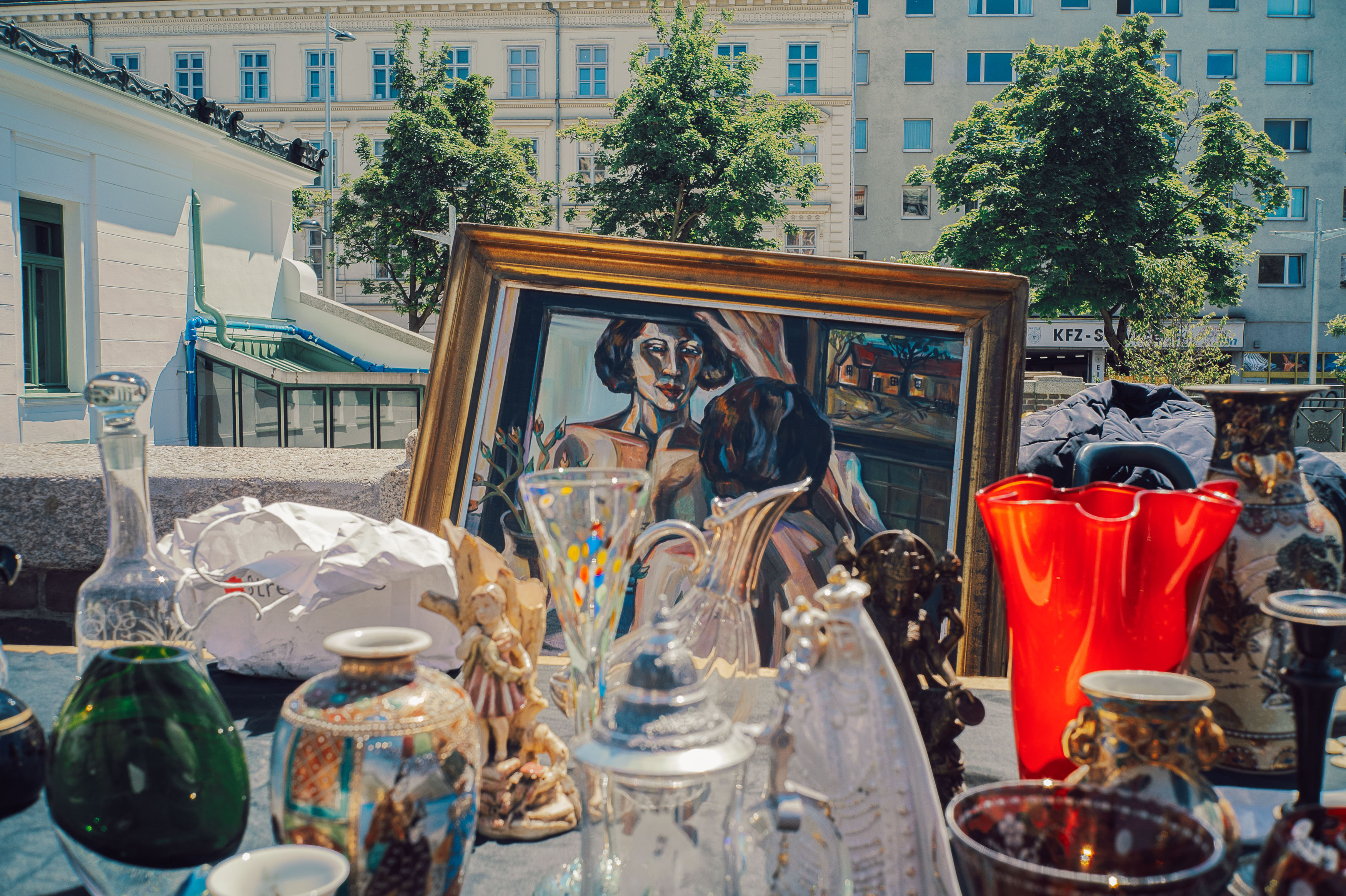
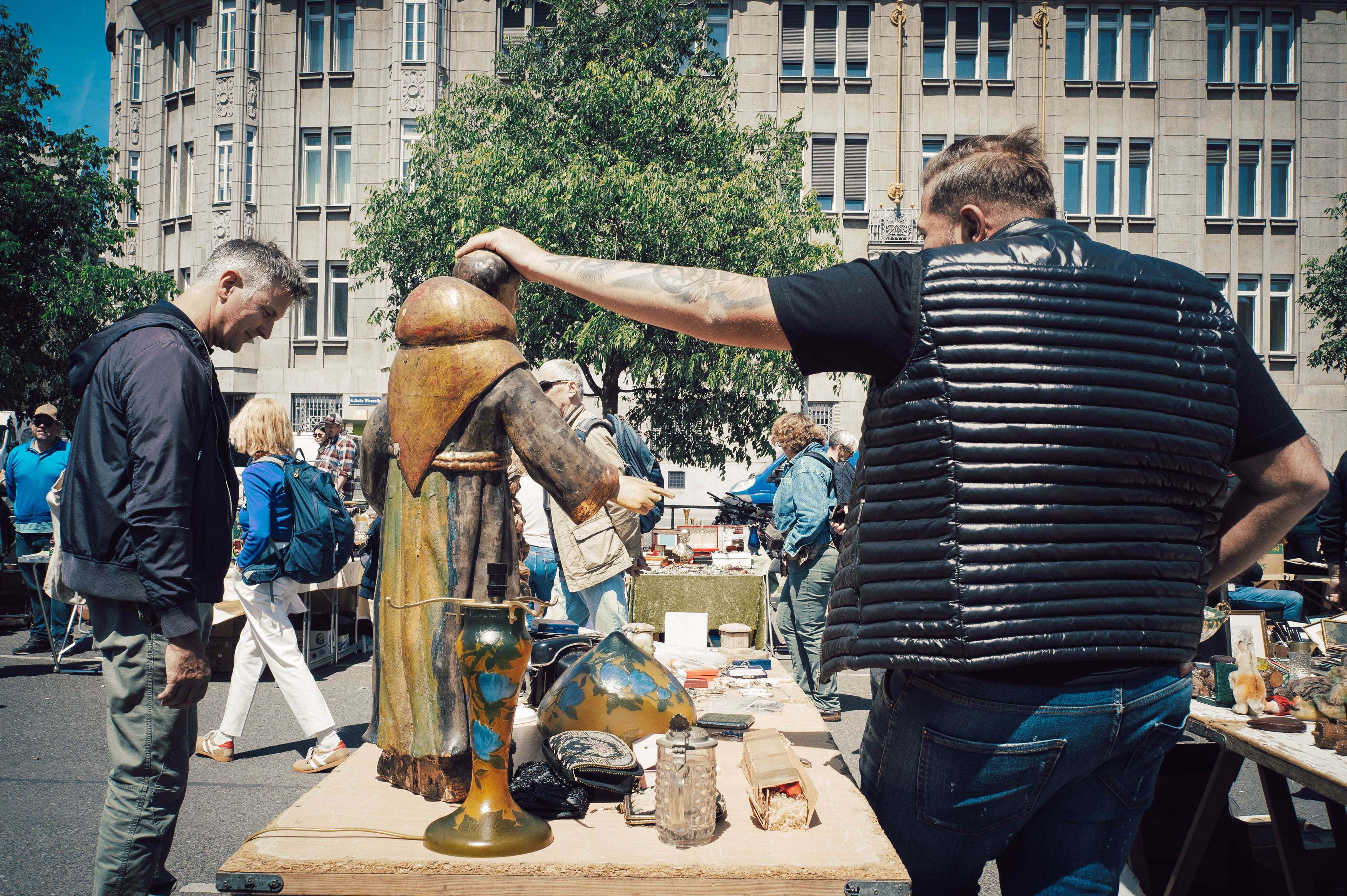
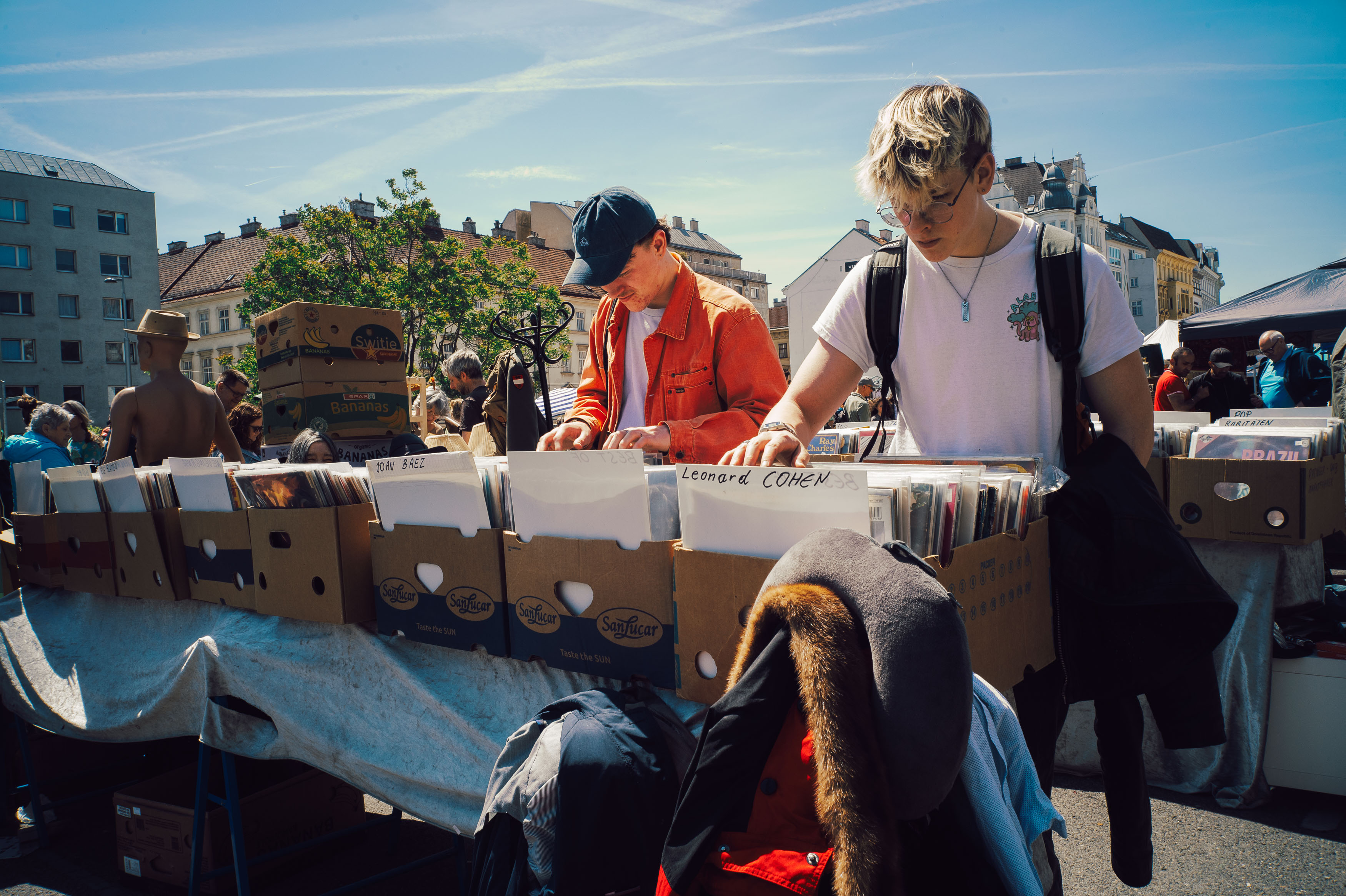
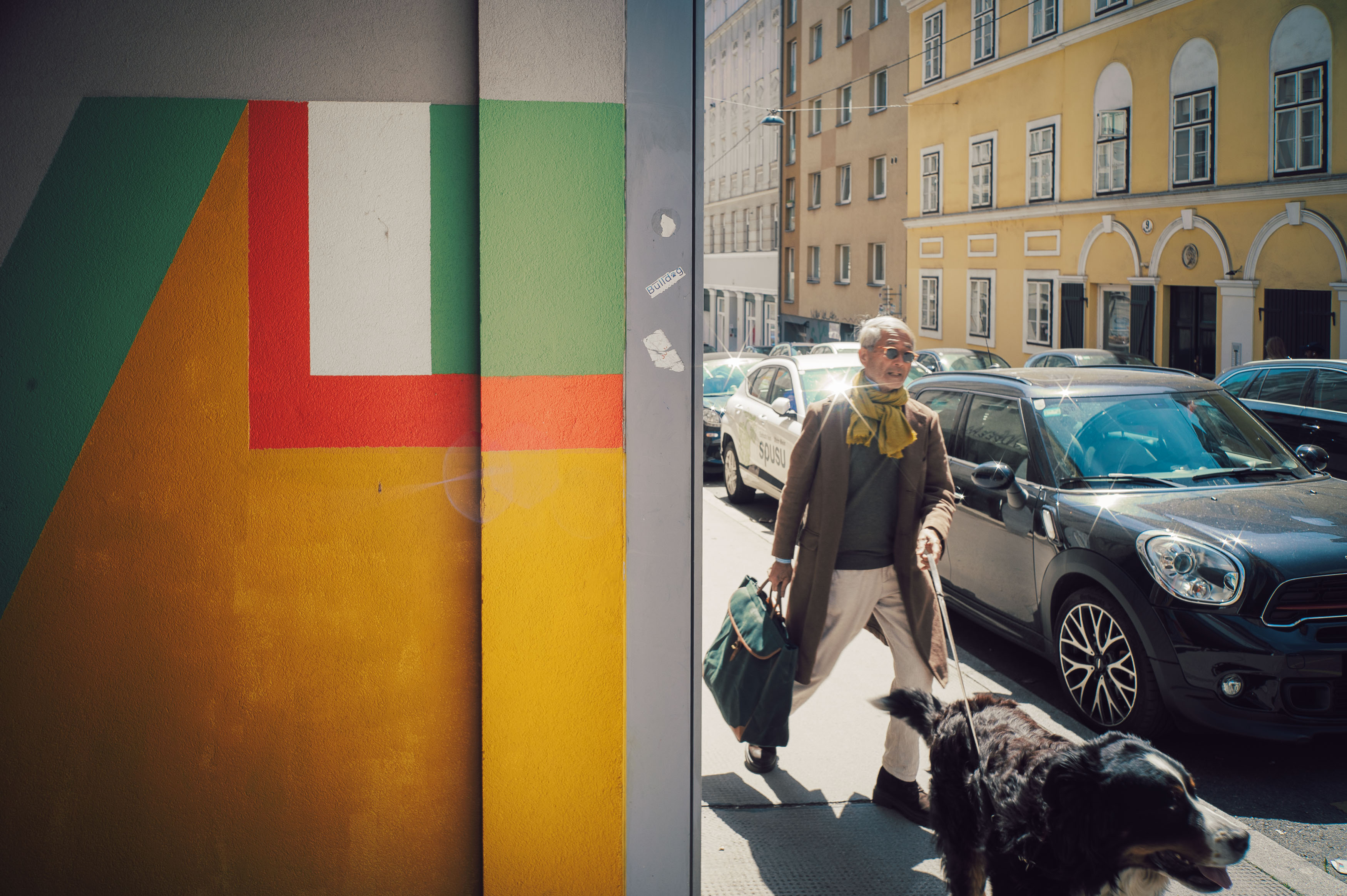
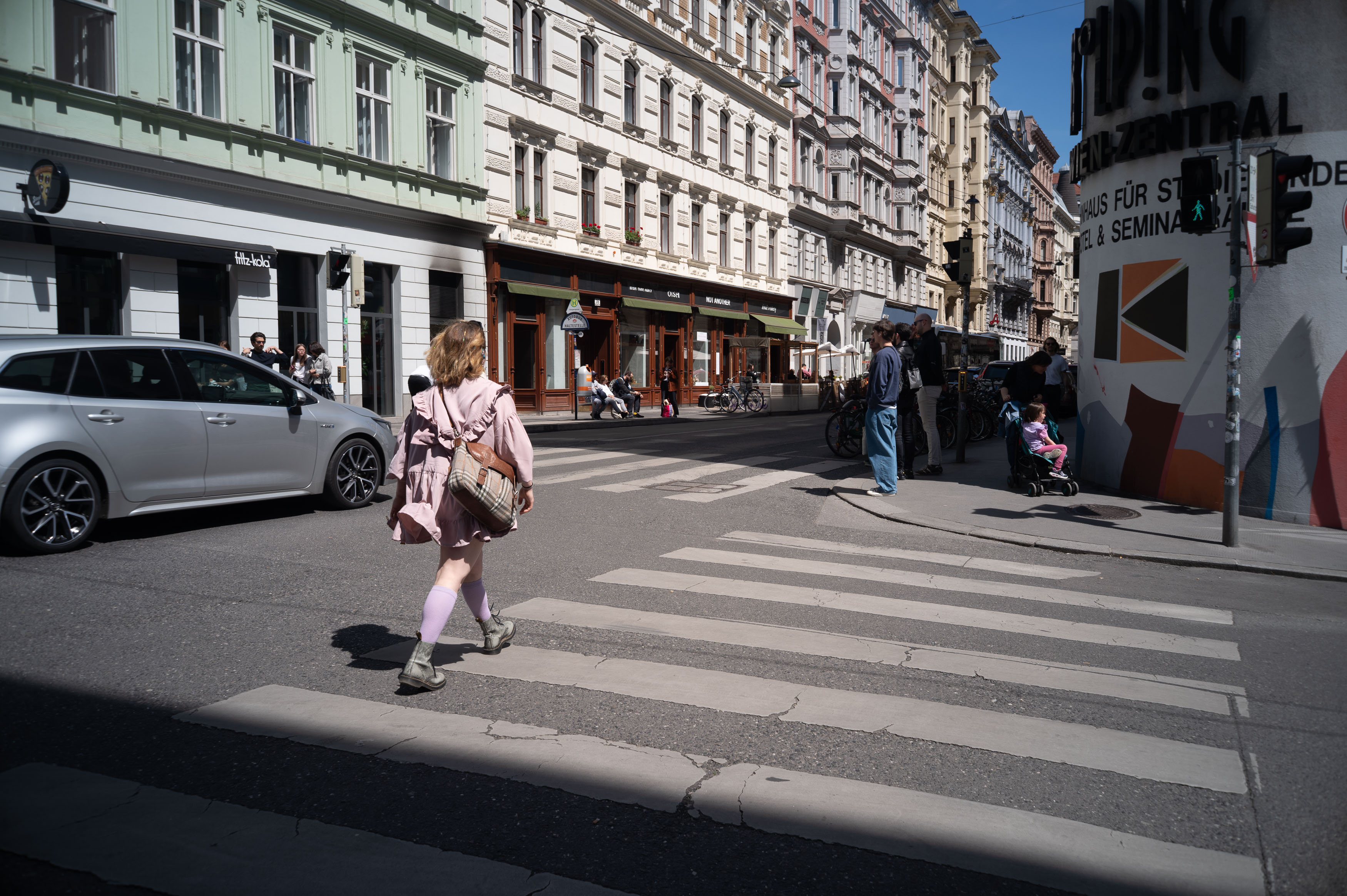
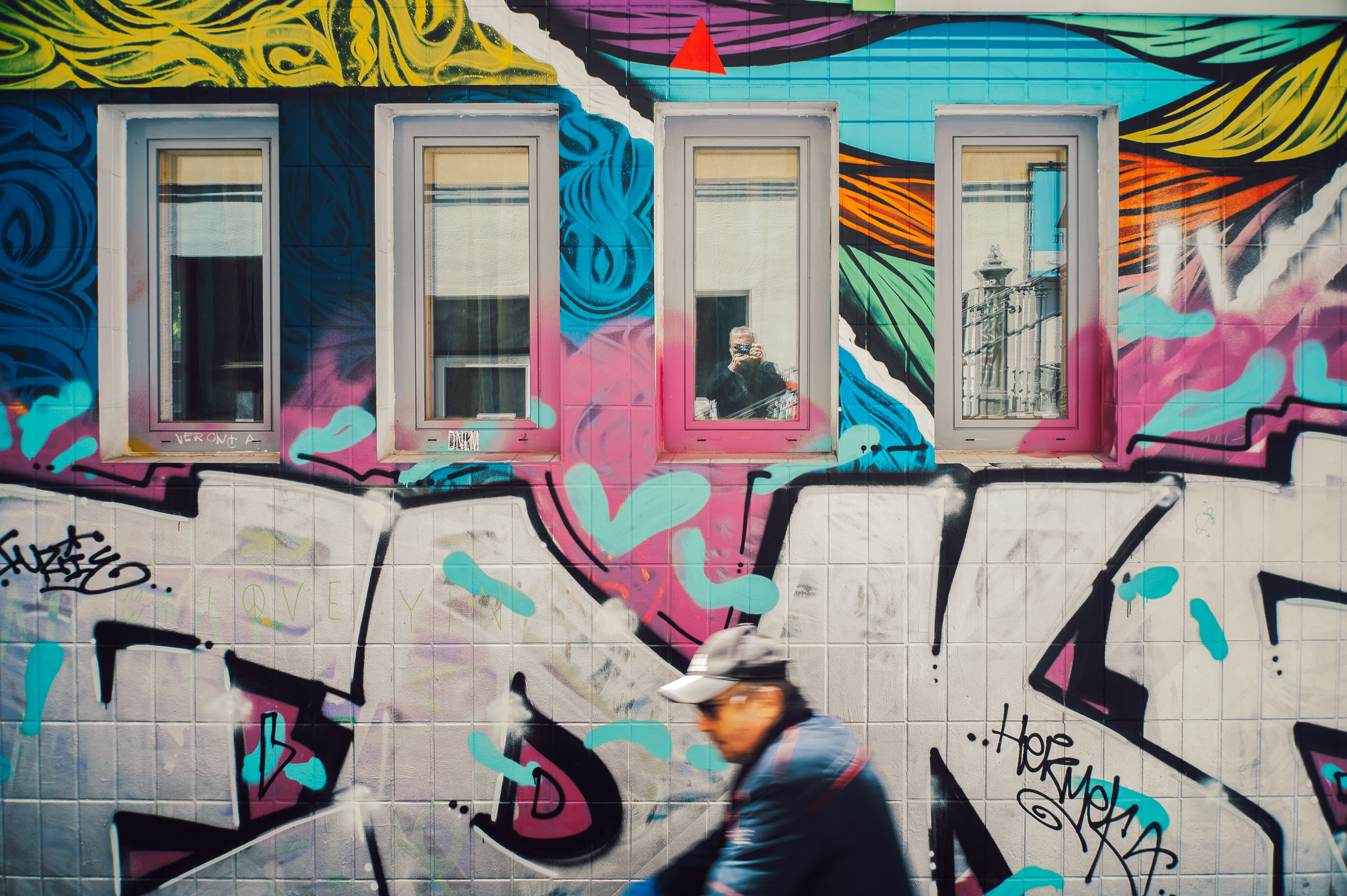
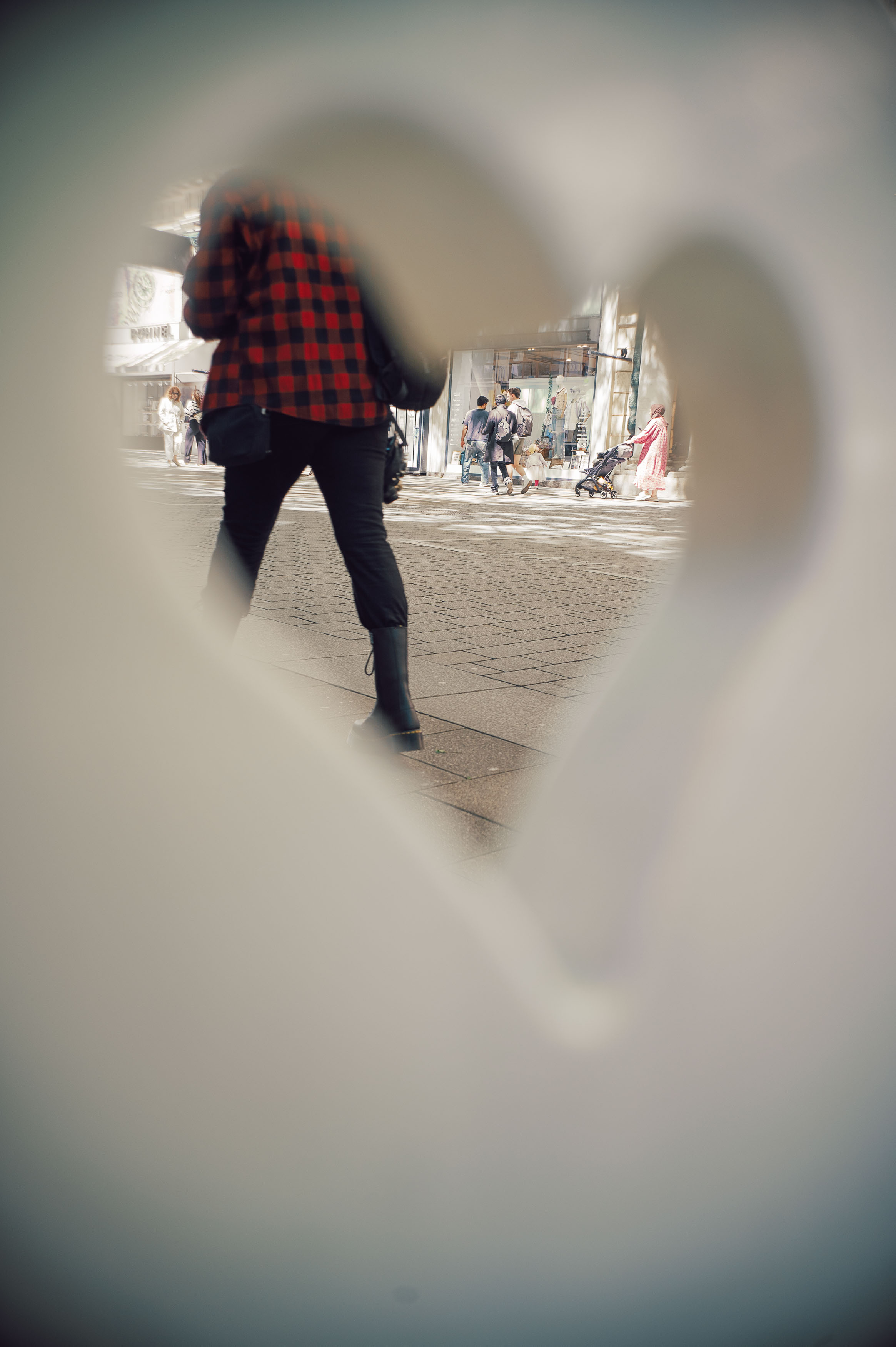
If you’re looking for objective perfection, this isn’t the lens for you. In fact, judged purely by modern standards, it’s difficult to argue that it’s particularly good at all.
Let’s begin with the flare. Despite the deeply recessed front element, point this lens anywhere near the sun and it erupts into a psychedelic display of hexagonal ghosts, coloured blobs, veiling flare and collapsing contrast. Some photographers deliberately seek out that behaviour, but I generally prefer keeping the sun somewhere over my shoulder, so most of my examples avoid the full disco light show.
More problematic is the vignetting. Wide open at f/2.8, the corners darken dramatically, as though the world is being viewed through a cardboard tube while driving through an alpine tunnel. Even stopping down doesn’t entirely eliminate it, and if you’re allergic to heavy corner shading, this lens probably isn’t going to become your new favourite.
Sharpness is equally complicated. At maximum aperture, the centre remains respectable, but detail falls away rapidly towards the edges where the image becomes noticeably smeared. Yet somehow, those flaws work together to produce something unexpectedly appealing. The rendering has a painterly quality that modern lenses often sacrifice in pursuit of perfection, and photographs seem to possess a depth and atmosphere that’s difficult to quantify on a test chart.
Stopping the lens down transforms its behaviour. By f/16 the dreamy softness gives way to surprisingly rich detail, while still retaining the gentle microcontrast and subtle rendering that make older optics so enjoyable to use. Tree bark gains texture, colours become vibrant and every corner of the frame rewards closer inspection, even if absolute edge sharpness never quite catches up with contemporary designs.
Looking back through photographs from both Shenzhen and Vienna, the Canon feels remarkably consistent despite the very different subjects. The quiet, almost surreal emptiness of Happy Valley contrasts beautifully with the bustle of Vienna’s flea markets, yet the lens gives both places a cohesive visual identity. Digital files from the Nikon certainly reveal more of the lens’s colour shifts and optical fall-off than film ever does, but they also confirm that the central sharpness is more than adequate while the imperfections remain part of its charm rather than distractions.
Ultimately, that’s what makes the Canon 28mm f/2.8 such an enjoyable lens. It doesn’t pretend to be perfect, nor does it try to compete with modern optics on technical grounds. Instead, it delivers photographs with personality, accepting softness, flare and vignetting as part of the creative process rather than problems to eliminate. Wide open it behaves like an unruly opera singer, full of excess and theatrical flourish. Stop it down and it settles into something far more disciplined, pairing beautifully with the Leica M2 to produce images that feel timeless rather than merely old.
Sometimes character really is worth more than perfection, and this little Canon has plenty of both flaws and personality to keep earning a place in my camera bag.
Have a WordPress.com account? Log in now.

