Welcome to a story about failure. Admittedly, that’s hardly a departure from the usual content around here, but this time the failure isn’t entirely mine. Well, not entirely. Today we’re looking at the wonderfully unpredictable world of colour film photography, where every stage of the process offers another opportunity for disappointment, confusion or outright catastrophe.
Film has a habit of seducing you with promises of beautiful colours, timeless character and authentic imperfections before reminding you that you’re actually just one careless mistake away from destroying an entire roll of memories. It’s a fickle mistress that whispers sweet nothings about dynamic range and grain before gaslighting you into believing you’re simply not good enough to use it properly.
That probably says more about my personality than film itself, but there really is something uniquely masochistic about the medium. A digital photographer can happily expose thousands of images knowing they’ll survive until they reach Lightroom. Film, on the other hand, spends every stage of its existence looking for new and inventive ways to go wrong.
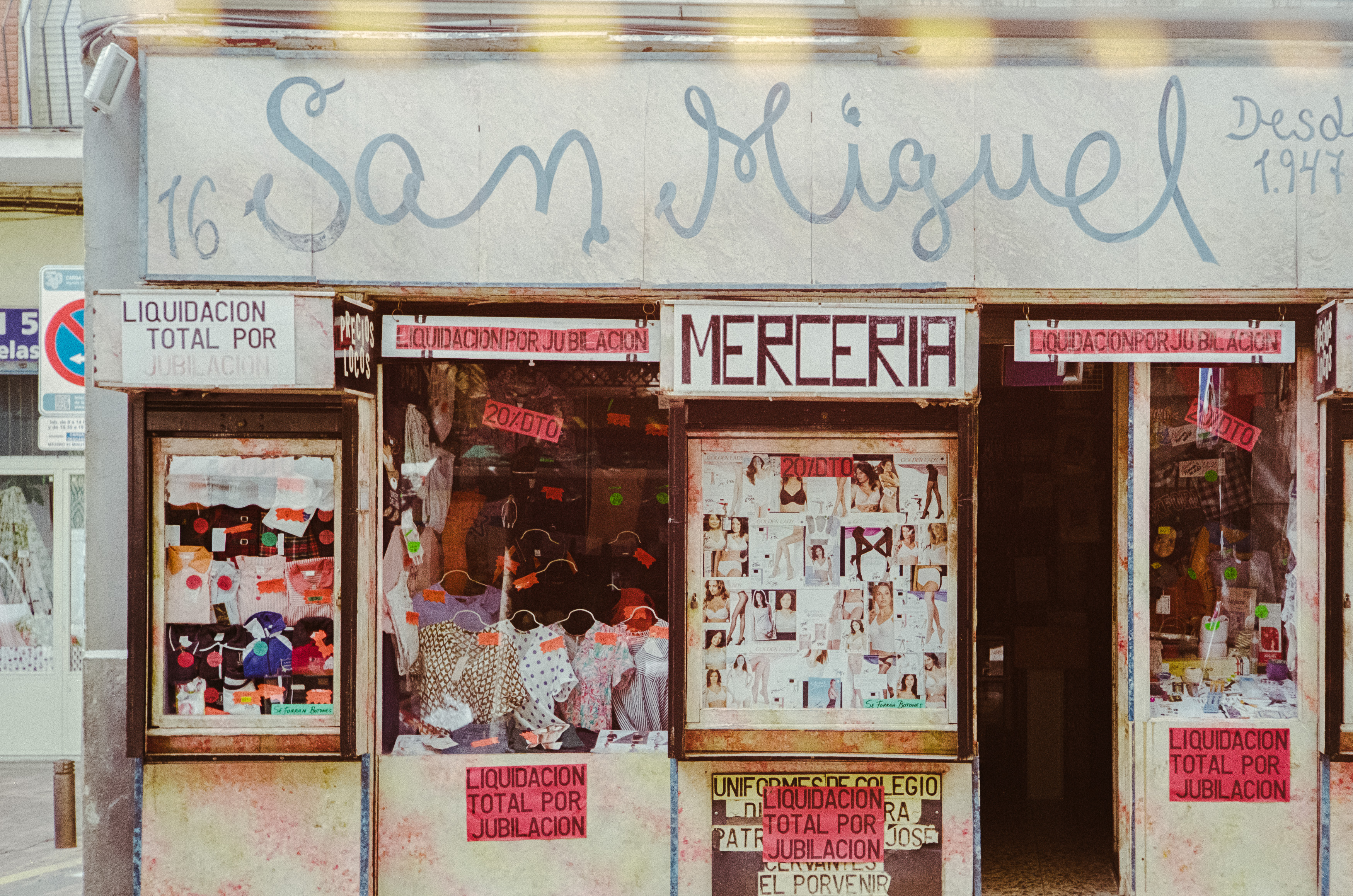
To demonstrate that point, I took two very different rolls on recent trips around Europe. One was the relatively safe option: Fujifilm 400, shot during a brief work visit to Madrid. The other was Ilford Ilfocolor 400 Vintage Tone, a film I’d never used before and one that promised exactly the sort of nostalgic colours that marketing departments know photographers find impossible to resist. As you’ll soon discover, only one of those rolls failed because of the film itself.
Sometimes the Weakest Link is You
My time in Madrid lasted barely thirty-six hours, leaving just enough opportunity for an early morning walk through the city before work. Armed with my Leica M2 and a Nikon 50mm Leica Thread Mount lens, I wandered the streets in a jet-lagged haze, quietly pleased with the photographs I’d managed despite feeling spectacularly uninspired.
The negatives themselves were absolutely fine. Unfortunately, I wasn’t.
The disaster didn’t happen while shooting. I hadn’t loaded the film incorrectly, accidentally opened the camera back or allowed airport X-ray machines to cook the emulsion. Instead, I managed something far more embarrassing during development.
Working inside a changing bag, I successfully loaded the film onto the developing reel before confidently pulling my hands out of the sleeves, only to realise I’d forgotten one tiny detail. The reel had never actually gone inside the developing tank. The moment I removed my arms, light flooded the changing bag and with it disappeared an entire roll of photographs. Feel free to laugh. This is, after all, a celebration of photographic incompetence rather than mastery.
The truth is that film is full of these potential failure points. Loading the camera, exposing correctly, rewinding safely, developing, scanning and editing all present fresh opportunities to ruin perfectly good photographs. Digital photography certainly has its own frustrations, but your memory card doesn’t suddenly self-destruct because it briefly caught sight of daylight before being copied onto your computer.





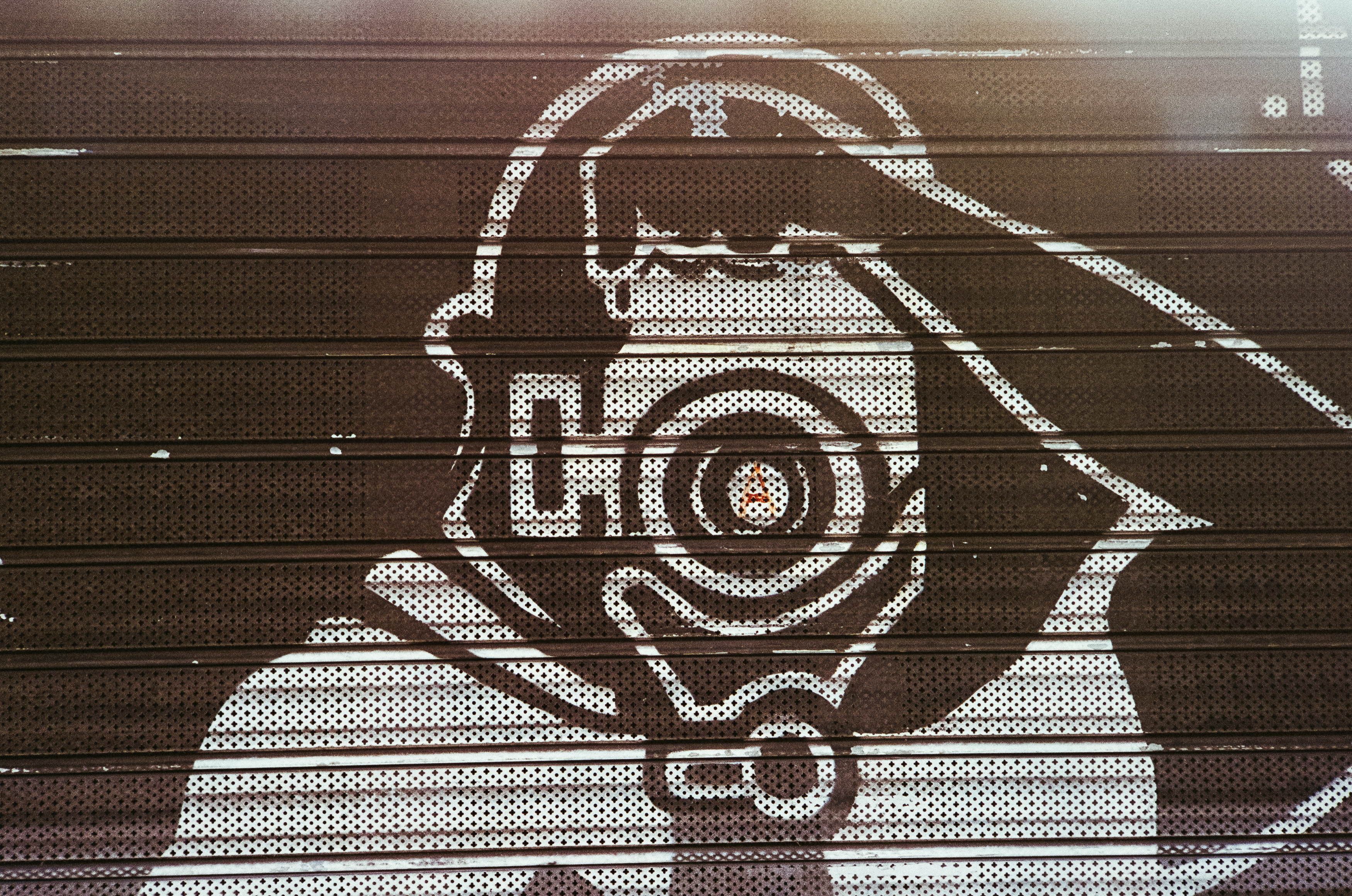
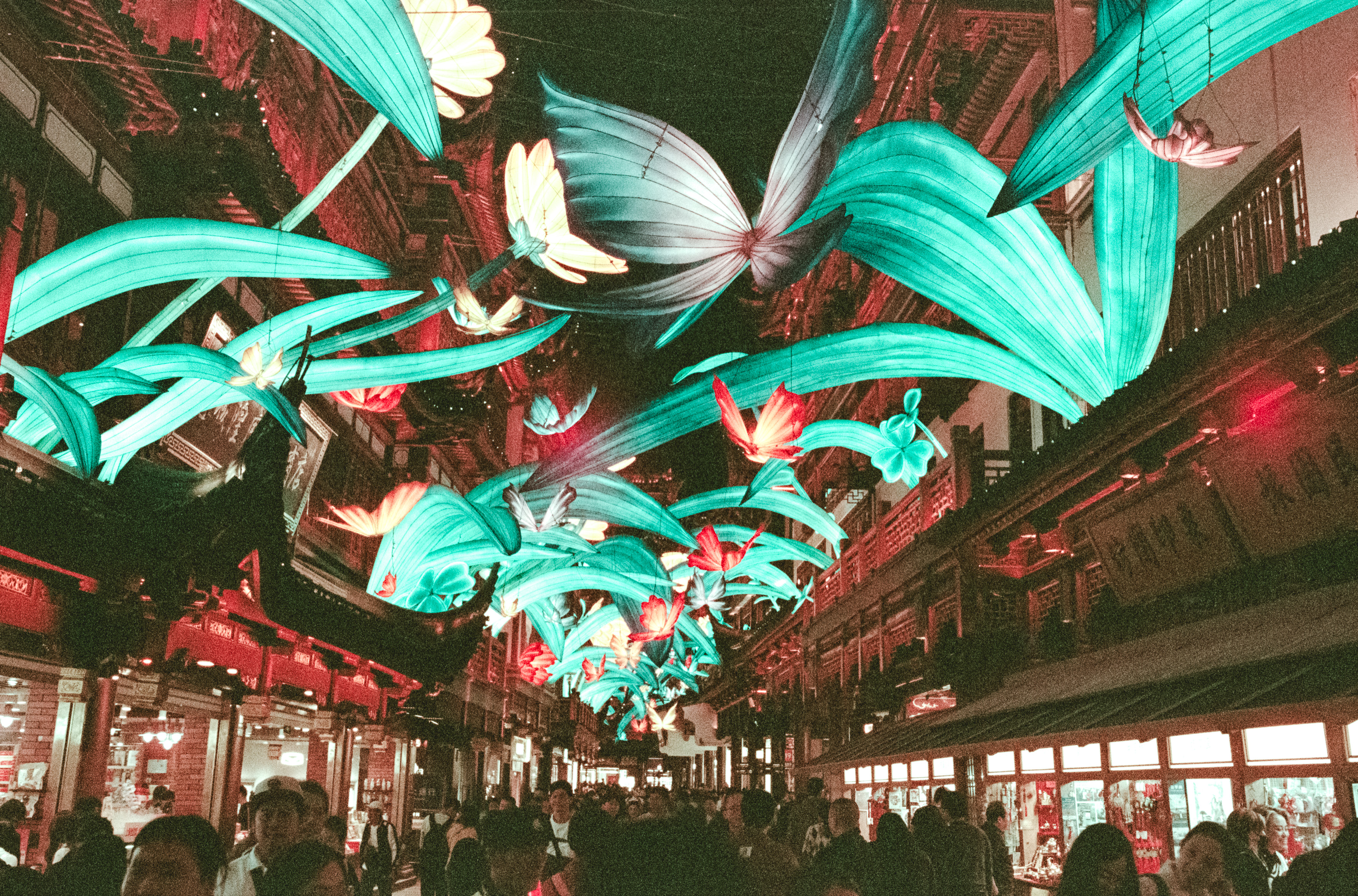
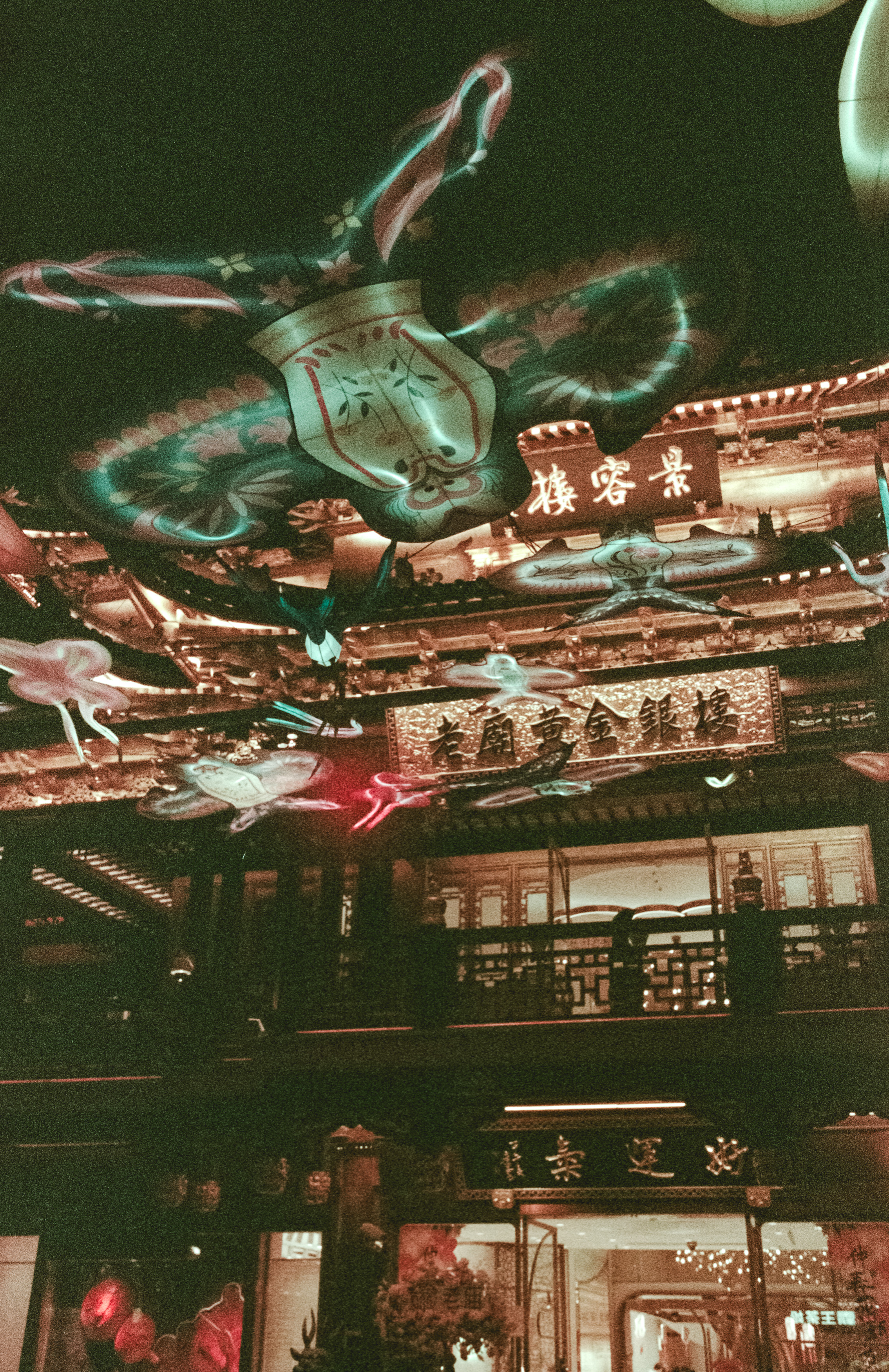
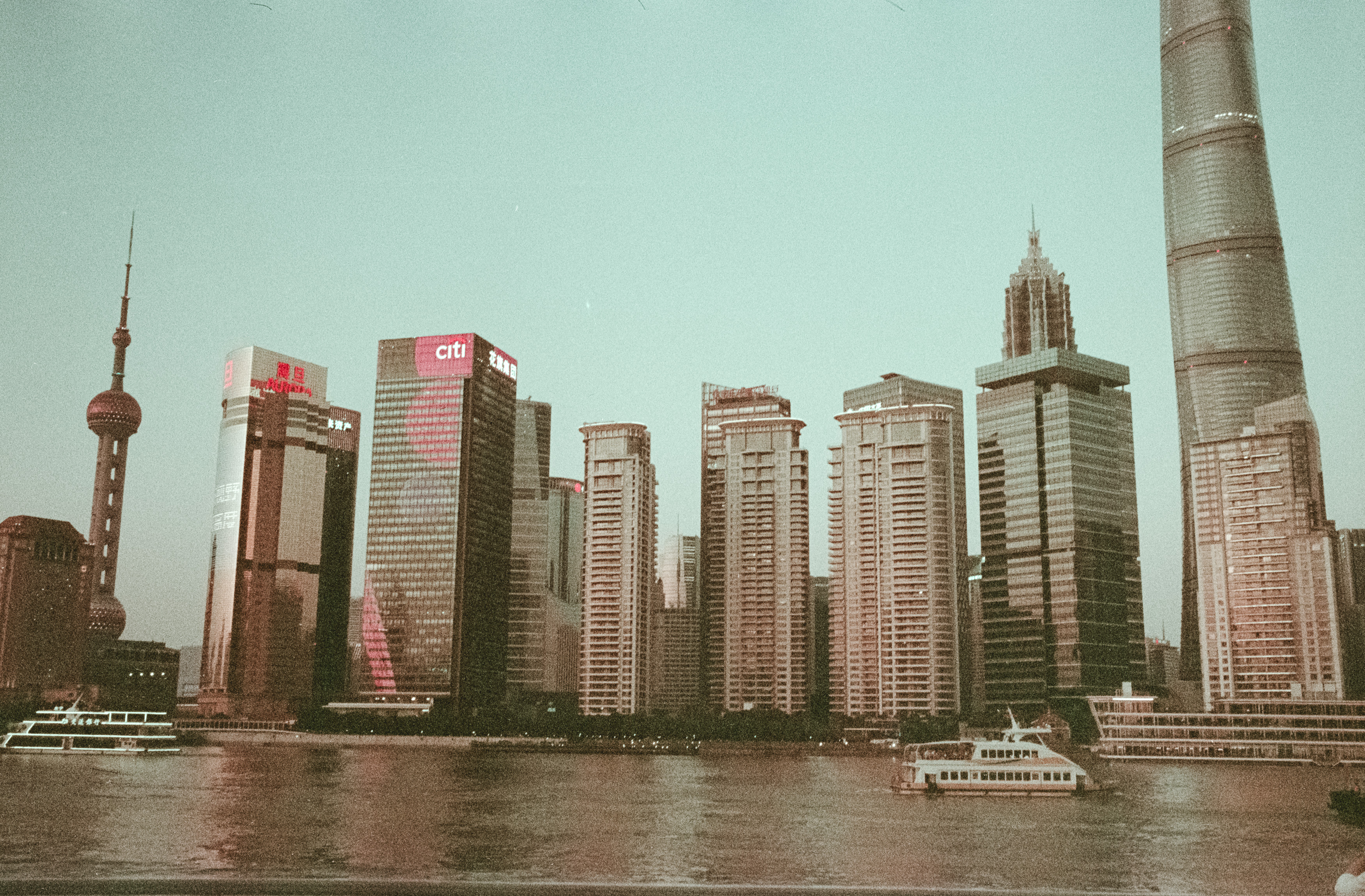
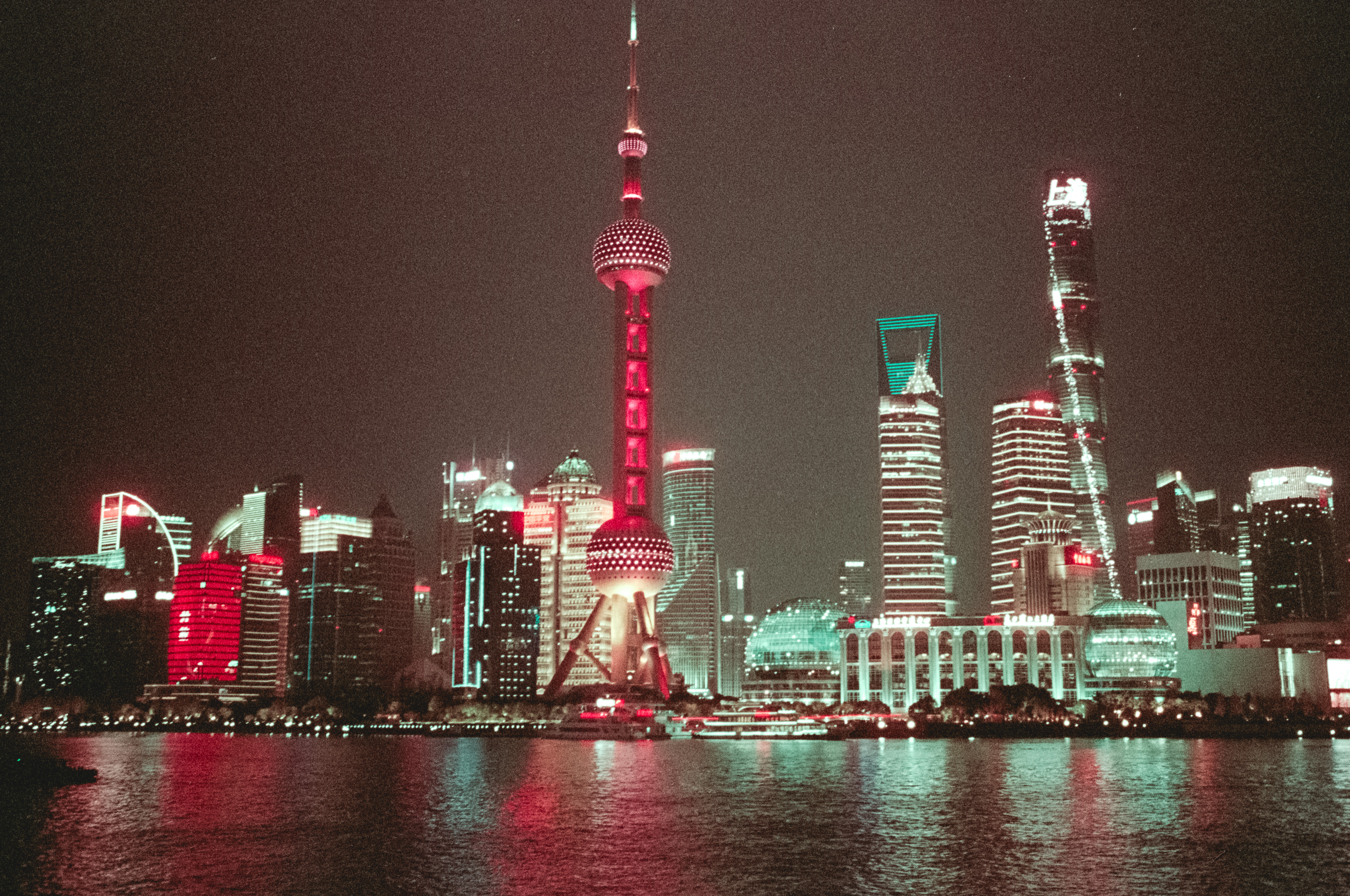
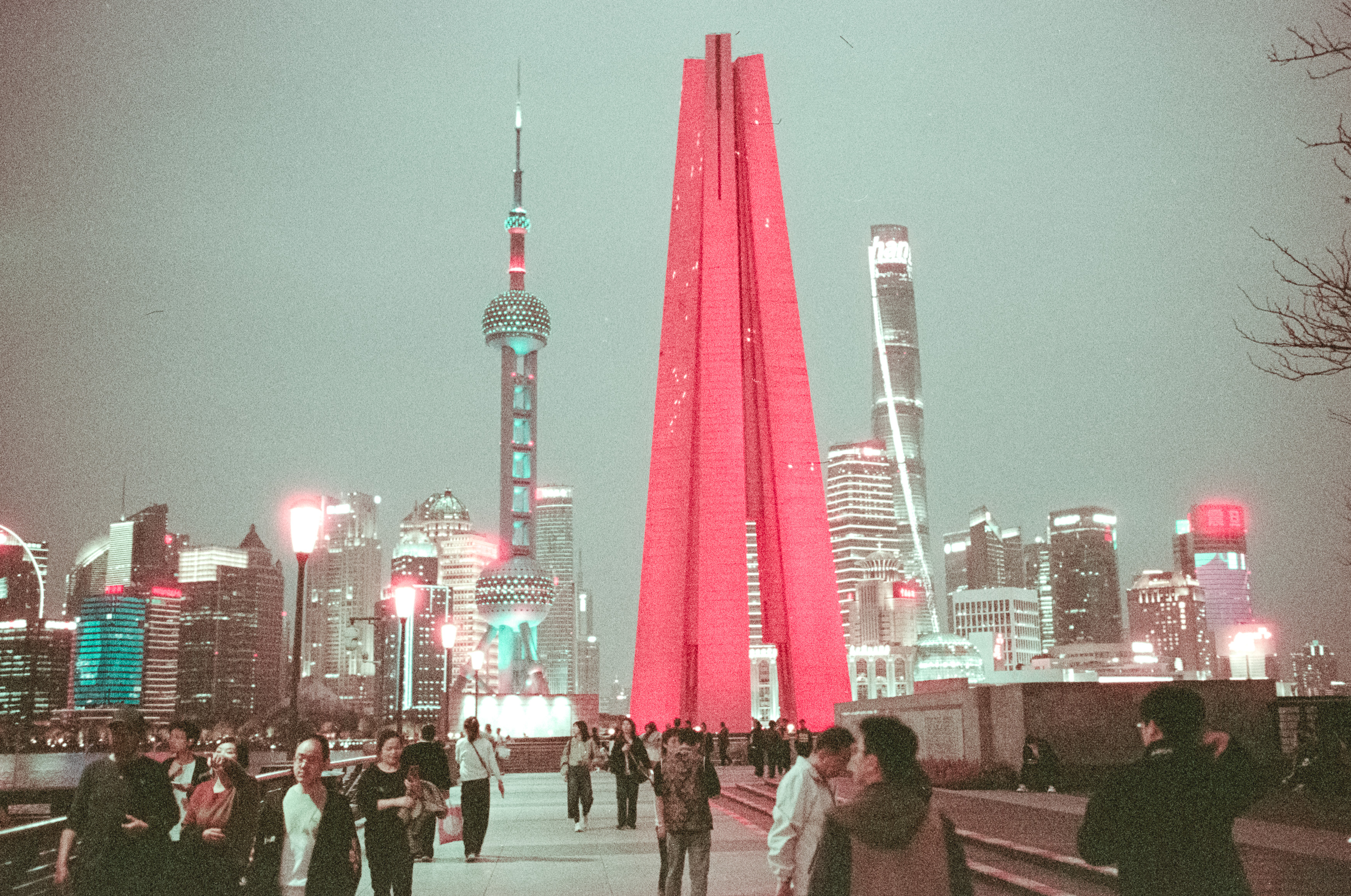
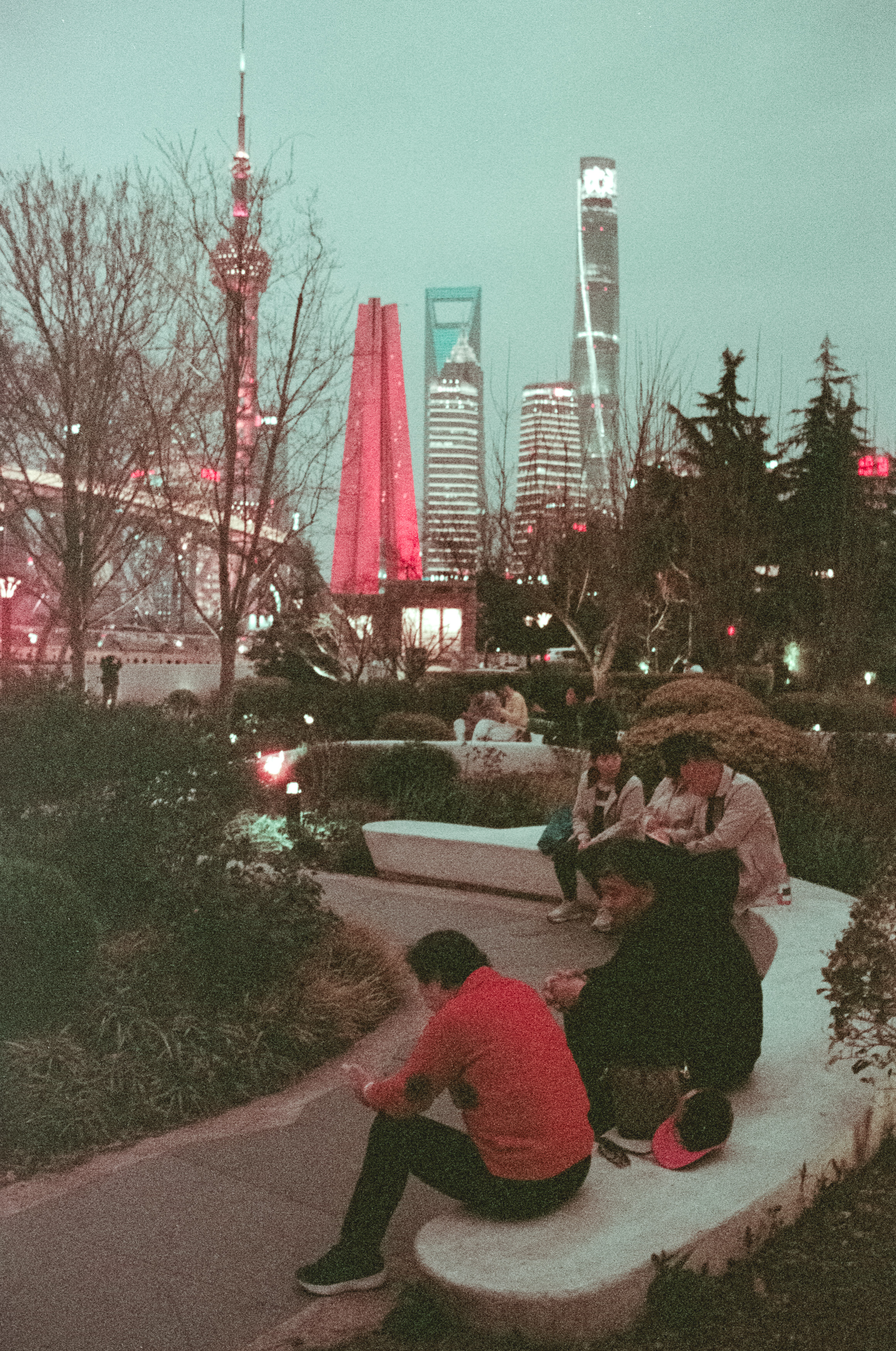
Of course, not every disappointment can be blamed on the photographer. Some films seem determined to sabotage you all by themselves, and I’d already experienced that on a previous trip to Shanghai with an anonymous rerolled stock that looked considerably better on the box than it ever did on the negatives.
Sadly, history was about to repeat itself.
My daughter had given me a roll of Ilford Ilfocolor 400 Vintage Tone for my birthday, and despite the slightly worrying promise of “vintage tones”, it seemed the perfect companion for an evening photographing Oslo during one of those impossibly long Scandinavian sunsets. Warm golden light, modern architecture and reflections across the water sounded like exactly the sort of scene this film was made for.
The results suggested otherwise.
Vintage Character or Just Bad Film?
The first thing worth pointing out is that Ilford Ilfocolor isn’t actually produced by the same company that manufactures Ilford’s famous black and white films. Harman Technology, the company behind classics like HP5, is entirely separate from Ilford Imaging, which licenses the name for this particular colour stock. That distinction matters because expectations matter.
When you hear the name Ilford, you naturally expect the same consistency and quality that has made their monochrome films legendary. Instead, Ilfocolor immediately raised suspicions before I even scanned the negatives. Rather than the familiar orange mask of conventional colour film, the negatives emerged an alarming shade of green that looked less like photographic material and more like something scraped from the bottom of a neglected biology experiment.
Scanning them didn’t inspire much more confidence. My workflow is deliberately manual, avoiding automated conversion software in favour of scanning the negatives as RAW positive files before inverting them myself in Lightroom. Establishing a neutral white balance, inverting the tone curve, correcting contrast and then adjusting colour provides complete control, although it also involves temporarily living in Lightroom’s own bizarre mirror universe, where moving sliders left often appears to do the opposite of what your brain expects.
Working this way also reveals something interesting about film itself. Every frame behaves slightly differently. Slight overexposure pushes colours towards pink, while underexposed frames drift green. Even after applying identical settings across an entire roll, every photograph still demands individual attention because no two negatives respond quite the same way.
That unpredictability is part of film’s charm, but it also exposes its weaknesses.
After plenty of tweaking, sharpening and colour correction, I eventually coaxed respectable images from the scans, but I couldn’t escape the conclusion that Ilfocolor 400 simply isn’t a particularly good film. It’s extremely grainy, highly contrasty, clips highlights and shadows with alarming enthusiasm and produces colours that become increasingly unstable the further your exposure drifts from perfection.
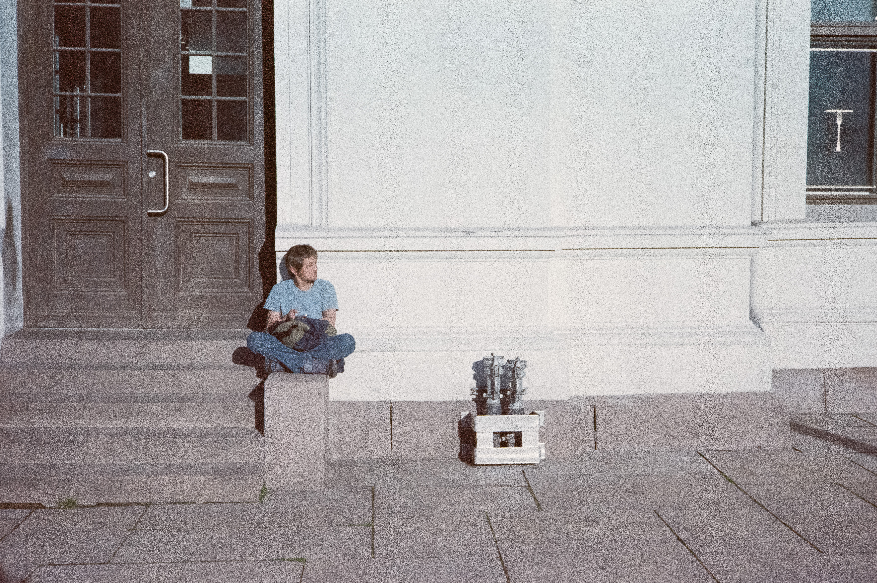





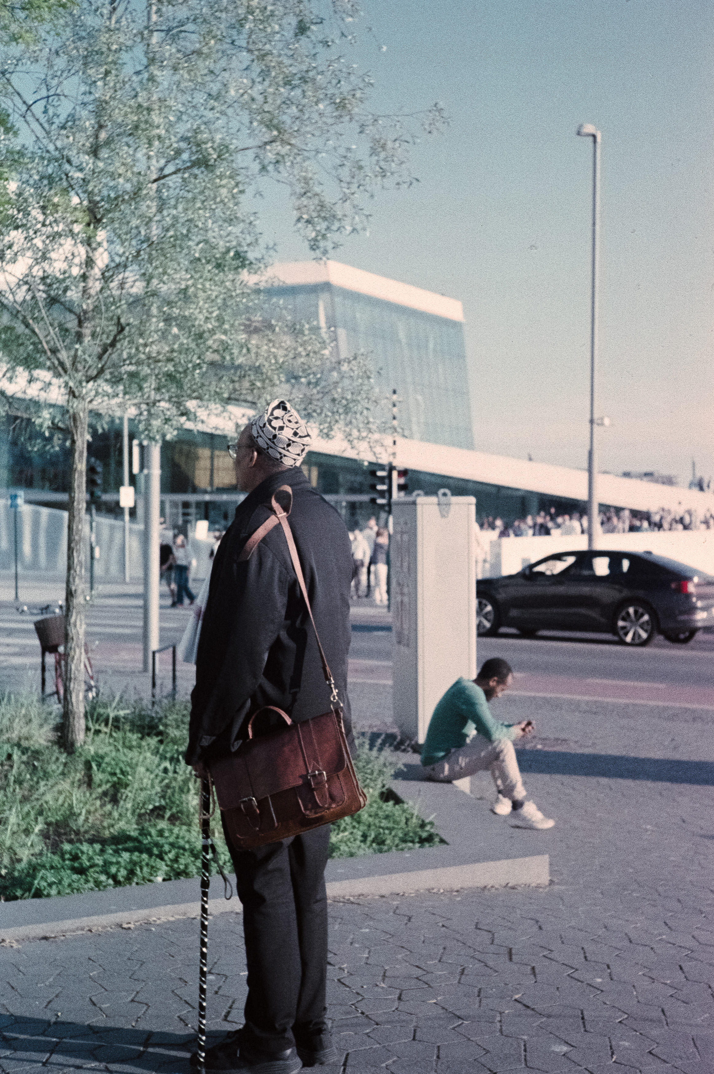
Ironically, those very flaws also give it a certain personality. Looking through the finished photographs, I couldn’t shake the feeling that I’d seen this look somewhere before. The muted colours, heavy grain and cool cast bear a striking resemblance to ORWO Wolfen NC500, another film stock that’s available under several different names. Whether Ilfocolor is simply rebadged Wolfen is open to debate, but the similarities are difficult to ignore.
Even so, I can’t quite bring myself to hate it. Some of the final images possess a gritty, desaturated mood that suits Oslo surprisingly well, even if they arrived there more by accident than design. Whether they’re successful because of the film’s shortcomings or despite them is probably something each viewer will decide for themselves.
Perhaps that’s the real lesson. Film photography is an unpredictable partnership between chemistry, mechanics and human error. Any one of those can betray you at any moment, yet somehow we keep loading another roll, convinced that next time everything will come together perfectly.
Most of the time it doesn’t, but that’s probably why the successes feel so satisfying when they finally arrive.