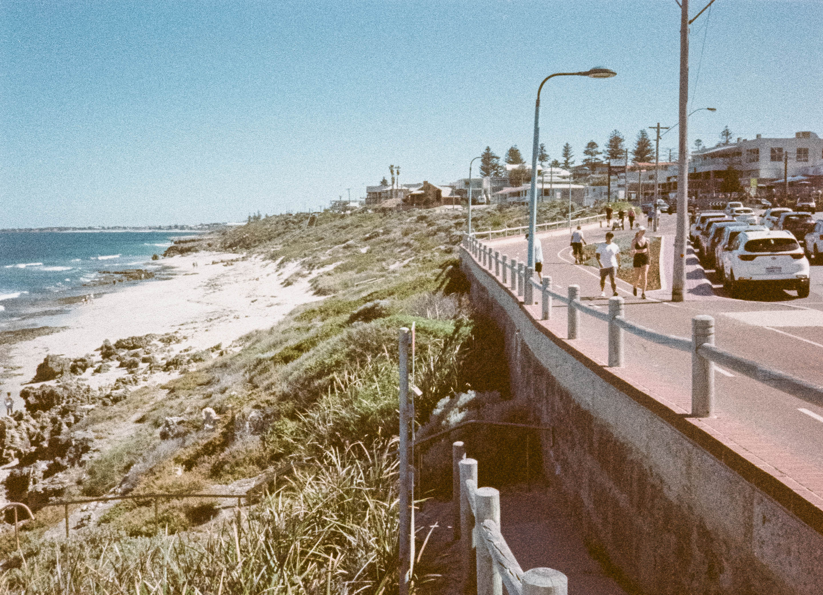
Is shooting expired film actually worth it? Or am I just chasing rainbows?

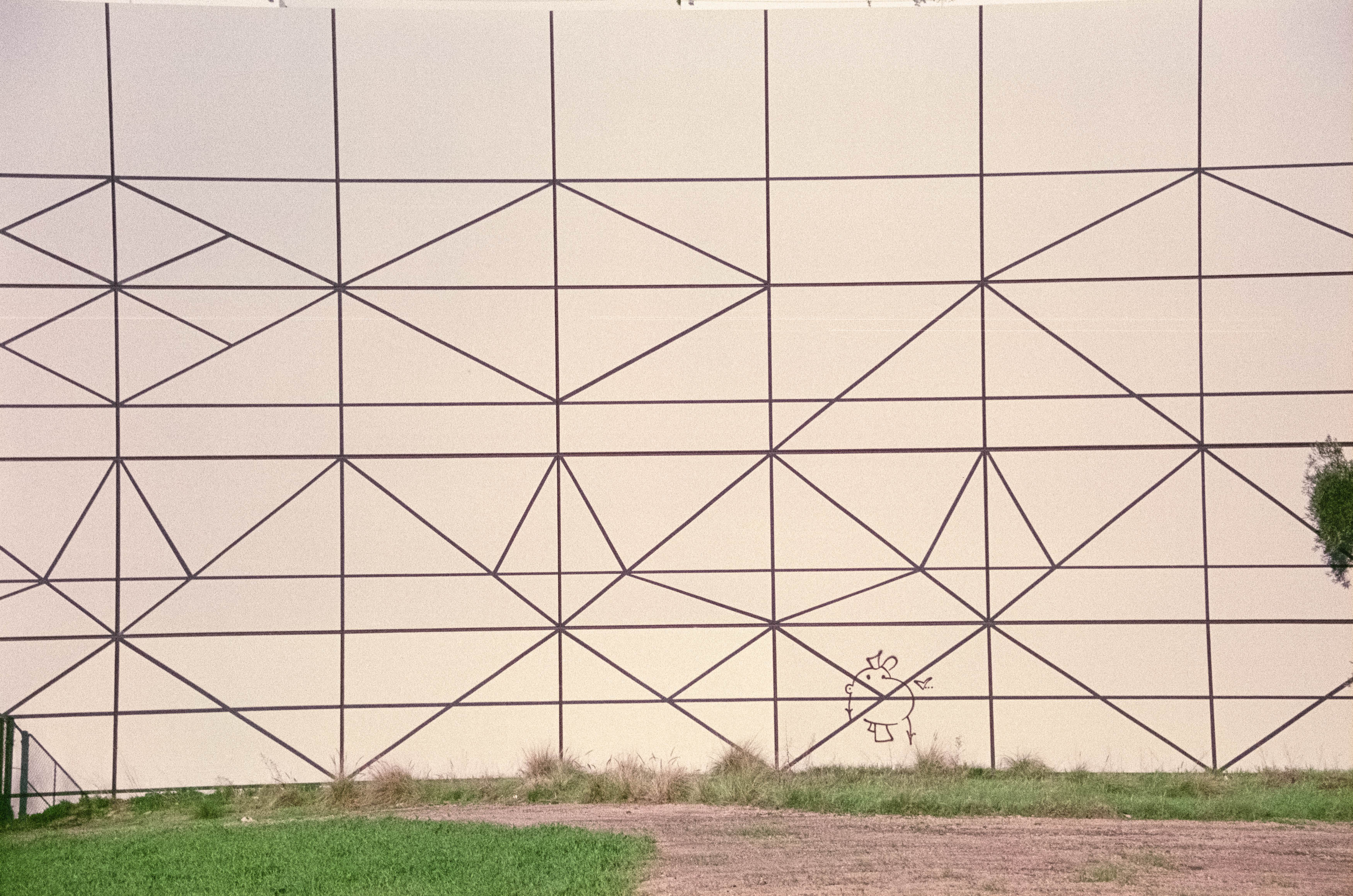
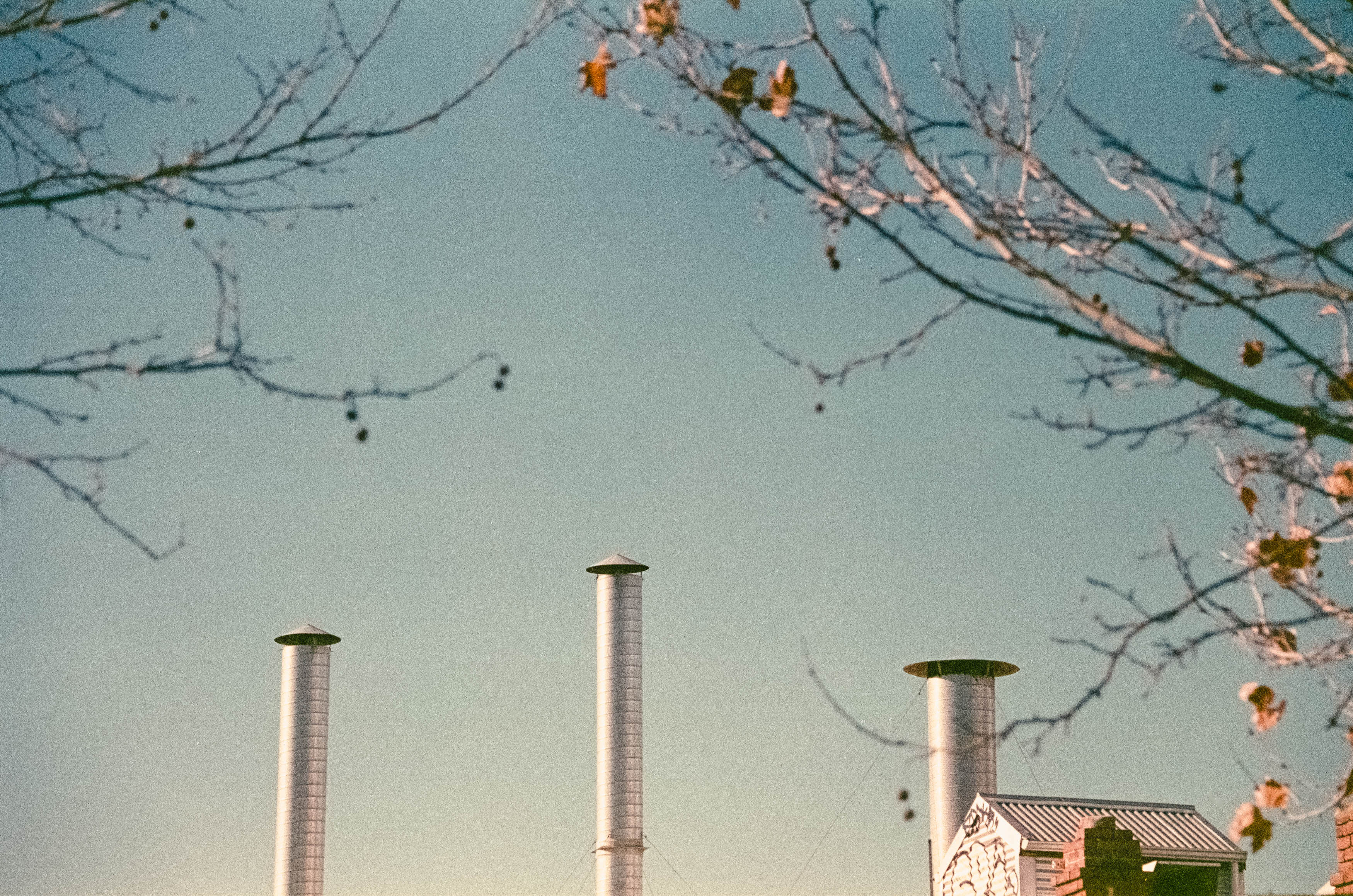
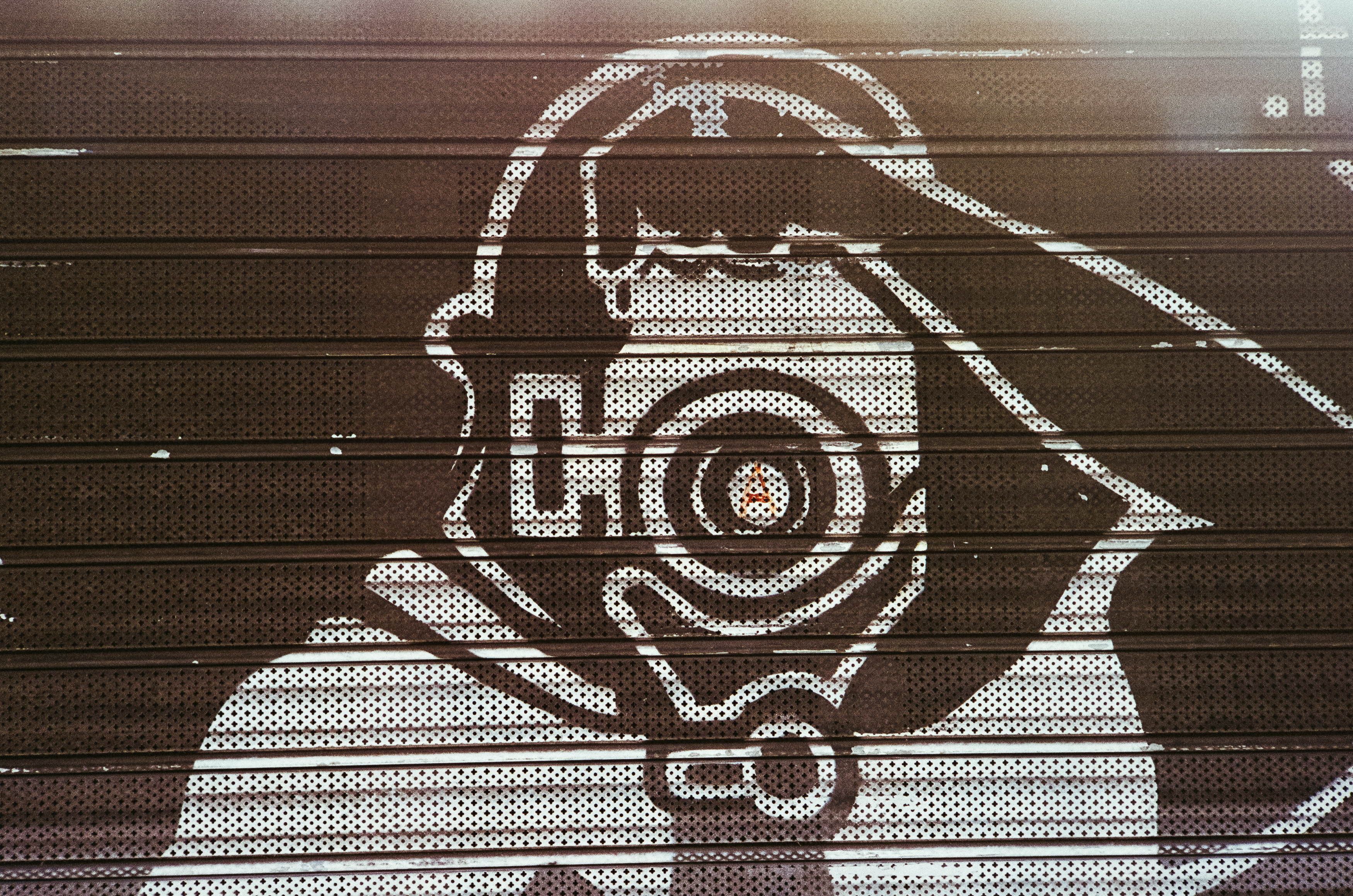
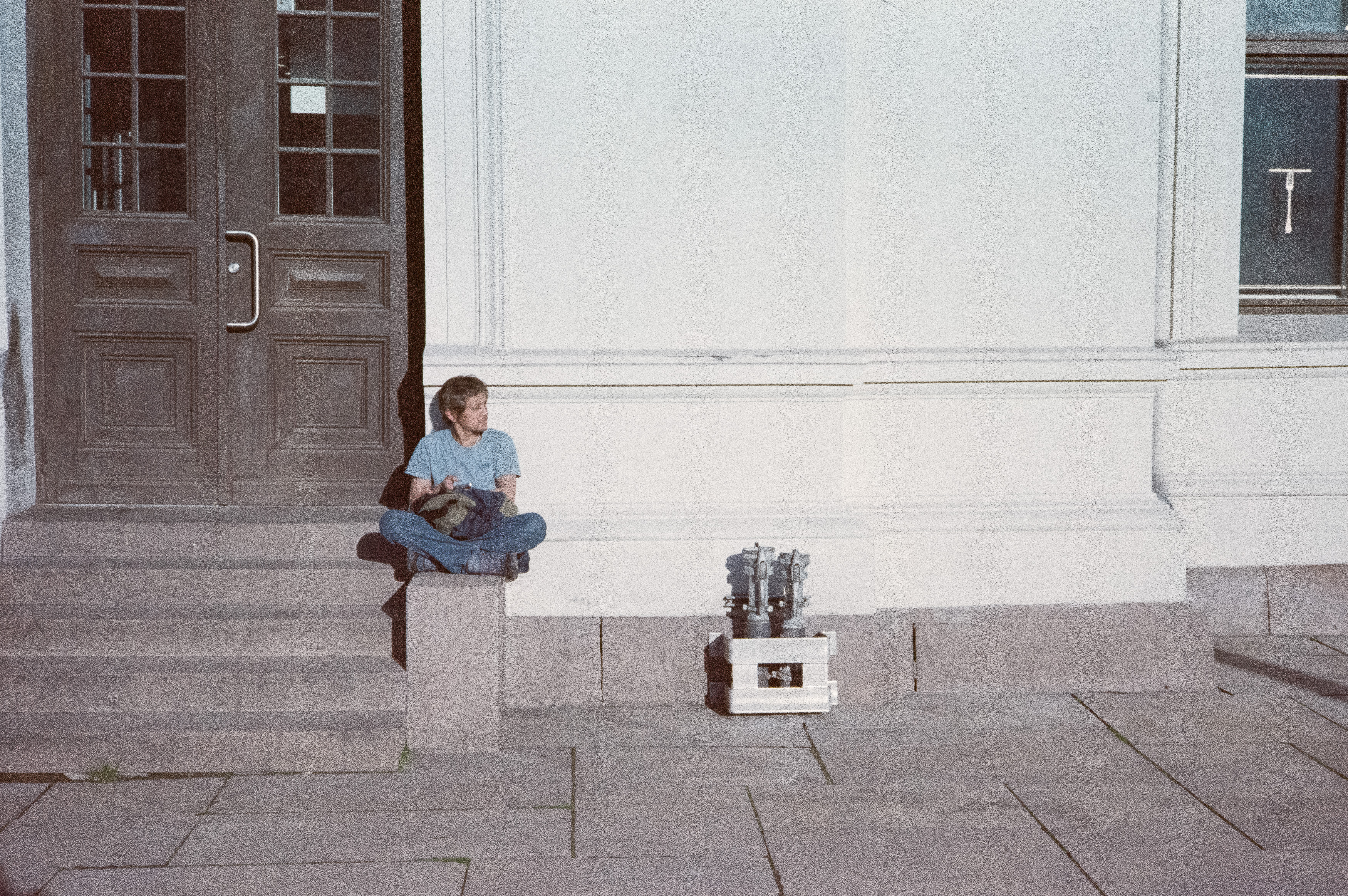
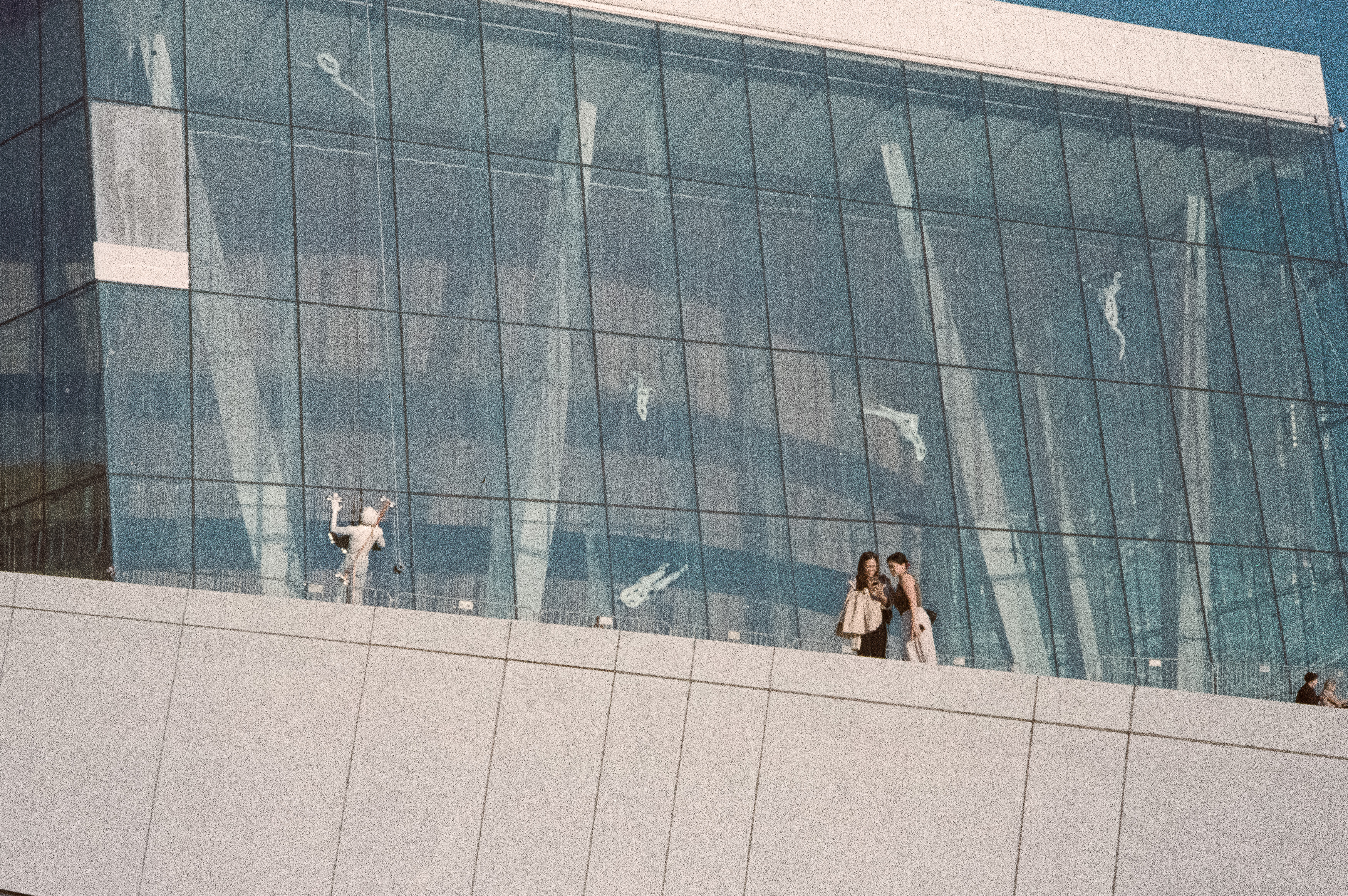
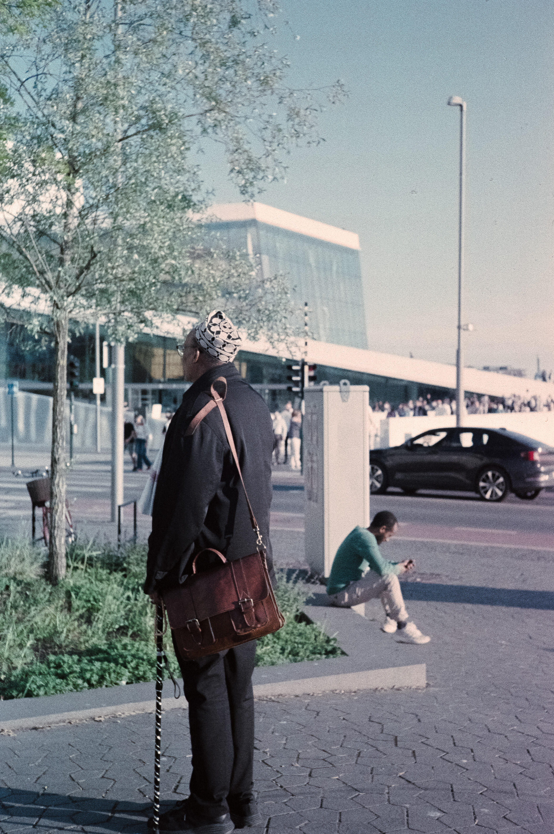
Agfacolor 200 20 years later

The recent demise of my beloved Fuji medium format point-and-shoot left me with photographic trauma that still hasn’t quite healed. If there were anything capable of adding fresh scars to that emotional damage, it would surely be expired film. After all, paying good money for something that’s already gone off feels completely irrational. I wouldn’t eat a mouldy sandwich that’s been sitting in a school bag for twenty years, so why would I willingly load twenty-year-old film into a camera?

Yet expired film has an undeniable appeal. Plenty of photographers swear by its unpredictable character, embracing colour shifts, grain and imperfections as part of the experience. I’ve never really belonged to that particular camp. If expired film were dramatically cheaper than fresh stock, I might understand the attraction, but these days many old rolls cost almost as much as new ones.

Fortunately, I didn’t have to buy this roll. My brother-in-law picked up some AgfaColor XRG 200 while visiting Spain several years ago and kindly passed a few rolls on to me. So, armed with film that expired in 2001 and expectations hovering somewhere below sea level, it was time to see whether this forgotten emulsion still had anything left to offer.

The original plan involved an early morning trip to Perth’s beaches, but the weather had other ideas. Rain is such a novelty in Perth that the first shower feels almost like a public celebration. Once the excitement wears off, though, you’re simply wet, so I postponed the outing and instead headed into the city under far more typical blue skies.

Giving Old Film Every Chance

Conventional wisdom suggests overexposing expired colour negative film by roughly one stop for every decade past its expiry date. At 21 years old, that meant treating this ISO 200 film as roughly ISO 50, while also remaining willing to give it even more light if conditions allowed.

I also tried to stack the odds in my favour by using a Nikon N80, whose Matrix metering was considered impressively sophisticated when both the camera and this film were new. Paired with Nikon’s versatile 28-300mm zoom, it offered the flexibility to photograph whatever caught my eye, even if the relatively slow aperture wasn’t ideal for ageing film.

I’d never been particularly fond of Agfa’s colour films, even when they were fresh. Compared to Kodak or Fuji, I’ve always found Agfa prone to muddy shadows and an overly magenta colour palette. Naturally, I expected two decades of ageing to make those weaknesses even worse.

Instead, I was greeted with something unexpected.

Better Than Expected

The first victory was simply that the film worked at all. Given my previous encounters with expired film, I’d fully expected another disaster. Instead, the generous exposure produced enough image density to cut through the inevitable base fog, leaving negatives that scanned surprisingly well.

There was certainly evidence of the film’s age. Grain was more noticeable, colours had shifted slightly and contrast wasn’t quite what fresh film would deliver. Even so, the results were far more usable than I’d anticipated. Static subjects came out especially well, while moving subjects occasionally defeated both the ageing emulsion and the slower zoom lens. Rather than feeling ruined, though, some of those imperfect frames developed a charm all of their own.

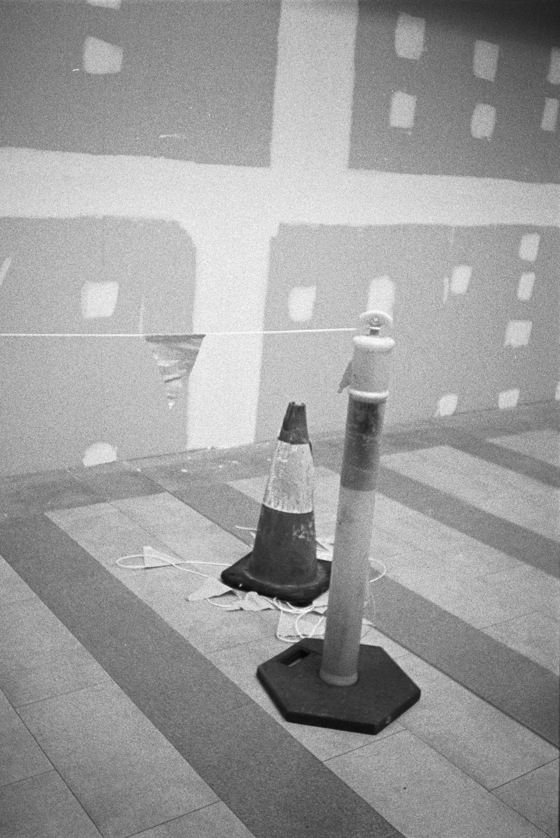
Reviewing my favourite images, I realised I’d accidentally assembled a mixture of street photography, architecture, minimalism and abstract compositions. More importantly, I genuinely liked several of them. Considering how low my expectations had been, that felt like a genuine success.

Expired film may never replace fresh stock in my camera bag, and I’m still not convinced it’s worth today’s inflated prices. However, this roll reminded me that photography doesn’t always reward certainty. Sometimes lowering your expectations leaves plenty of room to be pleasantly surprised.

Unlike my dearly departed Fuji GA645Zi, this ancient roll of Agfa actually delivered. That’s enough to spare it from photographic damnation, at least for now. As for me, I may be approaching my own use-by date, but there are still plenty more questionable photographic adventures waiting just around the corner. If nothing else, they should provide fresh material for the next chapter of my ongoing catalogue of photographic misadventures.


First Roll Impressions of Ilford Ilfocolor 400 and the Randomness of Film Photography

Welcome to a story about failure. Admittedly, that’s hardly a departure from the usual content around here, but this time the failure isn’t entirely mine. Well, not entirely. Today we’re looking at the wonderfully unpredictable world of colour film photography, where every stage of the process offers another opportunity for disappointment, confusion or outright catastrophe.

Film has a habit of seducing you with promises of beautiful colours, timeless character and authentic imperfections before reminding you that you’re actually just one careless mistake away from destroying an entire roll of memories. It’s a fickle mistress that whispers sweet nothings about dynamic range and grain before gaslighting you into believing you’re simply not good enough to use it properly.

That probably says more about my personality than film itself, but there really is something uniquely masochistic about the medium. A digital photographer can happily expose thousands of images knowing they’ll survive until they reach Lightroom. Film, on the other hand, spends every stage of its existence looking for new and inventive ways to go wrong.

To demonstrate that point, I took two very different rolls on recent trips around Europe. One was the relatively safe option: Fujifilm 400, shot during a brief work visit to Madrid. The other was Ilford Ilfocolor 400 Vintage Tone, a film I’d never used before and one that promised exactly the sort of nostalgic colours that marketing departments know photographers find impossible to resist. As you’ll soon discover, only one of those rolls failed because of the film itself.

Sometimes the Weakest Link is You

My time in Madrid lasted barely thirty-six hours, leaving just enough opportunity for an early morning walk through the city before work. Armed with my Leica M2 and a Nikon 50mm Leica Thread Mount lens, I wandered the streets in a jet-lagged haze, quietly pleased with the photographs I’d managed despite feeling spectacularly uninspired.

The negatives themselves were absolutely fine. Unfortunately, I wasn’t.

The disaster didn’t happen while shooting. I hadn’t loaded the film incorrectly, accidentally opened the camera back or allowed airport X-ray machines to cook the emulsion. Instead, I managed something far more embarrassing during development.

Working inside a changing bag, I successfully loaded the film onto the developing reel before confidently pulling my hands out of the sleeves, only to realise I’d forgotten one tiny detail. The reel had never actually gone inside the developing tank. The moment I removed my arms, light flooded the changing bag and with it disappeared an entire roll of photographs. Feel free to laugh. This is, after all, a celebration of photographic incompetence rather than mastery.

The truth is that film is full of these potential failure points. Loading the camera, exposing correctly, rewinding safely, developing, scanning and editing all present fresh opportunities to ruin perfectly good photographs. Digital photography certainly has its own frustrations, but your memory card doesn’t suddenly self-destruct because it briefly caught sight of daylight before being copied onto your computer.

Of course, not every disappointment can be blamed on the photographer. Some films seem determined to sabotage you all by themselves, and I’d already experienced that on a previous trip to Shanghai with an anonymous rerolled stock that looked considerably better on the box than it ever did on the negatives.

Sadly, history was about to repeat itself.

My daughter had given me a roll of Ilford Ilfocolor 400 Vintage Tone for my birthday, and despite the slightly worrying promise of “vintage tones”, it seemed the perfect companion for an evening photographing Oslo during one of those impossibly long Scandinavian sunsets. Warm golden light, modern architecture and reflections across the water sounded like exactly the sort of scene this film was made for.

The results suggested otherwise.

Vintage Character or Just Bad Film?

The first thing worth pointing out is that Ilford Ilfocolor isn’t actually produced by the same company that manufactures Ilford’s famous black and white films. Harman Technology, the company behind classics like HP5, is entirely separate from Ilford Imaging, which licenses the name for this particular colour stock. That distinction matters because expectations matter.

When you hear the name Ilford, you naturally expect the same consistency and quality that has made their monochrome films legendary. Instead, Ilfocolor immediately raised suspicions before I even scanned the negatives. Rather than the familiar orange mask of conventional colour film, the negatives emerged an alarming shade of green that looked less like photographic material and more like something scraped from the bottom of a neglected biology experiment.

Scanning them didn’t inspire much more confidence. My workflow is deliberately manual, avoiding automated conversion software in favour of scanning the negatives as RAW positive files before inverting them myself in Lightroom. Establishing a neutral white balance, inverting the tone curve, correcting contrast and then adjusting colour provides complete control, although it also involves temporarily living in Lightroom’s own bizarre mirror universe, where moving sliders left often appears to do the opposite of what your brain expects.

Working this way also reveals something interesting about film itself. Every frame behaves slightly differently. Slight overexposure pushes colours towards pink, while underexposed frames drift green. Even after applying identical settings across an entire roll, every photograph still demands individual attention because no two negatives respond quite the same way.

That unpredictability is part of film’s charm, but it also exposes its weaknesses.

After plenty of tweaking, sharpening and colour correction, I eventually coaxed respectable images from the scans, but I couldn’t escape the conclusion that Ilfocolor 400 simply isn’t a particularly good film. It’s extremely grainy, highly contrasty, clips highlights and shadows with alarming enthusiasm and produces colours that become increasingly unstable the further your exposure drifts from perfection.

Ironically, those very flaws also give it a certain personality. Looking through the finished photographs, I couldn’t shake the feeling that I’d seen this look somewhere before. The muted colours, heavy grain and cool cast bear a striking resemblance to ORWO Wolfen NC500, another film stock that’s available under several different names. Whether Ilfocolor is simply rebadged Wolfen is open to debate, but the similarities are difficult to ignore.

Even so, I can’t quite bring myself to hate it. Some of the final images possess a gritty, desaturated mood that suits Oslo surprisingly well, even if they arrived there more by accident than design. Whether they’re successful because of the film’s shortcomings or despite them is probably something each viewer will decide for themselves.

Perhaps that’s the real lesson. Film photography is an unpredictable partnership between chemistry, mechanics and human error. Any one of those can betray you at any moment, yet somehow we keep loading another roll, convinced that next time everything will come together perfectly.

Most of the time it doesn’t, but that’s probably why the successes feel so satisfying when they finally arrive.

Great Lens, Bad Film: Voigtlander VM Nokton 35mm f/1.5 in Shanghai with IronBridge 800T

I recently found myself in Shanghai and, somehow, my photographic ambitions got completely Shanghai’d. No, I didn’t wake up aboard a cargo ship with a mysterious hangover, a stranger called Tatiana and a rash that required medical attention. My downfall was much less dramatic but arguably far more predictable. I bought a new lens and then made the fatal decision to pair it with a film stock I’d never heard of.

If you’ve spent any time reading this blog, you’ll know I recently picked up a Leica M2. Yes, I’ve become one of those people. The reality, however, is that I’m nowhere near good enough to justify owning it. Then again, I couldn’t justify the price of a genuine Leica 35mm lens either, so I went hunting for something a little more attainable.

That search led me to Shanghai’s famous Xing Guang Photographic Equipment Market, where I found exactly what I wanted: a second-hand Voigtlander Nokton 35mm f/1.5. There were two versions available—a cheaper black model and a slightly more expensive silver brass version. Naturally, I bought the prettier one.

There’s a wonderful Chinese idiom, xin xue lai chao, which literally describes blood rushing to your head. It’s the perfect expression for those moments when logic quietly packs its bags and shiny objects take control. The silver brass Nokton looked absolutely perfect mounted on the Leica M2 and, if we’re being honest, sometimes that’s reason enough.

A Great Lens Meets a Very Bad Idea

To be fair, the lens itself never let me down. The Voigtlander Nokton 35mm f/1.5 belongs to the company’s “Vintage” line, although the name is slightly misleading because the vintage aspect refers more to the styling than the optical performance. Thanks to modern aspherical elements, this isn’t a dreamy character lens with swirly bokeh and soft corners. Instead, it’s impressively sharp while still retaining enough personality to stop images feeling overly clinical.

What impressed me most was just how compact it is. It balances beautifully on the Leica, the build quality feels superb and the focus tab makes manual focusing intuitive. The focus throw is short enough to move from close focus to infinity in one smooth motion, and the lens itself focuses down to half a metre, even if the M2’s rangefinder can’t quite keep up.

In many ways, this is probably a lens that shines just as brightly on a modern mirrorless camera as it does on film. It feels capable of resolving far more detail than most film stocks can actually record. Unfortunately, none of that mattered because, flushed with the excitement of my new purchase, I made another questionable decision.

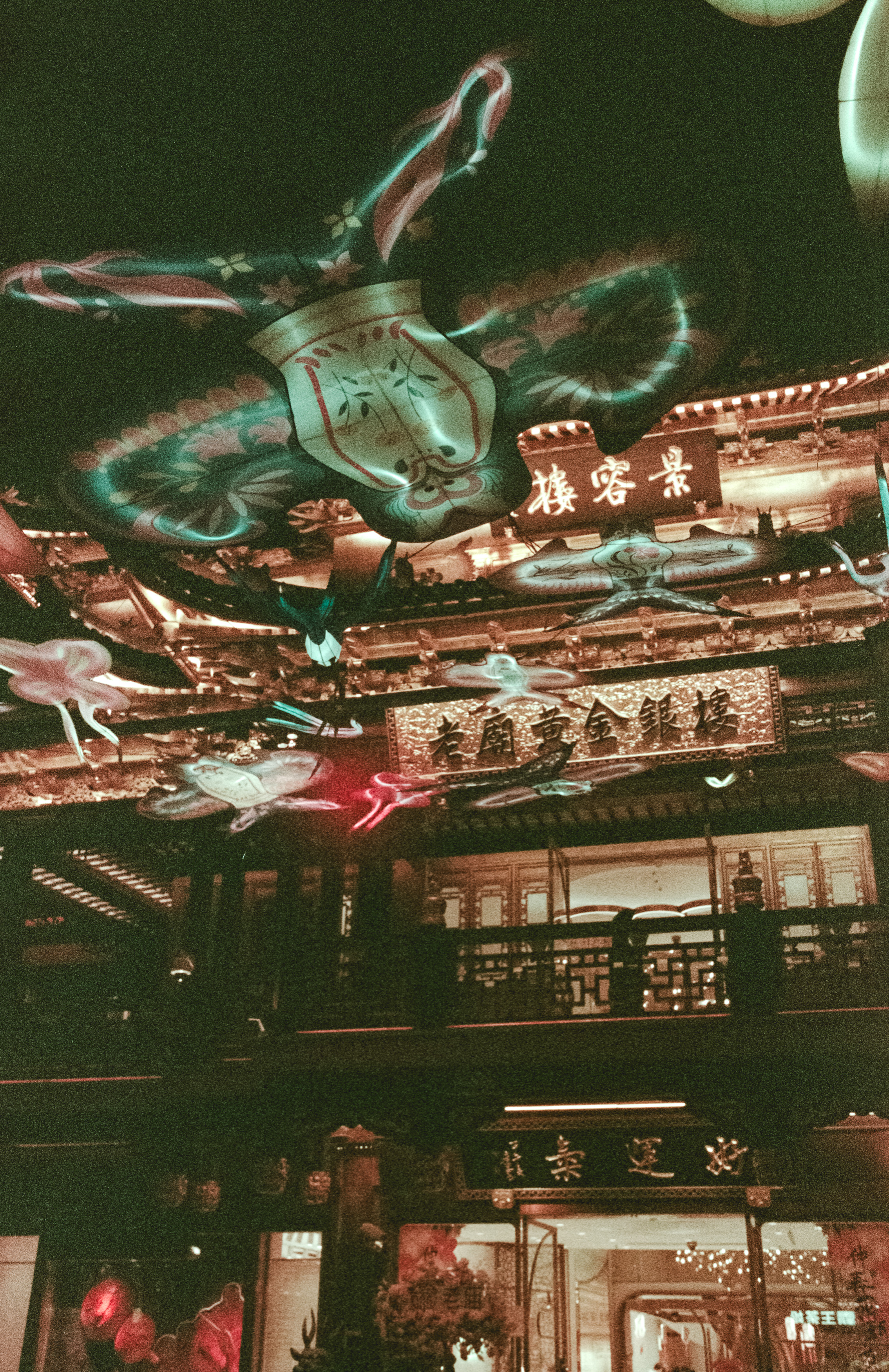
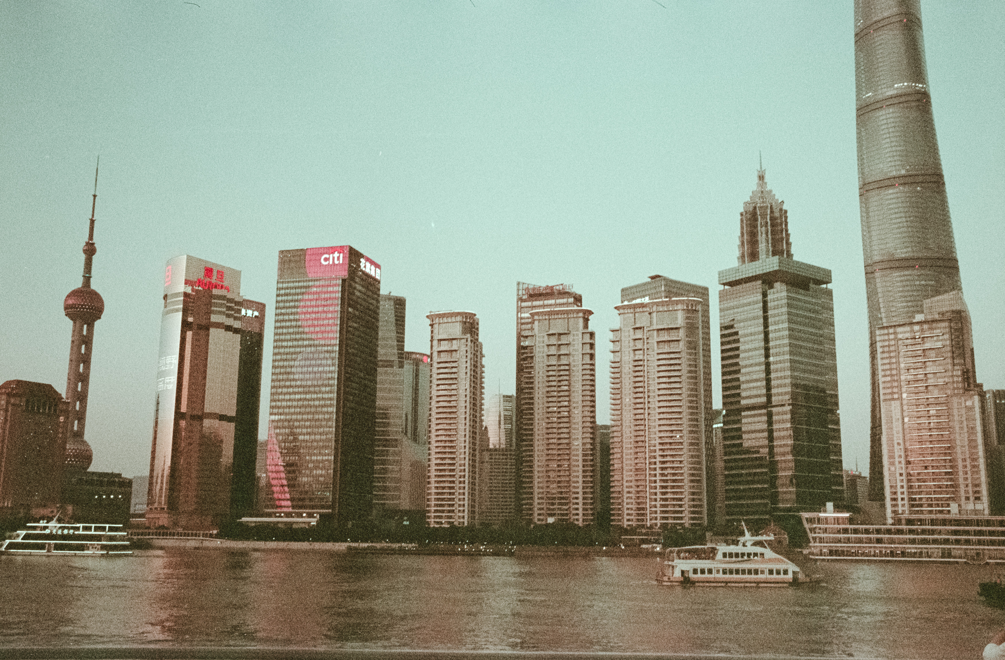
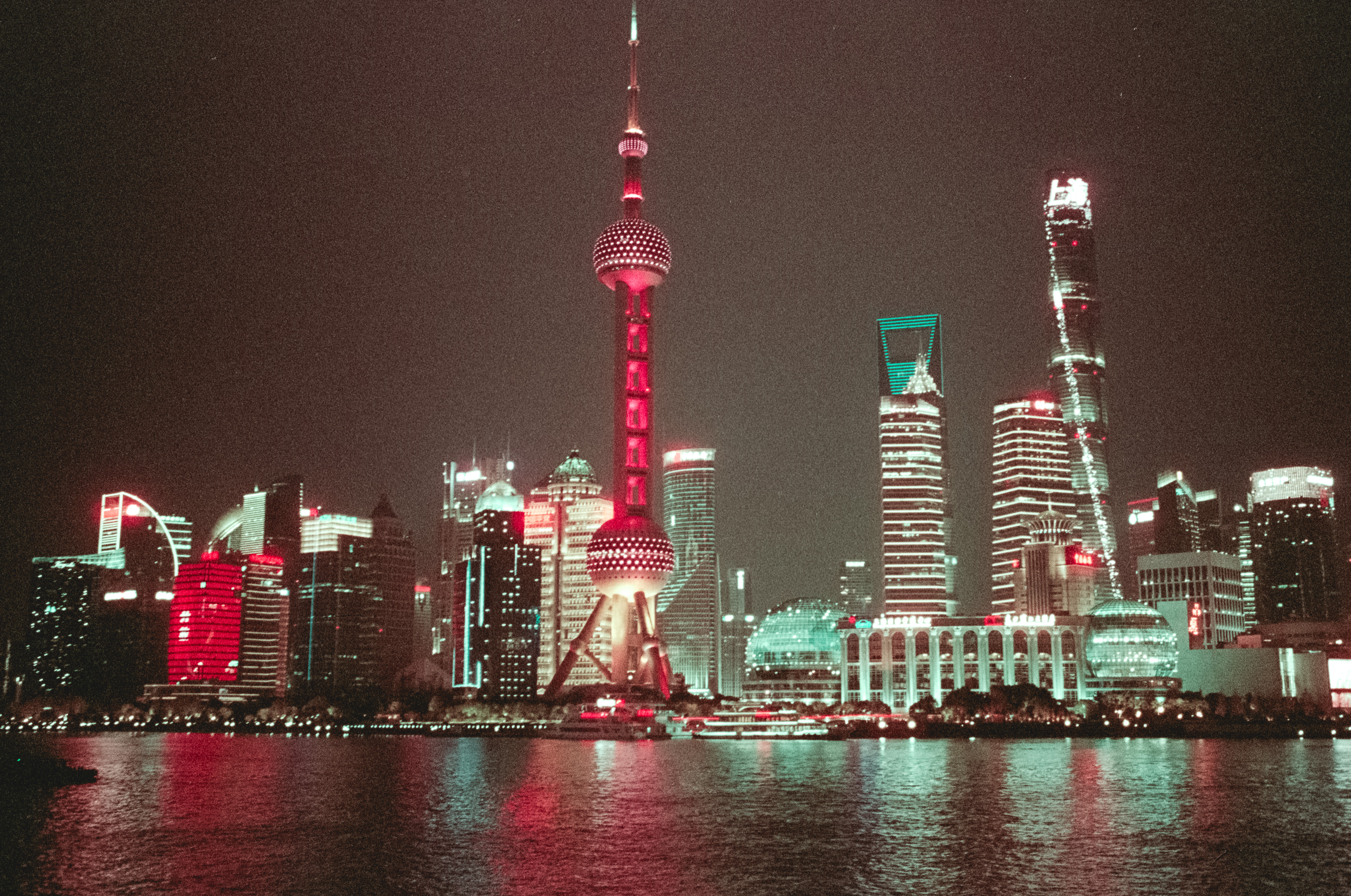
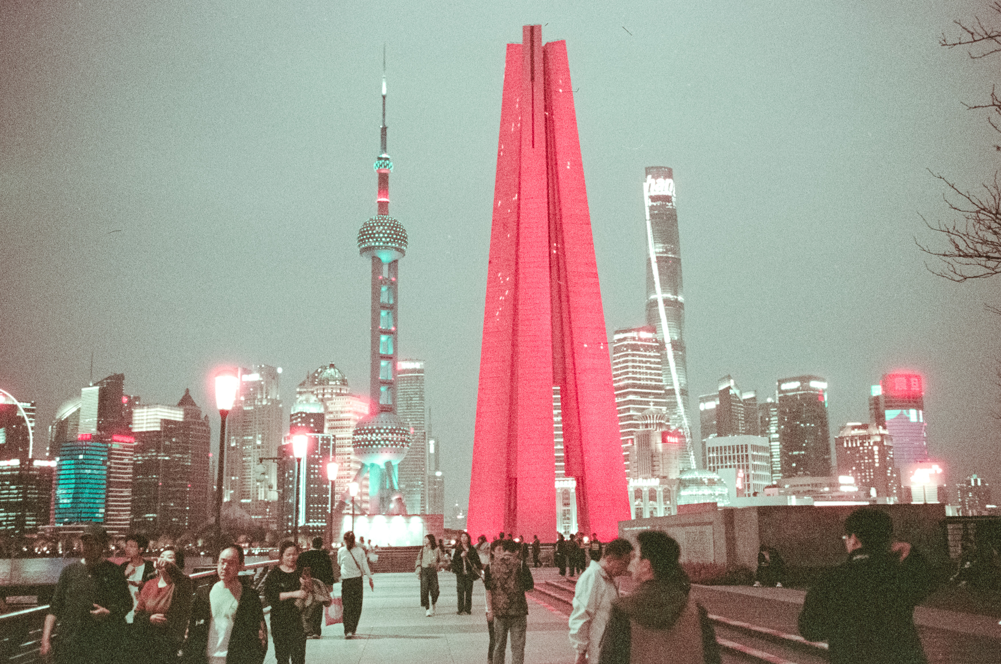
Walking past a local film shop, I spotted a rerolled stock called Iron Bridge 800T. Judging by the packaging, it appeared to be Kodak Vision3 500T with the remjet layer already removed, promising all the cinematic goodness of CineStill 800T without the hassle of removing remjet yourself during processing. It sounded like the perfect companion for a night on the Bund, photographing the Shanghai skyline across the Huangpu River with glowing city lights and those famous red halations around bright highlights.

As it turned out, the theory was considerably more impressive than the results.

Grain, Halation and Disappointment

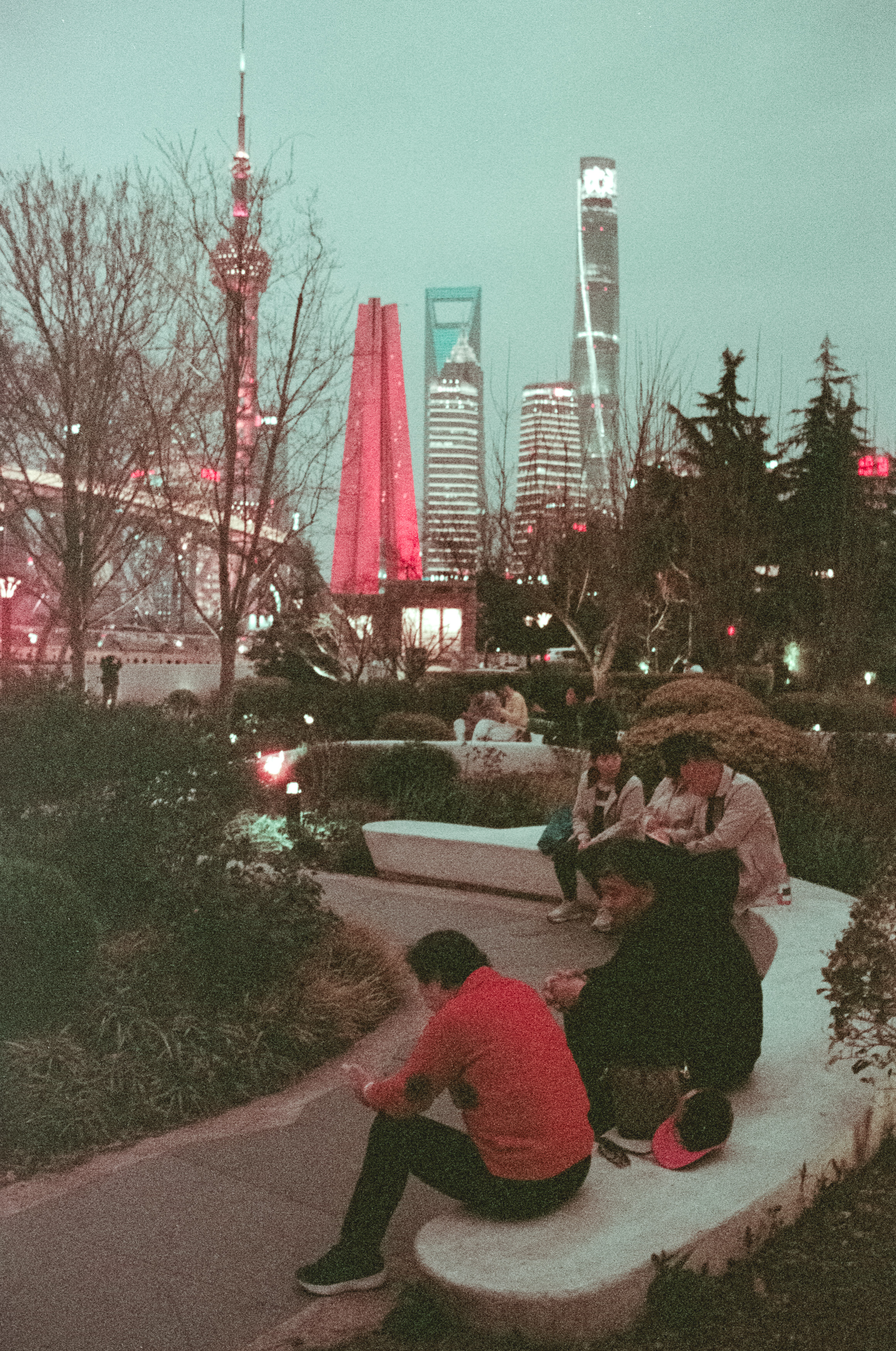
The halation certainly arrived, but so did the grain. Lots of grain. Instead of clean, cinematic negatives, I ended up with photographs drenched in teal shadows, pink highlights and enough texture to make sandpaper seem positively smooth. The images definitely had atmosphere, although not quite the atmosphere I’d hoped for.

To be clear, I don’t think the lens deserves any blame here. If anything, it simply exposed every weakness of the film. The Nokton was producing exactly the sort of sharp, modern images I’d bought it for, but the Iron Bridge stock buried those qualities beneath heavy grain and dramatic colour shifts.

A few weeks later I took the same lens to Kenya while visiting the Gazi Female Community Project, where I spent some time planting mangroves before wandering around with a roll of Kodak Gold 200. Mangrove forests aren’t naturally the most photogenic places—unless tangled roots happen to be your artistic obsession—but the difference was immediately obvious. The colours were cleaner, the negatives sharper and the personality of the lens finally began to emerge.

Even photographs of old fishing boats, hardly the world’s most original subject matter, demonstrated what the Voigtlander was capable of. The Shanghai results had suggested the lens lacked something, but the Kenya negatives proved the opposite. It wasn’t the Nokton that had failed me at all.

Of course, I didn’t know that at the time. The following day I loaded a second roll and headed further north along the Bund towards Waibaidu Bridge, fully expecting redemption. What I got instead was remarkable consistency, because the second roll looked every bit as grainy, pink and teal as the first.

When Failure Becomes Part of the Story

At this point, I’m fairly convinced Iron Bridge 800T is simply expired film, whether the packaging admits it or not. The excessive grain, dramatic colour shifts and muddy shadows seem difficult to explain any other way. My chemistry was fresh, I’d processed Kodak Gold successfully afterwards using exactly the same workflow, and I’d even exposed the film conservatively, often treating it as ISO 500 rather than the advertised 800.

For a while I wasn’t even sure these photographs deserved a video or a blog post. They certainly weren’t the showcase I’d imagined for a new lens, and I briefly considered quietly pretending the whole experiment had never happened. Thankfully, time has a habit of softening disappointment.

The more I revisited the negatives, the more those strange pink highlights and blue washes began to grow on me. They’re still technically flawed, but they somehow capture a mood I never intended to create. What initially felt like failure slowly became something closer to accidental artistry.

Of course, if you’re interested in buying a print, I’ll happily explain that they’re an intentional exploration of Shanghai’s electric urban landscape, complete with a lengthy discussion of postmodern semiotics and the dialectical relationship between synthetic colour and twenty-first-century city life. Otherwise, we can simply admit what really happened: I bought a beautiful lens, paired it with questionable film and accidentally created something far more memorable than I’d planned.

Photography rarely goes exactly as expected, but that’s part of what keeps it interesting. Sometimes the failures teach you more than the successes, and sometimes the pictures you almost threw away end up telling the best story of all.

First experiences with the Pentax 17: Half Frame, Half Baked and Half Good?

If you have even a passing interest in film, you’ve probably heard of the Pentax 17 by now. Released last year in response to the growing nostalgia for analogue photography, it’s one of the few new film cameras to come out in the last decade—and probably the only one from a major manufacturer that isn’t Leica. Pentax took a risk, targeting Gen Z’s fascination with a world they never actually lived in by creating a half-frame camera that sits somewhere between fully manual and fully automatic.

But who is it for?

Rather than catering to professionals, serious enthusiasts, or wealthy collectors looking for flashy trinkets, this camera is clearly aimed at hipsters. You can tell just by the fact that its designer, Takeo Suzuki—who goes by TKO—sports a waistcoat and flat cap. But is this camera a technical knockout? Well, I had my doubts, but I bought one as a Christmas present to myself. Why? Because I deserve it. Okay, also because my wife saw it, immediately wanted one, and who am I to argue?

Credit where it’s due—Pentax took a bold step releasing this niche product, especially at around 800 Australian dollars. I wasn’t planning on buying it until my wife convinced me that it would make me happier, healthier, and an all-around better human being. Has it changed my life? Not really. Let’s be honest—I don’t need another camera. But I do love half-frame cameras, and my old Canon Demi is getting unreliable. The Pentax 17, on the other hand, is brand new, fully functional, and—unlike my usual vintage finds—doesn’t smell like leather, tobacco, and urine. Don’t worry, I’ll add that patina over time.

This camera is supposed to be fun. Half-frame means I don’t have to worry as much about film costs, and the resolution is decent for most uses. Unlike Pentax’s 90s-era fully automatic point-and-shoots, this one puts some control back in my hands. Some, but not all. You have to focus manually using an icon-based system (flowers, people, mountains, and—of course—your dinner, because Instagram). You also have to wind the film on manually, which was about the hardest work I did all summer.

An odd choice to include manual focus

Early frames

Of course, it’s not all fun and games. I took my Pentax 17 and some Ilford HP5 and set out to capture some of the urban decay of tired shopping malls. The results? Nothing spectacular, but it did at least provide a monochromatic record of decline. But I know that’s not what you’re here for—you want your decrepitude in full color. So, I loaded up some Fuji 400 and headed to my home away from home, Leeman, for post-Christmas dog walks on the beach.

Speaking of which, my groodle puppy, Juni, has had plenty of exposure on film this summer. If you’ve been following along, yes, it’s the same dog—just three times bigger. We’re considering renaming her Ginger Monster. Capturing a fast-moving ball of auburn fur with a half-frame camera? Tricky, but fun.

Camera quirks

Now, about those exposure modes. They’re confusing. The dial is color-coded: white for non-flash modes, yellow for flash-based ones, and—just to mess with you—a blue auto mode that isn’t actually fully automatic. It basically turns your expensive camera into a $20 disposable. What focus distance? What aperture? What shutter speed? Who knows? I don’t use it. Instead, I stick to P mode, though I still don’t really know what it does. The biggest issue? The dial is way too easy to knock out of place, which led to some overexposed outdoor shots and underexposed indoor ones before I realized I’d accidentally switched to Bulb mode while winding on.

After some trial and error, I learned a few things. One: get your finger out of the way when shooting macro. Two: framing in a viewfinder camera is always a challenge, but the Pentax 17’s clear viewfinder and close-up frame lines help. Three: for general shooting, the 3m focus setting is usually good enough, though I did cheat and use an iPhone app to double-check distances.

I still haven’t touched auto mode—it gives me anxiety. With half-frame, I like to have two exposed rolls ready before developing to save time and chemicals. So, to make things more difficult for myself, I loaded up a roll of OneShot film next. Why? Because it was cheap. The results? Let’s just say OneShot probably isn’t ideal for a bright Perth summer—or for this camera. The muted colors and heavy grain didn’t do me any favors. The Fuji 400 shots fared better, and while nothing groundbreaking, I did get a few fun summer snapshots.

So, what’s the verdict? This isn’t a spectacular camera. It has its quirks—no self-timer, confusing exposure modes, and some incredibly bright blinking LEDs that don’t provide focus confirmation (because it’s manual focus). Plus, the electronic focus system introduces a slight shutter lag, which is odd for a manual-focus camera. The design is an eclectic mash-up of different Pentax and Ricoh cameras, with an Olympus Pen-style viewfinder and a winding lever that feels straight out of a Pentax 110. It’s a Frankenstein creation, and the real question is: does that make it charming or just dumb?

For me, it’s both. Plenty of YouTubers have reviewed this camera and been left scratching their heads, but that’s because it wasn’t made for high-end photographers. Honestly, it wasn’t even made for me—and I have no standards. But I love it. It’s quirky, fun, and surprisingly decent for what it is. Most of all, it’s brave and weird—just like Juni. Maybe I’m just brave and weird enough to appreciate it.

The Trials and Tribulations of Shooting Expired Film

So, I decided to embark on a little experiment to truly grasp the essence of expired film. My approach? A head-to-head comparison, using the same lens but different cameras. First up was my modern Nikon Z 6, followed by the classic Nikon F100, a relic from the film era. Loaded with a roll of Konica VX200 Super with an expiration date of 2007, I ventured out from Perth, hoping for some magical results beyond the capabilities of my trusty 24-megapixel Z 6.

I meticulously followed the guidelines for shooting expired film, adjusting the ISO to 80 for the 16-year-old film. As I ventured into the desolate landscape north of Perth, I aimed to capture the raw beauty of sand dunes and grass trees, focusing my creativity on the scenery before me.

Equipped with my Nikon 70-200mm f/2.8 zoom lens, renowned for its quality despite its hefty size, I set out to capture the scene with both digital and film cameras. The digital shot, while technically fine, lacked the depth and soul I wanted. However, the film photo… well, let’s just say it fell short of expectations.

Despite my initial excitement, the film results were underwhelming. Attempting to salvage them through post-processing proved futile, resembling a chaotic endeavor akin to artistic desperation. With each frame, my hope dwindled but I remained optimistic for the next outing.

As I eagerly shot frame after frame during my morning dog walk, the reality of the film’s condition became evident. The sickly green fog of the film base and the ghostly impressions on the negatives were inescapable. Nevertheless, I appreciated whatever semblance of imagery I managed to extract.

Reflecting on this experiment, perhaps more light or different approaches could yield better results with my remaining expired rolls. Yet, it’s clear that these photos won’t be gracing any magazine covers.

In the end, I’ll tuck away these disappointing outcomes as lessons learned, alongside other creative misfires in my basement archive. And who knows, maybe there’s a salvageable gem buried somewhere within the failed attempts.